
Want to save time and boost your design workflow? These 11 Chrome extensions can help you inspect CSS, grab colors, test responsive layouts, and more - directly in your browser. No need to juggle multiple tools or apps. Here’s a quick rundown:
- Hoverify: All-in-one tool for CSS inspection, responsive testing, and asset extraction.
- ColorZilla: Grab and manage colors with an eyedropper and gradient analyzer.
- Fonts Ninja: Identify fonts and organize them into collections.
- CSS Peeper: Extract styles, colors, and typography details effortlessly.
- Window Resizer: Test designs on various screen sizes instantly.
- WhatFont: Hover to identify fonts and their properties.
- PerfectPixel: Overlay designs on live sites for pixel-perfect accuracy.
- Muzli: Stay inspired with curated design trends and ideas.
- Page Ruler: Measure spacing, margins, and alignment on any webpage.
- CSSViewer: Instantly view CSS properties with a hover.
- Designer Tools: Use rulers, grids, and dimension checks for precise layouts.
These tools simplify design tasks like prototyping, testing, and collaboration. Whether you’re refining typography or ensuring responsive layouts, these extensions make the process faster and more efficient. Explore the list to find the ones that fit your needs.
How Chrome Extensions Improve Design Workflows
Chrome extensions have reshaped the way designers approach their work by cutting down on app-switching, which often disrupts the creative process. These tools bring improvements in speed, teamwork, responsiveness, and quality checks.
Speed is a standout benefit. Imagine a designer analyzing a competitor’s website - they can instantly extract the color palette, pinpoint fonts, and measure spacing without leaving the browser. This instant access keeps their creative flow uninterrupted.
Team collaboration becomes smoother with extensions that allow designers to leave visual feedback directly on web pages. For remote teams, this is a game-changer, enabling real-time comments and markups without requiring everyone to purchase or use the same high-cost design software.
Testing for responsive designs is made simple with extensions that simulate various screen sizes. Designers can quickly see how their layouts adapt to mobile devices, tablets, and different desktop resolutions - all without resizing browser windows or switching to separate testing tools.
Quality assurance gets a major boost thanks to extensions that can automatically check for accessibility compliance, validate HTML, and ensure pixel-perfect alignment. These tools help catch potential issues early, cutting down on the endless revisions that often crop up during final checks.
This list focuses on extensions that enhance workflows in practical ways, particularly for 2025 and beyond. To make the cut, each tool had to address common design challenges, work with current browser standards, and integrate seamlessly into existing workflows.
Extensions with steep learning curves or complicated setups were left out. The goal is to improve productivity right away, not to add unnecessary hurdles. Similarly, tools that replicate features already available in modern browsers were excluded in favor of those that genuinely expand functionality.
Cross-platform compatibility was another key factor. Design teams often use a mix of Windows, Mac, and Linux systems, so extensions that work consistently across all platforms were prioritized. This ensures that teams can share the same tools regardless of their hardware preferences.
1. Hoverify
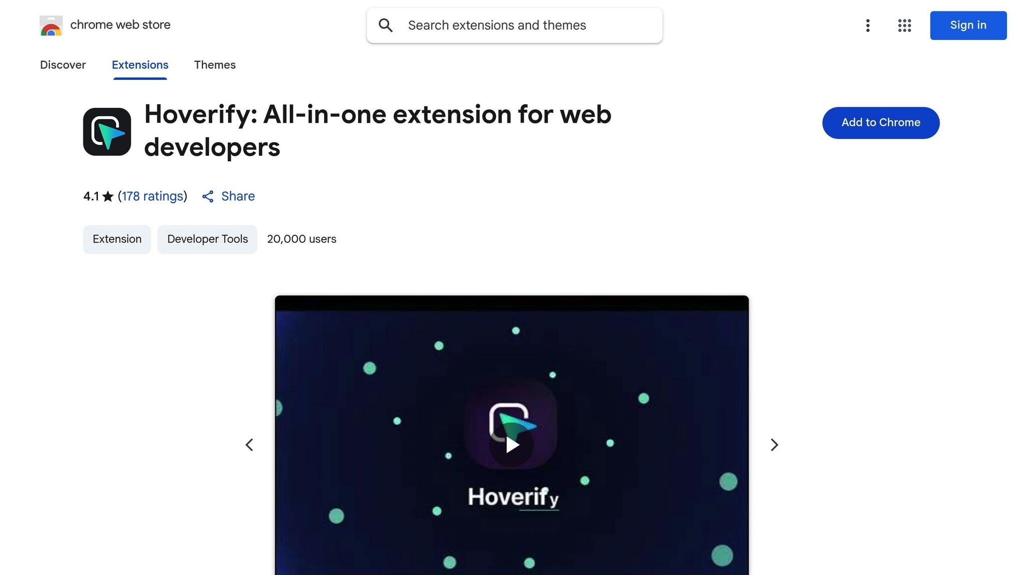
Hoverify brings together a suite of essential development tools in one handy browser extension. It lets you inspect, edit, test, and refine your work directly within a single interface. Its standout feature is the hover-to-inspect tool, which instantly reveals CSS properties. With just a click, you can make real-time edits to elements without breaking your creative rhythm. By combining real-time evaluation with smooth asset management, Hoverify tackles common design disruptions head-on.
Responsive Viewer and Real-Time Editing
Hoverify’s responsive viewer takes responsive design to the next level. It displays multiple synchronized screen sizes, allowing you to see interactions across various previews simultaneously. You can simulate devices with realistic frames, create custom profiles, and even test oversized viewports. On top of that, it offers real-time HTML and CSS editing directly in your browser, complete with syntax highlighting and a visual editor for quick style tweaks.
Color and Typography Tools
Hoverify simplifies working with colors and typography. Its Color Eyedropper tool lets you grab colors from any page element, including images and iframes, and provides values in formats like RGB, CMYK, HSL, and hex. It can also extract all the colors used on a webpage, giving you a comprehensive palette for design inspiration. For typography, the built-in font viewer identifies the typefaces used on each element, making it easy to spot fonts and address rendering inconsistencies across devices.
Layout Control and Asset Management
Hoverify offers precise layout control by displaying the CSS box model, allowing you to adjust spacing with ease. Locating components is simple too, thanks to its ability to identify elements by CSS selectors, tags, IDs, or classes. When it comes to assets, Hoverify makes life easier by quickly gathering images, videos, SVGs, PDFs, and Lottie animations from any webpage.
Capture and Debug
Capture visible areas, full pages, or specific elements, and use the built-in editor to add backgrounds, effects, branding, or annotations - no extra software required. Its custom code injection feature lets you apply temporary HTML, CSS, or JavaScript changes directly on live sites, with the option to make these modifications persistent for ongoing testing. The site stack analysis tool provides instant insights into the technologies, hosting, frameworks, and plugins behind any website, and you can export this data as JSON for documentation. These features make Hoverify an invaluable tool for streamlining your design and development workflow.
2. ColorZilla
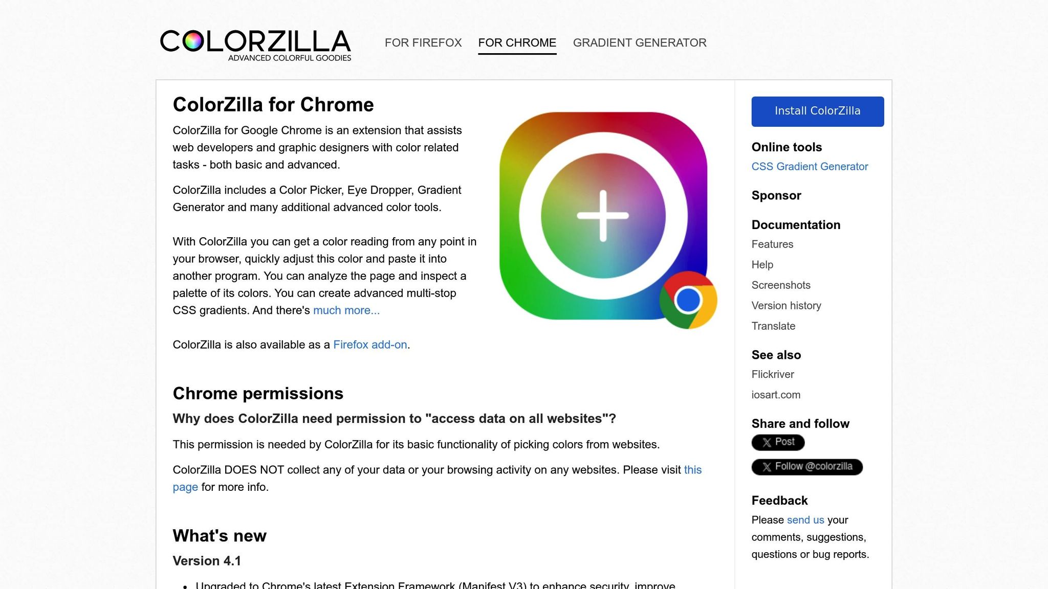
ColorZilla makes picking colors from any webpage effortless, thanks to its digital eyedropper tool that allows you to grab hues and build palettes with ease.
Color Management
With its eyedropper tool, you can click on any element to capture its exact color. It also keeps track of your recent selections in a built-in history, ensuring consistency in your design work. For more complex tasks, the gradient analyzer breaks down intricate gradients, revealing color stops, directions, and the CSS code needed to recreate them. This eliminates the need for tedious manual decoding and saves valuable time.
“Colorzilla is an eyedropper tool with a color picker, color history, CSS gradient analyzer, etc. It is an excellent Chrome extension for web developers or designers to directly pick up the color and use it in your design or work.” - BrowserStack
3. Fonts Ninja
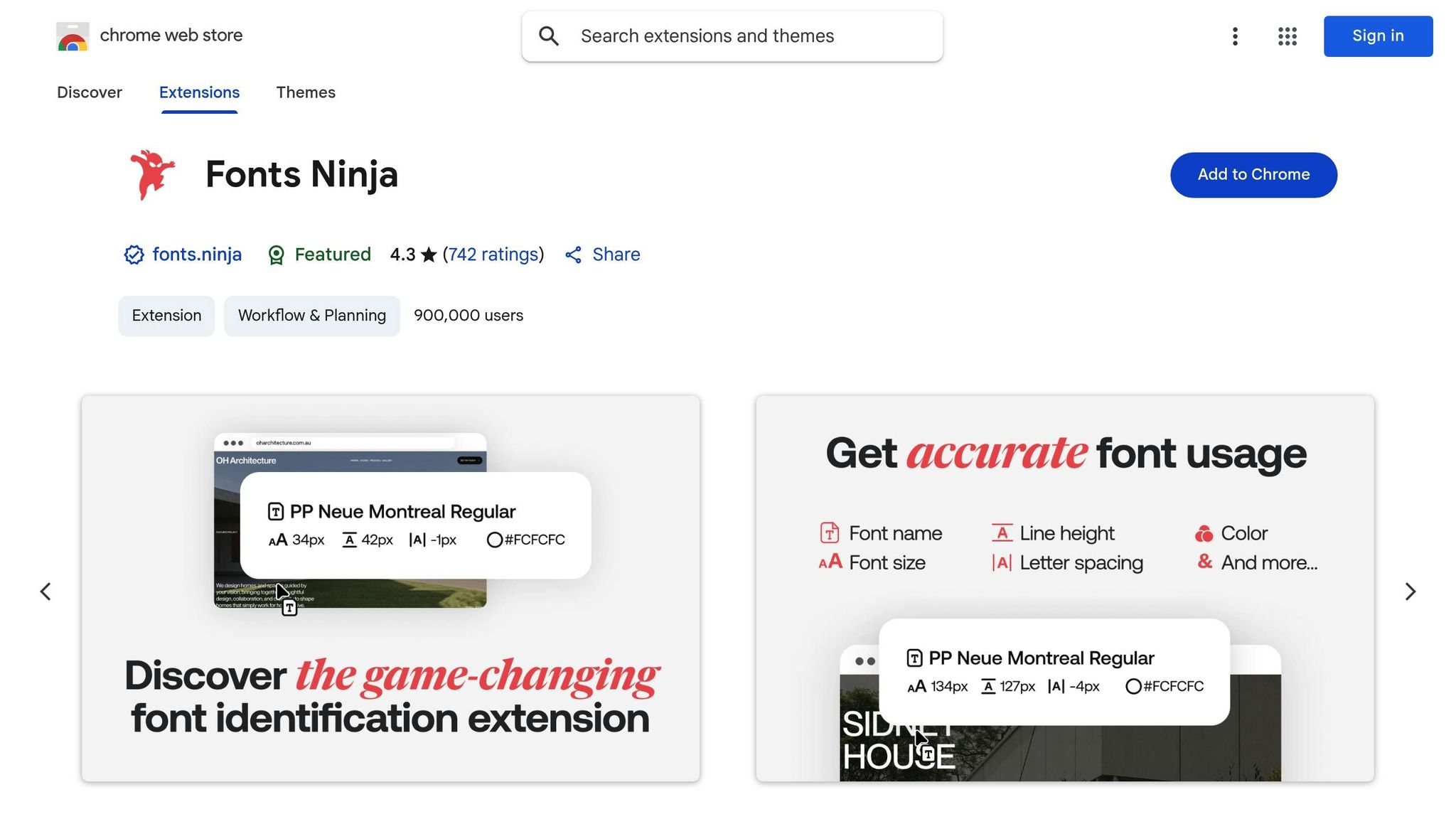
Fonts Ninja is a handy tool for designers, offering a quick way to identify font details on any website. Just hover or click, and it reveals the font information you need - no more second-guessing.
Color and Typography Management
With Fonts Ninja, you can instantly see essential font details like the family, weight, size, and line height, displayed in a simple overlay. This ensures your typography stays consistent and polished across projects.
The extension also includes a bookmarking feature, allowing you to save and organize fonts into collections. Whether you’re working on different projects or catering to various clients, this makes managing fonts a breeze.
Collaboration and Workflow Enhancement
Fonts Ninja simplifies teamwork by exporting font specifications in formats compatible with popular design tools like Sketch and Figma. This reduces miscommunication and makes handoffs smoother.
Need annotated font samples for style guides or presentations? Fonts Ninja has you covered, capturing screenshots with all the details. Ready to dive deeper into web styling? Check out CSS Peeper next.
4. CSS Peeper

Simplify CSS inspection and extraction without the hassle of traditional developer tools.
Color and Typography Management
CSS Peeper makes it easy to extract color palettes, providing hex, RGB, and HSL values in a handy sidebar. You can quickly copy any color value or export the entire palette in one go.
For typography, it lists all font families, weights, sizes, and line heights used on the page in one place. Instead of hovering over individual elements like other tools require, CSS Peeper gives you a full snapshot of all typographic styles at once - perfect for when you’re looking to gather ideas or refine your own designs.
Responsive Design and Layout Insights
CSS Peeper goes beyond just style extraction by offering detailed layout information. It provides precise data on margins, padding, positioning, and pixel dimensions for any selected element, making it easier to replicate responsive layouts.
The tool also visually breaks down the box model properties of any element, showing the content area, padding, borders, and margins. This feature helps you understand spacing or troubleshoot layout inconsistencies between mobile and desktop views.
Team Collaboration and Workflow Improvements
CSS Peeper isn’t just for individual use - it’s a powerful tool for teams. You can create style guides directly from inspected websites, complete with color swatches, typography details, and spacing specs. These guides can be exported and shared with developers or teammates, integrating smoothly with popular design tools.
On top of that, CSS Peeper allows you to download assets like images and icons directly from the page, saving time and effort in your workflow.
5. Window Resizer
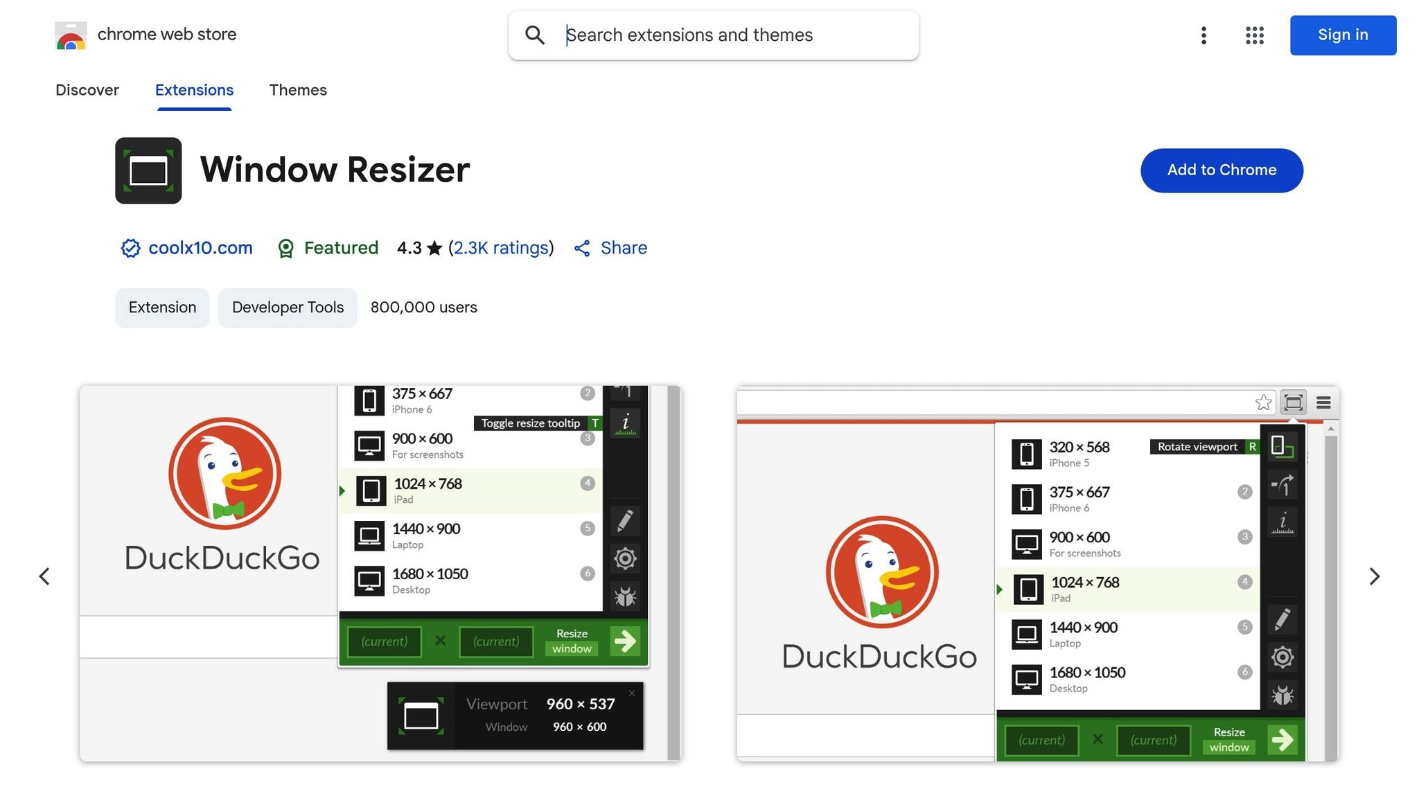
Easily test your designs across various screen sizes without juggling physical devices or complicated tools.
Prototyping and Testing Capabilities
Window Resizer transforms your browser into a responsive design testing station. It comes equipped with popular mobile, tablet, and desktop resolutions, all accessible through a simple pop-up menu. This makes it easy to see if your media breakpoints are working as they should. You can also set custom dimensions to match the specific needs of your project. By eliminating the need to switch between devices, Window Resizer saves time and streamlines your workflow, making it a go-to tool for layout adjustments.
Responsive Design and Layout Optimization
With the growing variety of devices and screen sizes, ensuring a consistent user experience has never been more important. Window Resizer addresses this challenge by offering two resizing modes: viewport-only or full-window. Plus, you can export and import settings to maintain consistency across different machines, making it even easier to optimize your layouts.
Collaboration and Workflow Enhancement
Window Resizer simplifies the process of checking layouts across resolutions, cutting down on repetitive tasks. You can quickly cycle through screen sizes to identify and fix layout issues on the spot. With an average user rating of 4.3 out of 5 stars, it’s clear that many designers rely on this tool daily. While it doesn’t fully replace testing on physical devices, it’s an excellent choice for quick iterations and instant visual feedback during the design process.
6. WhatFont
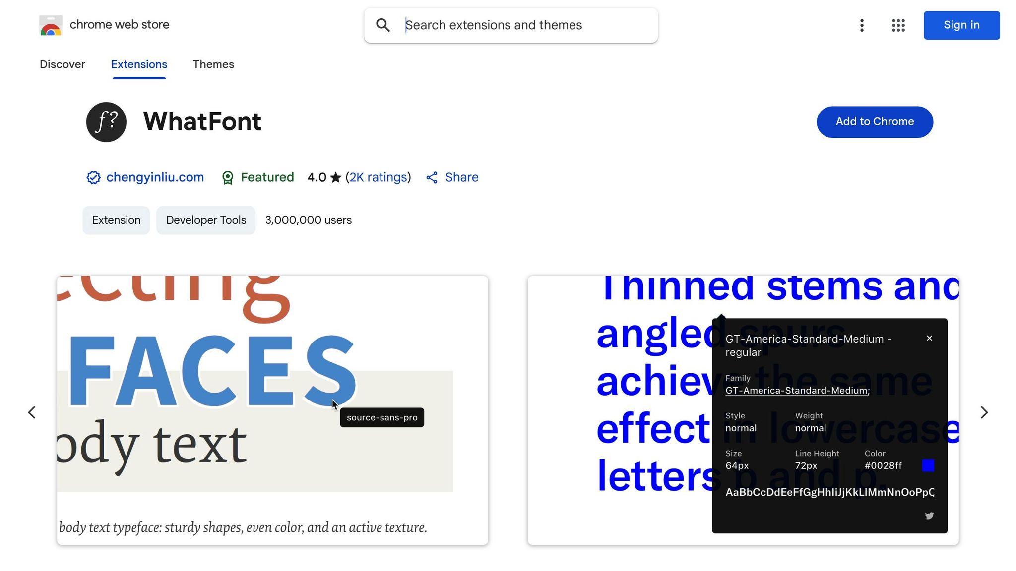
WhatFont stands out by offering instant font identification with a simple hover - no complicated setups required.
Color and Typography Insights
With WhatFont, identifying fonts on a webpage becomes effortless. Just activate the extension, hover over any text, and instantly see details like the font family, size, weight, line height, and even the color. This eliminates the need for manual inspection tools or guesswork.
“With just a click, this extension provides detailed information about the font family, size, weight, line height, and color of any text on a webpage.” - BrowserStack
It also integrates seamlessly with Google Fonts, allowing you to recognize and use popular typefaces right away. Whether you’re creating a style guide or making client revisions, this feature ensures quick access to the exact fonts you need. If a site uses a Google Font, you can easily incorporate it into your own projects, helping maintain consistent typography across designs.
This instant access to font details simplifies workflows and encourages smoother team collaboration.
Improving Collaboration and Workflow
WhatFont is a powerful tool for streamlining communication and design processes. When clients reference fonts from other websites, you can quickly identify and source the exact typefaces, ensuring clarity and consistency in design decisions.
“Among the best Chrome extensions for UI designers, WhatFont helps designers understand and replicate font styles directly from web pages.” - Midas Touch Infotech
For teams working on web design projects, WhatFont offers a shared reference point for typography details. By standardizing how font information is gathered and shared, it reduces miscommunication and ensures that designs are implemented consistently across the board.
7. PerfectPixel
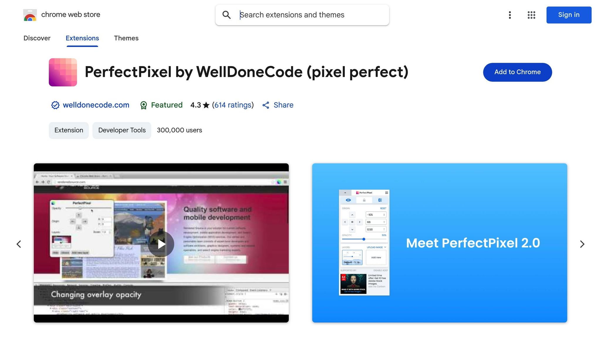
PerfectPixel is all about getting design implementation just right. By allowing you to overlay mockups directly onto live web pages, it ensures a pixel-perfect match between your original design and the final product. This tool makes the design review process smoother and more accurate.
Prototyping and Testing Features
PerfectPixel lets you overlay design images onto any webpage with adjustable opacity and simple drag-and-drop controls. This makes it easy to pinpoint misalignments or inconsistencies as your design moves from concept to development.
Responsive Design Made Simple
The extension works seamlessly across different screen sizes and browser adjustments, making it a great tool for checking responsive layouts. Its zoom feature is particularly handy for examining details like spacing, margins, and alignment on various devices.
Better Collaboration and Workflow
PerfectPixel improves teamwork by offering a clear visual reference during design handoffs. The built-in screenshot tool allows you to capture the overlay and share it with developers, team members, or clients. This makes feedback more straightforward and helps avoid miscommunication during design reviews, keeping everyone on the same page as the project evolves.
8. Muzli
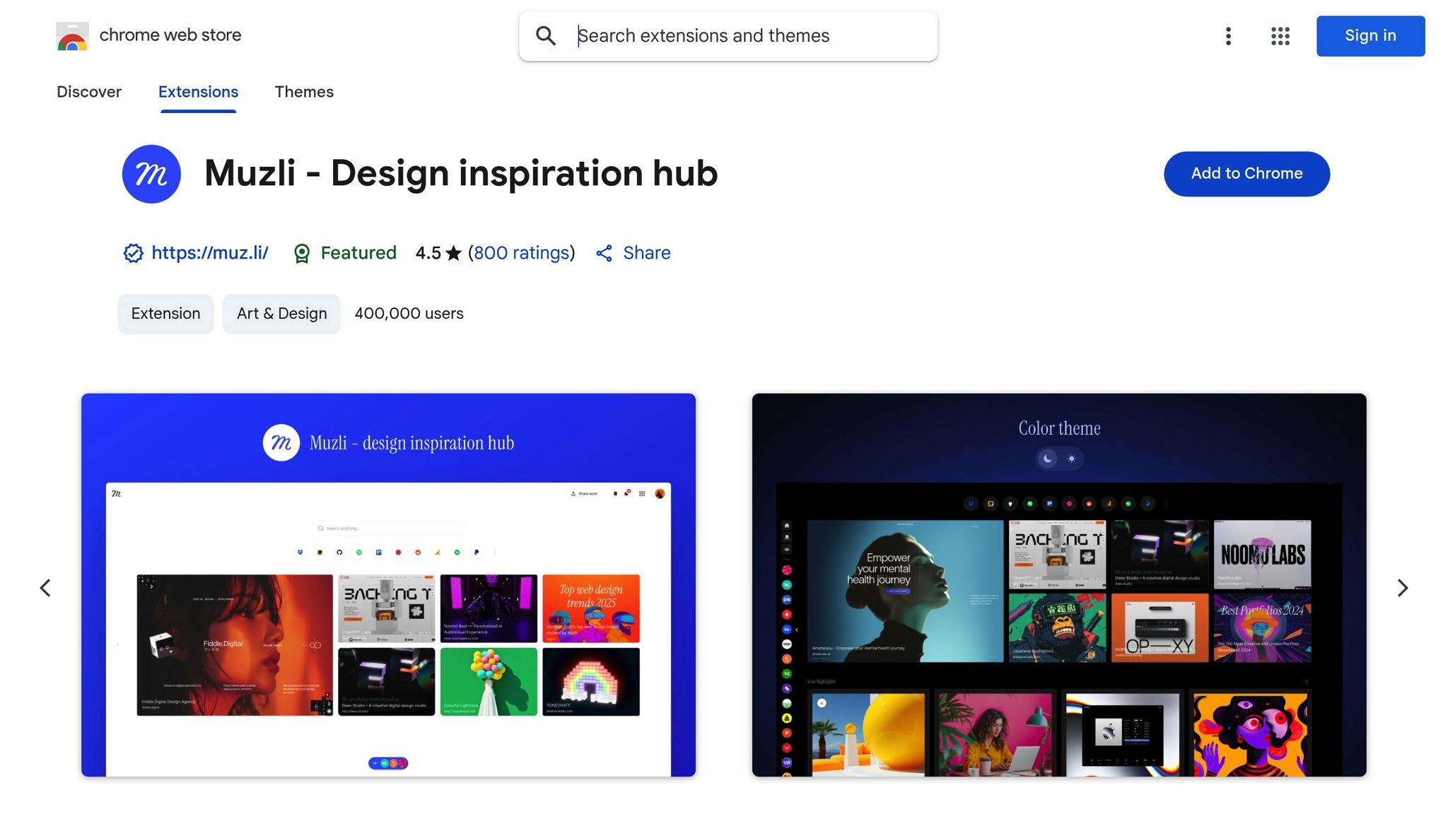
Muzli is your go-to source for design inspiration, offering a curated collection of the latest trends and ideas. It keeps your creative juices flowing by delivering fresh, on-point content directly to you. With its tailored feeds, Muzli ensures you’re always in the loop with emerging design styles, helping to elevate your daily projects. Plus, it works effortlessly with popular design tools, making prototyping and creative workflows smoother and more efficient.
9. Page Ruler
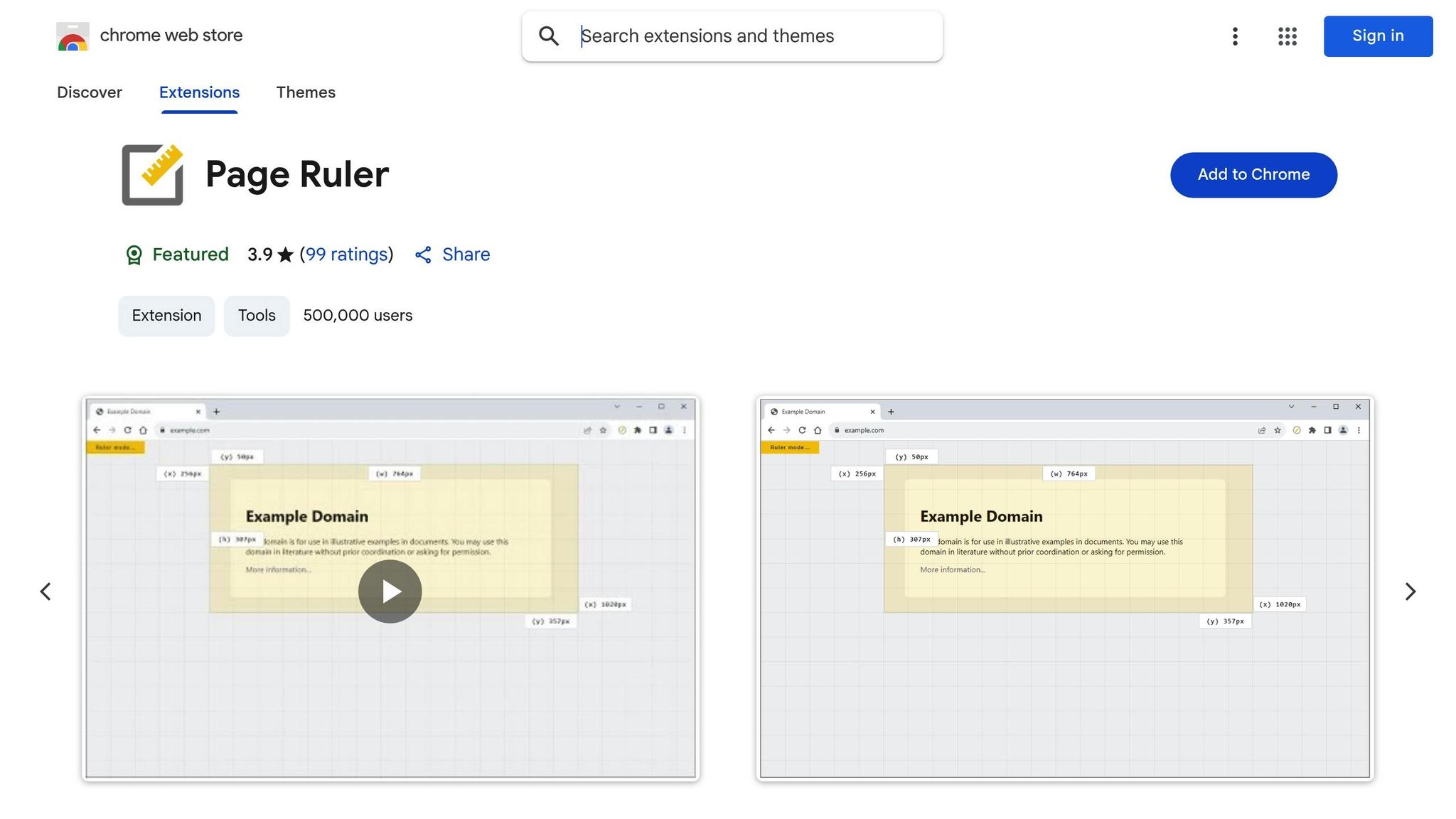
Page Ruler is a handy tool for designers who need pixel-perfect measurements on any webpage. It takes the guesswork out of alignment and spacing by letting you measure padding, margins, and distances between components - all without switching to another tool or diving into the code. This extension keeps everything you need for design measurement right at your fingertips.
Prototyping and Testing Features
When you’re prototyping, Page Ruler’s overlay guides help you double-check element positioning and spacing. The snap-to-edge feature ensures every measurement is precise, making it easier to test and confirm that your designs meet exact specifications.
Perfect for Responsive Design
Page Ruler shines in responsive design work. Its overlay system helps ensure consistent spacing and alignment across different screen sizes, so your layouts look great on any device.
Built-In Color and Typography Tools
Page Ruler doesn’t stop at measurements. It also features a color picker and typography inspector, which let you grab color codes and font details directly from web elements. This makes it a one-stop solution for analyzing and refining your designs.
10. CSSViewer
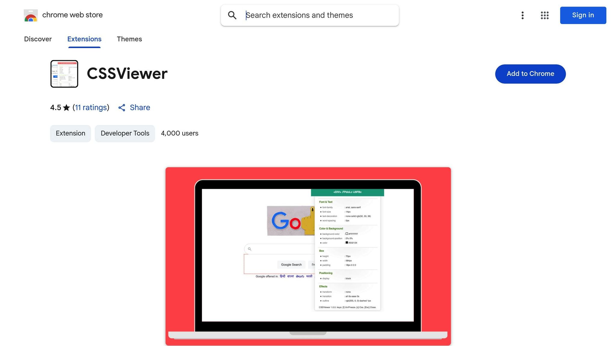
CSSViewer is a handy tool for inspecting CSS properties with ease. It provides quick, on-hover insights, making it a seamless addition to your design workflow. Instead of disrupting your creative process, it offers a straightforward way to view CSS details instantly.
With CSSViewer, inspecting an element’s CSS is as simple as clicking the icon and hovering over the desired element. This gives you real-time access to styling information, making it perfect for analyzing and reusing styles effortlessly. Unlike other tools that require navigating through multiple panels or clicks, CSSViewer simplifies the process by displaying the details immediately.
Its speed and simplicity make CSSViewer an essential part of any browser-based design toolkit.
11. Designer Tools

Designer Tools wraps up our list by focusing on precision. This browser extension turns your screen into a measurement tool, packed with features to ensure accurate spacing and alignment in your web designs.
With customizable rulers, guidelines, and grid systems, Designer Tools makes layout measurements and prototyping a breeze. Its grid system is easy to use, while on-demand dimension checks help identify spacing issues early in the process. You can move or remove guides and tweak settings to fit the specific needs of your project, giving you clear visual references to ensure every element is exactly where it needs to be.
This tool also simplifies prototyping by letting you measure elements directly on your screen without switching between multiple tools. That means you can quickly verify dimensions and maintain precision throughout your design process.
Rated 4.6 out of 5 stars by 231 users, Designer Tools has earned its place among professionals who prioritize accuracy. Its focus on detailed measurement makes it a must-have for any designer aiming for flawless results. Check out the feature comparison table next to see how it stacks up against other extensions.
Feature Comparison Table
Here’s a handy table that outlines the key features, primary tasks, and best use cases for each extension:
| Extension | Primary Function | Key Features | Best For |
|---|---|---|---|
| Hoverify | All-in-one web development | Inspector, color eyedropper, responsive viewer, assets extraction, site stack analysis, SEO tools, screenshot capture, debugging tools | Streamlining the entire web development workflow |
| ColorZilla | Color management | Eyedropper tool, color picker, color history, CSS gradient analyzer | Extracting colors and creating palettes |
| Fonts Ninja | Typography identification | Font detection | Identifying fonts on web pages |
| CSS Peeper | Style inspection | CSS analysis, style guide compliance, layout troubleshooting | Quick CSS inspection and design analysis |
| Window Resizer | Responsive testing | Browser resizing, multiple screen resolutions, custom sizes, settings export/import | Testing responsive designs across devices |
| WhatFont | Font identification | Font detection | Quickly identifying fonts on web pages |
| PerfectPixel | Design precision | Pixel-perfect overlay comparison, opacity adjustment, positioning controls | Verifying design-to-code accuracy |
| Muzli | Design inspiration | Curated design content, trend updates, creative showcases | Staying updated on design trends |
| Page Ruler | Measurement | Element measurement, positioning guides, dimension display | Quick measurements and alignment checks |
| CSSViewer | CSS inspection | Real-time CSS property display, hover-based inspection | Lightweight CSS property viewing |
| Designer Tools | Precision measurement | Customizable rulers, guidelines, grid systems, dimension checks | Detailed layout measurements and prototyping |
This table is designed to help you quickly compare tools and decide which ones fit your workflow best. Hoverify shines as a comprehensive solution, offering a wide range of features that can replace multiple single-purpose tools, making it ideal for designers who want to keep their browser toolbar clutter-free.
For measurement-focused tasks, extensions like Designer Tools, Page Ruler, and PerfectPixel provide unique approaches to ensure precision. Designer Tools offers customizable rulers and grid systems, while PerfectPixel focuses on overlay comparisons to achieve pixel-perfect designs.
In the inspection category, CSS Peeper and CSSViewer stand out, alongside Hoverify’s built-in inspection tools. CSS Peeper is great for detailed style analysis, while CSSViewer is perfect for quick property checks without extra bulk.
Ultimately, your choice depends on your specific workflow needs. If you prefer an all-in-one solution, Hoverify’s extensive feature set can simplify your process. On the other hand, combining specialized tools like ColorZilla for color management or PerfectPixel for design precision might be a better fit for targeted tasks. Each of these extensions plays a role in creating a smoother, more efficient design process.
Conclusion
The 11 Chrome extensions discussed here offer a practical set of tools that can reshape how you tackle design projects in 2025. By incorporating these extensions into your workflow, you can handle tasks that previously required multiple apps - all within your browser.
Gone are the days of juggling separate software to extract colors, bouncing between tabs to test responsive layouts, or relying on external tools for precise measurements. Now, you can manage these tasks seamlessly, cutting down on interruptions and focusing more on the creative aspects of your work. Among these, one standout tool combines several functions into a single, user-friendly interface.
Hoverify is a prime example, offering features like real-time CSS editing, responsive testing, and asset extraction all in one. With pricing set at $30 per year or $89 for lifetime access, it delivers excellent value for teams aiming to simplify their browser toolbars while retaining robust design capabilities.
Other specialized extensions such as ColorZilla for color tasks, PerfectPixel for alignment precision, and Muzli for creative inspiration excel in their specific areas. When used together, they create a cohesive workflow that supports every phase of the design process - from brainstorming and research to achieving flawless final designs.
The key to optimizing your workflow lies in selecting the right mix of tools. For responsive web design, extensions like Window Resizer and Hoverify’s responsive viewer take center stage. For projects focused on typography, tools like WhatFont and Fonts Ninja are indispensable. Check the feature comparison table above to craft a toolkit tailored to your unique needs.
As web design continues to push boundaries in 2025, these extensions enable you to work smarter, design with precision, and deliver outstanding results. Incorporate them into your process to elevate both your efficiency and the quality of your designs.
FAQs
How can Chrome extensions like Hoverify improve the design workflow for remote teams?
Chrome extensions like Hoverify can make a big difference for remote design teams by simplifying workflows and keeping everything organized. With features like web element inspection, color picking, typography management, and prototyping tools all bundled together, it eliminates the hassle of jumping between multiple apps.
For remote teams, these extensions also help improve communication. They allow for real-time sharing of design feedback and insights, ensuring everyone stays on the same page - no matter where they’re located. This not only saves time but also helps teams work more efficiently and get better results.
What features make Hoverify an essential Chrome extension for web designers in 2025?
Hoverify is a versatile browser extension that streamlines the web design process by offering a suite of practical tools. With its inspector, you can analyze and edit web elements directly, while the color eyedropper helps you pick colors with pinpoint accuracy. The responsive viewer makes it easy to test how your designs look on various screen sizes.
It doesn’t stop there. Hoverify includes asset extraction for downloading images and files, screenshot tools to capture web pages, and SEO analysis to help fine-tune site performance. Plus, its debugging tools allow you to quickly identify and fix issues. For an added bonus, Hoverify reveals details about a website’s tech stack, making it a one-stop solution for tackling modern web design tasks.
How do these Chrome extensions work seamlessly across different operating systems for design teams?
Chrome extensions work seamlessly within the Chrome browser, which is supported on major operating systems like Windows, macOS, and Linux. This means your team can rely on these tools no matter what platform they’re using.
What’s more, many extensions sync settings and preferences through your Google account. This ensures a consistent experience across devices, making it simpler for team members to collaborate. With this cross-platform functionality, everyone can access the same tools without being held back by operating system differences.
