
Testing responsive design doesn’t have to be complicated. These 5 Chrome extensions make it easier and faster to ensure your website looks great on any device:
- Hoverify: Test multiple devices simultaneously with mirrored interactions and inspect layouts in real time.
- Responsive Viewer: View different screen sizes side by side with synchronized interactions.
- Window Resizer: Adjust window dimensions with pixel-perfect accuracy and save custom sizes.
- Mobile Simulator: Simulate mobile gestures, test screen orientation, and adjust network speeds.
- Viewport Resizer: Quickly preview your site on various devices and create custom profiles.
These tools help you spot layout issues, fine-tune designs, and deliver a consistent user experience across devices. Whether you’re testing for desktops, tablets, or smartphones, these extensions simplify the process while saving you time.
1. Hoverify

Hoverify simplifies responsive testing by offering a comprehensive toolkit. With its Responsive Viewer, developers can preview websites on multiple devices and resolutions at the same time, eliminating the need to constantly resize windows.
The tool also includes mirrored interactions. This feature syncs clicks and scrolls across all previews, allowing developers to test multiple breakpoints simultaneously without repeating actions.
For added flexibility, Hoverify allows the creation of custom device profiles. Developers can tailor these profiles to match specific testing requirements, ensuring coverage across a wide range of screen sizes and resolutions.
The Inspector tool makes it easy to examine and tweak layouts. By hovering over elements, you can instantly inspect and modify HTML, CSS, media queries, and animations. This real-time editing feature cuts down debugging time, reducing the need to rely heavily on Chrome’s DevTools.
Hoverify brings all these tools together in a single interface, making responsive testing faster and more efficient.
2. Responsive Viewer

Responsive Viewer is a handy tool for testing how layouts look across different devices - all in a single window. It lets you view multiple device screens side by side, making it easier to spot inconsistencies.
One standout feature is its synchronized interaction. Actions like scrolling or clicking in one device preview are automatically mirrored across all others, saving time and effort during testing.
You can pick from preset device profiles or set up custom ones to match common resolutions, such as 360×640 for mobile, 768×1024 for tablets, 1366×768 for laptops, and 1920×1080 for desktops.
3. Window Resizer

Window Resizer makes viewport testing simple with a compact toolbar that lets you adjust window dimensions down to the pixel. Switching between different screen sizes has never been easier.
It offers preset shortcuts for popular screen sizes like 375×667 (iPhone), 1024×768 (iPad), and 1920×1080 (desktop), making breakpoint testing fast and efficient.
You can also save custom dimensions for quick access. For instance, if you frequently test at 1440×900, you can store it for future use.
Additionally, the extension shows your current viewport dimensions in real time. This feature is especially helpful for pinpointing breakpoints and troubleshooting CSS media queries.
4. Mobile Simulator
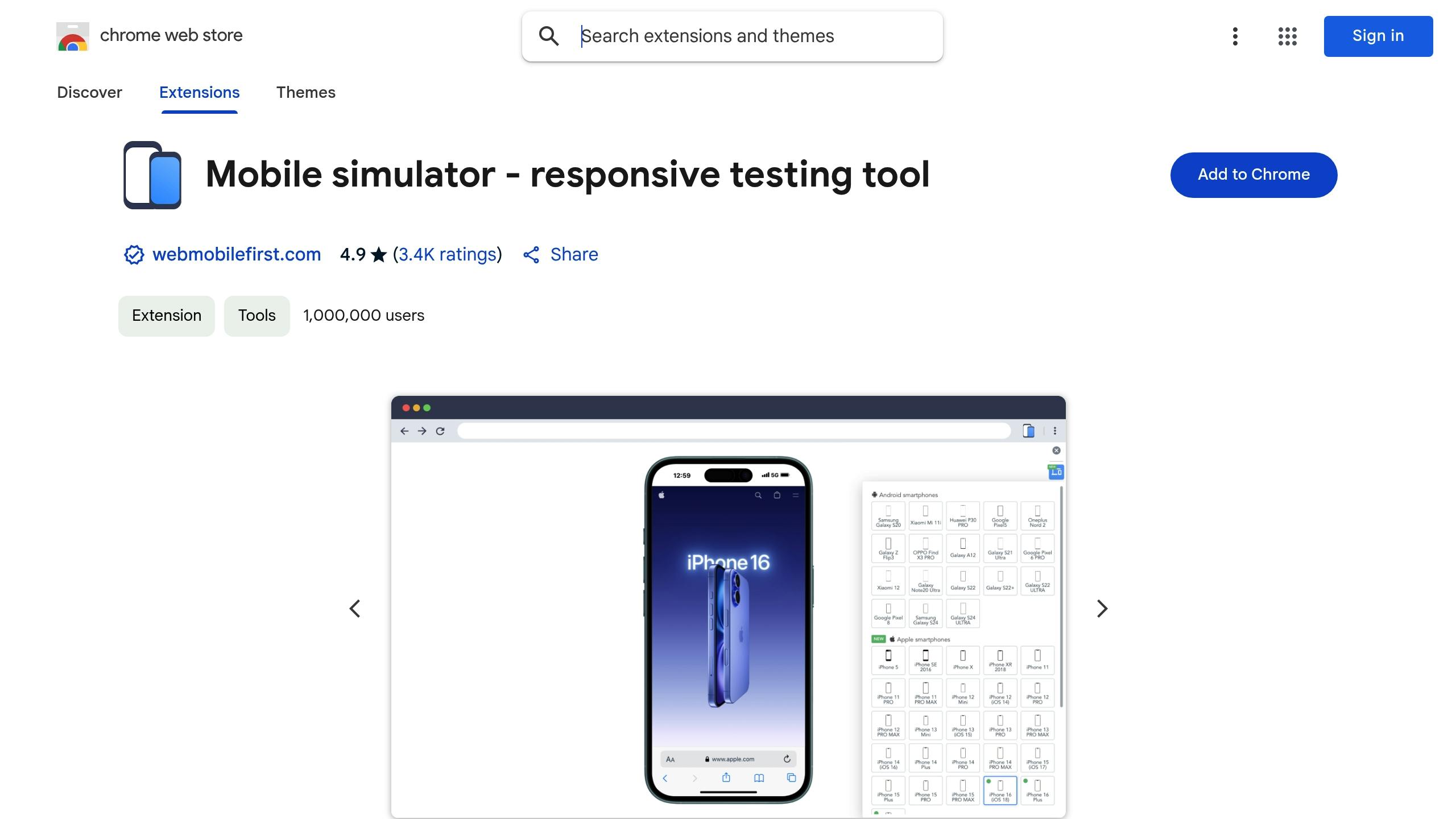
Mobile Simulator turns your desktop browser into a tool for testing mobile experiences. It doesn’t just resize your viewport - it mimics how mobile devices actually behave.
You can test gestures like swiping, pinch-to-zoom, and tapping to make sure everything works smoothly before going live.
Here are some of its standout features:
- Screen orientation switching: Easily toggle between portrait and landscape modes.
- Custom user-agent strings: See how your site performs on different mobile browsers.
- Network throttling: Test under various connection speeds, from fast 4G to sluggish 2G.
A built-in touch event debugger shows touch points and gesture paths, helping you identify and fix issues with touch targets or interactive elements.
The toolbar makes it simple to test common mobile screen resolutions. Quickly switch between popular devices like iPhone 13 (390×844), Samsung Galaxy S21 (360×800), or iPad Pro (834×1194).
It also replicates mobile-specific behaviors such as:
- On-screen keyboard interactions
- Viewport meta tag handling
- Mobile scrolling dynamics
- Device pixel ratio adjustments
With these tools, you can ensure your site feels natural and responsive on mobile devices.
5. Viewport Resizer
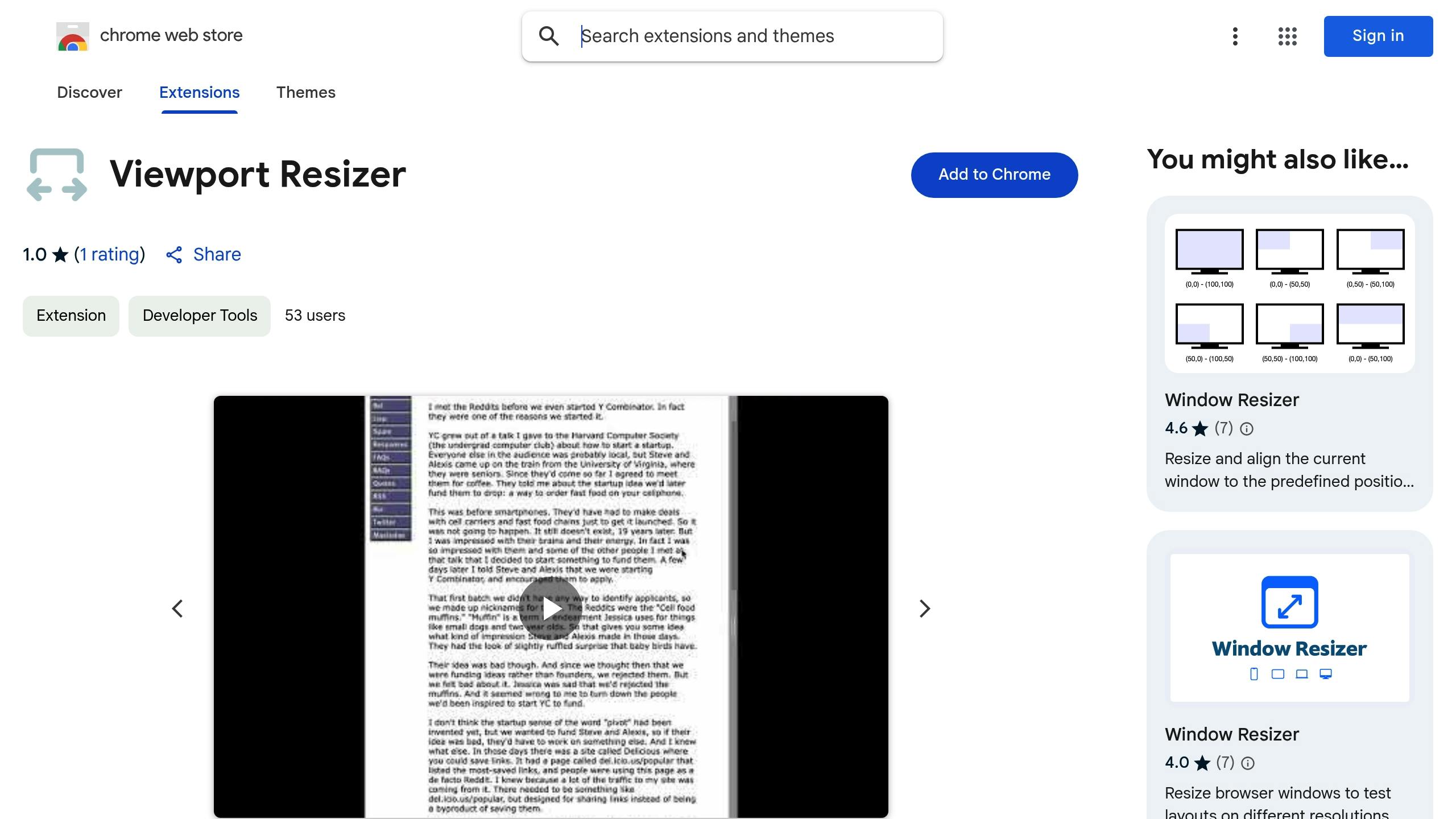
Viewport Resizer makes testing your website across different devices quick and simple. It allows you to preview how your site looks on various screen sizes, saving time during responsive testing. With its mirrored interaction feature, any clicks or scrolls you make are synchronized across all viewports, giving you a clear view of how your design behaves. You can also create custom device profiles to match specific dimensions, ensuring your project works seamlessly on any screen.
Conclusion
The extensions highlighted earlier simplify responsive testing by combining several crucial tools into one platform. With more than 22,000 developers already using these tools, they’ve become an essential part of modern web development.
By bringing key functions together, these tools minimize the need for multiple applications and save developers time. They allow you to preview layouts on various devices, spot problems quickly, and ensure a consistent user experience - all within a single interface.
Here are a few tips to make the most of your responsive testing:
- Create custom device profiles for your most-used screen sizes.
- Use synchronized testing to check for consistency across devices.
- Take advantage of built-in tools to address design issues efficiently.
These extensions simplify the testing process without compromising quality. Adding them to your workflow can help you deliver seamless experiences across devices while cutting down on testing time.
