CSS Grid’s auto-fit and auto-fill are two key tools for creating flexible layouts, but they behave differently. Here’s the quick takeaway:
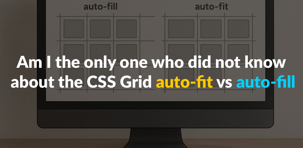
- Auto-fill: Creates as many columns as possible within the container, even if some remain empty. This keeps a consistent grid structure, making it great for layouts requiring uniform spacing.
- Auto-fit: Collapses empty columns and stretches existing ones to fill the space. This ensures content spans the full width of the container.
Key Difference: Auto-fill preserves empty columns, while auto-fit removes them and redistributes space.
Quick Comparison
| Feature | Auto-fill | Auto-fit |
|---|---|---|
| Empty Columns | Retained, even if unused | Collapsed, allowing content to stretch |
| Layout Flexibility | Maintains fixed spacing | Content adjusts to fill available space |
| Use Case | Uniform grids (e.g., photo galleries) | Responsive layouts (e.g., dashboards) |
Understanding these differences helps you choose the right option for your design needs. Read on for practical examples and tips!
1. CSS Grid auto-fit
The auto-fit property in CSS Grid offers a smart way to handle columns, creating grids that adapt to their content rather than sticking to a rigid structure. When combined with the repeat() function, it allows for layouts that adjust dynamically to the available space.
How it handles empty columns
What makes auto-fit stand out is how it deals with empty columns. Instead of keeping them, it collapses those unused spaces, resulting in a grid that responds directly to the content it holds.
“
auto-fitFITS the CURRENTLY AVAILABLE columns into the space by expanding them so that they take up any available space. The browser does that after FILLING that extra space with extra columns (as withauto-fill) and then collapsing the empty ones.” - Sara Soueidan
Essentially, the browser first checks how many columns could fit within the container. Then, it eliminates any empty columns and redistributes the extra space to the columns that contain content. This approach ensures that the grid layout always looks balanced and efficient.
Impact on grid item appearance
When auto-fit collapses empty columns, the remaining grid items stretch to fill the available space. This ensures that your content spans from edge to edge, creating a clean and polished look.
“If you’re using
auto-fit, the content will stretch to fill the entire row width.” - Sara Soueidan
Instead of leaving awkward gaps or unutilized areas, auto-fit ensures that every grid item grows proportionally to make the most of the container’s width. The result is a layout that feels cohesive and visually appealing.
When to use auto-fit
The auto-fit property shines in situations where you need a layout that adapts to varying amounts of content or different screen sizes. It’s particularly useful for grids that need to remain flexible - think dashboards, product pages, or any design where the number of items changes dynamically.
“Auto-fit behaves like auto-fill but with a key difference: it collapses any empty columns, causing the grid items to stretch and fill the remaining space. This makes auto-fit ideal for scenarios where you want your content to be responsive and adapt to different screen sizes without leaving gaps.” - Eldin Zeco
This property is perfect for card-based layouts, image galleries, or any interface where maintaining a balanced and responsive design is key. It ensures your layout looks complete, no matter how much content you have or how wide the viewport is.
Built-in responsiveness
Beyond collapsing empty columns, auto-fit simplifies the process of creating responsive designs. It automatically adjusts column sizes and wraps elements as needed, leaving the browser to handle the complex calculations. This means your grid will always adapt seamlessly to changes in content or screen size, making it a powerful tool for modern web layouts.
2. CSS Grid auto-fill
Unlike auto-fit, which collapses empty columns, auto-fill keeps them intact, resulting in a stable grid structure. The auto-fill property works by creating as many columns as possible within the available space, even if some of them remain empty. This behavior makes it a practical choice for specific layout needs.
How it handles empty columns
With auto-fill, empty columns are preserved in the grid, rather than being removed. When the browser calculates the layout using auto-fill, it determines the number of columns based on the specified size constraints. Even if no content fills some of these columns, they still take up space in the row. These placeholders can play a key role in maintaining alignment and spacing across the layout.
“auto-fill FILLS the row with as many columns as it can fit. So it creates implicit columns whenever a new column can fit, because it’s trying to FILL the row with as many columns as it can. The newly added columns can and may be empty, but they will still occupy a designated space in the row.” - Sara Soueidan
Why and where to use it
Since empty columns remain in the grid, auto-fill ensures a consistent structure where grid items keep their fixed dimensions. This approach is particularly helpful in layouts where uniformity is key. For instance:
- Photo galleries: Ensures images stay proportional and aligned.
- Product catalogs: Maintains consistent spacing between items.
- Card layouts and dashboards: Keeps content neatly arranged without distortion.
Additionally, when dealing with dynamic content that loads over time, auto-fill prevents sudden layout shifts by keeping the grid stable as new items are added.
Making layouts responsive
auto-fill adapts seamlessly to responsive designs by adjusting the number of columns as the screen size changes. On smaller screens, its behavior is similar to auto-fit. However, on wider screens, the difference becomes clear - auto-fill retains extra columns, preserving the original spacing and structure. This makes it an excellent choice for dynamic interfaces like content management systems, where maintaining a consistent grid layout is crucial for design integrity.
Pros and Cons Comparison
Here’s a closer look at how auto-fill and auto-fit stack up against each other. Use this breakdown to weigh the trade-offs and decide which is better suited for your layout needs.
| Feature | auto-fill | auto-fit |
|---|---|---|
| Empty Tracks | Creates empty tracks if there aren’t enough items to fill all columns | Collapses empty tracks, allowing items to stretch and fill the space |
| Responsiveness | Less flexible; maintains column size but may leave empty spaces | More adaptive; items stretch to fill the container, adjusting to screen size |
| Layout Consistency | Keeps a fixed grid layout with consistent spacing | Stretches content to fill the entire width, adapting to container size |
Auto-fill is ideal when you want a grid layout that maintains consistent spacing, even if it leaves some empty space. It’s predictable and works well for designs where uniformity matters across different screen sizes.
On the other hand, auto-fit shines in responsive designs. It stretches items to fill the available space, creating a seamless edge-to-edge look. This flexibility makes it great for dynamic layouts but can lead to issues, like excessive stretching, when there are only a few items in the grid.
Both properties are powerful tools for creating responsive layouts without the need for media queries. Your choice depends on whether you prioritize layout consistency or the ability to adapt dynamically to changing container sizes.
Conclusion
Grasping the difference between auto-fit and auto-fill is a game-changer for refining your responsive design approach. At first glance, these CSS Grid properties might look alike, but their functionality is quite distinct, and understanding this distinction can elevate the effectiveness of your layouts.
The main difference lies in how each property deals with empty space. Auto-fill focuses on creating implicit columns to pack the row with as many as possible, while auto-fit adjusts by collapsing empty columns, making the existing ones expand to fill the available space.
Your choice between these two depends on your design goals. Auto-fill is ideal for scenarios where maintaining a consistent, structured layout is the priority. It ensures uniform spacing and avoids awkward stretching, even when content is sparse. On the other hand, auto-fit shines in dynamic environments where adaptability is key. It creates a fluid, edge-to-edge look that works beautifully on both small screens and wide desktops. However, with minimal content, auto-fit can lead to grid items stretching too wide, so it requires careful consideration.
Both properties can simplify your CSS by reducing the reliance on complex media queries, making your code easier to manage. Remember, auto-fill generates a more rigid grid structure, while auto-fit offers flexibility. Pair either one with the minmax() function to unlock true responsiveness. This combination ensures your layouts adapt seamlessly across devices while maintaining the intended behavior of your grid.
FAQs
When should I use auto-fit vs. auto-fill in CSS Grid layouts?
To choose between auto-fit and auto-fill in CSS Grid, it all comes down to how you want your layout to manage unused space.
- Auto-fill packs as many columns as it can into the available space, even if some of those columns remain empty. This works well if you want to keep space open for items that might be added later.
- Auto-fit, by contrast, collapses any unused columns, letting the existing grid items stretch to fill the space more effectively.
Go with auto-fill if you need a steady grid structure, and opt for auto-fit if you prefer a layout that adapts to the content dynamically.
When should I use auto-fit instead of auto-fill in CSS Grid?
When designing layouts, auto-fit is your go-to choice if you want grid items to stretch and fill all the available space. This approach works perfectly for responsive designs like image galleries or dashboards, where items need to expand evenly within the container, leaving no gaps behind.
On the other hand, auto-fill is better suited for layouts where maintaining empty spaces is intentional. For example, if you have a fixed number of columns and are okay with gaps between items, auto-fill keeps the structure consistent while leaving room for potential additions. The key is deciding whether your priority is dynamic space-filling or a steady grid structure.
What should I watch out for when using auto-fit and auto-fill in CSS Grid for responsive design?
When working with auto-fit and auto-fill in CSS Grid, there are a few common mistakes that can throw off your layout:
- Improper grid track sizes: This can create unexpected gaps or cause elements to overlap, disrupting the design.
- Ignoring min/max sizing: Without setting proper constraints, grid items might break out of their boundaries or overflow awkwardly.
- Skipping responsiveness tests: Failing to check layouts on different screen sizes can lead to poor user experiences on smaller or larger devices.
To avoid these problems, make sure to define clear track sizes, keep grid nesting minimal, and test your layout on a range of devices. This will help you build a design that’s both flexible and visually consistent.
