
Want to create smooth, engaging animations in React? Combining Tailwind CSS and Framer Motion makes it simple. Tailwind handles styling with utility-first classes, while Framer Motion provides a React-friendly API for animations. Together, they enable you to craft everything from hover effects to complex gesture-based interactions - all while keeping your code clean and responsive.
Key Takeaways:
- Tailwind CSS: Utility classes for styling and transitions (
transform,transition,duration). - Framer Motion: Declarative animation library for React with props like
animate,initial, andwhileHover. - Ease of Use: Tailwind for layout, Framer Motion for animations - no need for complex CSS or JavaScript.
- Performance: GPU-accelerated animations ensure smooth transitions.
- Accessibility: Respect user preferences with reduced motion settings.
Example Highlights:
- Hover Effects: Buttons that scale on hover or shrink when clicked.
- State Animations: React to state changes with dynamic transitions.
- Responsive Design: Adjust animations for mobile and desktop.
- Scroll Triggers: Animate elements as they come into view.
Whether you’re building a responsive gallery, interactive menu, or animated forms, this guide walks you through setup, examples, and performance tips to create polished, responsive animations in React.
Setting Up Your Development Environment
Let’s walk through installing and configuring Tailwind CSS and Framer Motion to get your React project ready for styling and animations.
Installing and Configuring Tailwind CSS
To set up Tailwind CSS, start by installing three key packages: tailwindcss, postcss, and autoprefixer. Run the following command in your project directory:
npm install tailwindcss postcss autoprefixer
Once the installation is complete, initialize Tailwind CSS by running:
npx tailwindcss init -p
This command creates two configuration files: tailwind.config.js and postcss.config.js, setting up PostCSS for you.
To optimize your production build, configure tailwind.config.js like this:
module.exports = {
  purge: ['./src/**/*.{js,jsx,ts,tsx}', './public/index.html'],
  darkMode: false, // Use 'media' or 'class' for dark mode
  theme: {
    extend: {},
  },
  variants: {
    extend: {},
  },
  plugins: [],
}
The purge option ensures unused CSS classes are removed, keeping your final build lightweight. Next, add Tailwind’s base styles, components, and utilities to your main CSS file:
@tailwind base;
@tailwind components;
@tailwind utilities;
These utilities include helpful classes like transform, transition, and duration, which are great for adding basic animations and effects.
Installing and Importing Framer Motion
To bring animations into your project, install Framer Motion with:
npm install framer-motion
As the creators describe it:
“Motion for React is an animation library that’s simple to start and fun to master.”
After installation, import Framer Motion components into your React files. The most commonly used is the motion component:
import { motion } from "framer-motion";
You can replace standard JSX elements with motion components to add animations. For instance, instead of a plain <div>, you’d use <motion.div> and gain access to animation props like animate, initial, transition, and whileHover.
Here’s a quick example:
// Static component
<div className="bg-blue-500 p-4 rounded">
  Hello World
</div>

// Animated component
<motion.div
  className="bg-blue-500 p-4 rounded"
  whileHover={{ scale: 1.05 }}
  transition={{ duration: 0.2 }}
>
  Hello World
</motion.div>
This small change transforms a static element into one that responds dynamically to user interaction.
Using Tailwind and Framer Motion Together
Tailwind CSS handles your styling, while Framer Motion takes care of animations.
“Combining the utility-first styling of Tailwind CSS with the powerful animation capabilities of Framer Motion allows developers to craft stunning animations and transitions with ease.”
Here’s how the two work together: use Tailwind for your component’s base styling and layout, then wrap it in a motion component to add animations. For example, you might use Tailwind classes like bg-gradient-to-r, from-purple-500, and to-pink-500 for a gradient background, and then use Framer Motion’s whileHover prop to animate the component’s size or opacity when hovered.
This approach keeps your code clean. Styling stays in the className attributes, while animation logic is handled through Framer Motion props.
One thing to note is performance. Framer Motion animates properties via JavaScript and inline styles, which means it can handle advanced animations like spring physics or gesture-based interactions - things Tailwind’s transition utilities can’t do. For simpler effects like hover transitions, you can choose between Tailwind and Framer Motion based on what fits your needs best.
In February 2025, LogRocket praised Motion (formerly Framer Motion) as a tool that simplifies creating animations in JavaScript, making it easier for developers to add intuitive, high-quality animations with minimal effort.
With both tools now set up, you’re ready to create stunning animations and responsive designs in your React project.
Building Basic Animations
With your tools ready to go, it’s time to dive into creating some basic animations for your React components. These foundational techniques will serve as building blocks for more intricate animations down the road.
Adding Enter and Exit Animations
Enter and exit animations are a great way to make components appear and disappear with a touch of elegance, enhancing the overall user experience. Framer Motion simplifies this process with three key properties: initial, animate, and exit.
- initial defines the starting state of your animation.
- animate specifies the final state.
- exit determines how the component disappears.
Here’s an example that fades in a welcome message:
import React from 'react';
import { motion } from 'framer-motion';

const FadeInComponent = () => {
  return (
    <motion.div
      className="p-6 bg-blue-500 text-white rounded-lg"
      initial={{ opacity: 0 }}
      animate={{ opacity: 1 }}
      transition={{ duration: 1 }}
    >
      Welcome to the Animated World!
    </motion.div>
  );
};

export default FadeInComponent;
In this example, the component starts fully transparent (opacity: 0) and fades in over one second. Tailwind CSS handles the styling, while Framer Motion takes care of the animation logic.
Want to add more depth? Combine properties like opacity and position. For instance, adding y: -20 to the initial state and y: 0 to the animate state creates a slide-up effect during the fade-in.
For exit animations, wrap your component in Framer Motion’s AnimatePresence. This ensures the exit animation completes before the component is removed from the DOM:
import { useState } from 'react';
import { AnimatePresence, motion } from 'framer-motion';

const ExampleExitAnimation = () => {
  const [showComponent, setShowComponent] = useState(true);

  return (
    <AnimatePresence>
      {showComponent && (
        <motion.div
          className="p-4 bg-green-500 text-white rounded"
          initial={{ opacity: 0, scale: 0.8 }}
          animate={{ opacity: 1, scale: 1 }}
          exit={{ opacity: 0, scale: 0.8 }}
          transition={{ duration: 0.3 }}
        >
          I can fade in and out!
        </motion.div>
      )}
    </AnimatePresence>
  );
};
Creating Hover and Tap Effects
Interactive animations make your UI feel lively and engaging. With Framer Motion’s whileHover and whileTap properties, adding these effects is straightforward.
For example, here’s a button that grows when hovered and shrinks slightly when clicked:
<motion.button
  className="px-6 py-3 bg-purple-600 text-white rounded-lg font-semibold"
  whileHover={{
    scale: 1.2,
    transition: { duration: 1 },
  }}
  whileTap={{ scale: 0.9 }}
>
  Hover and Click Me!
</motion.button>
For navigation links, you might prefer subtler effects. Here’s a simple hover animation for a menu link:
<motion.a
  href="/about"
  className="text-gray-700 hover:text-blue-600 px-4 py-2 rounded"
  whileHover={{ scale: 1.05 }}
  transition={{ type: "spring", stiffness: 300 }}
>
  About Us
</motion.a>
You can even combine Framer Motion’s animations with Tailwind’s hover utilities to layer effects, such as color changes paired with scaling or rotation.
Animating State Changes
State-driven animations let your components visually respond to changes in your app’s data. By tying animations to state, you can make transitions feel smooth and intuitive.
Here’s a simple toggle button that changes its size and rotation based on its active state:
import { useState } from 'react';
import { motion } from 'framer-motion';

const ToggleButton = () => {
  const [isActive, setIsActive] = useState(false);

  return (
    <motion.button
      className={`px-6 py-3 rounded-lg font-semibold ${
        isActive ? 'bg-green-500 text-white' : 'bg-gray-200 text-gray-800'
      }`}
      animate={{
        scale: isActive ? 1.1 : 1,
        rotate: isActive ? 5 : 0,
      }}
      transition={{ duration: 0.3 }}
      onClick={() => setIsActive(!isActive)}
    >
      {isActive ? 'Active' : 'Inactive'}
    </motion.button>
  );
};
For more complex animations, use variants to define named animation states. This keeps your code organized, especially when juggling multiple animations:
import { useState } from 'react';
import { motion } from 'framer-motion';

const cardVariants = {
  collapsed: {
    height: 80,
    opacity: 0.7,
  },
  expanded: {
    height: 200,
    opacity: 1,
  },
};

const ExpandableCard = () => {
  const [isExpanded, setIsExpanded] = useState(false);

  return (
    <motion.div
      className="bg-white border border-gray-300 rounded-lg p-4 cursor-pointer"
      variants={cardVariants}
      animate={isExpanded ? "expanded" : "collapsed"}
      transition={{ duration: 0.4, ease: "easeInOut" }}
      onClick={() => setIsExpanded(!isExpanded)}
    >
      <h3 className="font-bold">Click to expand</h3>
      {isExpanded && (
        <p className="mt-2 text-gray-600">
          This content appears when the card is expanded!
        </p>
      )}
    </motion.div>
  );
};
As Sam Selikoff points out:
“I love using variants alongside React state – pass your state to
animate, and now you’ve got a tidy place to define all your animation targets!”
Timing is critical for state animations. Quick interactions like button clicks feel natural with durations of 0.2 to 0.3 seconds. For larger changes, such as expanding layouts, aim for 0.4 to 0.6 seconds to strike the right balance between speed and smoothness.
Advanced Animation Patterns
Taking your animations to the next level can make your React components more dynamic and visually engaging. Advanced techniques like staggered animations, responsive designs, and gesture-based triggers allow you to craft polished interfaces that resonate with users.
Staggered and Sequence Animations
Staggered animations bring a rhythmic flow to your interface by animating multiple elements in succession. With Framer Motion, this effect is easy to implement using the staggerChildren property.
Here’s an example of animating a list with a staggered effect:
import { motion } from 'framer-motion';

const containerVariants = {
  hidden: { opacity: 0 },
  show: {
    opacity: 1,
    transition: {
      staggerChildren: 0.1,
      delayChildren: 0.3,
    },
  },
};

const itemVariants = {
  hidden: { opacity: 0, y: 20 },
  show: { opacity: 1, y: 0 },
};

const StaggeredList = () => {
  const items = ['Dashboard', 'Analytics', 'Reports', 'Settings'];

  return (
    <motion.ul
      className="space-y-4 p-6"
      variants={containerVariants}
      initial="hidden"
      animate="show"
    >
      {items.map((item, index) => (
        <motion.li
          key={index}
          className="p-4 bg-gray-100 rounded-lg shadow-sm"
          variants={itemVariants}
        >
          {item}
        </motion.li>
      ))}
    </motion.ul>
  );
};
In this setup, each item appears 0.1 seconds after the previous one, starting with a delay of 0.3 seconds.
For more intricate sequences, nested staggered containers can create layered effects:
const gridVariants = {
  hidden: { opacity: 0 },
  show: {
    opacity: 1,
    transition: {
      staggerChildren: 0.2, // Stagger rows
    },
  },
};

const rowVariants = {
  hidden: { opacity: 0 },
  show: {
    opacity: 1,
    transition: {
      staggerChildren: 0.1, // Stagger cards within each row
    },
  },
};

const cardVariants = {
  hidden: { opacity: 0, scale: 0.8 },
  show: { opacity: 1, scale: 1 },
};
As Adam Wathan from Tailwind Labs states:
“Framer Motion is basically the coolest library anyone has ever made”.
Combining Tailwind’s styling with Framer Motion’s animation tools allows you to create seamless effects with minimal effort.
Responsive Animations
Animations that adapt to various screen sizes improve both performance and user experience. A mobile-first approach works well here - keep animations simple and fast on smaller screens, then enhance them for larger displays.
import { motion } from 'framer-motion';
import { useState, useEffect } from 'react';

const ResponsiveCard = () => {
  const [isMobile, setIsMobile] = useState(false);

  useEffect(() => {
    const checkMobile = () => setIsMobile(window.innerWidth < 768);
    checkMobile();
    window.addEventListener('resize', checkMobile);
    return () => window.removeEventListener('resize', checkMobile);
  }, []);

  const cardVariants = {
    hidden: {
      opacity: 0,
      y: isMobile ? 10 : 30,
      scale: isMobile ? 0.95 : 0.8,
    },
    visible: {
      opacity: 1,
      y: 0,
      scale: 1,
      transition: {
        duration: isMobile ? 0.3 : 0.6,
        ease: "easeOut",
      },
    },
  };

  return (
    <motion.div
      className="p-4 md:p-8 bg-white rounded-lg shadow-lg mx-4 md:mx-8"
      variants={cardVariants}
      initial="hidden"
      animate="visible"
      whileHover={!isMobile ? { scale: 1.05 } : {}}
    >
      <h3 className="text-lg md:text-2xl font-bold mb-2 md:mb-4">
        Responsive Animation
      </h3>
      <p className="text-sm md:text-base text-gray-600">
        This card animates differently on mobile and desktop.
      </p>
    </motion.div>
  );
};
Alternatively, you can use Tailwind’s breakpoints directly in your animation logic:
const ResponsiveButton = () => {
  return (
    <motion.button
      className="px-4 py-2 md:px-6 md:py-3 bg-blue-500 text-white rounded-lg duration-300 md:duration-500"
      whileHover={{
        scale: 1.05,
        transition: { duration: 0.2 },
      }}
      whileTap={{ scale: 0.95 }}
    >
      Click Me
    </motion.button>
  );
};
Gesture and Scroll-Triggered Animations
Once you’ve mastered responsive designs, adding animations triggered by gestures or scrolling can further enhance interactivity. Scroll-triggered animations, for example, can reveal content as users navigate the page. Framer Motion’s whileInView prop simplifies this process.
import { motion } from 'framer-motion';

const ScrollRevealSection = () => {
  return (
    <div className="min-h-screen py-16">
      <motion.div
        className="max-w-4xl mx-auto px-6"
        initial={{ opacity: 0, y: 50 }}
        whileInView={{ opacity: 1, y: 0 }}
        transition={{ duration: 0.6, ease: "easeOut" }}
        viewport={{ once: true, amount: 0.3 }}
      >
        <h2 className="text-3xl md:text-5xl font-bold text-center mb-8">
          Amazing Features
        </h2>
        <p className="text-lg text-gray-600 text-center">
          This content slides up smoothly when it comes into view.
        </p>
      </motion.div>

      <div className="grid md:grid-cols-3 gap-8 mt-16 max-w-6xl mx-auto px-6">
        {[1, 2, 3].map((item, index) => (
          <motion.div
            key={item}
            className="p-6 bg-white rounded-xl shadow-lg"
            initial={{ opacity: 0, y: 30 }}
            whileInView={{ opacity: 1, y: 0 }}
            transition={{
              duration: 0.5,
              delay: index * 0.1,
              ease: "easeOut"
            }}
            viewport={{ once: true }}
          >
            <h3 className="text-xl font-semibold mb-2">Feature {item}</h3>
            <p className="text-gray-600">
              Description of feature {item}.
            </p>
          </motion.div>
        ))}
      </div>
    </div>
  );
};
These animation techniques, when combined, can create a rich, interactive experience that keeps users engaged. By layering these patterns thoughtfully, you can elevate the functionality and appeal of your applications.
Improving Animation Performance
To ensure your interactive components deliver a smooth and responsive user experience, optimizing animation performance is key. This is especially important for React components that need to perform well across various devices.
Reducing Rendering Overhead
For better performance, focus on animating GPU-accelerated properties like transform and opacity. These properties keep the load off the main thread, avoiding unnecessary layout recalculations. On the flip side, properties like width, height, margin, box-shadow, or filter can slow things down as they force the browser to re-evaluate layouts.
Additionally, using memoization tools like useMemo and useCallback can help limit re-renders, particularly in complex animations.
import { motion } from 'framer-motion';

// Optimized animation using GPU-accelerated properties
const OptimizedCard = () => {
  return (
    <motion.div
      className="p-6 bg-white rounded-lg shadow-lg"
      initial={{ opacity: 0, transform: "translateY(20px)" }}
      animate={{ opacity: 1, transform: "translateY(0px)" }}
      transition={{ duration: 0.3 }}
    >
      <h3 className="text-xl font-semibold">Fast Animation</h3>
    </motion.div>
  );
};

// Slower animation due to layout recalculations
const SlowCard = () => {
  return (
    <motion.div
      className="p-6 bg-white rounded-lg"
      initial={{ height: 0, width: 0, marginTop: 20 }}
      animate={{ height: 200, width: 300, marginTop: 0 }}
      transition={{ duration: 0.3 }}
    >
      <h3 className="text-xl font-semibold">Slow Animation</h3>
    </motion.div>
  );
};
For a better user experience, keep animation durations between 200ms and 500ms. You can also use the will-change CSS property to notify browsers about upcoming animations, enhancing performance.
The next step is to make sure your animations are accessible to all users.
Supporting Motion Preferences for Accessibility
It’s important to consider users who may have motion sensitivities. Excessive or rapid animations can cause discomfort, so respecting motion preferences is essential. The prefers-reduced-motion media query helps detect when users have enabled reduced motion settings on their devices.
import { motion } from 'framer-motion';
import { useEffect, useState } from 'react';

const AccessibleAnimation = () => {
  const [prefersReducedMotion, setPrefersReducedMotion] = useState(false);

  useEffect(() => {
    const mediaQuery = window.matchMedia('(prefers-reduced-motion: reduce)');
    setPrefersReducedMotion(mediaQuery.matches);

    const handleChange = (e) => setPrefersReducedMotion(e.matches);
    mediaQuery.addEventListener('change', handleChange);

    return () => mediaQuery.removeEventListener('change', handleChange);
  }, []);

  const animationVariants = {
    hidden: {
      opacity: 0,
      y: prefersReducedMotion ? 0 : 20
    },
    visible: {
      opacity: 1,
      y: 0,
      transition: {
        duration: prefersReducedMotion ? 0.1 : 0.6,
        ease: "easeOut"
      }
    }
  };

  return (
    <motion.div
      className="p-6 bg-blue-100 rounded-lg"
      variants={animationVariants}
      initial="hidden"
      animate="visible"
      whileHover={prefersReducedMotion ? {} : { scale: 1.05 }}
    >
      <h3 className="text-lg font-semibold">Accessible Content</h3>
      <p className="text-gray-700">
        This animation respects user motion preferences.
      </p>
    </motion.div>
  );
};
For users with reduced motion settings, consider replacing animated elements with static visuals. Loading indicators can also be adjusted by slowing down rotation speeds or removing scaling effects. Reduced motion doesn’t have to mean no motion at all - simple fades or slower transitions can often work just as well.
To refine these optimizations, debugging tools come in handy.
Debugging with Hoverify
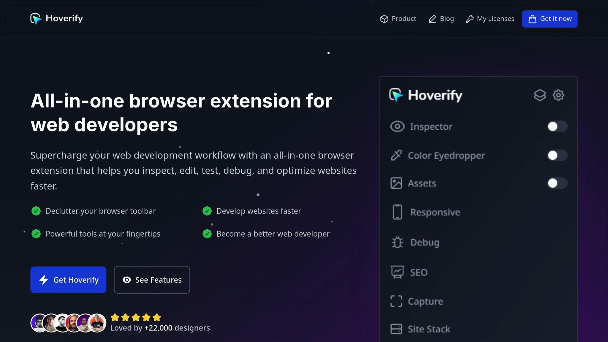
Debugging animation performance is easier with tools like Hoverify. Its inspector capabilities are particularly useful for identifying issues in complex setups that combine Tailwind CSS and Framer Motion. While proper styling and logic are essential for smooth interactions, debugging ensures any remaining performance hiccups are addressed.
// Example component for debugging with Hoverify
const DebuggableAnimation = () => {
  return (
    <motion.div
      className="relative p-8 bg-gradient-to-r from-purple-400 to-pink-400 rounded-xl"
      initial={{ opacity: 0, scale: 0.8 }}
      animate={{ opacity: 1, scale: 1 }}
      transition={{ duration: 0.5 }}
      whileHover={{
        scale: 1.05,
        boxShadow: "0 20px 25px -5px rgba(0, 0, 0, 0.1)"
      }}
      data-testid="animated-card"
      data-animation-state="idle"
    >
      <h3 className="text-white text-xl font-bold">Debug This Animation</h3>
      <p className="text-white opacity-90">
        Use Hoverify to inspect animation properties.
      </p>
    </motion.div>
  );
};
Hoverify also includes a responsive viewer for testing animations across different devices. You can even inject custom code to experiment with performance tweaks:
/* Inject via Hoverify for quick testing */
.motion-element {
  will-change: transform, opacity;
  backface-visibility: hidden;
  perspective: 1000px;
}

/* Test reduced motion preferences */
@media (prefers-reduced-motion: reduce) {
  .motion-element {
    transition: none;
  }
}
Practical Use Cases
Once you’ve optimized for performance and accessibility, it’s time to see how these animation techniques can shine in real-world scenarios. Below, we’ll explore how dynamic animations can enhance navigation menus, image galleries, and forms.
Animating Navigation Menus
Navigation menus can feel more intuitive and engaging with smooth animations. By combining Tailwind CSS with Framer Motion, you can create a sliding menu that highlights active sections and offers interactive hover and tap effects.
Here’s an example of a sliding navigation menu:
import { motion } from 'framer-motion';
import { useState } from 'react';
import { usePathname } from 'next/navigation';

const AnimatedNavigation = () => {
  const [isOpen, setIsOpen] = useState(false);
  const pathname = usePathname();

  const navVariants = {
    hidden: {
      x: '-100%',
      opacity: 0
    },
    visible: {
      x: 0,
      opacity: 1,
      transition: {
        type: 'spring',
        stiffness: 300,
        damping: 30
      }
    }
  };

  const menuItems = [
    { href: '/', label: 'Home' },
    { href: '/about', label: 'About' },
    { href: '/services', label: 'Services' },
    { href: '/contact', label: 'Contact' }
  ];

  return (
    <div className="relative">
      <button
        onClick={() => setIsOpen(!isOpen)}
        className="p-2 bg-blue-600 text-white rounded-md hover:bg-blue-700"
      >
        Menu
      </button>

      <motion.nav
        className="absolute top-12 left-0 bg-white shadow-lg rounded-lg p-4 w-48"
        variants={navVariants}
        initial="hidden"
        animate={isOpen ? "visible" : "hidden"}
      >
        {menuItems.map((item) => (
          <motion.a
            key={item.href}
            href={item.href}
            className={`block p-2 rounded transition-colors ${
              pathname === item.href
                ? 'bg-blue-100 text-blue-600'
                : 'text-gray-700 hover:bg-gray-100'
            }`}
            whileHover={{ scale: 1.05 }}
            whileTap={{ scale: 0.95 }}
          >
            {item.label}
            {pathname === item.href && (
              <motion.div
                layoutId="activeIndicator"
                className="absolute left-0 w-1 h-6 bg-blue-600 rounded-r"
              />
            )}
          </motion.a>
        ))}
      </motion.nav>
    </div>
  );
};

export default AnimatedNavigation;
In this example, the layoutId prop ensures smooth transitions between active states, while usePathname() determines the current menu selection. The spring animation creates a natural, responsive feel.
Interactive Image Galleries
Image galleries are a perfect canvas for gesture-based animations and smooth transitions. By combining Framer Motion’s animation capabilities with Tailwind CSS’s responsive utilities, you can create an engaging gallery experience.
Here’s an example of an animated image gallery:
import { motion, AnimatePresence } from 'framer-motion';
import { useState } from 'react';

const ImageGallery = () => {
  const [currentIndex, setCurrentIndex] = useState(0);
  const [direction, setDirection] = useState(0);

  const images = [
    { src: '/image1.jpg', alt: 'Gallery image 1' },
    { src: '/image2.jpg', alt: 'Gallery image 2' },
    { src: '/image3.jpg', alt: 'Gallery image 3' }
  ];

  const slideVariants = {
    enter: (direction) => ({
      x: direction > 0 ? 1000 : -1000,
      opacity: 0
    }),
    center: {
      zIndex: 1,
      x: 0,
      opacity: 1
    },
    exit: (direction) => ({
      zIndex: 0,
      x: direction < 0 ? 1000 : -1000,
      opacity: 0
    })
  };

  const swipeConfidenceThreshold = 10000;
  const swipePower = (offset, velocity) => {
    return Math.abs(offset) * velocity;
  };

  const paginate = (newDirection) => {
    setDirection(newDirection);
    setCurrentIndex((prevIndex) => {
      if (newDirection === 1) {
        return prevIndex === images.length - 1 ? 0 : prevIndex + 1;
      } else {
        return prevIndex === 0 ? images.length - 1 : prevIndex - 1;
      }
    });
  };

  return (
    <div className="relative w-full max-w-2xl mx-auto h-96 overflow-hidden rounded-lg bg-gray-100">
      <AnimatePresence initial={false} custom={direction}>
        <motion.img
          key={currentIndex}
          src={images[currentIndex].src}
          alt={images[currentIndex].alt}
          custom={direction}
          variants={slideVariants}
          initial="enter"
          animate="center"
          exit="exit"
          transition={{
            x: { type: "spring", stiffness: 300, damping: 30 },
            opacity: { duration: 0.2 }
          }}
          drag="x"
          dragConstraints={{ left: 0, right: 0 }}
          dragElastic={1}
          onDragEnd={(e, { offset, velocity }) => {
            const swipe = swipePower(offset.x, velocity.x);

            if (swipe < -swipeConfidenceThreshold) {
              paginate(1);
            } else if (swipe > swipeConfidenceThreshold) {
              paginate(-1);
            }
          }}
          className="absolute w-full h-full object-cover cursor-grab active:cursor-grabbing"
        />
      </AnimatePresence>

      {/* Navigation buttons */}
      <button
        onClick={() => paginate(-1)}
        className="absolute left-4 top-1/2 transform -translate-y-1/2 bg-black bg-opacity-50 text-white p-2 rounded-full hover:bg-opacity-75 transition-colors"
      >
        ←
      </button>
      <button
        onClick={() => paginate(1)}
        className="absolute right-4 top-1/2 transform -translate-y-1/2 bg-black bg-opacity-50 text-white p-2 rounded-full hover:bg-opacity-75 transition-colors"
      >
        →
      </button>

      {/* Indicators */}
      <div className="absolute bottom-4 left-1/2 transform -translate-x-1/2 flex space-x-2">
        {images.map((_, index) => (
          <motion.button
            key={index}
            onClick={() => {
              setDirection(index > currentIndex ? 1 : -1);
              setCurrentIndex(index);
            }}
            className={`w-3 h-3 rounded-full transition-colors ${
              index === currentIndex ? 'bg-white' : 'bg-white bg-opacity-50'
            }`}
            whileHover={{ scale: 1.2 }}
            whileTap={{ scale: 0.9 }}
          />
        ))}
      </div>
    </div>
  );
};

export default ImageGallery;
This gallery supports swipe gestures and click navigation, ensuring a seamless user experience. Users can interact with the content in multiple ways, making it adaptable to different preferences.
Form Feedback Animations
Animated feedback can make form interactions clearer and more engaging, helping users navigate validation states and submission processes with ease. These animations not only improve the visual experience but also provide helpful cues about the form’s status.
import { motion, AnimatePresence } from 'framer-motion';
import { useState } from 'react';

const AnimatedForm
Animations like these can guide users through forms while keeping the experience intuitive and visually appealing.
Conclusion
Bringing Tailwind CSS and Framer Motion together gives you a dynamic toolkit for crafting interactive React applications. Tailwind’s utility-first approach to styling pairs seamlessly with Framer Motion’s smooth and efficient animations, creating an enhanced user experience that’s both visually appealing and functional.
Framer Motion’s declarative animation system simplifies the process of building UIs that are not only visually consistent but also responsive and full of life.
To keep performance in check, focus on mobile-first strategies, use memoization, and integrate tools like PurgeCSS. These techniques can significantly cut rendering times and shrink CSS bundle sizes - by as much as 30% and 90%, respectively.
Accessibility should always be a priority when working with animations. Following WCAG guidelines ensures inclusivity, such as providing options to disable motion animations unless they are essential. Adding features like pause controls for animations lasting over five seconds and offering reduced motion settings makes your designs more user-friendly for everyone.
As you refine your project, tools like Hoverify can be a game-changer. Its real-time debugging and cross-device testing capabilities allow you to inspect styles, tweak animations, and identify issues early in the process. This not only saves time but also ensures a smoother development workflow.
FAQs
How can I improve the performance of animations in React using Tailwind CSS and Framer Motion?
To improve animation performance in React when using Tailwind CSS and Framer Motion, consider these practical tips:
- Trim unused CSS: Use Tailwind’s purge feature to strip away unused styles during production builds. This reduces the size of your CSS file, leading to faster loading times.
- Leverage Framer Motion optimizations: Features like
willChangecan signal the browser about upcoming changes, improving animation efficiency. UselayoutIdfor seamless shared element transitions, and stick tomotioncomponents instead of standard HTML elements to keep animations outside React’s rendering process. - Keep animations simple: Avoid overly intricate animations that could slow down performance, especially on less powerful devices. Focus on lightweight, smooth animations to maintain a consistent and enjoyable user experience.
These strategies can help you deliver animations that are both visually appealing and performance-friendly for modern web applications.
How can I make animations in React with Tailwind CSS and Framer Motion more accessible?
To make sure your animations are usable for everyone, it’s important to respect user preferences for reduced motion. You can achieve this by using the prefers-reduced-motion media query, which allows you to create a more static experience for those who might find animations distracting or even uncomfortable.
Steer clear of fast or flashing animations, as they can cause discomfort or even health issues, especially for individuals with photosensitivity. If an animation runs for more than five seconds, always include an option to pause, stop, or disable it. By following these guidelines, your animations can enhance the experience without leaving anyone out.
How can I use Tailwind CSS and Framer Motion together to create responsive animations for different screen sizes?
To craft responsive animations using Tailwind CSS and Framer Motion, you can leverage Tailwind’s responsive utility classes alongside Framer Motion’s animation capabilities. Tailwind’s breakpoint utilities make it easy to tailor animation styles for different screen sizes, ensuring transitions look smooth and adapt well across devices.
For added flexibility, consider using React’s window.matchMedia API to create custom hooks. These hooks can trigger animations based on specific screen sizes, helping you deliver visually appealing and functional animations that work seamlessly on both small and large screens.
