
Want to build modals that are easy to style, responsive, and accessible? Here’s how Tailwind CSS and React Portals can help:
- Tailwind CSS: Simplifies modal design with utility classes for layout, responsiveness, and styling.
- React Portals: Renders modals outside the main DOM hierarchy, avoiding layout conflicts and improving performance.
- Accessibility: Use ARIA labels, focus management, and keyboard navigation to make your modals inclusive.
- Responsiveness: Tailwind’s breakpoints (
sm:,md:,lg:) ensure modals look great on any screen size.
Quick Overview of Modal Features
- Core Styling: Tailwind classes like
w-full,bg-black/50, androunded-lgmake design fast and consistent. - Advanced Rendering: React Portals handle modal placement for better control and flexibility.
- User-Friendly Controls: Include Escape key support, overlay clicks, and clear close buttons.
- Mobile Optimization: Ensure modals work seamlessly for the 94% of smartphone users conducting local searches.
Example Code:
ReactDOM.createPortal(
  <div className="fixed inset-0 z-50 flex items-center justify-center">
    <div className="fixed inset-0 bg-black/50" onClick={onClose}></div>
    <div className="relative z-50 bg-white rounded-lg shadow-xl">
      {children}
    </div>
  </div>,
  document.getElementById('modal-root')
);
This guide walks you through building a functional, accessible, and polished modal using Tailwind CSS and React Portals. You’ll also learn advanced techniques like dark mode, backdrop effects, and content overflow handling. Let’s dive in!
Core Concepts: Tailwind CSS and React Portals
Tailwind CSS for Modal Design
Tailwind CSS makes designing modals straightforward by offering a set of utility classes that eliminate the need for writing extensive custom CSS. These predefined classes allow you to handle everything from positioning to animations directly in your HTML, making the design process faster and more consistent.
One of Tailwind’s standout features is its focus on responsive design. By using breakpoint prefixes like sm:, md:, and lg:, you can easily adapt modal layouts for different screen sizes. Here’s an example:
| Screen Size | Tailwind Class | Modal Width |
|---|---|---|
| Mobile (<640px) | w-full | Full width |
| Tablet (≥768px) | md:w-3/4 | 75% width |
| Desktop (≥1024px) | lg:w-1/2 | 50% width |
By leveraging these utility classes, you can quickly set up responsive modals that look great on any device. Once the design is in place, the next step is managing how the modal is rendered, which is where React Portals come into play.
React Portals Explained
React Portals provide a powerful way to render components outside their parent DOM hierarchy. This is especially useful for modals, which often need to break free from their parent containers. The syntax is simple and effective:
ReactDOM.createPortal(
  modalContent,
  document.getElementById('portal-root')
)
Using React Portals comes with several advantages:
- DOM Independence: Modals are rendered at the root level, avoiding issues caused by nested DOM structures.
- Event Bubbling: Even though the modal is rendered outside its parent, events still propagate through the React component tree as expected.
- Improved Performance: Updates to the modal don’t trigger unnecessary re-renders in the parent components.
This combination of flexibility and performance makes React Portals an ideal solution for rendering modals.
Making Modals Accessible
With Tailwind CSS handling the styling and React Portals managing the rendering, the next critical step is ensuring your modals are accessible. Accessibility features not only improve usability but also make your application inclusive for all users. Here are some key considerations:
| Feature | Implementation | Purpose |
|---|---|---|
| Focus Management | autoFocus attribute | Automatically directs focus to the modal when it opens. |
| Keyboard Navigation | onKeyDown handler | Allows users to close the modal with the Escape key. |
| Screen Readers | aria-modal="true" | Informs assistive technologies that the modal is active. |
| Content Masking | aria-hidden="true" | Hides background content from screen readers. |
A great real-world example of this is Jaker Hossain’s reusable modal component, developed in April 2025. It achieved perfect accessibility scores while maintaining responsive design and supporting features like entry/exit animations and back navigation. This example demonstrates that you can balance accessibility with advanced functionality, creating modals that are both user-friendly and visually appealing.
Create A Reusable Modal with React & Tailwind CSS
::: @iframe https://www.youtube.com/embed/sj2BgOKUE9M :::
Building the Modal Component
Creating a modal component involves careful planning, efficient coding, and attention to accessibility. Here’s a step-by-step guide to help you build a functional and production-ready modal.
Project Setup Steps
Start by preparing your project environment. Add a root element in your index.html for the modal portal:
<div id="modal-root"></div>
Next, set up a React project and install the necessary dependencies:
# Create a new React project
npx create-react-app modal-project
cd modal-project

# Install Tailwind CSS and its dependencies
npm install -D tailwindcss@3 postcss autoprefixer
npx tailwindcss init -p
Update the tailwind.config.js file to include the paths to your template files:
module.exports = {
  content: [
    "./src/**/*.{js,jsx,ts,tsx}",
  ],
  theme: {
    extend: {},
  },
  plugins: [],
}
Finally, add the required Tailwind CSS directives to your src/index.css file:
@tailwind base;
@tailwind components;
@tailwind utilities;
Modal Component Code
Here’s the basic structure for the modal component in Modal.jsx:
import { useEffect } from 'react';
import ReactDOM from 'react-dom';

const Modal = ({ isOpen, onClose, children }) => {
  useEffect(() => {
    const handleEscape = (e) => {
      if (e.key === 'Escape') onClose();
    };

    document.addEventListener('keydown', handleEscape);
    return () => document.removeEventListener('keydown', handleEscape);
  }, [onClose]);

  if (!isOpen) return null;

  return ReactDOM.createPortal(
    <div className="fixed inset-0 z-50 flex items-center justify-center">
      <div
        className="fixed inset-0 bg-black/50"
        onClick={onClose}
      />
      <div className="relative z-50 bg-white rounded-lg shadow-xl">
        {children}
      </div>
    </div>,
    document.getElementById('modal-root')
  );
};

export default Modal;
This code sets up the modal’s core functionality, including rendering it conditionally and closing it with the Escape key or a click on the backdrop.
Tailwind CSS Styling Guide
Tailwind CSS provides a simple way to style the modal. Here’s a quick breakdown of the key classes:
| Element | Tailwind Classes | Purpose |
|---|---|---|
| Overlay | fixed inset-0 bg-black/50 | Adds a semi-transparent dark backdrop |
| Container | relative z-50 bg-white rounded-lg | Defines the modal’s main box |
| Content Wrapper | p-6 max-w-lg mx-auto | Controls padding and maximum width |
| Close Button | absolute top-4 right-4 | Positions the close button in the corner |
These classes ensure the modal looks clean and professional while maintaining responsiveness.
Adding Accessibility Support
Accessibility is essential for a modal. Here’s an enhanced version of the component with focus management and scroll prevention:
import { useRef, useEffect } from 'react';
import ReactDOM from 'react-dom';

const Modal = ({ isOpen, onClose, title, children }) => {
  const modalRef = useRef(null);

  useEffect(() => {
    if (isOpen) {
      document.body.style.overflow = 'hidden';
      modalRef.current && modalRef.current.focus();
    } else {
      document.body.style.overflow = 'unset';
    }
  }, [isOpen]);

  return ReactDOM.createPortal(
    <div
      role="dialog"
      aria-modal="true"
      aria-labelledby="modal-title"
      ref={modalRef}
      tabIndex="-1"
      className="modal-container"
    >
      {/* Modal content */}
    </div>,
    document.getElementById('modal-root')
  );
};
This version ensures the modal is accessible by managing focus and preventing background scrolling when the modal is open.
“Using the HTML
<dialog>element gives us a lot of accessibility features for free”
“Tailwind CSS works by scanning all of your HTML files, JavaScript components, and any other templates for class names, generating the corresponding styles and then writing them to a static CSS file”
With these steps, your modal is now functional, styled, and accessible. Next, you can focus on refining its design and enhancing interactivity.
Modal Enhancements
Once you’ve set up the basic modal component, there are plenty of ways to refine its design and functionality. These adjustments can improve both the user experience and the visual appeal of your modal. Let’s dive into some advanced techniques.
Backdrop Effects
Tailwind’s backdrop utilities can help you create a visually striking background for your modal. Using backdrop filter classes, you can make the modal stand out while adding depth to the interface.
<div className="fixed inset-0 backdrop-blur-md bg-black/30 dark:bg-slate-900/40">
  {/* Modal content */}
</div>
You can adjust the blur intensity with Tailwind’s preset classes:
| Blur Intensity | Class | Effect |
|---|---|---|
| Light | backdrop-blur-sm | 4px blur |
| Medium | backdrop-blur-md | 12px blur |
| Heavy | backdrop-blur-lg | 16px blur |
| Extra Heavy | backdrop-blur-xl | 24px blur |
For a frosted glass effect, combine backdrop blur with a semi-transparent background:
<div className="bg-white/30 backdrop-blur-md shadow-xl rounded-lg">
  {/* Modal content */}
</div>
This combination enhances the modal’s prominence while maintaining a sleek, modern design.
Dark Mode Implementation
Dark mode is essential for modern interfaces. Tailwind makes it easy to add dark mode support to your modals. Start by updating your tailwind.config.js file:
module.exports = {
  darkMode: 'class',
  // other config options
}
Then, apply dark mode variants to your modal component:
const Modal = ({ isOpen, onClose, children }) => {
  return (
    <div className="
      bg-white dark:bg-gray-800
      text-gray-900 dark:text-gray-100
      shadow-xl dark:shadow-gray-900/50
      border border-gray-200 dark:border-gray-700
    ">
      {children}
    </div>
  );
};
This ensures your modal aligns with the theme of the user’s system or application setting, delivering a consistent experience.
Content Overflow Management
To handle content that exceeds the modal’s height, enable smooth scrolling and limit the modal’s size. Here’s an example:
const Modal = ({ isOpen, onClose, children }) => {
  return (
    <div className="fixed inset-0 flex items-center justify-center">
      <div className="
        relative
        max-h-[90vh]
        w-full max-w-2xl
        bg-white rounded-lg
        overflow-hidden
      ">
        <div className="
          overflow-y-auto
          max-h-[calc(90vh-8rem)]
          p-6
        ">
          {children}
        </div>
      </div>
    </div>
  );
};
This setup ensures the modal stays within 90% of the viewport height, applies consistent padding, and displays a scrollbar only when necessary. It’s a simple yet effective way to maintain usability across devices.
“Using the HTML
<dialog>element gives us a lot of accessibility features for free”
“Tailwind CSS works by scanning all of your HTML files, JavaScript components, and any other templates for class names, generating the corresponding styles and then writing them to a static CSS file”
Testing with Hoverify
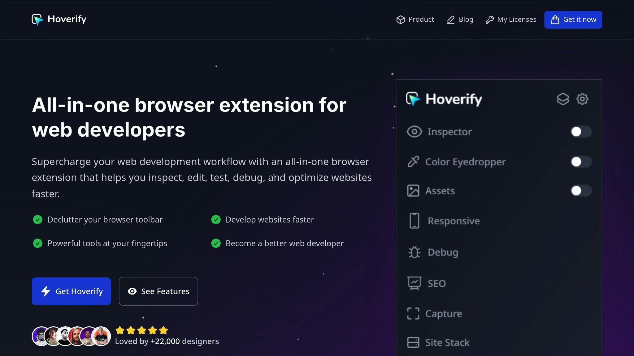
Evaluate your modal’s performance across various devices using Hoverify’s tools. These tests build on the design and accessibility principles covered earlier.
Modal Layout Testing
Hoverify’s Inspector tool is perfect for checking your modal’s styling and positioning:
// Example modal component for testing
const Modal = ({ isOpen }) => {
  return (
    <div className="fixed inset-0 flex items-center justify-center">
      <div className="bg-white dark:bg-gray-800 p-6 rounded-lg w-11/12 md:w-2/3 lg:w-1/2">
        {/* Modal content */}
      </div>
    </div>
  );
};
This tool helps you ensure proper z-index values, spacing, responsiveness, and even pseudo-element behavior. The visual CSS Box feature is especially useful for confirming spacing and dimensions across various breakpoints.
Device Compatibility Check
To ensure your modal looks and works well on different devices, test it across various screen sizes. Focus on these key checkpoints:
| Screen Size | Key Checkpoints |
|---|---|
| Mobile (<768px) | Full-width modal, scrollable content |
| Tablet (768px-1024px) | Centered positioning, proportional width |
| Desktop (>1024px) | Maximum width constraints, backdrop interaction |
Hoverify’s Responsive Viewer allows you to test multiple viewport sizes at the same time, making it easier to spot inconsistencies and refine your modal’s adaptability.
Color Contrast Verification
After confirming layout and device compatibility, assess your modal’s color contrast for accessibility. Accessibility guidelines recommend a minimum contrast ratio of 4.5:1 for text elements against their background. Pay special attention to modal content, button text, error messages, alerts, and the close button.
// Example of colors designed for accessibility
<div className="
  text-gray-900 dark:text-gray-100
  bg-white dark:bg-gray-800
  border-gray-200 dark:border-gray-700
">
  {/* Modal content */}
</div>
Use Hoverify’s Color Eyedropper to measure contrast ratios and ensure compliance with WCAG standards.
“Using the HTML
<dialog>element gives us a lot of accessibility features for free”
“Tailwind CSS works by scanning all of your HTML files, JavaScript components, and any other templates for class names, generating the corresponding styles and then writing them to a static CSS file”
Conclusion
Tailwind CSS and React Portals work together seamlessly to create modals that are both functional and user-friendly. Here’s why this approach stands out:
- Improved Accessibility: Ensures smooth keyboard navigation and compatibility with screen readers, making modals more inclusive.
- Responsive Design Made Easy: Leverages Tailwind’s utility classes to adapt effortlessly across different screen sizes.
- Streamlined Architecture: Keeps the modal logic separate from the main component tree for cleaner, more maintainable code.
Incorporating Hoverify’s testing suite adds an extra layer of assurance, helping you maintain high-quality standards for your modals.
By implementing portals correctly, you can sidestep common issues like z-index conflicts and positioning errors. When combined with Tailwind’s styling capabilities, the result is sleek, reliable modals.
Striking the right balance between design, technical precision, and accessibility is key. Use these strategies to take your modal development to the next level in your projects.
FAQs
How do React Portals make modal components more efficient and easier to manage?
React Portals offer a smart way to handle modal components by rendering them outside the main DOM structure. This setup avoids triggering re-renders in parent components when the modal’s state changes, resulting in smoother performance and an improved user experience.
On top of that, Portals simplify working with modals in more intricate applications. They let you position and style modals without being tied to their parent components, giving you more control over layout and design while streamlining the development process.
How can I make sure my modals are accessible for users with disabilities?
To make your modals user-friendly and accessible, start with semantic HTML elements like <dialog> or <div role="dialog"> to establish a solid foundation. Ensure that focus is trapped within the modal while it’s open, preventing users from accidentally navigating to content outside of it. Include a clearly visible and well-labeled close button that screen readers can easily recognize.
Incorporate ARIA attributes like aria-modal to signal assistive technologies that the modal is active. Also, make sure the modal is fully keyboard-accessible, allowing users to navigate it using only their keyboard. Lastly, test your modal across various assistive technologies to ensure it functions smoothly for everyone.
How do I add dark mode to modals using Tailwind CSS, and why does it matter for user experience?
To enable dark mode for modals using Tailwind CSS, you’ll need to adjust your tailwind.config.js file. Set darkMode: 'class' in the configuration. This approach lets you toggle dark mode by adding or removing the dark class on the root HTML element. You can manage this behavior with JavaScript, checking the user’s system preferences or saved settings in local storage:
if (localStorage.getItem('color-theme') === 'dark' ||
    (!('color-theme' in localStorage) &&
    window.matchMedia('(prefers-color-scheme: dark)').matches)) {
    document.documentElement.classList.add('dark');
} else {
    document.documentElement.classList.remove('dark');
}
Dark mode isn’t just about aesthetics - it can reduce eye strain in dim environments, improve readability, and even extend battery life on devices with OLED screens. Plus, it aligns with user preferences and accessibility standards, ensuring your application feels welcoming and easy to use for everyone.
