
Want to boost your product page conversions? Start with better CSS debugging. Misaligned buttons, slow-loading images, and poor mobile layouts can push customers away. Fixing these issues isn’t just about aesthetics - it’s about protecting your sales.
Here’s what you’ll learn:
- Why CSS issues hurt conversions (e.g., 53% of users abandon sites that load slowly).
- Common problems like layout shifts, mobile responsiveness issues, and browser inconsistencies.
- How to use tools like browser DevTools and Hoverify to debug faster and smarter.
- Practical fixes for layout, cross-browser issues, and performance optimization.
Key takeaway: Clean, fast, and responsive product pages = higher sales. Let’s dive into actionable steps to debug and optimize your CSS.
Using Browser Developer Tools for CSS Debugging
Modern browsers come equipped with powerful debugging tools that take the guesswork out of fixing CSS issues on product pages. These tools provide instant feedback, giving you a clear view of how your CSS impacts page elements and helping you quickly identify layout hiccups.
Inspecting and Editing CSS in Real-Time
The Inspect tool is a must-have for CSS troubleshooting. By right-clicking any element and selecting “Inspect”, you can activate a helpful overlay that visually displays layout dimensions, padding, and margins in color-coded sections. This visual feedback makes pinpointing spacing issues much easier.
In the Elements panel, you get a live look at your page’s structure and the CSS applied to it. The Styles pane within this panel shows you everything from applied styles and inherited properties to pseudo-classes and overridden rules. Even better, it allows live editing, so you can tweak CSS directly and see the changes instantly.
These live editing tools are just the start - there are additional visual aids designed to help you dig deeper into layout and spacing challenges.
Using Visual Tools for Layout Debugging
One standout feature is the Box Model diagram, located in the Elements panel. This diagram breaks down an element’s content, padding, border, and margin in a clear, visual format. It’s incredibly useful for spotting spacing problems, alignment issues, or conflicts within the box model.
CSS Debugging with Hoverify Tools
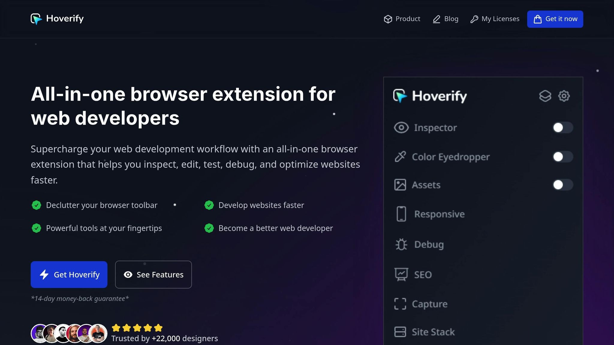
Hoverify builds on the foundation of browser developer tools, offering specialized features that simplify and speed up CSS debugging for product pages. Its streamlined workflows cut down on the time and effort typically required for traditional debugging methods.
Using Hoverify’s Inspector for Faster Debugging
Hoverify’s Inspector takes debugging to the next level with intuitive hover-to-inspect and click-to-edit capabilities. Instead of right-clicking and diving into menus, you can simply hover over an element to instantly view its properties and styles. This real-time feedback is especially helpful when dealing with intricate layouts on product pages.
One standout feature is the ability to debug pseudo-elements like :before and :after. These often-hidden elements, commonly used for decorative effects or hover states, become visible and editable, which is a game-changer for fine-tuning buttons, overlays, and other interactive components.
The visual editor allows you to tweak styles such as colors, spacing, typography, and layouts directly, with instant results. This is particularly useful for ensuring visual consistency and brand alignment on product pages. If you prefer working directly with CSS, the syntax-highlighted code editor keeps your code clear and easy to read.
Another handy tool is the ability to export components to CodePen. Once you’ve resolved a CSS issue, you can quickly extract the solution for documentation or future use, complete with all child elements intact.
Next, let’s look at how Hoverify’s Responsive Viewer ensures your product pages look and function perfectly across all devices.
Multi-Device Testing with Hoverify’s Responsive Viewer
Product pages need to work seamlessly on every device, and Hoverify’s Responsive Viewer simplifies multi-device testing by letting you debug multiple devices at the same time.
The synchronized interaction feature is especially useful. Actions like clicking or scrolling on one device view are mirrored across all others, making it easy to catch layout discrepancies or interactive bugs that show up on specific screen sizes.
Hoverify also lets you simulate modern devices with accurate frames and operating system visuals, providing a realistic preview of how your pages will look to real users. You can even create custom device profiles to test critical viewport combinations.
For responsive breakpoints, the ability to test viewports larger than your screen is a huge advantage. You can see how your product pages perform on ultra-wide monitors or high-resolution displays without needing access to those devices.
Asset and Performance Debugging Tools
Performance issues often originate from poorly optimized assets, and Hoverify’s Assets feature makes identifying these problems straightforward.
The tool can extract and analyze assets like images, videos, SVGs, PDFs, and even Lottie animations, including those hidden in iframes or behind interactive elements. This visibility helps pinpoint oversized files, redundant assets, or missing optimizations that slow down page loading.
With its filter and sort functionality, you can quickly identify problematic assets based on size, format, or type. For example, you can spot large images that need compression, outdated formats that should be updated, or duplicate files adding unnecessary weight.
Hoverify’s Font Viewer is another essential tool, displaying which fonts are used by each element. This is critical for maintaining consistent typography on product pages, where readability and brand alignment matter. The Color Palette feature extracts all colors used on the page, helping you identify inconsistencies or document design system hex values.
The Image Optimization tool further enhances performance by flagging optimization opportunities. Instead of juggling multiple tools, you can analyze, plan, and implement image optimizations directly within Hoverify, saving time and improving load speeds.
Fixing Common Product Page CSS Issues
Product pages often encounter unique CSS challenges that can directly affect conversions. While the techniques above help identify issues, let’s dive into specific methods to fix them.
Debugging Layout and Alignment Problems
When layout issues crop up on product pages, they’re often tied to CSS Grid or Flexbox conflicts. A practical first step is to highlight problematic elements with temporary colors or borders, making it easier to pinpoint trouble spots.
Using CSS custom properties (variables) can simplify debugging. By defining key measurements at the root level, you can adjust values in real time through your browser’s developer tools. This is especially handy for product galleries, where consistent spacing is crucial during layout testing.
:root {
  --product-grid-gap: 1.5rem;
  --image-aspect-ratio: 1.25;
  --button-spacing: 2rem;
}
Flexbox layouts can break when flex-direction changes for different screen sizes. Adding temporary outlines to flex containers can help you visualize how space is distributed. Similarly, debugging CSS Grid is easier with the grid-template-areas property, which lets you name grid sections for clarity. This is particularly useful for product pages that juggle multiple content sections like images, descriptions, and reviews.
Modern layouts often rely on the CSS gap property instead of margin-based spacing. However, older code may mix both approaches, leading to inconsistent spacing. Transitioning to gap not only resolves these issues but also makes responsive adjustments more predictable.
Fixing Cross-Browser Compatibility Issues
Ensuring product pages look consistent across browsers is just as important as fixing layout problems. Safari is notorious for its quirks with flexbox behavior and CSS Grid support. For example, Safari’s handling of flex-shrink can cause product images to compress unexpectedly on mobile devices.
In some cases, vendor prefixes are still necessary for certain CSS properties, like backdrop-filter or advanced transforms. To avoid browser-specific hacks, use CSS feature detection with @supports queries. This approach ensures fallback styles are applied for browsers lacking support for modern features.
@supports (display: grid) {
  .product-layout {
    display: grid;
    grid-template-columns: 1fr 1fr;
  }
}

@supports not (display: grid) {
  .product-layout {
    display: flex;
    flex-wrap: wrap;
  }
}
For older browsers like Internet Explorer, focus on progressive enhancement rather than replicating modern layouts. Additionally, Mobile Safari can misinterpret viewport units (vh, vw), but using the dvh (dynamic viewport height) unit resolves many of these issues in compatible browsers.
CSS Validation and Code Quality Checks
To maintain clean and efficient CSS, regular validation and quality checks are essential. The W3C CSS Validation Service can catch syntax errors that might otherwise go unnoticed but could still cause unexpected behavior. This is especially useful for teams with multiple contributors.
Tools like Specificity Calculator and the BEM methodology help reduce selector specificity, making stylesheets easier to maintain. Over time, product pages can accumulate unused styles, particularly after A/B testing or design updates. Tools like PurgeCSS or UnCSS can identify and remove this dead code, improving page load times.
Automating your workflow with stylelint ensures consistent code style and prevents common mistakes. Additionally, extracting Critical CSS - the styles needed for above-the-fold content - can significantly improve page speed. Tools like Critical or Critters make this process easier, ensuring users see product images and essential information immediately.
Finally, CSS minification and compression reduce file sizes, speeding up load times. However, debugging minified CSS is nearly impossible, so always maintain source maps in development to trace issues back to the original code.
Performance Debugging and Optimization
Performance hiccups can seriously impact conversion rates. If your product pages load slowly or feel sluggish, customers are likely to leave before making a purchase. The solution? Pinpoint the bottlenecks through systematic debugging and apply targeted fixes. Start by addressing issues with specific assets to cut down on load times.
Debugging Image and Asset Loading Issues
Images often make up a large chunk of a page’s total file size, which can drag down loading speed. Begin by auditing your image performance using the Network tab in Chrome DevTools. Sort resources by size to spot the heaviest assets. Large product images should be your top priority for optimization. Switching to modern formats like WebP or AVIF can significantly reduce file sizes without compromising quality.
Make sure critical images - especially those above the fold - load immediately. Check your lazy loading settings in DevTools to ensure they aren’t delaying essential visuals. Use the Performance tab to see how lazy loading affects key metrics like load time.
CSS background images can be trickier to debug since they don’t show up in standard image audits. The Coverage tab in DevTools can help you identify unused CSS that might be triggering unnecessary image requests. For small icons and decorative elements, consider using CSS image sprites to cut down on HTTP requests.
You can also improve asset loading by using resource hints like preload and prefetch. These help critical assets load faster, but be careful not to overwhelm the preloading process. Compare Time to First Byte (TTFB) metrics before and after implementing these hints to measure their impact.
Tools like Hoverify can automatically compress and convert images to modern formats, but keep an eye on visual stability. Avoid layout shifts that could disrupt the user experience. Once your assets are optimized, ensure your layouts work smoothly across all devices.
Testing and Fixing Responsive Breakpoints
Responsive breakpoints can run into trouble when users resize their browser windows or rotate their devices. While Chrome DevTools’ Device Mode offers standard presets, it’s smart to test with custom viewport sizes to catch any unexpected gaps in your design.
Pay close attention to how layout properties behave. Grid and Flexbox layouts, for example, adjust differently as the viewport changes. Use the Elements panel in DevTools to inspect computed styles and resolve inconsistencies, ensuring your layout adapts seamlessly to all screen dimensions.
On mobile devices, viewport units like vh and vw can behave unpredictably due to browser UI changes. Toggle the mobile toolbar in DevTools to diagnose these issues. Newer dynamic viewport units (like dvh and dvw) can help, but always provide fallbacks for older browsers.
Font scaling can also reveal layout flaws. Test your designs with increased font size settings to ensure text remains readable and accessible. Similarly, make sure interactive elements - like buttons - are large enough to be easily tapped on touchscreens.
Measuring Performance Improvements
Before making any changes, establish baseline performance metrics. Tools like Google PageSpeed Insights are a good starting point, but real-world monitoring gives a clearer picture of how users actually experience your site.
Focus on achieving strong Core Web Vitals scores by ensuring pages load quickly, respond promptly to user actions, and maintain visual stability during loading. The Web Vitals Chrome extension can help you keep track of these metrics.
Use DevTools to examine Time to Interactive (TTI) and Main Thread activity, identifying tasks that delay interactivity. Review resource loading waterfalls to see the download sequence of assets and find opportunities for parallel loading. Be cautious with third-party scripts - they can introduce performance issues if not managed properly.
JavaScript-heavy pages may also struggle with memory usage. Use the Memory tab in DevTools to detect and fix potential memory leaks that could degrade performance over time.
Real User Monitoring (RUM) data from analytics platforms can provide valuable insights into how your pages perform across different devices and network conditions. Track improvements over time and validate them through A/B testing and metrics like bounce rate and time on page. This ensures your performance tweaks are genuinely boosting conversions.
Finally, simulate slower connections using network throttling in DevTools. This helps you evaluate how well your pages perform for users with limited bandwidth, ensuring a smooth experience for everyone.
Conclusion and Key Takeaways
CSS debugging is about much more than just fixing layout issues - it’s about protecting your bottom line. Every misaligned element, slow-loading asset, or unresponsive design can quietly chip away at your sales. By applying the right techniques, you can ensure your product pages run smoothly and keep your conversions intact.
Your go-to tools for debugging should be browser developer tools like DevTools. These tools are indispensable for identifying heavy assets, spotting performance bottlenecks, and cleaning up unused CSS. They form the foundation for a more efficient debugging process, giving you the insights you need to fine-tune every detail of your product pages.
If you’re ready to take it up a notch, Hoverify simplifies debugging by consolidating multiple tools into one browser extension. With Hoverify, you can inspect elements, test responsive designs, and optimize assets all in one place. The Inspector feature allows you to hover over any element to instantly see its styles, while the Responsive Viewer lets you preview your product pages across multiple devices at once.
When it comes to performance debugging, remember that page speed is directly tied to conversions. Use modern image formats and implement resource hints to speed up asset loading. For responsive design, test custom viewport sizes and use dynamic viewport units with fallbacks to maintain consistent layouts.
Setting baseline metrics is a crucial first step in any debugging strategy. Core Web Vitals scores provide clear performance targets, while Real User Monitoring data reveals how your optimizations hold up in real-world conditions. Tools like network throttling in DevTools let you evaluate how your pages perform for users with slower internet connections.
Debugging isn’t a one-and-done task - it’s an ongoing commitment. Regular audits and monitoring ensure your product pages continue to provide a fast, seamless experience that keeps users engaged and conversions flowing.
FAQs
How can I use browser DevTools to quickly find and fix CSS issues on my product page?
To tackle CSS problems on your product page, open your browser’s DevTools by right-clicking the troublesome element and choosing Inspect. In the Styles panel, you can see all the CSS rules applied to that element, including any overridden or inactive styles. You can even experiment by making temporary edits directly in DevTools to see how changes affect your page in real-time.
Switch to the Computed tab to verify which CSS properties are actually being applied. This helps ensure your layout and responsiveness match your design goals. If there are invalid or conflicting styles, the Issues panel pinpoints specific problems, making it easier to fix them. This hands-on method is a quick way to refine your page’s design and enhance the user experience.
What common CSS mistakes can hurt the responsiveness and performance of my product pages?
Some CSS mistakes can seriously hurt both the responsiveness and performance of your website. For example, relying on fixed-width layouts, skipping mobile optimization, or cluttering your pages with unnecessary styles and oversized, unoptimized images. These missteps can lead to a frustrating user experience, slow page load times, and higher bounce rates - ultimately impacting your conversions.
To steer clear of these issues, focus on flexible and responsive designs that adjust seamlessly to various screen sizes. Take the time to optimize images for web use, and keep your CSS clean and concise by avoiding excessive or redundant rules. A well-organized layout not only improves usability but also encourages visitors to stay and explore your product pages.
How does Hoverify simplify CSS debugging, and which features are best for improving product pages?
Hoverify streamlines CSS debugging by bundling inspection, editing, and testing tools into one handy browser extension. With Hoverify, you can preview changes instantly while keeping persistent states, enabling you to tackle issues up to 40% faster.
If you’re working on high-performing product pages, Hoverify’s features are a game-changer. Use its inspection tools to pinpoint layout glitches, editing options to refine responsiveness, and testing functionalities to confirm seamless performance across different devices. Together, these tools make enhancing user experience and optimizing page performance straightforward and efficient.
