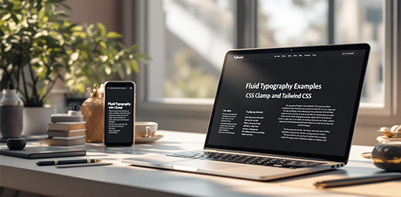
Fluid typography ensures your text scales smoothly across devices - no awkward jumps or unreadable sizes. By combining CSS clamp() and Tailwind CSS, you can create font sizes that adapt naturally to viewport widths. Here’s how:
- What is Fluid Typography? Text that adjusts automatically based on screen size.
- Why Use It? Better readability, fewer media queries, and consistent design across devices.
- How It Works: Use
clamp()to set a minimum, preferred, and maximum font size. - Tailwind Integration: Customize
fontSizeintailwind.config.jsfor easy implementation.
Example:
h1 { font-size: clamp(25px, 8vw, 100px); }
This guide breaks down everything you need to know, from setting up fluid type scales to ensuring accessibility, so your text looks great everywhere.
CSS clamp(): The Key to Flexible Typography
The CSS clamp() function makes it easy to create responsive typography that adjusts smoothly across different screen sizes - no need for complicated media queries. Here’s how to use it effectively.
How CSS clamp() Works
The clamp() function allows you to set a minimum, preferred, and maximum value, ensuring text scales fluidly without breaking layouts:
/* Syntax */
clamp(minimum-value, preferred-value, maximum-value)
For example:
.heading {
    font-size: clamp(1rem, -0.875rem + 8.333vw, 3.5rem);
}
This approach keeps text readable on smaller screens while preventing it from becoming too large on bigger displays. The preferred value uses a mix of vw (viewport width) and rem units for smooth scaling.
Applying clamp() for Fluid Typography
Here’s how to use clamp() to create text sizes that adjust naturally across devices:
/* Example: Fluid typography */
h1 { font-size: clamp(25px, 8vw, 100px); }
h2 { font-size: clamp(18px, 6vw, 85px); }
p { font-size: clamp(16px, 4vw, 24px); }
You can even apply clamp() to other properties, like line height and letter spacing, for better proportional scaling:
.article-text {
    font-size: clamp(16px, 4vw, 24px);
    line-height: clamp(1.2, calc(1em + 0.5vw), 1.5);
}
Tips for Using clamp():
- Stick to
remunits for the minimum and maximum values for consistency. - Test your typography on different screen sizes to ensure it looks good everywhere.
- Include fallback styles for browsers that don’t support
clamp().
Now that you know the basics of clamp() for typography, let’s explore how Tailwind CSS can make this process even easier with its built-in utility classes and configuration tools.
Implementing Fluid Typography with Tailwind CSS
Tailwind’s Typography Utilities
Tailwind CSS comes with static sizing by default. However, you can achieve fluid typography by customizing the fontSize property using the clamp() function. This allows text to scale smoothly across different screen sizes.
Customizing Tailwind Config for Fluid Typography
To set up fluid typography, update the fontSize property in your tailwind.config.js file with clamp() values. Here’s an example configuration:
module.exports = {
    theme: {
        extend: {
            fontSize: {
                'fluid-sm': 'clamp(0.875rem, 0.8rem + 0.375vw, 1rem)',
                'fluid-base': 'clamp(1rem, 0.95rem + 0.25vw, 1.125rem)',
                'fluid-lg': 'clamp(1.125rem, 1.1rem + 0.125vw, 1.25rem)',
            },
        },
    },
}
Example: Applying Fluid Typography in HTML
Once you’ve added custom classes, you can use them in your HTML like this:
<article class="prose">
    <h1 class="fluid-2xl font-bold">Main Heading</h1>
    <p class="fluid-base leading-relaxed">Article content with fluid typography</p>
    <h2 class="fluid-xl font-semibold">Subheading</h2>
</article>
For more intricate designs, you can create a font size scale that keeps proportions consistent across all screen sizes. The key is to balance the minimum and maximum values in clamp() for smooth scaling.
Tailwind’s utility-first design paired with clamp() makes it straightforward to implement fluid typography. Just remember to test for browser compatibility, especially with older browsers, and add fallbacks if needed.
Advanced Techniques for Fluid Typography
Creating a Fluid Type Scale
A fluid type scale ensures text elements maintain balanced proportions across various screen sizes. Start by setting a base size and a scaling ratio. Use the clamp() function to create adaptable font sizes that adjust seamlessly.
fontSize: {
    'display': 'clamp(2rem, calc(1.5rem + 3vw), 4rem)',
    'h1': 'clamp(1.75rem, calc(1.25rem + 2.5vw), 3.5rem)',
    'h2': 'clamp(1.5rem, calc(1rem + 2vw), 3rem)',
    'body': 'clamp(1rem, calc(0.75rem + 1vw), 1.25rem)',
    'small': 'clamp(0.875rem, calc(0.75rem + 0.5vw), 1rem)'
}
This setup ensures text scales proportionally while staying legible on any device. However, consider edge cases like very small or large viewports to maintain readability across all scenarios.
Managing Extreme Viewport Sizes
Extreme viewport sizes can cause text to appear too small or too large. To avoid this, set maximum font sizes to no more than 2.5 times the minimum size. Here’s an example:
/* For very small screens */
.text-adaptive {
    font-size: clamp(16px, 4vw + 1rem, 24px);
    line-height: clamp(1.2, calc(1.15 + 0.5vw), 1.5);
}
For reference, use these suggested sizes:
- Mobile: 16–18px
- Tablet: 18–20px
- Desktop: 20–24px
This ensures text remains visually consistent while being easy to read. Beyond aesthetics, it’s crucial to align fluid typography with accessibility standards.
Ensuring Accessibility in Fluid Typography
Accessibility is key in fluid typography. To meet WCAG 1.4.4 guidelines, follow these best practices:
- Use relative units like
remfor font sizes. - Test text scaling at different zoom levels to ensure usability.
- Maintain strong color contrast, regardless of text size.
“Using the CSS
clampfunction in combination with the viewport units to achieve fluid sizing introduces another set of drawbacks that we need to consider.” - Adrian Bece [2]
Here’s a foundational setup for accessible typography:
:root {
    --min-font: 16px;
    --max-font: 20px;
    --min-width: 320px;
    --max-width: 1200px;
}

body {
    font-size: clamp(var(--min-font),
        calc(16px + 0.5vw),
        var(--max-font));
}
This method balances readability and design across devices. Regular testing on various screens is essential to ensure a smooth and user-friendly experience.
Troubleshooting and Best Practices
Common Issues and Solutions
When working with fluid typography, developers often face challenges that can impact the user experience. One recurring issue is browser-specific quirks, especially in Safari. These can usually be addressed by carefully following fluid typography principles.
Another common problem is keeping text readable across very large or very small screen widths. To address this, set well-balanced minimum and maximum font sizes that suit your target devices. Make sure to test extensively on screens of various sizes to catch any potential issues.
Improving Typography Performance
Performance is a key factor in making fluid typography effective. Using CSS clamp() is a lightweight alternative to traditional media queries and helps improve efficiency. If you’re working with Tailwind CSS, you can streamline your setup by creating custom utilities like this:
theme: {
    extend: {
        fontSize: {
            fluid: 'clamp(1rem, calc(0.75rem + 1vw), 1.25rem)'
        }
    }
}
This approach simplifies your workflow while keeping performance in check.
Browser Compatibility and Fallbacks
The clamp() function is supported by 91.4% of browsers, but it’s still wise to implement a fallback strategy for broader compatibility. Here’s an example:
.fluid-heading {
    font-size: 1.5rem;
    font-size: clamp(1.5rem, calc(1rem + 2vw), 3rem);
}
“When you use
vwunits or limit how large text can get withclamp(), there is a chance a user may be unable to scale the text to 200% of its original size.” - Adrian Roselli, Accessibility Expert [1]
To ensure accessibility, combine relative units (like rem) with viewport units (vw) and test your design on multiple browsers and zoom levels. This ensures your typography not only performs well but is also accessible to all users.
Conclusion and Key Takeaways
Summary of Fluid Typography Principles
Fluid typography brings a fresh approach to responsive web design by allowing text to scale smoothly across different devices. Using CSS clamp() alongside Tailwind CSS’s utility-first framework, developers can ensure text remains readable while adjusting dynamically to screen sizes. The standout feature here is the ability to define exact minimum and maximum font sizes, while ensuring smooth transitions between these limits.
With Tailwind CSS and clamp(), managing font sizes across breakpoints becomes simpler. This approach removes the hassle of complex media queries and results in cleaner, more maintainable code. Here’s a quick look at how you can apply these ideas to your projects.
Next Steps for Fluid Typography
If you’re ready to implement fluid typography, here’s a practical guide:
| Phase | Action | Outcome |
|---|---|---|
| Initial Setup | Configure Tailwind typography utilities | Establish scalable fonts |
| Testing & Optimization | Test and adjust clamp values for viewports | Ensure consistent readability |
| Accessibility | Add fallbacks and run accessibility tests | Provide a universal experience |
Fluid typography emphasizes responsive design that works for everyone. With CSS clamp() now supported by 91.4% of browsers, these techniques are becoming a standard in modern web development.
As you refine your typography strategy, prioritize accessibility. A well-rounded approach ensures your typography adapts beautifully and remains user-friendly across all devices and screen sizes.