
Cross-browser issues can break your website’s layout, functionality, and user experience. Here’s how you can identify and fix them effectively:
- Test Across Browsers: Check Chrome, Firefox, Edge, and Safari on various devices.
- Use Debugging Tools: Tools like Hoverify let you inspect HTML/CSS, edit in real time, and preview layouts on different devices.
- Follow a Step-by-Step Process:
- Test your site’s layout, fonts, images, and forms across browsers.
- Inspect and tweak HTML/CSS to fix visual issues.
- Validate responsive behavior for mobile and tablet views.
- Identify browser-specific bugs and test fixes.
- Verify your changes across all platforms.
Pro Tip: Stick to web standards, test thoroughly, and use tools like Hoverify to streamline your workflow. This ensures a consistent browsing experience for all users.
Setting Up Your Debug Environment
Browser Testing Basics
To ensure your website works smoothly across different platforms, test it on a variety of browsers and devices. Focus on:
- Browsers: Chrome, Firefox, Edge, and any Chromium-based browser on both Windows and macOS.
- Devices: Mobile phones (iOS, Android) and tablets at key resolutions.
Using the right tools can speed up issue detection and allow for quick fixes.
Debug Tools Overview
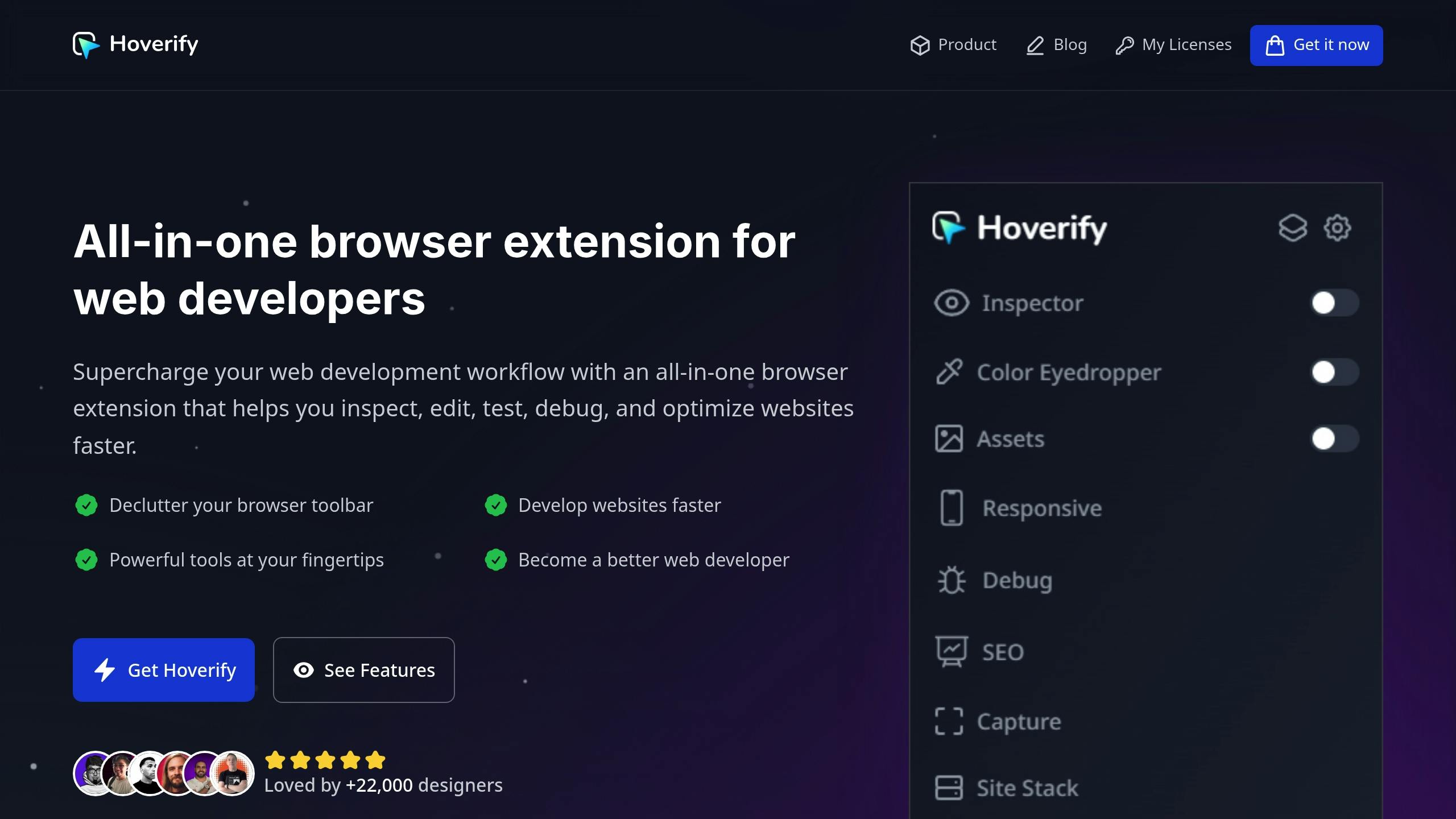
Hoverify is a versatile tool that offers features to simplify debugging and testing, including:
- Real-time HTML/CSS inspection and editing.
- Layout previews for various device sizes.
- Custom device profiles for testing specific resolutions.
- Quick extraction of images and scripts.
- Tech stack analysis for deeper insights into your website.
- SEO tools built into the platform.
- Screenshot capture for documentation.
Its responsive viewer and ability to create custom device profiles make it easy to test across all relevant screen sizes and resolutions [1].
5 Steps to Fix Browser Issues
Using your debug environment, Hoverify’s tools make it easy to tackle browser issues step by step:
Step 1: Browser Testing Techniques
Hoverify’s responsive viewer lets you test your site across various devices with synced interactions. The mirrored interactions feature ensures actions are synchronized across all device previews, making testing more streamlined.
Key areas to check:
- Layout alignment and font rendering
- Image scaling and proportions
- Functionality of forms, buttons, and navigation
Step 2: Use Dev Tools for Inspection
Hoverify allows you to inspect and tweak HTML and CSS in real time:
- Make CSS edits and see immediate updates
- Test pseudo-class states effortlessly
- Debug media queries for different screen sizes
This step helps address element-specific issues efficiently.
Step 3: Validate Responsive Layouts
Ensure your site handles taps, swipes, and scrolling properly across different breakpoints. Test touch interactions to confirm mobile-specific behaviors work as intended.
This step ensures your layout adapts seamlessly across devices.
Step 4: Identify and Fix Browser Bugs
- Note inconsistencies between browsers
- Use live CSS or JavaScript injections to address problems
- Test fixes across all impacted browsers
This step focuses on isolating and resolving any lingering bugs effectively.
Debug Tools Guide
After completing Step 5, make Hoverify’s debug tools a part of your daily workflow:
Key Features of Hoverify Debug Tools
- Real-time Inspector: Hover over elements to inspect them, edit CSS directly, and test pseudo-classes or media queries on the spot.
- Responsive Testing: View multiple device previews side by side, interact with them simultaneously, and take screenshots with a single click.
- Debugging Options: Clear cache and cookies instantly, inject custom HTML/CSS/JS, and keep test code active across sessions.
Suggested Daily Debug Routine
- Start by clearing cache and cookies with Hoverify’s one-click reset feature.
- Use the real-time inspector to fine-tune CSS, verify layout accuracy, and identify any issues.
- Test designs across synced device previews, and document any inconsistencies for focused troubleshooting.
Next, use these practices to enhance your workflow in the Browser Compatibility Tips section.
Browser Compatibility Tips
Now that you have your tools ready, it’s time to focus on key compatibility checks. Sticking to web standards, testing thoroughly, and debugging effectively will help you deliver a consistent experience across all browsers.
Pair Hoverify’s features with the following checklist to address common compatibility challenges:
- Ensure proper implementation of CSS resets and vendor prefixes.
- Test the configuration of the viewport meta tag for responsive design.
- Use feature detection to handle modern browser APIs.
- Set up fallback fonts and plan for graceful degradation.
- Verify JavaScript compatibility and include necessary polyfills.
- Validate form behavior and functionality across different browsers.
- Test touch events and mobile-specific interactions.
- Confirm that media query breakpoints work as expected.
- Inspect CSS animations and transitions for consistency.
- Check that images render uniformly across browsers.
Incorporate this checklist into your regular debugging workflow to catch and resolve issues early, keeping your project on track.
Summary and Action Steps
Combine the five debugging phases - testing, inspection, responsive validation, bug fixes, and verification - into a consistent daily routine. Here’s how to streamline your workflow:
-
Set Up Your Daily Debug Workflow
Run daily tests on Chrome, Firefox, Edge, and Safari using Hoverify’s synced previews. This helps catch browser-specific issues early. -
Use Real-Time Testing
Check multiple device resolutions at once with Hoverify’s responsive viewer to ensure your site looks great everywhere. -
Take Quick Debug Actions
- Optimize and extract assets with a single click
- Clear cache and cookies instantly
- Inject custom HTML, CSS, or JS for immediate fixes
