How to Debug Responsive Design Issues in Under 5 Minutes
Struggling with responsive design issues? You’re not alone. Whether it’s overlapping text, broken navigation menus, or awkward horizontal scrolling, these problems can ruin user experience and hurt your website’s performance. But here’s the good news: you can fix most issues in under 5 minutes with the right tools and workflow.
Here’s how:
- Identify common issues like horizontal scrolling, tiny text, or misaligned layouts.
- Use tools like Hoverify to inspect, edit, and test your designs across devices instantly.
- Leverage browser developer tools for deeper analysis, such as checking media queries and JavaScript errors.
- Test on multiple devices simultaneously to spot inconsistencies.
This guide walks you through a simple, step-by-step process to diagnose and fix responsive design problems efficiently. Whether it’s a flexbox glitch or a media query oversight, you’ll learn how to resolve issues quickly and keep your site looking great on any screen.
Common Responsive Design Problems
What is Responsive Design?
Responsive design is a web development approach that ensures websites look and function well on any device or screen size. Instead of creating separate versions for mobile and desktop, it uses techniques like flexible grids, scalable images, and CSS media queries to create a single site that adjusts seamlessly to fit any screen.
Think of it like water filling a container - it reshapes itself to fit whatever it’s poured into. A responsive website does the same, whether it’s displayed on a 27-inch desktop monitor, a 10-inch tablet, or a 5-inch smartphone. The goal is simple: provide a smooth and enjoyable experience with easy reading, navigation, and interaction, no matter what device someone is using.
When done right, users won’t notice any awkward scrolling, tiny fonts, or misplaced elements. Mastering the basics - like flexible layouts and media queries - is the foundation for troubleshooting any responsive design hiccups.
Signs of Responsive Problems
Spotting responsive design issues early is critical to maintaining a seamless user experience. These problems often follow predictable patterns, making them easier to identify and address.
Horizontal scrolling is a glaring sign of trouble. If users have to scroll sideways on mobile, something is off. This often happens when elements have fixed widths that exceed the screen size or when margins and padding aren’t adjusted for smaller screens.
Tiny text and small buttons can frustrate mobile users. If people need to zoom in to read or struggle to tap buttons, it’s a sign your design isn’t mobile-friendly.
Overlapping elements can make content unreadable. This usually happens when absolute positioning isn’t adjusted for different screen sizes or when grid and flexbox layouts lack proper fallbacks. You might see text covering images, buttons overlapping each other, or menus colliding with other elements.
Improperly scaling images can throw off your entire layout. Oversized images might push content off-screen or create unnecessary white space, while undersized images can appear pixelated or leave awkward gaps.
Broken or missing navigation menus on smaller screens are a major usability issue. If your menu doesn’t collapse into a mobile-friendly format or the hamburger menu doesn’t work, users may not be able to access important parts of your site.
Cut-off or hidden content can leave users unaware they’re missing crucial information. This often happens with sidebars that don’t reposition properly, footers that get buried, or call-to-action buttons that fall outside the visible area.
Inconsistent spacing and alignment across devices can make your site look messy. What looks clean and aligned on a desktop might appear scattered or uneven on a mobile screen.
The key to resolving these issues quickly is learning to recognize these patterns. Most responsive design problems fall into these categories, so once you spot the issue, you can focus your troubleshooting efforts where they’re needed most. Developing this skill will make diagnosing and fixing problems a much faster process.
Tools and Setup You Need
Setting Up Your Environment
Getting your debugging environment ready doesn’t have to take long - just a couple of minutes, and you’re good to go. Start with a modern browser like Chrome, Firefox, or Safari. Chrome is a favorite among developers because its developer tools offer a wide range of features for responsive debugging.
To open developer tools, press F12 on Windows or Cmd+Option+I on Mac. Familiarize yourself with the device toolbar, which makes switching between screen sizes a breeze.
Before diving in, clear your browser cache (Ctrl+Shift+Delete on Windows or Cmd+Shift+Delete on Mac) to ensure you’re working with the latest version of your site. For testing, open multiple windows or tabs to simulate different screen sizes at the same time.
Consider installing Hoverify, a powerful debugging extension. It combines several tools into a single interface, making your workflow more efficient. Once your environment is set up, you’re ready to see how Hoverify can simplify debugging.
Hoverify: Key Debugging Features
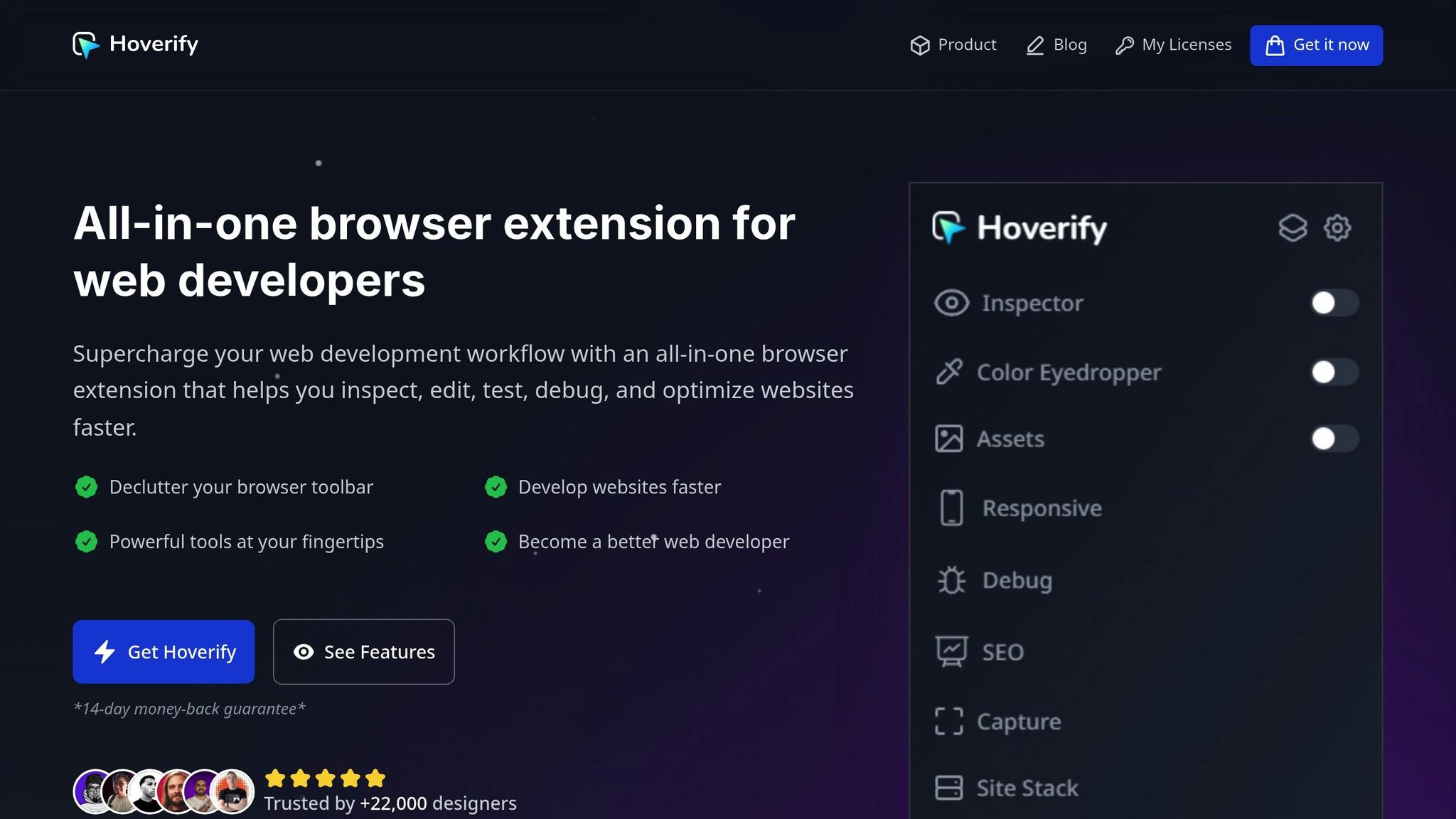
Hoverify packs a punch with features designed to make debugging faster and easier.
- Inspector: Simply hover over elements to view and edit their properties instantly. You can tweak styles like padding, margins, and positioning in real time, with the changes reflected across all screen sizes. No need to write CSS manually - adjustments are visual and immediate.
- Responsive Viewer: This feature lets you test your site on multiple devices at once, from smartphones to tablets and desktops. When you interact with one simulated device - scrolling, clicking, or navigating - the others mirror your actions. This makes it easier to catch issues that only appear during specific interactions. You can also customize device profiles to match the exact dimensions your audience uses.
- Real-Time CSS Editing: Edit CSS directly within Hoverify, complete with syntax highlighting. Adjust media queries, tweak breakpoints, and refine layouts without toggling between your browser and code editor.
- Element Search: Quickly locate elements by tag, ID, class, or CSS selector using the built-in search tool.
- CSS Box Visualization: This feature gives you a clear view of padding, margins, borders, and element dimensions. It’s a lifesaver for spotting spacing issues that can disrupt layouts on different screen sizes.
Hoverify doesn’t stop there. It also includes a Color Eyedropper for sampling colors from iframes and images, an Assets Extractor to pinpoint resource-related problems, and a Custom Code Injection feature. The latter allows you to test CSS or JavaScript fixes temporarily without touching your actual codebase.
With these tools, you can identify and resolve responsive design issues in just a few minutes, keeping up with the fast pace of development.
5-Minute Debugging Process
When you’re racing against the clock to resolve responsive design problems, having a clear, step-by-step approach can save you a ton of stress. Here’s how you can tackle these issues efficiently by combining two powerful workflows: Hoverify for visual debugging and browser developer tools for deeper analysis.
Using Hoverify for Quick Fixes
Hoverify’s Responsive Viewer is your go-to tool for an instant snapshot of how your site looks across multiple devices. This eliminates the need to manually resize your browser or switch between devices. In future, Hoverify’s Responsive Viewer will also have a inspector of it’s own making it more easy to debug issues.
Step 1: Spot Problem Areas
Fire up the Responsive Viewer and scroll through your website as it appears on various devices. Look for issues like text spilling out of containers, misaligned layouts, or missing elements. This gives you a bird’s-eye view of where things are going wrong.
Step 2: Inspect and Adjust
Once you identify a problem in the Responsive Viewer, open your browser’s developer tools (F12 or right-click → “Inspect Element”) to examine the troublesome element. Use the device toolbar in your browser’s dev tools to toggle between different screen sizes and see how the element behaves. The element inspector will help you understand the CSS properties affecting the layout.
Your browser’s Elements panel is a lifesaver for spacing issues. It clearly shows margins, padding, and borders in the box model visualization, helping you understand what’s pushing elements out of place. For instance, if a sidebar is creating overflow on tablets, you can quickly see whether the culprit is padding, a fixed width, or something else.
Step 3: Real-Time CSS Tweaks
Edit your CSS directly in the browser’s Styles panel to test quick fixes. Any changes you make are instantly reflected in the current view. Focus on quick fixes like adjusting max-width, tweaking flex settings, or refining media query breakpoints. Use Hoverify’s Responsive Viewer to quickly check how your changes look across multiple devices simultaneously.
You can even test changes on the fly using the browser’s dev tools before committing them to your codebase.
Step 4: Check Interactions
Once the visual issues are fixed, test all interactions using both the browser’s device simulation and Hoverify’s Responsive Viewer. Click buttons, open menus, and fill out forms to ensure everything works smoothly across devices.
Using Browser Developer Tools
After handling the visual side of things with Hoverify, dive into the technical details using your browser’s developer tools.
Activate Responsive Mode
Press F12 and enable the device toolbar (Ctrl+Shift+M or Cmd+Shift+M) to simulate different devices. This mode lets you test specific screen sizes and resolutions.
Test Popular Devices
Use the device dropdown to simulate popular options like the iPhone 14, Samsung Galaxy S23, or iPad Air. Be sure to check both portrait and landscape orientations, as some layout issues only appear in one mode. Pay attention to pixel density settings, too - high-DPI displays can reveal problems you might otherwise miss.
Check for JavaScript Errors
Head to the Console tab to look for JavaScript errors that could be causing responsive issues. Errors related to viewport settings or media query calculations are common culprits.
Analyze Network Performance
Switch to the Network tab and reload your page. Look for large files, like images over 500KB, that could slow down mobile performance. Sorting resources by size helps you quickly spot and address these bottlenecks.
Inspect Edge Cases
Use the Elements panel to dig into tricky CSS issues. This is especially helpful for inspecting pseudo-elements, animations, or grid layouts that might not be fully visible in visual debugging tools.
Why Hoverify Works Better for US Developers
When deadlines are tight, and delivering flawless, responsive designs is non-negotiable, the tools you use can make all the difference. While browser developer tools have been a go-to for years, Hoverify offers a fresh approach that’s especially suited for developers tackling the fast-paced demands of the US market.
Feature and Speed Comparison
Hoverify stands out when you compare its features to traditional browser developer tools for responsive debugging:
| Feature | Hoverify | Browser DevTools |
|---|---|---|
| Speed of Debugging | Faster (real-time edits) | Moderate (manual steps) |
| Multi-Device Testing | Simultaneous previews | One device at a time |
| Learning Curve | Easy to use | Moderate (technical skills) |
The simultaneous multi-device preview is a game-changer. Instead of toggling between device modes in browser tools, you can see how your changes impact all screen sizes at once. This eliminates the constant back-and-forth, saving time and reducing frustration. Hoverify also offers real-time CSS editing, which skips the tedious refresh cycles and delivers instant feedback.
For US developers, the custom device profiles feature is a standout. It allows you to test on specific devices popular in the American market, such as the latest iPhones, leading Android models, or even custom breakpoints tailored to your client’s analytics data. These features create a streamlined workflow that’s perfectly aligned with the demands of the US market.
Time-Saving Examples
Hoverify’s capabilities translate into real-world time savings, which can be critical when every minute counts.
Take a common scenario: debugging a navigation menu that collapses incorrectly on tablets but works on phones and desktops. Using browser developer tools, you’d manually resize the viewport, inspect the issue, make a CSS change, refresh, and repeat. Each iteration can take several minutes.
With Hoverify’s Responsive Viewer, you instantly see the broken tablet layout alongside the working phone and desktop views. Adjustments can be made on the spot, cutting the debugging process to under a minute.
Another handy feature is synchronized scrolling and clicking. Imagine testing a long landing page - scrolling on one device view automatically syncs with others, making it easy to spot inconsistencies without manually navigating each view. This is a huge time-saver when working with lengthy, complex layouts.
Hoverify also simplifies spacing issues with its CSS Box Visualization tool. Instead of guessing margins and paddings or manually calculating them, you get a clear visual representation of what’s causing alignment or overflow problems. This is particularly helpful when dealing with intricate flexbox or grid layouts, which are common in modern responsive designs.
For developers juggling tight schedules and demanding clients, Hoverify’s Custom Code Injection feature is a lifesaver. It lets you test fixes without altering the actual codebase, so you can demonstrate solutions during client calls or stakeholder meetings. This approach not only speeds up the development process but also helps you stay ahead in a high-pressure environment.
Conclusion
Tackling responsive design issues doesn’t have to throw off your schedule. With the right tools and a clear plan, you can pinpoint and fix problems in no time.
The secret lies in blending dependable tools with an organized approach. Browser developer tools are a great starting point, but Hoverify takes it a step further, boosting your efficiency and simplifying your workflow.
When deadlines are tight, speed is everything. Features like Hoverify’s synchronized scrolling, CSS box visualization, and custom code injection don’t just save time - they’re essential for developers managing fast-paced projects.
With its multi-device preview, real-time CSS editing, and custom device profiles, Hoverify eliminates the hassle of constant viewport adjustments, offering a comprehensive solution tailored for developers in the U.S. looking to streamline their responsive design process.
FAQs
What are the most common responsive design problems you can quickly solve with Hoverify?
Hoverify simplifies the process of tackling responsive layout challenges, like overlapping elements or misaligned components on different screen sizes. It also ensures your website displays perfectly across mobile, tablet, and desktop by addressing viewport sizing issues. On top of that, Hoverify helps you quickly spot and fix device-specific rendering problems, making it easier to eliminate inconsistencies across browsers and devices efficiently.
How does Hoverify’s multi-device testing feature make debugging responsive design faster and easier?
Hoverify’s multi-device testing tool simplifies debugging by allowing you to view and test your website across various screen sizes and devices simultaneously. No more switching back and forth between individual device views - this feature makes it easy to catch layout or functionality issues in one go.
By consolidating everything into a single interface, you can quickly identify and address responsive design challenges, speeding up your workflow and cutting down the time spent on troubleshooting.
How can I use browser developer tools with Hoverify to troubleshoot technical issues more effectively?
To address technical issues more efficiently, pair your browser’s developer tools with Hoverify. Features like breakpoints, live expressions, and the Issues panel in Chrome DevTools make it easier to spot JavaScript errors or resource loading issues. These tools dig into the underlying problems in your code, giving you a clearer picture of what’s going wrong.
Hoverify takes this a step further by letting you inspect, edit, and test elements directly in your browser. Whether you’re debugging CSS hover states or analyzing how dynamic content behaves, Hoverify simplifies the process. Together, these tools create a smoother workflow for tackling responsive design problems head-on.
