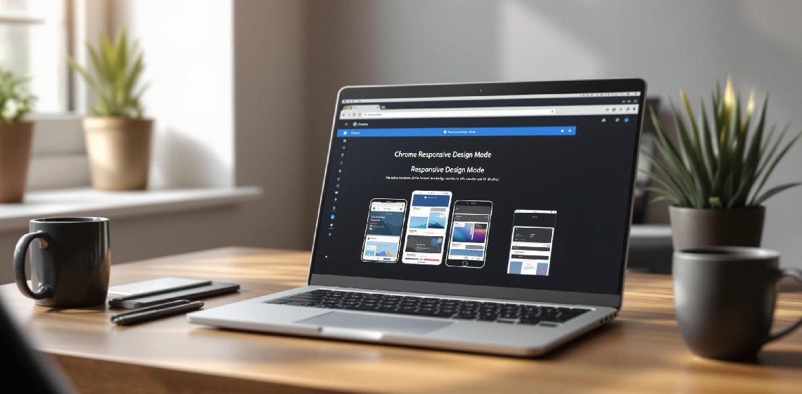
How to Use Responsive Design Mode in Chrome
Chrome’s Responsive Design Mode lets you test how websites look and work on different devices without needing physical hardware. Here’s a quick guide to get started:
-
Access Developer Tools:
- Press
Ctrl + Shift + I(Windows/Linux) orCmd + Option + I(Mac). - Or use the browser menu: More Tools > Developer Tools.
- Press
-
Enable Responsive Mode:
- Click the phone/tablet icon in Developer Tools or press
Ctrl + Shift + M(Windows/Linux) orCmd + Shift + M(Mac).
- Click the phone/tablet icon in Developer Tools or press
-
Key Features:
- Test with preset devices like iPhones, Androids, iPads, or desktops.
- Add custom screen sizes for specific dimensions.
- Rotate screens to check landscape and portrait layouts.
- Simulate touch gestures and network speeds (e.g., 3G, offline).
-
Advanced Testing:
- Adjust device pixel ratio (DPR) for high-resolution screens.
- Use media query tools to test breakpoints.
- Capture screenshots of your responsive designs.
For more advanced options, extensions like Hoverify offer multi-device previews, asset extraction, and real-time CSS inspection to enhance your workflow.
Responsive Design Mode is essential for ensuring your site looks great and works smoothly on any device.
Opening Responsive Design Mode
Here’s how you can open Developer Tools and enable responsive mode for testing.
Access Developer Tools
There are several ways to open Developer Tools:
- Keyboard shortcuts:
- On Windows/Linux: Ctrl + Shift + I
- On Mac: Command + Option + I
- Browser menu:
- Click the three-dot menu (⋮) in the upper-right corner
- Go to More Tools > Developer Tools
- Right-click method:
- Right-click anywhere on a webpage
- Select Inspect from the context menu
Once Developer Tools is open, you can move on to enabling the Device Toolbar.
Enable Device Toolbar
To activate the Device Toolbar, use one of these methods:
- Toggle Device Toolbar button:
- Find the phone/tablet icon in the Developer Tools toolbar
- Click the icon to enable responsive mode (it will turn blue when active)
- Keyboard shortcut:
- On Windows/Linux: Ctrl + Shift + M
- On Mac: Command + Shift + M
When enabled, the Device Toolbar creates a responsive testing environment. You’ll see:
- Adjustable viewport dimensions
- A dropdown to select devices
- Zoom level controls
- An option to toggle device orientation
- Additional settings via the three-dot menu
Pro tip: For better multitasking, dock Developer Tools to the right. Use the three-dot menu and select Dock to right to view both code and the responsive preview side by side.
Device Presets and Settings
Chrome’s Responsive Mode lets you test various screen sizes directly in your browser.
Select Device Profiles
Use the device dropdown above the viewport to pick from:
- Popular devices like iPhone 14 or Samsung Galaxy S20
- Tablets such as iPad Air or iPad Mini
- Desktops, including laptops with touchscreens or HiDPI displays
Want to create a custom profile? Here’s how:
- Open the device dropdown menu.
- Scroll to the bottom and select “Edit.”
- Click “Add custom device.”
- Fill in the name, width, height, device pixel ratio, and, if needed, a user agent string.
Switch Screen Orientation
Need to see your layout in landscape or portrait?
- Click the rotate icon (🔄) next to the device selector.
- Or use this shortcut: Ctrl + Shift + O (Windows/Linux) or Command + Shift + O (Mac).
This will rotate the viewport, helping you see how your design handles different orientations.
Understanding Device Pixel Ratio (DPR)
DPR measures how physical pixels relate to CSS pixels on a screen. Here are some examples:
- A standard desktop monitor has a DPR of 1.
- The iPhone 14 Pro boasts a DPR of 3.
- Many Android devices fall around a DPR of 2.75.
When setting up custom profiles, include the correct DPR to test high-resolution images, media queries, and touch targets effectively.
For an enhanced testing workflow, check out Hoverify’s Responsive Viewer. It syncs previews across devices, working seamlessly with Chrome’s tools to create a thorough testing environment.
Set Custom Screen Sizes
Chrome’s Responsive Design Mode lets you go beyond preset device profiles by customizing screen sizes. This flexibility is perfect for testing specific dimensions and ensuring your design works across a range of devices.
Resize the Viewport
To adjust the viewport size manually:
- Hover over the edges of the viewport to reveal the resize handle (↔️).
- Click and drag to change the width or height.
- The dimensions will appear in the top-right corner (e.g., “375×667”).
Quick Tip: Hold Shift while dragging to keep the current aspect ratio intact.
Enter Specific Dimensions
For exact dimensions, you can input pixel values directly. Click the dimensions display in the top bar, type in the width and height in pixels, and press Enter.
Here are some common responsive breakpoints to consider:
| Device Category | Width (px) | Example Use Cases |
|---|---|---|
| Mobile Small | 320–375 | Compact displays, older phones |
| Mobile Large | 376–428 | Most modern smartphones |
| Tablet | 768–1024 | iPads, Android tablets |
| Desktop | 1025–1440 | Laptops, standard desktop screens |
Test Media Query Breakpoints
Testing media query breakpoints ensures that your design adjusts smoothly across different screen sizes.
- Open Developer Tools.
- Click the triple-dot menu (⋮).
- Go to “More tools” and select “Media queries.”
- Use the colored bars to resize the viewport to specific breakpoints.
Pay attention to these key transitions:
- Mobile to tablet: Look for changes in navigation, grids shifting from single to multi-column layouts, and touch-friendly elements scaling properly.
- Tablet to desktop: Ensure content reflows correctly, sidebars appear as expected, and hover states function on larger screens.
- Large desktop: Check that maximum content width constraints prevent the layout from stretching too far on wide displays.
Extra Testing Features
Chrome offers several tools to help you test your site under different conditions.
Test Different Network Speeds
You can simulate various connection speeds using the Network tab:
- Open Developer Tools (F12 or Ctrl+Shift+I).
- Navigate to the Network tab.
- Use the “No throttling” dropdown to choose:
- Fast 3G
- Slow 3G
- Offline
- Custom profiles
Pro tip: Testing on slower connections can help you spot areas to improve, like optimizing images, animations, or interactive elements.
Test Touch Interactions
Use Chrome’s Device Mode to simulate touch-based interactions, such as:
- Tapping buttons or links.
- Swiping gestures.
- Testing touch-specific features.
- Checking hover states designed for mobile devices.
You can also take screenshots of these interactions to compare layouts and functionality across devices.
Take Viewport Screenshots
Document your site’s responsiveness by capturing viewport screenshots:
- Press Ctrl+Shift+P (Cmd+Shift+P on Mac).
- Type “screenshot” in the command menu.
- Select one of these options:
- Capture area
- Capture full size
- Capture node
- Capture viewport
For full-page screenshots, open Developer Tools (Ctrl+Shift+I), press Ctrl+Shift+P, type “full”, and pick “Capture full size screenshot.” This method is quick and efficient for documenting your site’s design and layout.
Hoverify Tools for Responsive Testing
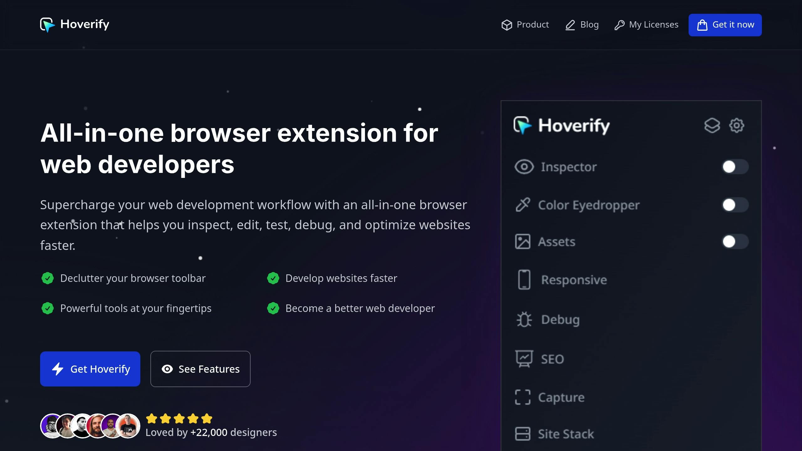
Chrome’s built-in tools are great, but Hoverify takes things up a notch. It offers advanced features that make responsive testing more efficient for both designers and developers.
What is Hoverify
Hoverify is a browser extension available for Chrome, Firefox, and other Chromium-based browsers. It’s packed with tools to simplify web design and development. As web developer Madhu Menon puts it:
“Found an incredibly useful web design / development tool called Hoverify. Allows you to inspect elements on any site, copy styles, show grids, check on different viewports, grab asset lists, hide elements, and a whole lot more.” [1]
Multi-Device Preview Tools
Hoverify makes responsive testing smoother with features like:
- Previewing your site on multiple devices at the same time.
- Mirroring interactions across all device views when you interact with one preview.
- Creating custom device profiles tailored to your needs, beyond the standard presets.
“As a website developer, this plugin has so many handy features. One of my favorites is the ability to quickly take full page screenshots very easily, and the inspector tool and color selectors I use very often.” [1]
These features aren’t just about testing - they help you fine-tune your designs to work seamlessly across devices.
Web Development Tools
Hoverify doesn’t stop at responsive testing. It also includes tools that enhance your overall design workflow:
| Feature | Purpose | How It Helps Responsive Design |
|---|---|---|
| Asset Extraction | Grab images, SVGs, videos, and animations | Easily collect media for different screen sizes |
| Inspector Tool | Hover to inspect HTML/CSS | Make real-time adjustments without opening dev tools |
| Site Stack Analysis | Check technologies and plugins | Understand the technical setup of a site |
“Incredible app for web designers! Wow!! I’m really impressed, it combined a ton of other tools I was using. So happy I found this.” [1]
The inspector tool, in particular, is a time-saver. It lets you examine and tweak elements directly without constantly switching between panels, speeding up the testing process.
Wrapping Up
Chrome’s Responsive Design Mode is a solid tool for testing layouts across various devices. Pairing it with extensions like Hoverify can streamline the testing process and improve efficiency.
For developers, having reliable tools is essential. Chrome provides a strong starting point, while Hoverify enhances the experience with features like synchronized multi-device previews and real-time CSS inspection.
This combination has gained popularity among developers, with over 22,000 users already relying on Hoverify [1]. Developer Mike Oliver shares his experience:
“My go-to browser extension when building websites. The support is amazing and very responsive” [1]
Here’s how you can optimize your responsive testing workflow:
- Start with Chrome’s Responsive Design Mode: Test your layout on various devices.
- Add Hoverify’s multi-device preview: Check multiple screen sizes simultaneously.
- Utilize Hoverify’s Inspector tool: Make quick CSS tweaks on the go.
The ultimate goal of responsive design testing is to ensure a site works flawlessly across all devices. By combining Chrome’s built-in tools with Hoverify’s advanced features, developers can build websites that look great and function perfectly, no matter the device.
