Dark mode is no longer optional - it’s a must-have feature. With over 80% of users enabling dark mode and Americans spending an average of 6+ hours daily on screens, it’s clear that offering a comfortable viewing experience is essential. But how do you implement it efficiently without wasting time?
Here are 4 ways to add dark mode to your project:
- Native CSS (
prefers-color-scheme): Automatically adapts to system settings with minimal setup. - CSS Variables + JavaScript: Offers full control with a manual toggle and user preference saving.
- Tailwind CSS: Simplifies dark mode with built-in utilities and flexibility for responsive designs.
- CSS Filters: A quick solution for legacy projects, but less precise and harder to maintain.
Key Takeaways:
- Use native CSS for simplicity and speed.
- Opt for CSS variables + JavaScript for customization and user control.
- Choose Tailwind CSS for an easy, utility-based approach.
- Reserve CSS filters for temporary or basic needs.
Each method has pros and cons, depending on your project’s goals, complexity, and user needs. Below is a quick comparison to help you decide.
Quick Comparison
| Method | Complexity | Customization | Performance | Accessibility |
|---|---|---|---|---|
| Native CSS | Low | Limited | Excellent | High |
| CSS Variables + JavaScript | Medium | High | Good | High |
| Tailwind CSS | Low | Good | Good | High |
| CSS Filters | Very Low | Limited | Poor | Low |
Choose the right option based on your priorities - simplicity, flexibility, or speed - and start building a better user experience today.
1. Native CSS with prefers-color-scheme
The prefers-color-scheme CSS media query taps into the user’s system settings, automatically detecting whether their device or browser is set to light or dark mode. This ensures the website aligns with the user’s existing preferences.
Here’s an example of how it works:
:root {
  --bg-color: #ffffff;
  --text-color: #000000;
}

@media (prefers-color-scheme: dark) {
  :root {
    --bg-color: #1a1a1a;
    --text-color: #ffffff;
  }
}

body {
  background-color: var(--bg-color);
  color: var(--text-color);
}
This code snippet demonstrates how CSS variables and the media query enable automatic theme switching without relying on JavaScript.
Simple to Implement
This method is straightforward: define color variables and use the @media (prefers-color-scheme: dark) query to apply dark mode styles. There’s no need for JavaScript or complex state management. However, if you’re updating an existing site, you might need to plan carefully to integrate these changes.
Performance Benefits
Using this approach is faster than JavaScript-based solutions. It avoids re-renders and prevents the “flash of unstyled content” (FOUC). Additionally, combining this with <link media> queries can defer non-essential CSS, improving load times. On AMOLED screens, dark mode can even save up to 60% of energy.
Accessibility Features
This method respects system-level accessibility settings, automatically applying dark mode for users who may have light sensitivity or spend extended periods looking at screens.
Apple highlights the importance of user preference in their guidelines:
“The choice of whether to enable a light or dark appearance is an aesthetic one for most users, and might not relate to ambient lighting conditions.”
This underscores that the user’s preference should take precedence over assumptions about when dark or light themes are appropriate.
Limitations in Customization
While prefers-color-scheme is great for automating theme detection, it doesn’t offer a manual override. To add this feature, you’d need JavaScript to let users toggle themes and save their preferences.
2. CSS Variables and Manual Theme Toggle with JavaScript
This method combines CSS variables and JavaScript to let users manually toggle between light and dark themes. Unlike system-preference-based methods, this approach puts the control directly in the hands of the user.
Here’s how it works: CSS variables store the color values, while JavaScript toggles a data-theme attribute on the root HTML element. Below is an example of the CSS setup:
:root {
  --bg-color: #ffffff;
  --text-color: #000000;
  --border-color: #e0e0e0;
}

[data-theme="dark"] {
  --bg-color: #1a1a1a;
  --text-color: #ffffff;
  --border-color: #333333;
}

body {
  background-color: var(--bg-color);
  color: var(--text-color);
  border: 1px solid var(--border-color);
}
The JavaScript handles the toggling logic and saves the user’s choice for future visits using localStorage:
const themeToggle = document.getElementById('theme-toggle');
const htmlElement = document.documentElement;

// Load saved theme preference
const savedTheme = localStorage.getItem('theme');
if (savedTheme) {
  htmlElement.setAttribute('data-theme', savedTheme);
}

themeToggle.addEventListener('click', () => {
  const currentTheme = htmlElement.getAttribute('data-theme');
  const newTheme = currentTheme === 'dark' ? 'light' : 'dark';

  htmlElement.setAttribute('data-theme', newTheme);
  localStorage.setItem('theme', newTheme);
});
Implementation Complexity
Setting this up requires a moderate understanding of CSS and JavaScript. You’ll need to replace hardcoded color values in your styles with CSS variables and add JavaScript to toggle the theme and save the user’s preference. While not overly complex, it’s a step up from simpler methods.
Customizability
This approach offers a lot of room for personalization. You can easily expand it to support additional themes - like high-contrast or brand-specific designs - by defining more CSS variable sets. This flexibility allows you to style different parts of your interface uniquely while maintaining a consistent overall look.
Performance Considerations
Modern browsers handle CSS variables efficiently, and the JavaScript runs only when the user interacts with the toggle. However, if the saved theme loads too late, a brief flash of the default theme might occur. To avoid this, you can include an inline script in the HTML head to immediately apply the saved theme.
Accessibility Tips
Make sure the toggle button is accessible. Add an ARIA label, such as aria-label="Toggle between light and dark theme", and ensure it’s keyboard-friendly. Accessibility features like these ensure that all users, including those with motor impairments, can easily set and retain their preferences.
Next, we’ll explore how a utility-first framework like Tailwind CSS can simplify dark mode implementation.
3. Utility-First CSS Frameworks (Tailwind CSS Dark Mode)
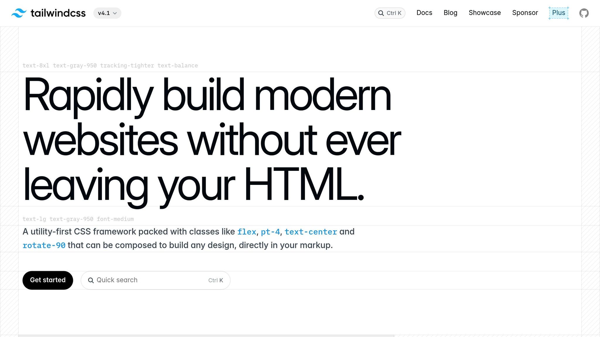
Tailwind CSS makes it easy to implement dark mode with its utility-first approach, using the dark: variant to style elements specifically for dark mode.
“Tailwind has built-in support for dark mode through the dark: variant.”
– Md. Saad, StaticMania
The framework offers two main ways to enable dark mode: the media strategy, which adapts to the user’s operating system preference via prefers-color-scheme, and the selector strategy, which allows manual toggling. To configure this, you can adjust the darkMode option in your tailwind.config.js file:
module.exports = {
  darkMode: 'selector', // or 'media'
  // ... rest of your config
}
With the selector strategy, you can directly use utility classes in your HTML to define light and dark mode styles:
<div class="bg-white dark:bg-gray-900 text-black dark:text-white">
  <h1 class="text-2xl font-bold border-b border-gray-200 dark:border-gray-700">
    Welcome to our site
  </h1>
  <button class="bg-blue-500 hover:bg-blue-600 dark:bg-blue-600 dark:hover:bg-blue-700">
    Click me
  </button>
</div>
To toggle dark mode, you can use JavaScript to add or remove the dark class from a parent element, such as the <html> tag:
// Toggle dark mode
function toggleDarkMode() {
  document.documentElement.classList.toggle('dark');
  localStorage.setItem('darkMode', document.documentElement.classList.contains('dark'));
}
Simplifying Complexity
Tailwind CSS takes the hassle out of managing dark mode by relying on its utility classes. There’s no need to fiddle with CSS variables or manually write media queries - everything is baked into the framework. The selector strategy, introduced in Tailwind CSS v3.4.1 (April 2024), replaced the older class strategy, offering developers more straightforward control over dark mode activation.
Tailored Customization
Tailwind’s dark mode is highly flexible. Developers can combine the dark: variant with responsive breakpoints and state variants like hover: and focus: to build dynamic designs. For example, you can use classes such as dark:hover:bg-gray-800 or md:dark:text-blue-400 to create responsive, interactive elements.
“Tailwind CSS’s selector strategy for dark mode provides a flexible and powerful approach to implementing custom dark mode toggling in web projects. It equips developers with the tools to create dynamic, user-centric web applications that cater to individual preferences, enhancing the overall user experience.”
– Brad Dirheimer
Additionally, you can customize which utilities support the dark: variant. While dark mode is enabled by default for color-related utilities like backgroundColor, borderColor, and textColor, you can extend it to other utilities in your Tailwind configuration. This level of customization complements Tailwind’s focus on performance.
Keeping It Efficient
Tailwind CSS is designed with performance in mind. It generates only the CSS you actually use, ensuring dark mode styles don’t unnecessarily inflate your CSS file. For example, Netflix’s use of Tailwind for its Netflix Top 10 section results in just 6.5 kB of CSS being delivered over the network. If you’re using a framework like Next.js, unused CSS is automatically removed during the build process, further optimizing the bundle size.
The main thing to watch out for is ensuring your JavaScript for toggling dark mode is efficient. Storing user preferences in localStorage helps avoid layout shifts during page load, maintaining a smoother user experience.
4. CSS Filter and Inversion Techniques
CSS filter and inversion techniques offer a quick way to enable dark mode by applying visual effects directly to elements or entire pages. Instead of relying on predefined color palettes, these methods use dynamic filters like invert(), hue-rotate(), and brightness() to alter the appearance of content without changing the HTML structure or creating separate stylesheets.
Here’s a simple example of how to use an inversion filter on the root element:
/* Basic inversion for dark mode */
html[data-theme="dark"] {
  filter: invert(1) hue-rotate(180deg);
}

/* Avoid double inversion for images and videos */
html[data-theme="dark"] img,
html[data-theme="dark"] video {
  filter: invert(1) hue-rotate(180deg);
}
This technique flips all colors on the page, instantly creating a dark mode effect. However, it requires exceptions for media elements like images and videos to prevent them from appearing inverted.
Implementation Complexity
At first glance, CSS filter techniques are straightforward to set up, requiring just a few lines of code. This makes them appealing for quick prototypes or legacy projects where a full redesign isn’t practical. However, things get trickier when you need more refined control.
For example, selectively excluding specific elements, such as logos or brand imagery, requires additional rules:
html[data-theme="dark"] .logo,
html[data-theme="dark"] .brand-image,
html[data-theme="dark"] .photo-gallery img,
html[data-theme="dark"] .video-player {
  filter: invert(1) hue-rotate(180deg);
}
While this approach works, maintaining such exceptions can become cumbersome, especially for larger projects.
Performance Impact
Using CSS filters can affect performance, as the computational cost depends on the type and number of filters applied.
“The main problem with this ‘app’ is painting… What you need to do is to manually promote elements that use these filter effects to a layer… and after that you will see massive improvement in responsiveness of your app. But on mobile devices generation 2012 and below you can forget good performance, this is just too much for them.”
- Blago Eres, Contributor
Filters like invert(), brightness(), and hue-rotate() are relatively lightweight, but combining multiple filters or applying them to large sections can lead to performance bottlenecks. Modern browsers often use GPU acceleration to handle filters, but older or less powerful devices may still struggle.
To mitigate performance issues, you can promote filtered elements to their own rendering layer:
html[data-theme="dark"] {
  filter: invert(1) hue-rotate(180deg);
  transform: translateZ(0); /* Force GPU acceleration */
  will-change: transform;
}
Testing has shown that using will-change: transform can significantly reduce painting times - from 690ms to 63ms in some cases. However, be cautious when creating multiple layers, as overuse can degrade performance instead of improving it.
Accessibility Concerns
While filter-based dark modes are convenient, they can introduce accessibility challenges. For example, people with astigmatism - about half the population - often find it harder to read white text on a black background compared to black text on white.
“People with astigmatism (approximately 50% of the population) find it harder to read white text on black than black text on white.”
- Jason Harrison, Postgraduate Researcher at the Sensory Perception & Interaction Research Group at the University of British Columbia
Inversion can also disrupt visual hierarchy and reduce contrast. Subtle differences in color that work well in light mode may become exaggerated or indistinguishable when inverted. Moreover, filter-based dark modes often fail to meet WCAG contrast guidelines because they don’t account for the nuanced color relationships needed for readability.
Customization Limitations
One of the biggest drawbacks of CSS filter techniques is their lack of flexibility. While you can tweak filter intensity or combine effects, these changes are mathematical rather than design-driven.
For instance, you can create a softer inversion effect by adjusting filter values:
/* Softer inversion for a less harsh dark mode */
html[data-theme="dark"] {
  filter: invert(0.9) hue-rotate(180deg) brightness(1.1);
}
However, these adjustments are applied uniformly across the page, making it difficult to preserve brand colors, introduce custom accents, or maintain the carefully crafted visual hierarchy of a well-designed dark theme.
In short, CSS filters are best suited for temporary or basic dark mode solutions rather than polished, long-term implementations.
Comparison: Pros and Cons
This breakdown highlights the strengths and weaknesses of four dark mode implementation methods, helping you decide which one fits your project and skill level best.
| Method | Setup Complexity | Accessibility Compliance | Flexibility | Performance Impact |
|---|---|---|---|---|
| Native CSS with prefers-color-scheme | Low – Single media query setup | High – Automatically respects user preferences | Medium – Limited to system detection | Excellent – No JavaScript overhead |
| CSS Variables + JavaScript Toggle | Medium – Requires JavaScript logic | High – Full control over contrast ratios | Excellent – Complete design flexibility | Good – Minimal DOM manipulation |
| Tailwind CSS Dark Mode | Low – Built-in utility classes | High – Follows accessibility best practices | Good – Extensive utility options | Good – Optimized CSS output |
| CSS Filter Techniques | Very Low – Few lines of code | Poor – May not meet WCAG guidelines | Limited – Based on mathematical adjustments | Poor – GPU-intensive operations |
The native CSS method stands out for its simplicity and performance. By using the prefers-color-scheme media query, dark mode activates seamlessly, without the need for JavaScript. However, it relies entirely on the user’s system settings, offering little customization.
If you’re looking for more control, CSS variables with a JavaScript toggle might be the way to go. This method offers unmatched design flexibility, allowing you to fine-tune contrast ratios and other visual elements. Plus, the performance impact is minimal, especially when paired with early localStorage usage to store user preferences.
For those new to dark mode implementation, Tailwind CSS provides an easy entry point. Its built-in utility classes simplify the process, and the framework adheres to accessibility best practices. However, you’ll still need to test and adjust contrast ratios to align with your specific design needs.
On the other hand, CSS filters are a quick and simple option but come with notable downsides. They can be GPU-intensive, potentially slowing down performance, and they often fail to meet WCAG contrast standards, which could compromise accessibility.
Accessibility should always be a priority. High user preference for dark mode means getting it right can significantly impact user retention. To align with WCAG guidelines, use dark grays instead of pure black for backgrounds and ensure interactive elements maintain strong contrast ratios.
Performance is another critical factor. For example, dark mode can extend battery life on OLED devices by up to 60% compared to light themes. However, poorly implemented solutions that cause excessive reflows and repaints during theme switching can negate these benefits.
For a balance of flexibility, efficiency, and accessibility, CSS variables are a solid choice. If you’re working on a rapid prototype or are new to dark mode, Tailwind CSS offers an accessible starting point with minimal setup. Opt for native CSS when performance is your top priority and user-controlled theme switching isn’t needed. Reserve CSS filters for quick prototypes or legacy projects where a full redesign isn’t feasible.
Conclusion
Deciding on the best dark mode approach depends entirely on your project’s specific requirements. Each method has its own advantages and trade-offs, so it’s all about finding the right balance between simplicity, control, and performance to meet your goals.
For example, if you’re working on rapid prototyping, using CSS variables alongside the prefers-color-scheme media query can be a quick and effective solution. It offers a straightforward setup while still delivering functional results.
On the other hand, production-level applications often demand more control and better performance. Combining CSS variables with a JavaScript toggle can provide that flexibility. A real-world example is Twitter, which introduced a toggleable dark theme and saw a 10% increase in user engagement, along with longer session durations. Adding smooth transitions can further improve the user experience.
Accessibility is another key consideration. To ensure readability, aim for a minimum contrast ratio of 4.5:1 for standard text. A well-designed dark mode can also significantly reduce bounce rates - by up to 70% in some cases.
Battery efficiency is another factor, especially for mobile apps. Dark mode can save as much as 67% of battery life at full brightness, though this benefit drops to 14% at lower brightness levels.
Keep in mind that around 50% of users with astigmatism find white text on black backgrounds difficult to read. Offering both light and dark modes is essential to accommodate diverse user needs.
Finally, test your implementation across different devices and gather feedback early. By aligning your dark mode with performance goals, accessibility standards, and user preferences, you can deliver a smoother and more inclusive experience.
FAQs
What are the pros and cons of using CSS filters to create dark mode?
Using CSS filters for dark mode comes with both advantages and drawbacks. On the upside, it’s incredibly easy to set up and can instantly apply a dark mode effect to an entire webpage. This can make browsing more comfortable in low-light settings and even help save battery life on devices with OLED screens.
That said, there are some downsides to consider. CSS filters can sometimes produce inconsistent color results, which might make certain elements harder to read. In well-lit environments, the inverted colors might actually lead to more eye strain for some users. Plus, this approach doesn’t allow for the level of precision needed to achieve a more refined and visually appealing design.
How can I make sure my dark mode design is accessible for users with visual impairments or astigmatism?
Creating an accessible dark mode starts with ensuring high contrast ratios between text and background. Aim for a ratio of at least 15.8:1 to keep text readable. Avoid overly bright or glowing text, as it can cause strain or halos, especially for users with astigmatism.
Including customization options is another key step. Allow users to tweak contrast and color schemes to match their preferences. This not only improves usability but also makes the design more inclusive for individuals with various visual impairments. Additionally, testing your dark mode with accessibility tools can help you catch and fix potential issues early in the design process.
What are the best ways to optimize performance when using CSS variables and JavaScript for dark mode?
To get the best performance when implementing dark mode using CSS variables and JavaScript, keep these tips in mind:
- Rely on CSS variables for theme changes: This approach minimizes reflows and repaints, leading to a smoother user experience.
- Toggle classes on a top-level container: By limiting DOM manipulation to a single high-level element, you reduce unnecessary updates across the document.
- Use the
prefers-color-schememedia feature: This allows you to automatically detect and apply the user’s preferred theme without needing extra JavaScript.
These techniques work together to deliver a dark mode that’s quick, efficient, and user-friendly, all while keeping performance demands low.
