CSS gradients can make your website look sleek and modern, but they can also slow it down if not used wisely. Here’s what you need to know:
- Complex gradients with too many color stops or large areas can burden the CPU and slow rendering.
- Gradients vs. images: CSS gradients reduce HTTP requests and file sizes but may not always be the fastest option for intricate designs.
- Animations: Avoid animating gradient colors; instead, animate
background-positionfor smoother performance. - Optimization tips: Use fewer color stops, leverage browser tools to test performance, and apply
will-changeortransform: translateZ(0)to improve rendering. - Responsive design: Simplify gradients for smaller screens and use media queries to adjust performance-heavy animations.
Common Mistakes in CSS Gradient Usage
Building on earlier discussions about performance, let’s dive into some common mistakes that can make CSS gradients less efficient. Even experienced developers sometimes unintentionally create performance bottlenecks with gradients.
Overloading Gradients with Too Many Color Stops
One frequent issue is making gradients overly complex by using too many color stops. Each additional color stop requires more pixel calculations, which can slow down rendering and increase load times.
The fix? Keep it simple. Use only the number of color stops needed to achieve your desired effect. For example, a clean three-color gradient is often more effective than a complicated seven-color design.
Another related problem is color banding, where subtle differences between similar colors create visible, unwanted bands. This typically happens due to compression that reduces the number of colors displayed. To avoid this, stick to a smaller, more distinct range of colors in your gradients.
Challenges with Large Gradient Areas
Large gradient areas, like full-screen backgrounds, can put significant strain on the rendering engine, especially on high-resolution devices.
For animations involving large gradients, using the will-change property can help browsers prepare for smoother rendering. You can also use media queries to deliver simpler gradients or even static images on less powerful devices, ensuring a better performance. If a gradient becomes too complex, consider converting it into an optimized image format like PNG or WebP. This approach can sometimes be more efficient than relying on CSS gradients.
Browser Compatibility Concerns
Browser support for CSS gradients isn’t always consistent. While linear and radial gradients are widely supported, including in Microsoft Edge and IE11, conical gradients are less reliable. Many older versions of Chrome, Firefox, Edge, Opera, and Safari don’t support them, and browsers like Internet Explorer, Opera Mini, and UC Browser for Android lack support entirely.
To address this, validate your HTML and CSS to catch syntax errors that might trip up older browsers. Use feature detection to provide fallback options for unsupported gradient types. Regular cross-browser testing is also essential to maintain a consistent experience across all the browsers your users rely on.
Best Practices for Fast and Smooth Gradients
Now that we’ve looked at common mistakes, let’s dive into strategies that ensure gradients are both visually appealing and optimized for performance.
Keep Color Stops to a Minimum
Simpler gradients with fewer color stops are easier for browsers to render smoothly. Avoid overly complex transitions with too many colors, as these can increase the computational load. If you need a more intricate appearance, try layering gradients or choosing colors that create the illusion of complexity without straining browser resources. Later, we’ll compare CSS gradients and image gradients to help you decide which works best for specific scenarios.
CSS Gradients vs. Image Gradients
CSS gradients are typically more efficient because they don’t require extra HTTP requests and remain lightweight even when applied to large elements. Using CSS3 techniques can improve page rendering speed by 12%, reduce file sizes by 9.5%, and cut down HTTP requests by 45% compared to image-based gradients. Google’s Adam de Boor emphasized this during Gmail’s optimization efforts:
“Google’s current goal is to get Gmail to load in under a second. Speed is a feature.”
For users with slower internet connections, CSS gradients are an excellent choice since they don’t add to bandwidth usage. They are ideal for responsive designs, dynamic color adjustments, and scaling across various screen sizes. On the other hand, image-based gradients can be reserved for older browsers or when a design demands exceptionally intricate gradients. Using CSS custom properties can further simplify managing consistent gradient definitions.
Use CSS Custom Properties for Gradients
CSS custom properties, or variables, make gradient management much easier. Instead of repeating the same gradient definitions throughout your stylesheet, you can define them once and reuse them, promoting cleaner and more maintainable code.
As explained by MDN Web Docs:
“Custom properties allow a value to be defined in one place, then referenced in multiple other places so that it’s easier to work with. Another benefit is readability - for instance, ‘—main-text-color’ clarifies intent better than ‘#00ff00’, especially if the color is used in different contexts.”
To maximize efficiency, define your gradient variables at the root level for global access across your project. For example, rather than duplicating a gradient multiple times, you can set a variable like this:
--primary-gradient: linear-gradient(45deg, #ff6b6b, #4ecdc4);
This method becomes even more powerful when combined with JavaScript for dynamic adjustments. Organize related gradient variables - such as grouping brand-specific gradients or button gradients together - to improve readability and avoid tedious search-and-replace tasks across your stylesheets.
Tools and Methods for Testing and Optimizing Gradients
Choosing the right tools is essential for identifying and addressing gradient performance challenges. Below, we’ll dive into methods and tools that can help you fine-tune your CSS gradients. From online generators to browser tools, there’s a lot you can do to streamline your workflow.
Online CSS Gradient Generators
Online gradient generators are a great starting point for creating efficient gradient code. They save time and help you avoid potential performance hiccups. For example, ColorZilla includes a CSS gradient analyzer that breaks down your gradient structure and highlights areas for improvement. These tools allow you to design gradients with fewer stops, smoother transitions, and optimized rendering for various screen sizes.
But don’t stop there - browser-based tools can take your gradient optimization to the next level.
Gradient Optimization with Browser DevTools
Modern browser DevTools provide robust features to help you analyze and improve gradient performance in real time. Here’s how you can make the most of them:
- Performance Analysis: Use the flame chart to monitor page activity. Pay attention to “Self Time” and look for red blocks in the “Main” section to identify slow processes.
- Rendering Insights: Enable Paint Flashing and Layer Borders in the Rendering tab. This will reveal repaint areas and show how gradients impact performance.
- Unused CSS Detection: The Coverage tool can pinpoint unused CSS, which might be dragging down performance.
- Network Throttling: Simulate slower network conditions to ensure your gradient optimizations hold up under varying connection speeds.
These features provide a clear view of how your gradients are performing and where you can make improvements.
Gradient Analysis with Hoverify
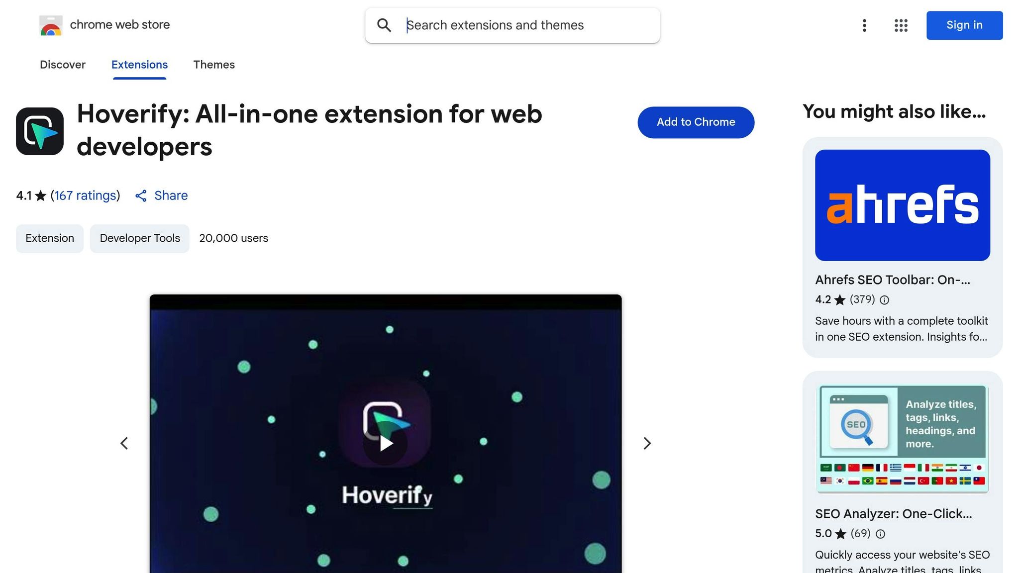
If you’re looking for a specialized tool for CSS gradient inspection, Hoverify is worth exploring. With a 4.1/5 rating on the Chrome Web Store from 167 users, it’s a favorite among developers. Its Inspector feature allows you to edit and test CSS gradients in real time, including pseudo-elements, media queries, and animations. This means you can tweak and experiment without constantly switching between your code editor and browser.
As user Mike Oliver puts it:
“My go-to browser extension when building websites. The support is amazing and very responsive.”
Another developer, Michael Andreuzza, shares his enthusiasm:
“been playing with @hov3rify almost the whole day pure joy. This lovely tool is gonna help you a lot when inspecting CSS…love it”
Hoverify also includes a Color Eyedropper for picking colors from anywhere on the page - images, iframes, you name it - providing values in RGB, CMYK, HSL, and hex formats. Its Responsive Viewer is another standout feature, enabling you to test your gradients across multiple devices simultaneously. Click or scroll on one device and see the effect mirrored on others, ensuring your gradients look great across different screen sizes and resolutions.
These tools and methods can make gradient optimization a smoother process, helping you deliver polished and efficient designs.
Advanced Methods for Gradient Animation and Rendering Efficiency
Once you’ve nailed down the basics of gradient optimization, it’s time to shift your attention to advanced techniques - especially when dealing with animations and ensuring smooth performance across devices. Animated gradients can transform your visuals, but if not implemented carefully, they can slow down performance and ruin the experience. These methods build on earlier strategies to keep your animations fluid and responsive, no matter the device.
Performance Tips for Animated Gradients
When it comes to animated gradients, the key to smoother performance lies in leveraging GPU-friendly techniques. Not all animation methods are created equal, and some can put a heavy strain on your CPU.
Take this tip: Animating background-position is far more efficient than animating gradient colors. Why? Adjusting the position of a gradient allows the browser to use GPU acceleration, which lightens the CPU’s load and delivers smoother animations. On the other hand, animating gradient colors forces the browser to recalculate the gradient on every frame, which can lead to stuttering and lag.
Here’s a quick comparison of the two approaches:
/* Less efficient: Animating gradient colors */
.gradient-slow {
  background: linear-gradient(45deg, #ff6b6b, #4ecdc4);
  animation: colorShift 3s infinite;
}

@keyframes colorShift {
  0% { background: linear-gradient(45deg, #ff6b6b, #4ecdc4); }
  50% { background: linear-gradient(45deg, #4ecdc4, #45b7d1); }
  100% { background: linear-gradient(45deg, #ff6b6b, #4ecdc4); }
}

/* More efficient: Animating background position */
.gradient-fast {
  background: linear-gradient(45deg, #ff6b6b, #4ecdc4, #45b7d1, #96ceb4);
  background-size: 200% 200%;
  animation: positionShift 3s infinite;
}

@keyframes positionShift {
  0% { background-position: 0% 50%; }
  50% { background-position: 100% 50%; }
  100% { background-position: 0% 50%; }
}
Another way to improve performance is by using the will-change property. Adding will-change: background-position; gives the browser a heads-up about the upcoming animation, allowing it to allocate resources in advance.
| Animation Technique | Performance Impact | Browser Support | Best For |
|---|---|---|---|
Animating background-position | Low (GPU-accelerated) | Excellent | Smooth animations for most use cases. |
| Animating Gradient Colors | High (CPU-intensive) | Very Good | Simple fades with minimal performance concerns. |
| Animating with Pseudo-elements | Medium | Excellent | Layered effects over static backgrounds. |
| JavaScript-based Animation | Variable (Can be high) | Excellent | Complex or interactive animations beyond CSS. |
Using Hardware Acceleration
For truly smooth animations, hardware acceleration is a game-changer. By offloading rendering tasks to the GPU, you can achieve better performance, even on less powerful devices. One simple way to trigger hardware acceleration in CSS is by using transforms like translateZ(0). This forces the browser to create a new composite layer, shifting the workload from the CPU to the GPU.
Here’s an example:
.accelerated-gradient {
  background: linear-gradient(45deg, #667eea, #764ba2);
  background-size: 400% 400%;
  transform: translateZ(0); /* Activates GPU rendering */
  animation: gradientShift 4s ease infinite;
}

@keyframes gradientShift {
  0% { background-position: 0% 50%; }
  50% { background-position: 100% 50%; }
  100% { background-position: 0% 50%; }
}
However, use hardware acceleration wisely. Each composite layer consumes GPU memory, so applying it to too many elements can lead to performance issues.
Responsive Gradient Adjustments
Not all devices are created equal, and what looks great on a desktop might struggle on a mobile phone. To address this, use CSS media queries to tailor animations to different screen sizes. On less powerful devices, simplify animations by reducing color stops, shortening durations, or even switching to static gradients.
Here’s how you can adapt gradients for various devices:
/* Base gradient for mobile */
.responsive-gradient {
  background: linear-gradient(135deg, #667eea, #764ba2);
}

/* Enhanced version for tablets */
@media (min-width: 768px) {
  .responsive-gradient {
    background: linear-gradient(135deg, #667eea, #764ba2, #f093fb, #f5576c);
    background-size: 300% 300%;
    animation: subtleShift 6s ease-in-out infinite;
  }
}

/* Full animation for desktops */
@media (min-width: 1024px) {
  .responsive-gradient {
    background-size: 400% 400%;
    animation: fullShift 4s ease-in-out infinite;
  }
}

/* Respect user preferences */
@media (prefers-reduced-motion: reduce) {
  .responsive-gradient {
    animation: none;
  }
}
Relative units like percentages or viewport-based measurements ensure gradients scale properly on different screen sizes. This prevents gradients from looking too small on large screens or overwhelming smaller ones.
Lastly, keep accessibility in mind by honoring user preferences for reduced motion. The prefers-reduced-motion media query lets you disable animations for users who prefer a static experience, improving both usability and performance.
Conclusion: Key Takeaways for Efficient CSS Gradients
Summary of Optimization Tips
Optimizing CSS gradients doesn’t have to be complicated. Start by reducing the number of color stops - stick to two or three instead of overloading with five or six. This simple adjustment can noticeably improve page speed.
When it comes to animations, CSS gradient animations outperform JavaScript-based effects in terms of performance. For instance, animating the background-position on an oversized gradient is often smoother and less resource-intensive than recalculating gradient colors with every frame.
To further enhance performance, leverage hardware acceleration. Using properties like transform: translateZ(0) or the will-change declaration shifts rendering tasks from the CPU to the GPU, resulting in smoother animations.
Testing tools are your allies. Tools like Hoverify’s inspector and responsive viewer can help detect performance issues early, while the prefers-reduced-motion media query ensures accessibility by respecting users’ motion preferences.
Finally, responsive media queries can simplify gradients for smaller screens, balancing performance with visual design. By applying these techniques, you can create gradients that are both efficient and visually appealing.
Next Steps
Now that you’ve got these strategies in hand, it’s time to put them into practice. Start by auditing your gradients - look for excessive color stops, unnecessary recalculations, or overly large gradient areas. A study from 2025 revealed that over 60% of web designers now use specialized gradient tools, cutting design time by 30% on average compared to manual coding.
For smoother animations, prioritize background-position effects, especially on mobile devices where processing power can be limited. This small tweak can make a noticeable difference in performance.
Make testing a routine part of your workflow. Use tools like Hoverify and browser DevTools to check gradient performance across different devices and browsers. Efficient gradient animations can even reduce bounce rates by up to 20%.
Lastly, consider isolating gradient-heavy sections with CSS containment properties. This allows browsers to optimize rendering for those areas independently. And as the @property rule becomes more widely supported in 2025, you’ll gain even more flexibility for creating smooth, JavaScript-free gradient transitions.
With these practical techniques, you’re ready to take your CSS gradients to the next level. Start small, test often, and transform performance bottlenecks into seamless, engaging visuals.
FAQs
What are the best ways to improve CSS gradient performance on mobile devices?
To make CSS gradients run more smoothly on mobile devices, start by keeping the number of color stops to a minimum. Fewer stops reduce the rendering workload, which can significantly improve performance. Steer clear of overly complex gradient shapes or animations, as they can strain lower-end devices and cause noticeable lag.
Focus on clean, simple designs that are easier to render efficiently. Be sure to test your gradients across different mobile browsers to ensure they perform well everywhere. When possible, opt for CSS gradients instead of image-based solutions - they generally load faster and are more resource-friendly, especially when transitions are kept minimal.
Why should I use CSS gradients instead of image-based gradients in web design?
CSS gradients bring some clear perks to web design, especially when compared to image-based gradients. For starters, they’re incredibly lightweight, which means faster load times and smoother rendering - something that’s especially important for mobile users. Plus, they adjust effortlessly to different screen sizes, making them a great choice for responsive designs.
What’s also great about CSS gradients is how easy they are to customize. You can change colors, angles, and styles directly in your code - no need to mess around with editing or creating multiple image files. On top of that, they cut down on extra HTTP requests, helping your site run faster and improving the overall user experience. With CSS gradients, you can achieve eye-catching designs without sacrificing performance.
Why is it better to animate the background position of a gradient instead of its colors?
Animating the background position of a gradient is a smarter choice because it takes advantage of hardware acceleration. This means the task is offloaded to your device’s GPU, reducing the load on the CPU and making the process more efficient. Essentially, it just shifts the gradient image, which is far less demanding on system resources.
On the other hand, animating the gradient colors is a heavier operation. It requires recalculating and rendering new color transitions for every frame, which increases the workload significantly. This can slow down animations, particularly on devices with limited processing power. By focusing on animating the position instead, you can create smoother, more responsive animations while keeping performance in check.
