Responsive images are key to faster websites and better user experiences. They automatically adjust to screen sizes, saving bandwidth and improving load times. Here’s what you need to know:
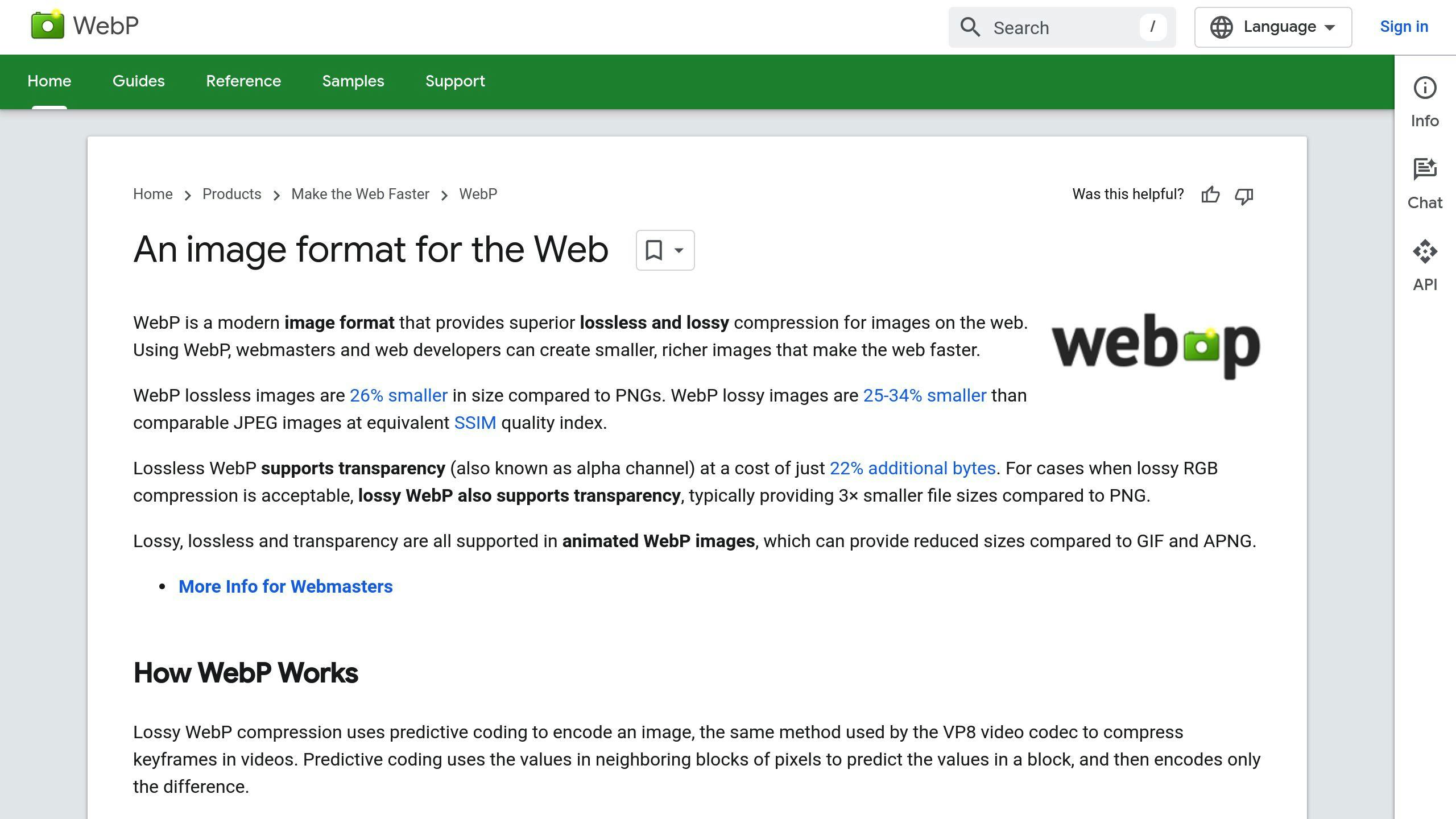
- Modern Formats: Use WebP (26-34% smaller than JPEG/PNG) or AVIF (even better compression for high-quality visuals).
- Optimization Techniques: Compress images without losing quality and use lazy loading (
loading="lazy") for faster page loads. - HTML Markup: Implement
<picture>andsrcsetto deliver the right image for every device. - Tools: Automate optimization with tools like Hoverify and use CDNs for faster delivery.
Quick Comparison of Image Formats
| Format | Compression Efficiency | Ideal Use Case | Browser Support |
|---|---|---|---|
| WebP | 26-34% smaller | Logos, illustrations | Excellent |
| AVIF | Superior compression | High-quality photos | Expanding |
| JPEG/PNG | Baseline | Legacy compatibility | Universal |
Optimizing images means better SEO, lower bounce rates, and happier users. Start with modern formats, lazy loading, and responsive HTML tags to stay ahead.
Responsive Images: Basics and Benefits
What Are Responsive Images?
Responsive images adjust automatically based on the user’s device, ensuring they look great and load efficiently. They solve the problem of unoptimized images by tailoring the size and quality to the screen, device, or network. This improves both user experience and site performance. The magic happens through specific HTML attributes that guide browsers to pick the best image version for the situation.
Here’s an example of how it works:
<picture>
    <source srcset="image-small.jpg" media="(max-width: 600px)">
    <source srcset="image-medium.jpg" media="(max-width: 1200px)">
    <img src="image-large.jpg" alt="Example Image">
</picture>
Key Techniques for Implementing Responsive Images
To get the best results, developers use a mix of methods when working with responsive images. Here’s a quick breakdown:
| Technique | What It Does | Why It Matters |
|---|---|---|
| Server-side Resizing | Creates multiple image versions | Reduces processing on the user’s device |
| Client-side Rendering | Loads the right image dynamically | Speeds up loading times |
| Breakpoint Management | Sets size thresholds for images | Keeps visuals consistent |
Why Responsive Images Boost Performance
Using the right image size reduces unnecessary data usage and speeds up loading times, which is especially important for mobile users. Modern formats like WebP and AVIF make this even better by offering smaller file sizes without sacrificing quality.
To implement responsive images effectively, focus on these three areas:
- Format Choice: Opt for modern formats like WebP or AVIF for better compression.
- Size Variations: Prepare multiple versions of each image for different screen sizes.
- HTML Markup: Use proper tags and attributes to enable responsive behavior.
Mastering these basics opens the door to more advanced tools and techniques for making responsive images easier to manage.
Make Your Site Lightning Fast With Responsive Images
Tools and Methods to Optimize Image Performance
To keep websites running smoothly, developers need to use updated tools and techniques for image optimization. Here’s a breakdown of strategies to ensure quick and efficient image delivery.
Modern Image Formats: WebP and AVIF

WebP and AVIF are leading the way in image compression, offering better performance than traditional formats like JPEG and PNG. Here’s a quick comparison:
| Format | Compression Efficiency | Ideal Use Case | Browser Support |
|---|---|---|---|
| WebP | 26-34% smaller than JPEG/PNG | Logos, illustrations, animations | Excellent |
| AVIF | Even better than WebP | High-quality photos | Expanding |
| JPEG/PNG | Baseline | Legacy compatibility | Universal |
Switching to these formats can significantly reduce image sizes without sacrificing quality, especially for modern browsers.
Using Lazy Loading to Improve Load Times
Lazy loading delays the loading of images until they are needed, speeding up page load times and saving bandwidth. The native loading="lazy" attribute is simple to implement and works well for most cases:
<img src="image.jpg" loading="lazy" alt="Description">
For more advanced scenarios, libraries like lazySizes can extend functionality, offering better browser compatibility and additional features.
How CDNs Enhance Image Delivery
Content Delivery Networks (CDNs) make image delivery faster by caching files at multiple locations worldwide. Many modern CDNs also provide features like automatic format conversion and adaptive delivery, tailoring image quality to the user’s device and connection speed. This reduces latency and ensures users always get the best experience.
Automating Image Optimization
Automation tools simplify the process of optimizing images. Tools like Hoverify can handle tasks like compression, format conversion, and creating responsive images. These tools analyze the image content and apply the best settings automatically, saving time and ensuring consistency.
For projects with high image volumes, automation is essential. It allows developers to focus on implementing responsive design principles while ensuring all images are optimized for performance and quality.
Best Practices for Using Responsive Images
Compressing Images Without Losing Quality
Reducing image file size is key to improving website performance. Modern compression methods can shrink files while keeping them visually intact. Here’s a quick breakdown:
| Image Type | Suggested Compression Method | Typical Size Reduction |
|---|---|---|
| Photographs | Lossy (e.g., JPEG, WebP) | 25-34% |
| Graphics/Logos | Lossless (e.g., PNG, WebP) | ~26% |
Once compressed, ensure the images are delivered efficiently using responsive techniques and proper HTML markup.
Using HTML Markup for Responsive Images
The <picture> tag and srcset attribute let browsers pick the most suitable image size and format for a user’s device. Here’s an example of how to use them:
<picture>
    <source
        srcset="image-large.webp 1200w,
                image-medium.webp 800w,
                image-small.webp 400w"
        type="image/webp"/>
    <img src="image-fallback.jpg" alt="Description"
        loading="lazy"
        width="800"
        height="600"/>
</picture>
Including width and height attributes is crucial as it helps avoid layout shifts during loading.
Examples of Websites Using Responsive Images Well
Top websites show how responsive images can significantly enhance user experience. For example:
- Google uses WebP along with lazy loading, cutting image payloads by up to 70%.
- Amazon optimizes its product images with responsive sizes and gradual loading, ensuring faster browsing.
These examples underline the importance of responsive image strategies for performance gains. Developers can achieve similar results by focusing on:
- Using modern formats like WebP with fallback options
- Setting up
srcsetandsizesattributes correctly - Testing on various devices and under different network conditions
- Tracking performance improvements with tools such as WebPageTest
Conclusion: Key Points for Developers
As progresses, responsive images continue to play a major role in improving web performance. By using modern formats and advanced tools, developers can achieve faster load times and save bandwidth, reshaping the way images are delivered online.
What’s Next for Responsive Images
Responsive images are heading into an exciting phase, with trends like:
- Tools that use real-time analysis to pick the best image formats and sizes based on user context.
- Improved compression methods that make formats like AVIF even more efficient.
- Machine learning helping to fine-tune image delivery to match specific user needs.
With WebP and AVIF now supported by almost all browsers, developers have reliable options for optimizing performance across different platforms.
Steps to Start Using Responsive Images
To effectively implement responsive images, follow these steps:
- Pick Modern Formats: Use WebP for everyday needs and AVIF for higher-quality visuals. Both offer excellent compression and compatibility.
- Leverage Essential Tools:
- Use CDNs to speed up image delivery.
- Enable lazy loading to reduce initial load times.
- Automate optimization processes to save time and effort.
- Monitor Key Metrics: Use tools like WebPageTest to track:
- Page load speeds
- Bandwidth usage
- User engagement
- Performance across devices
FAQs
Here are answers to some common questions developers often encounter about responsive images.
What image format works best for responsive design?
SVGs are ideal for scalable graphics, while WebP and AVIF are excellent choices for photos and detailed visuals. SVGs ensure sharp scaling at any resolution, while WebP and AVIF provide efficient compression for high-quality images.
Should images be lazy loaded?
Yes, lazy loading delays the loading of off-screen images, improving page load times. However, always define image dimensions to prevent layout shifts.
“If you can’t specify your images’ dimensions, lazy loading them can save network resources at the risk of these increased layout shifts. In most scenarios, images still lazy load if you don’t specify dimensions, but there are a few edge cases you should be aware of.”
Which is better: WebP or AVIF?
WebP is faster and has broader browser support, making it a safe choice for most use cases. AVIF, on the other hand, offers superior compression for high-quality visuals but isn’t as widely supported. Use WebP for compatibility and AVIF when compression efficiency is a priority.
