Here’s what you need to know about responsive design breakpoints in 2024:
- Breakpoints are CSS points where a website’s layout changes for different screen sizes
- Mobile-first design is crucial, with over 54% of web traffic from mobile devices
- Key breakpoint ranges:
- Mobile: Up to 576px
- Tablet: 577px - 768px
- Large Tablet: 769px - 1024px
- Desktop: 1025px - 1440px
- Large Desktop: 1441px+
Quick Comparison: Device Breakpoints
| Device | Width Range | Layout Focus |
|---|---|---|
| Mobile | Up to 576px | Single column, core content |
| Tablet | 577px - 1024px | Dual column, more features |
| Desktop | 1025px+ | Multi-column, full content |
Key takeaways:
- Use at least 3 breakpoints (mobile, tablet, desktop)
- Let your content guide breakpoint choices
- Test on real devices
- Use flexible units (rem, %) over fixed pixels
- Stay updated on new CSS features like container queries
Remember: Good responsive design isn’t just about looks - it builds trust. 94% of people find well-designed websites more trustworthy.
Basics of responsive design
Responsive design makes websites work on all devices. It’s about creating layouts that change based on screen size.
Main ideas
Responsive design is all about flexibility. Your website should look good and work well on any screen. Here’s what that means:
- Fluid grids that resize using percentages
- Flexible images that don’t break layouts
- CSS media queries for different device styles
How breakpoints work
Breakpoints are key to responsive design. They tell the browser when to change the layout.
Here’s a simple CSS example:
/* Mobile */
body {
    font-size: 16px;
}

/* Tablet */
@media (min-width: 768px) {
    body {
        font-size: 18px;
    }
}

/* Desktop */
@media (min-width: 1024px) {
    body {
        font-size: 20px;
    }
}
This code makes text bigger on larger screens. It’s easier to read that way.
Better user experience
Responsive design makes websites better for users. How? It:
- Makes content readable on any device
- Simplifies navigation for touchscreens
- Speeds up load times
Take the BBC News website. It uses responsive design like this:
| Device | Layout |
|---|---|
| Mobile | Single column, bigger touch targets |
| Desktop | Multi-column, more visible content |
This helps people find and read news fast, no matter what device they’re using.
Breakpoint basics
Breakpoints are the foundation of responsive design. They’re where your site’s layout shifts to fit different screens.
Breakpoint types
There are two main types:
- Device-based
- Content-based
Device-based breakpoints use common screen sizes:
| Device | Breakpoint |
|---|---|
| Mobile | Up to 500px |
| Tablet | 500px to 1200px |
| Laptop | 1200px to 1400px |
| Large monitors | 1400px and up |
Content-based? They’re set when your layout starts looking weird.
Using CSS media queries
Media queries are how we apply breakpoints. They let you change CSS based on screen size.
Here’s a basic one:
@media only screen and (min-width: 768px) {
    /* CSS for screens 768px and wider */
}
You can use max-width too:
@media only screen and (max-width: 600px) {
    /* CSS for screens up to 600px wide */
}
Want a range? Combine them:
@media only screen and (min-width: 600px) and (max-width: 900px) {
    /* CSS for screens between 600px and 900px */
}
Pro tip: Start with mobile-first. Design for small screens, then add styles for larger ones.
Important breakpoints for 2024
In 2024, responsive design breakpoints are still crucial for creating websites that work well on all devices. Here’s what you need to know:
Mobile breakpoints
Mobile devices dominate web traffic. Key breakpoints:
| Device Type | Width Range |
|---|---|
| Extra Small Mobile | 320px - 480px |
| Small Mobile | 481px - 600px |
For mobile, think:
- Single-column designs
- Big, easy-to-tap buttons
- Simple navigation (like hamburger menus)
Tablet and desktop breakpoints
As screens get bigger, you have more layout options:
| Device Type | Width Range |
|---|---|
| Small Tablets | 601px - 768px |
| Large Tablets | 769px - 1024px |
| Small Desktops/Laptops | 1025px - 1280px |
| Large Desktops | 1281px - 1440px |
| Extra-Large Desktops | 1441px and up |
For larger screens:
- Use multi-column layouts
- Show more content
- Include detailed navigation
New device challenges
2024 brings foldable phones and wearables. While exact breakpoints vary, consider:
- Layouts that adapt to changing screen orientations
- Designs for both small and large screens on foldables
- Simple interfaces for smartwatches
How to use breakpoints
Breakpoints are crucial for responsive design. Here’s how to use them:
CSS setup
Use media queries for breakpoints. For mobile-first:
/* Mobile base */
body { font-size: 16px; }

/* Tablet */
@media only screen and (min-width: 768px) {
    body { font-size: 18px; }
}

/* Desktop */
@media only screen and (min-width: 1024px) {
    body { font-size: 20px; }
}
This starts with mobile styles and builds up.
Mobile-first vs. desktop-first
| Approach | Pros | Cons |
|---|---|---|
| Mobile-first | Core content focus, Better mobile performance | Harder to add desktop features |
| Desktop-first | Complex designs, Easier for existing sites | Can bloat mobile experience |
Mobile-first is great for new projects. Desktop-first works for updating old sites.
Flexible units
Use em and rem for responsive designs:
em: Based on parent’s font sizerem: Based on root font size
Example:
html { font-size: 16px; }

.container {
    width: 90%;
    max-width: 1200px;
    margin: 0 auto;
}

h1 { font-size: 2rem; } /* 32px */
p {
    font-size: 1rem; /* 16px */
    line-height: 1.5;
}
.sidebar { font-size: 0.875em; } /* 14px, parent-relative */
These units help maintain consistent sizing and adapt to different screens.
Advanced breakpoint methods
Let’s look at some cool ways to make your responsive design even better in 2024:
Adjustable text size
Want text that changes size smoothly? Use CSS clamp():
h1 {
    font-size: clamp(1.5rem, 5vw, 3rem);
}
This makes your text size flexible, but not TOO big or small.
Container queries
These let you style based on a parent container’s size. Great for reusable components:
.card-container {
    container-type: inline-size;
}

@container (min-width: 400px) {
    .card {
        display: flex;
    }
}
Now your card layout changes when its container hits 400px, no matter the page width.
CSS Grid and Flexbox
These layout tools play nice with breakpoints:
CSS Grid:
.grid {
    display: grid;
    grid-template-columns: repeat(auto-fit, minmax(250px, 1fr));
    gap: 1rem;
}
This grid adjusts columns automatically as space changes.
Flexbox:
.nav {
    display: flex;
    flex-wrap: wrap;
}

@media (max-width: 768px) {
    .nav {
        flex-direction: column;
    }
}
Your nav menu goes from side-by-side to stacked on smaller screens.
Testing breakpoints
Want your site to look good on all devices? You need to test those breakpoints. Here’s how:
Testing tools
Chrome DevTools is your friend:
- Test on popular devices
- Try touch events
- Check slow 3G performance
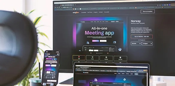
For a quick multi-device view with Frames and synchronization, try Hoverify Responsive Viewer. Just enter your URL.
Speed and efficiency
Fast loading is key. Here’s how:
-
Use Chrome’s Network panel Simulate slow connections to spot issues early.
-
Try PageSpeed Insights Get speed scores for mobile and desktop.
-
Optimize images Don’t make mobile users download huge images. Use
srcset:
<img
    srcset="small.jpg 320w, medium.jpg 800w, large.jpg 1200w"
    sizes="(max-width: 320px) 280px,
            (max-width: 800px) 440px,
            800px"
    src="large.jpg" alt="Responsive image"
/>
Usability for all
Accessibility matters. Check these:
- Keyboard navigation on all screens
- Readable text (16px minimum)
- Color contrast ratios
Real device testing beats emulators. Get your hands on some phones and tablets if you can.
Breakpoint best practices
Let’s look at how to use breakpoints effectively in 2024.
How many breakpoints to use
Use at least three breakpoints:
- Mobile (320px - 480px)
- Tablet (601px - 1024px)
- Desktop (1025px and up)
But don’t stop there. Tailor breakpoints to your content and audience. Building an app for stock traders? Add an extra-large desktop breakpoint (1441px+) for multiple charts and data feeds.
Focusing on content
Let your content guide your breakpoints:
- Start mobile-first: What’s essential on the smallest screen?
- Add breakpoints when needed: Expand the browser. When does your layout get awkward?
- Keep it readable: Aim for 16px minimum font size on mobile.
Content priorities across breakpoints:
| Breakpoint | Content Focus |
|---|---|
| Mobile | Core message, key CTAs |
| Tablet | More context, secondary features |
| Desktop | Full content, advanced interactions |
Keeping designs consistent
For a smooth user experience:
-
Use a design system: Reusable components that adapt across breakpoints.
-
Stick to your brand: Keep your logo, colors, and fonts consistent.
-
Build up gradually: Start basic on mobile, add features as screens grow.
The goal? A seamless experience. Users shouldn’t feel like they’re on different sites as they switch devices.
What’s next for breakpoints
2024 and beyond
Breakpoints are changing to keep up with web design trends. Mobile-first development is leading the charge, with over 50% of web traffic now coming from mobile devices.
Here’s what to watch for:
- Component-based breakpoints replacing viewport-based ones
- AI helping with responsive design
- New devices pushing flexible layouts
New CSS features
CSS is getting better at handling responsive designs:
- Container queries Style based on parent container size, not just viewport:
@container (min-width: 400px) {
    .card {
        display: flex;
    }
}
- Native CSS nesting Cleaner code for breakpoints:
.header {
    padding: 1rem;

    @media (min-width: 768px) {
        padding: 2rem;
    }
}
- Subgrid Better control over nested grids across breakpoints.
Preparing for new devices
Web designers need to think ahead:
| Device Type | Design Considerations |
|---|---|
| Foldable phones | Multiple screen states |
| AR/VR headsets | 3D layouts, gesture controls |
| Smart watches | Tiny screens |
| Large displays | Super high resolutions |
How to get ready:
- Use flexible units (rem, em, %) instead of pixels
- Test on lots of devices
- Use progressive enhancement
Ethan Marcotte, who came up with “responsive web design”, says:
“The web’s flexibility is a feature, not a bug.”
Conclusion
Responsive design breakpoints are still crucial in 2024. With mobile traffic dominating, designers must adapt to various screen sizes and user behaviors.
Here’s what you need to know:
- Mobile-first is the new norm (over 50% of web traffic)
- Focus breakpoints on content, not device sizes
- New CSS features like container queries offer more flexibility
- Thorough device testing is a must
What’s next for web designers?
- Use flexible units (rem, %) over fixed pixels
- Test on various devices, including foldables
- Stay updated on new CSS capabilities
- Prioritize performance across all breakpoints
| Device | Web Traffic % |
|---|---|
| Mobile | 54.46% |
| Desktop | 42.54% |
| Tablet | 3% |
Good design isn’t just about looks - it builds trust. In fact, 94% of people find well-designed websites more trustworthy.
What breakpoints should I use in 2024?
In 2024, your breakpoints should match your users’ devices and behaviors. Here’s a practical approach:
Start with these common breakpoints:
- Mobile: 480px
- Tablet: 768px
- Desktop: 1024px
- Large Desktop: 1280px
But don’t stop there. Check your site’s analytics. If most of your traffic is mobile, focus on those breakpoints first.
Here’s a quick reference for common breakpoints:
| Device Type | Breakpoint Range |
|---|---|
| Mobile | Up to 576px |
| Tablet | 577px - 1024px |
| Desktop | 1025px - 1440px |
| Large Desktop | 1441px and above |
Remember: These are just starting points. Your ideal breakpoints depend on your content and users.
Here’s the key: Use at least three breakpoints - mobile, tablet, and desktop. This covers the basics for most devices.
But here’s the thing: Don’t base breakpoints on specific devices. Instead, look at your content. If your layout looks off at a certain width, that’s where you need a breakpoint.
And don’t forget: Always test on real devices. Tools like Google’s Mobile-Friendly Test can help, but nothing beats seeing your site on actual screens.
