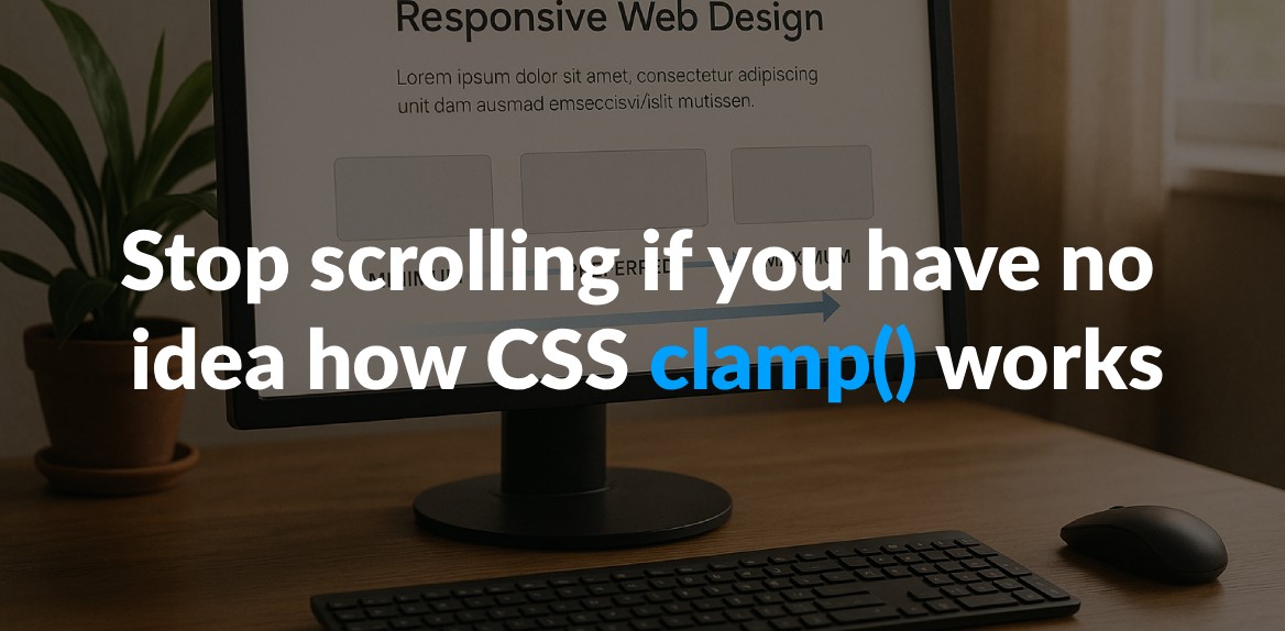
CSS clamp() is a simple yet powerful function that helps you set values with a minimum, preferred, and maximum range - all in one line of code. It’s perfect for creating fluid, responsive designs without relying on multiple media queries. Here’s why it matters:
- What it does: Dynamically adjusts values (like font sizes or padding) between a defined minimum and maximum based on your preferred value.
- How it works: Follows the formula
clamp(min, preferred, max)and ensures values stay within these boundaries. - Why use it: Simplifies your code, reduces media queries, and keeps designs flexible across screen sizes.
- Browser support: Over 90% of browsers, including Chrome, Firefox, Safari, and Edge, support it.
For example, font-size: clamp(1rem, 2vw, 2.5rem); makes text scale smoothly with screen size but never smaller than 1rem or larger than 2.5rem.
Key takeaway: Replace multiple breakpoints with clamp() for cleaner, responsive CSS. Just ensure you test for accessibility and include fallbacks for older browsers.
Why Use clamp() for Responsive Design?
CSS clamp() is a game-changer for responsive design. It simplifies code, reduces the need for multiple media queries, and makes interfaces more adaptable. By allowing you to set dynamic limits for CSS properties, clamp() ensures your designs scale fluidly across devices.
Reducing Media Query Code
Traditional responsive design often relies on numerous media queries to handle different screen sizes. This can quickly bloat your CSS files, making them harder to maintain. With clamp(), you can replace multiple breakpoints with a single line of code that adjusts automatically to screen size changes.
This streamlined approach not only reduces code complexity but also improves maintainability. Fewer media queries mean fewer chances for errors, leading to more consistent and reliable designs. In short, clamp() helps you write cleaner, more efficient CSS.
Building Flexible Interfaces
Beyond simplifying your code, clamp() enhances the adaptability of your designs. It allows you to create interfaces that respond fluidly to any screen size, rather than being tied to specific breakpoints. This ensures content remains legible and well-proportioned on all devices.
“By leveraging CSS clamp for responsive typography, we can create harmonious and visually pleasing designs that automatically adjust to different screen widths… With the power of CSS clamp, we can achieve typography that not only adapts seamlessly but also provides a consistent and engaging experience across various devices.” - Antematter
The magic of clamp() lies in its ability to scale smoothly between minimum and maximum values. This keeps text, spacing, and other elements proportional, maintaining a consistent visual hierarchy and intuitive navigation regardless of screen size.
Where clamp() Works Best
While clamp() can enhance many CSS properties, it truly excels in areas where fluid scaling is essential. Typography is a standout use case - elements like headings, hero text, and other prominent display items benefit greatly from its ability to adapt seamlessly between mobile and desktop sizes.
Other ideal applications include spacing properties like margin, padding, and gap, which directly affect layout density and visual balance. Additionally, layout constraints such as width, max-width, and container sizing work beautifully with clamp() to create responsive containers. This is particularly effective for card layouts, content sections, and navigation elements.
The key is to use clamp() for properties that influence user experience and visual hierarchy. Its smooth scaling ensures designs remain intuitive and visually cohesive.
“CSS clamp has become a game-changing solution for responsive design, offering versatility and ease of use that every developer should embrace.” - Antematter
Next, we’ll dive into practical examples to show how clamp() brings these benefits to life.
Practical Examples of Using clamp()
Let’s dive into some real-world uses of clamp() for creating fluid, responsive designs.
Dynamic Font Sizing
Typography is one of the best places to see clamp() in action. With just one line of CSS, you can make text scale beautifully across devices, from mobile screens to desktops.
Here’s an example for responsive body text:
body {
  font-size: clamp(0.8rem, 1vw, 1.2rem);
}
This setup ensures your text size is fluid, starting at 1vw (1% of the viewport width) but never dropping below 0.8rem or exceeding 1.2rem. By using rem for the minimum and maximum values, you also respect user accessibility settings, while the viewport unit keeps the scaling smooth.
For headings that need bolder scaling, this works well:
.text {
  font-size: clamp(1rem, 2vw, 2.5rem);
}
“With clamp, you’re essentially telling the browser: ‘Make this font no smaller than a minimum size and no larger than a maximum size. But between those sizes, adjust smoothly based on the viewport width.‘” - Adam Wright, Designer, Adam Wright Design
Typography isn’t the only area where clamp() shines - spacing is another.
Responsive Spacing
Good spacing is critical for clean, user-friendly designs. With clamp(), you can ditch rigid breakpoints and create seamless transitions that adjust naturally to any screen size.
Here’s how to apply fluid padding:
padding: clamp(16px, calc(10.667px + 1.667vw), 32px);
This code gives 16px of padding on smaller screens, scaling up to 32px on larger ones. The calc() function ensures smooth interpolation between the values as the viewport changes.
For more complex layouts, you can even create asymmetric spacing:
padding: clamp(16px, calc(10.667px + 1.667vw), 32px) clamp(8px, calc(0px + 2.5vw), 32px);
Want to support multi-language layouts? Logical properties like padding-inline and padding-block make it easy:
padding-inline: clamp(16px, calc(10.667px + 1.667vw), 32px);
padding-block: clamp(1.875rem, calc(1.648rem + 1.136vw), 2.5rem);
Fluid spacing also works wonders for grid layouts. Instead of fixed gaps, try this:
gap: clamp(1rem, calc(0.333rem + 3.333vw), 3rem);
This keeps grid gaps proportional, scaling from 1rem to 3rem depending on the viewport size.
Layout Constraints
Clamp() isn’t just for typography and spacing - it’s also perfect for setting flexible layout constraints. It ensures containers adapt intelligently, preventing designs from feeling too cramped or overly stretched.
For content containers that prioritize readability, use character-based units:
article {
  width: clamp(45ch, 50%, 75ch);
}
This keeps text width between 45 and 75 characters - the sweet spot for comfortable reading - while scaling with its parent container.
Hero images often need precise sizing for different devices. Here’s how to handle that:
img {
  width: clamp(800px, 100%, 1200px);
}
This ensures your image is never smaller than 800px or larger than 1200px, while filling its container whenever possible.
For page wrappers that maintain consistent layouts, try this:
.wrapper {
  width: clamp(16rem, 90vw, 70rem);
  margin-left: auto;
  margin-right: auto;
  padding-left: 1.5rem;
  padding-right: 1.5rem;
}
This creates a centered container that uses up to 90% of the viewport width on smaller screens (with a 16rem minimum) and caps at 70rem on larger ones. Auto margins center the wrapper, while padding keeps content from hugging the edges.
These examples show how clamp() can simplify and elevate your designs, solving common challenges with clean, flexible code.
Using Hoverify to Work with clamp()
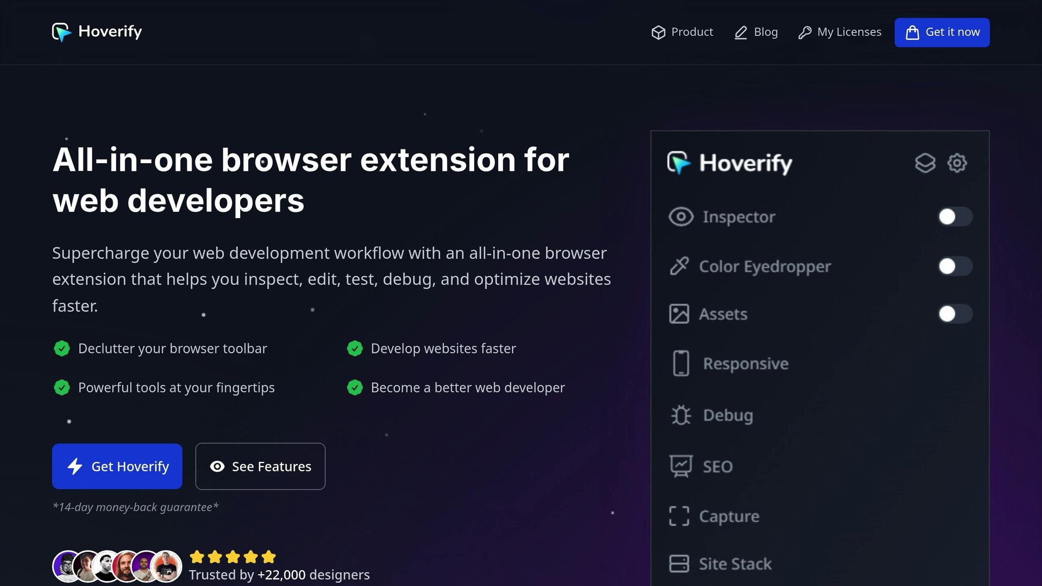
Hoverify brings a set of specialized tools to help you refine your responsive designs, especially when working with clamp(). While clamp() simplifies creating fluid and adaptable layouts, Hoverify makes testing and perfecting those dynamic values a breeze.
Testing clamp() Values Across Devices
Hoverify’s Responsive Viewer allows you to preview how your clamp() settings perform across various devices - all at the same time. No more manually resizing your browser window; now you can see how your typography and spacing adapt on phones, tablets, and desktops simultaneously.
With synchronized interactions, actions like scrolling or clicking on one device preview automatically update across all others. This feature makes it easy to catch inconsistencies in your clamp() values without repeating the same actions for each viewport.
Hoverify also supports custom device profiles, enabling you to test your designs on screen sizes that are most relevant to your users. Even if you need to simulate viewports larger than your physical screen, Hoverify has you covered.
Real-Time Editing and Testing
Hoverify’s Inspector tool simplifies tweaking clamp() values. Just hover over any element to view its current styles, including any clamp() declarations. The Visual Editor then lets you adjust these values in real time - no need to open developer tools.
This live editing feature is especially handy when fine-tuning the minimum, preferred, and maximum values of clamp(). As you make adjustments, you can instantly see the results across all device previews. Plus, syntax highlighting makes it easier to work with even the most complex clamp() expressions.
The Inspector works seamlessly across different screen sizes and animations, so you can observe how clamp() behaves during transitions and at various breakpoints. Once you’ve nailed the perfect values, you can easily copy or export your component to CodePen, making it simple to document or share with your team.
Hoverify goes beyond real-time editing, offering tools that enhance every aspect of responsive CSS design.
Other Hoverify Features for Responsive CSS
In addition to its clamp() tools, Hoverify includes features that simplify responsive design workflows. The Color Eyedropper ensures consistency in your color schemes, while the Font Viewer lets you see which fonts are being used at different sizes - helpful when clamp() affects font rendering.
For layouts involving responsive images, the Assets extraction tool allows you to quickly grab media files like images and SVGs to test how they interact with your fluid designs.
The Custom Code injection feature is another game-changer. It lets you inject CSS directly into any page, so you can experiment with different clamp() approaches and instantly see how they improve an existing site’s responsiveness.
Hoverify has earned the trust of developers for its efficiency and flexibility. With real-time editing, multi-device testing, and a suite of inspection tools, it’s an excellent choice for developers looking to master clamp() and other modern CSS techniques.
Best Practices and Common Mistakes
Mastering clamp() involves understanding its nuances, avoiding common errors, and applying proven strategies to create designs that are both reliable and accessible.
Choosing the Right Values
To make the most of clamp(), it’s essential to carefully select the minimum, preferred, and maximum values. A key rule of thumb is to use relative units like rem instead of fixed units such as pixels. This ensures your designs remain flexible and respect user browser settings, including accessibility preferences.
For instance, when styling headings, opt for larger ranges between the minimum and maximum values. A good example for h2 elements might be a range from 2rem to 2.75rem (32px to 44px). For body text, a more subtle range like 1.125rem to 1.5rem (18px to 24px) works well.
“The preferred value is the expression whose value will be used as long as the result is between the minimum and maximum values.”
To avoid issues, stick to straightforward formulas for the preferred value. If you want multiple elements to scale proportionally, adjust their preferred values to maintain visual harmony across screen sizes.
Now let’s look at common mistakes to steer clear of when using clamp().
Avoiding Overuse and Extreme Values
To achieve consistent and accessible designs, avoid these common pitfalls when applying clamp():
- Overusing viewport units: While
vwunits can be useful, relying on them too heavily or creating extreme ranges can result in inconsistent designs. - Extreme value ranges: Setting overly wide ranges can disrupt the user experience, especially at different screen sizes or zoom levels.
Testing is crucial. Always check how your fluid typography behaves at various zoom levels to ensure compliance with accessibility standards. Accessibility expert Adrian Roselli emphasizes the importance of this step:
“When you use
vwunits or limit how large text can get withclamp(), there is a chance a user may be unable to scale the text to 200% of its original size. If that happens, it is WCAG failure under 1.4.4 Resize text (AA) so be certain to test the results with zoom.”
Reserve fluid typography for key elements like headings, hero text, and other prominent content where the scaling difference adds noticeable value. Avoid applying clamp() to every text element on the page - strategic use yields better results.
Fallback Strategies for Older Browsers
Although clamp() is widely supported in modern browsers, providing fallbacks for older browsers is a smart move. One simple approach is to define a fixed size as a default before your clamp() declaration:
.heading {
  font-size: 2rem; /* Fallback for older browsers */
  font-size: clamp(1.5rem, 4vw, 3rem);
}
This ensures that older browsers display a reasonable fixed size, while modern browsers benefit from fluid scaling. Remember, clamp() can be applied to any CSS property that accepts length, frequency, angle, time, percentage, number, or integer values.
When setting fallbacks, choose values that balance well across your target screen sizes. Test these fallbacks thoroughly to confirm consistent performance, even on outdated browser versions.
Conclusion: Getting Started with CSS clamp()
CSS clamp() is a game-changer for responsive design, simplifying the process by reducing the need for multiple media queries and enabling interfaces to adapt seamlessly. With 96% browser support, there’s no better time to start using it.
A great way to begin is by swapping out static font-size media queries for clamp(). Once you’re comfortable, expand its use to other properties like padding, margins, and container widths. Typography is an especially good place to experiment with clamp() and see its benefits in action.
Here’s an example of a card component that uses clamp() across various properties:
.card {
  /* Responsive width */
  width: clamp(280px, 60vw, 600px);

  /* Responsive padding */
  padding: clamp(1rem, 0.5rem + 2vw, 3rem);

  /* Responsive border radius */
  border-radius: clamp(0.25rem, 0.5vw, 1rem);
}

.card h2 {
  /* Responsive heading */
  font-size: clamp(20px, 16px + 1.5vw, 32px);
  margin-bottom: clamp(0.5rem, 0.3rem + 0.5vw, 1.5rem);
}

.card p {
  /* Responsive text */
  font-size: clamp(16px, 14px + 0.5vw, 18px);
  line-height: 1.5;
}
This example showcases how a card component can scale fluidly with the viewport - all without relying on media queries.
To streamline your work with clamp(), tools like Hoverify can make a big difference. Hoverify’s Inspector tool lets you tweak CSS properties in real-time, testing how your clamp values behave across various screen sizes. The Responsive Viewer feature allows you to preview multiple device sizes side by side, making it easy to fine-tune your minimum, preferred, and maximum values. Once you’ve nailed the perfect responsive behavior, you can even export your components directly to CodePen.
If math isn’t your strong suit, clamp generators can help simplify the process, allowing you to calculate optimal values quickly. Start small - choose one element in your project, replace its static sizing with a clamp() function, and watch how it adjusts effortlessly to different screen sizes.
Don’t forget to test fluid typography with zoom functionality to ensure your design meets WCAG accessibility guidelines. With 86.3% of home pages failing contrast standards according to WebAIM, using clamp() thoughtfully can contribute to better accessibility by maintaining consistent, readable sizing across devices.
CSS clamp() isn’t just a tool for responsive design - it’s a step toward more elegant, maintainable, and accessible web development.
FAQs
How does the CSS clamp() function make web designs more responsive compared to using media queries?
The CSS clamp() function is a handy tool for creating responsive designs. It allows you to set a property - like font size or spacing - with a flexible range that adjusts dynamically based on the viewport size. With clamp(), you can define a minimum value, an ideal value, and a maximum value, ensuring that your design stays within these limits while adapting fluidly.
What sets clamp() apart from traditional media queries is its ability to provide smooth transitions without relying on specific breakpoints. This means layouts can adjust naturally across different screen sizes, reducing the need for extra code. The result? A cleaner, easier-to-maintain stylesheet and a more consistent user experience across devices.
How do I choose the minimum, preferred, and maximum values when using the CSS clamp() function?
When working with the CSS clamp() function, keep these tips in mind to create designs that are both flexible and user-friendly:
- Minimum value: Use this to stop elements from becoming too small. For example, setting a font size to
1.5remensures text remains readable and accessible. - Preferred value: Opt for a dynamic value, like one based on viewport units (
vw), to allow the element to scale naturally with the screen size. - Maximum value: Set an upper limit to prevent elements from growing too large. For instance, a maximum of
2remcan maintain readability and keep your layout intact.
Thoughtfully choosing these values helps your design adapt smoothly across different devices while staying visually appealing and functional.
How can I use CSS clamp() while ensuring accessibility and compliance with WCAG guidelines?
To make sure your use of CSS clamp() stays accessible and aligns with WCAG guidelines, avoid setting font sizes in a way that blocks users from resizing text. This is especially crucial for people with visual impairments who depend on adjustable text for better readability.
A good rule of thumb is to keep the maximum font size no more than 2.5 times the minimum size to ensure proper scalability. Also, take the time to test your designs on different devices to verify that text remains clear, resizable, and easy to read. While you’re at it, pay attention to details like color contrast and spacing to further improve usability.
