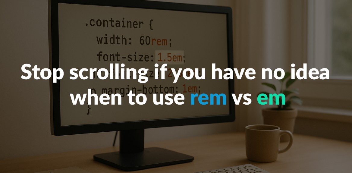
Confused about rem vs em in CSS? Here’s the simple breakdown:
- rem: Always relative to the root element’s font size (
<html>). Ideal for consistent, predictable layouts and global styles. - em: Relative to the parent element’s font size. Best for scaling components based on their parent context.
Quick takeaway: Use rem for global, uniform sizing (like typography and spacing). Use em for local, component-specific adjustments.
Key Differences
| Feature | rem Units | em Units |
|---|---|---|
| Reference Point | Root element (<html>) font size | Parent element font size |
| Behavior | Predictable, consistent | Scales with nesting |
| Best Use Cases | Global styles, typography, layouts | Component-specific scaling |
For smoother workflows, tools like Hoverify can help inspect and fine-tune rem and em values in real time. Start by using rem for base styles and em for flexible components, and watch your designs scale effortlessly.
How rem and em Units Work
Understanding how rem and em units calculate their sizes is key to using them effectively in CSS. Each unit relies on a different reference point, which influences how they behave in your layouts.
How rem Works
The rem unit is always based on the font size of the root element, which is typically the <html> tag in HTML. Most browsers set the default root font size to 16 pixels, meaning 1rem equals 16px unless you modify it. Here’s an example:
html {
  font-size: 16px; /* Default in most browsers */
}
h1 {
  font-size: 2rem; /* 2 * 16px = 32px */
}
p {
  font-size: 1rem; /* 1 * 16px = 16px */
  padding: 1.5rem; /* 1.5 * 16px = 24px */
}
What makes rem units so useful is their consistency - 2rem always equals 32px (assuming a 16px root font size), no matter where the element is in the DOM. This predictability is especially helpful for maintaining uniform typography and spacing across your site. Plus, rem units automatically adapt to users’ browser font settings, improving accessibility.
“Equal to the computed value of
font-sizeon the root element. When specified on thefont-sizeproperty of the root element, the rem units refer to the property’s initial value.” - W3C
Next, let’s see how em units differ.
How em Works
The em unit calculates its size relative to the font size of its parent element. For font-related properties, 1em equals the computed font size of the parent. For other properties, like padding or margins, it references the element’s own font size.
“In CSS, an em unit is equal to the computed
font-sizefor the element to which the em is applied.” - Louis Lazaris
For example, if an element has font-size: 20px, then 1em on that element or its children equals 20px. This means border-radius: 0.5em translates to 10px, and padding: 2em becomes 40px. If no specific font size is defined, the em unit defaults to the browser’s base font size (usually 16px).
Main Differences Between rem and em
The key difference lies in their reference points. Rem units always reference the root element’s font size, making them ideal for consistent layout sizing and spacing throughout your document.
On the other hand, em units adjust based on their parent element’s font size, offering more flexibility in localized contexts. However, this flexibility can lead to unintended scaling effects in nested elements. For instance, if a parent has font-size: 20px and a child uses font-size: 2em, the child’s font size becomes 40px. If a grandchild also uses font-size: 2em, it scales to 80px, potentially leading to unexpected results.
When to Use rem Units
Rem units shine when consistency and accessibility are top priorities. Knowing when to use rem over other units can turn your CSS from unreliable into a dependable foundation.
Global Font Sizing and Accessibility
Rem units are a key tool for creating accessible websites that honor user preferences. They scale automatically based on the browser’s default font size, which many users adjust to suit their needs.
The Web Content Accessibility Guidelines (WCAG 2.2 SC 1.4.4) specify that text must be resizable up to 200% without assistive technology. Rem units make meeting this requirement straightforward, as they naturally adapt to user-defined font settings.
Here’s an example:
html {
  font-size: 16px; /* Default size, adjustable by the user */
}

h1 {
  font-size: 2rem; /* Scales to 2x the user's preferred size */
}

p {
  font-size: 1rem; /* Matches the user's chosen reading size */
}

button {
  font-size: 1.125rem; /* A bit larger but still user-scalable */
  padding: 0.75rem 1.5rem; /* Padding also scales proportionally */
}
For instance, if a user increases their browser’s font size from 16px to 20px, a 2rem heading will scale from 32px to 40px. This keeps the visual hierarchy intact while accommodating user needs.
Beyond typography, rem units are also invaluable for creating a consistent spacing system.
Consistent Spacing and Layout Design
Rem units are excellent for building predictable spacing systems that scale uniformly across your site. Using rem for margins, padding, and layout dimensions ensures your design stays proportional, regardless of screen size or user settings.
Here’s how you can use rem to create a consistent spacing system:
:root {
  font-size: 16px;
}

/* Unified spacing scale */
.card {
  padding: 1.5rem; /* 24px */
  margin-bottom: 2rem; /* 32px */
  border-radius: 0.5rem; /* 8px */
}

.section {
  margin-bottom: 4rem; /* 64px */
  padding: 2rem 1rem; /* 32px 16px */
}

.button {
  padding: 0.75rem 1.5rem; /* 12px 24px */
  margin-top: 1rem; /* 16px */
}
Using rem units can also minimize Cumulative Layout Shift (CLS) during page loads. This allows browsers to allocate space more accurately before content fully loads, resulting in a smoother user experience.
For responsive designs, rem units simplify media queries. Instead of recalculating pixel values for various breakpoints, you can adjust the root font size and let everything scale proportionally:
/* Mobile-first design */
html {
  font-size: 14px;
}

/* For tablets and larger screens */
@media (min-width: 768px) {
  html {
    font-size: 16px; /* Scales everything proportionally */
  }
}

/* For desktops and larger screens */
@media (min-width: 1024px) {
  html {
    font-size: 18px; /* Further proportional scaling */
  }
}
Using Hoverify for rem-based Designs

To make the most of rem-based layouts, Hoverify is a handy tool that simplifies calculations and fine-tuning. With Hoverify, you can visually inspect and adjust rem-based styles directly in the browser.
Hoverify’s real-time editing feature lets you see how changes to rem values impact your layout instantly. For instance, you can hover over an element to view its rem-based styles, with computed pixel values displayed alongside. This helps clarify the relationship between rem units and their rendered sizes.
Additionally, Hoverify’s Responsive Viewer lets you preview your site across multiple devices at once. This ensures that rem-based elements scale consistently on different screens. Its Custom Code feature even allows you to test various root font sizes on the fly, helping you catch and fix issues before deployment.
When to Use em Units
While rem units are ideal for maintaining consistency across a design, em units are perfect for situations where you need elements to scale based on their parent container. They’re particularly useful for creating flexible components that adapt smoothly while preserving their design proportions.
Scaling Components Relative to Parent Context
Em units are particularly effective for modular components because they scale in direct relation to their parent’s font size. This ensures that all elements within a component maintain a harmonious visual balance.
Here’s an example of how em units work in practice:
.card {
  font-size: 18px; /* Base font size for the parent */
}

.card-title {
  font-size: 1.5em; /* 27px */
  margin-bottom: 0.5em; /* Scales with the title size */
}

.card-content {
  font-size: 1em; /* Matches the parent's font size */
  padding: 1em 1.5em; /* Padding scales proportionally */
  line-height: 1.4em; /* Maintains proportional spacing */
}

.card-button {
  font-size: 0.9em; /* Slightly smaller than the parent */
  padding: 0.75em 1.25em; /* Scales with the button text */
}
By setting a base font size on the parent (e.g., .card), all child elements scale proportionally. For instance, increasing the .card font size from 18px to 24px will automatically adjust the size of all nested elements, ensuring the design remains balanced.
You can also combine this approach with media queries to make components responsive. Adjusting the parent’s font size dynamically scales all nested elements:
.testimonial {
  font-size: 16px;
}

.testimonial-quote {
  font-size: 1.25em; /* 20px */
  padding: 1.5em;    /* 24px */
  margin: 1em 0;     /* 16px top/bottom */
}

/* Mobile adjustment */
@media (max-width: 768px) {
  .testimonial {
    font-size: 14px; /* Scales down all nested elements */
  }
}
This method simplifies responsive adjustments since a single change to the parent cascades through all child components.
Common Problems with em Units and How to Fix Them
While em units are incredibly versatile, they can sometimes cause issues in nested structures. When em values are applied repeatedly in nested elements, the scaling can multiply, leading to unexpectedly large or small text sizes. For example:
/* Nested scaling issue */
.article {
  font-size: 18px;
}

.article-section {
  font-size: 1.2em; /* 21.6px */
}

.article-subsection {
  font-size: 1.2em; /* 25.92px */
}

.article-paragraph {
  font-size: 1.1em; /* 28.512px */
}
To avoid this, you can mix rem and em units strategically. Use rem for font sizes to establish a consistent base and em for margins, padding, or other properties that benefit from local scaling:
.article {
  font-size: 18px;
}

.article-section {
  font-size: 1.2rem; /* Consistent base size */
  margin-bottom: 1.5em; /* Scales with the section text */
  padding: 1em; /* Proportional padding */
}

.article-subsection {
  font-size: 1.1rem; /* Fixed base size for subsections */
  margin-bottom: 1em; /* Proportional spacing */
}
By keeping font sizes consistent with rem and using em for spacing, you can prevent unexpected scaling while maintaining flexibility. Additionally, avoid deep nesting to simplify calculations and minimize performance issues.
Visualizing em Relationships with Hoverify
To address scaling challenges, Hoverify provides tools to inspect and understand how em values cascade through your components. With its Inspector feature, you can hover over elements to see both the em value and its computed pixel equivalent, making it easier to debug and fine-tune your CSS.
Hoverify also offers a Custom Code feature that lets you test different em values in real-time. This allows you to experiment with adjustments and instantly see their effects on your design.
Another valuable tool is the Responsive Viewer, which lets you preview how em-based components behave across various screen sizes. By examining multiple viewports simultaneously, you can catch scaling issues like excessive padding or margins before they make it into production.
Finally, Hoverify’s search functionality allows you to locate elements by class or ID and inspect their computed styles. This is especially helpful when dealing with complex, nested structures where em calculations might behave unpredictably. Together, these tools make managing em-based designs far more intuitive and efficient.
rem vs em: How to Choose
Use rem for consistency and em for flexibility. Most successful designs incorporate both units strategically, leveraging their strengths instead of relying on just one.
After understanding how these units work, apply these practical guidelines to make the right choice.
Comparison Table: rem vs em
| Feature | rem Units | em Units |
|---|---|---|
| Reference Point | Root element (<html>) font size | Parent element font size |
| Predictability | Highly predictable and consistent across the document | Less predictable due to parent inheritance |
| Nesting Behavior | Uniform size, unaffected by nesting | Scales with nesting, leading to cumulative effects |
| Flexibility | Stable and predictable, but less adaptable | Allows designs to adjust based on context |
| Maintenance | Easy – root size changes cascade uniformly | Can be more complex with nested elements |
| Best Use Cases | Global sizing, layouts, and base typography | Component-specific scaling and modular design |
| Accessibility | Ensures uniformity and consistency | Adapts to user preferences for scaling |
| Complexity | Lower complexity due to consistency | Higher complexity due to contextual sizing |
These distinctions can guide your decisions in real-world design scenarios.
Simple Rules for Choosing the Right Unit
To decide which unit to use, keep these tips in mind:
- Use rem for global elements like base font sizes and layout spacing. Since rem scales uniformly from the root element, it ensures a consistent visual hierarchy across the site, regardless of nesting.
- Use em for components that need contextual scaling. It’s ideal for elements like button padding, card spacing, or other design elements that should scale based on their parent container.
- Apply the global vs. local principle. Use rem for site-wide elements like typography scales or grid systems. For container-specific adjustments - like icon sizes relative to text or padding that adapts to content - em works better.
- Factor in your team’s expertise. Rem is easier to handle due to its predictable behavior, making it a safer choice for teams with mixed experience levels. Em, on the other hand, requires a deeper understanding of inheritance and scaling.
- Think about long-term maintenance. For projects requiring frequent updates or collaboration, rem’s consistency allows you to adjust the entire site’s scale by simply changing the root font size.
Using Hoverify to Test and Debug
Once you’ve chosen your units, test your decisions with Hoverify. This tool simplifies the process of analyzing how rem and em behave in your designs, offering real-time insights.
- The Inspector feature helps you see how each unit functions within your layout, letting you fine-tune them as needed.
- The Responsive Viewer is especially useful for testing how your rem and em choices scale across different screen sizes. It highlights issues like oversized text on mobile or uneven spacing across viewports.
- With the Custom Code feature, you can experiment by switching between rem and em values and instantly see the results. This allows you to refine your CSS before finalizing it.
- Finally, the search functionality helps you locate elements by their unit type, ensuring consistent design across your project.
Conclusion: Using rem and em for Better Design
Understanding rem and em units is a game-changer for crafting modern, responsive CSS designs. These relative units give you the tools to create layouts that adapt effortlessly to user preferences and various screen sizes, ensuring a smoother experience for everyone.
Here’s a quick breakdown: rem is all about consistency, while em offers adaptability. By using rem for global elements like typography and layout spacing, you maintain uniformity throughout your site. Meanwhile, em works best for scaling components in context, making your designs more dynamic and responsive.
Most modern browsers set the root font size to 16px by default, meaning 1rem equals 16px. This default setup allows users to adjust browser settings, enabling your design to scale appropriately. Plus, the WCAG 2.1 guidelines recommend that text should be resizable up to 200% without losing functionality. Using relative units like rem and em helps you meet this requirement naturally, making accessibility a built-in feature of your design.
If you’re looking for practical ways to experiment with these units, Hoverify makes it easy. Its Inspector tool lets you tweak rem and em values in real time, while the Responsive Viewer shows how these units behave across devices. This hands-on approach helps you identify and fix scaling issues before they affect your users.
“As a website developer, this plugin has so many handy features. One of my favorites is the ability to quickly take full page screenshots very easily, and the inspector tool and color selectors I use very often.” - Terri Tutich
To get started, try converting a few pixel-based values to rem or em and test your design at 150% and 200% scaling using Hoverify’s Custom Code feature.
FAQs
How do rem and em units improve website accessibility?
Using rem and em units in CSS can make your website easier to read and more user-friendly. These units allow text sizes to adjust based on a user’s browser or device settings, which is especially helpful for those with visual impairments or specific accessibility needs.
Unlike fixed sizes like pixels, relative units like rem and em let your design adapt and scale smoothly. This approach not only improves responsiveness but also ensures your content is more inclusive for a broader range of users.
Can using em units in nested elements cause layout issues, and how can you prevent them?
Using em units in deeply nested elements can sometimes cause scaling issues. Since sizes are inherited from parent elements, they can compound, leading to layouts that are either inconsistent or unexpectedly large.
To address this, you can reset font sizes at each nesting level to stop the compounding effect. Another option is to switch to rem units, which are tied to the root font size instead of parent elements. This approach provides more consistent and predictable sizing, particularly for intricate layouts.
When should I use rem vs. em in responsive web design?
When it comes to setting sizes in CSS, using rem and em strategically can make your designs both consistent and flexible.
Use rem for global sizing, like defining font sizes across your site. Since rem is tied to the root element’s font size, it ensures consistency no matter how deeply elements are nested. This makes it perfect for maintaining uniformity in your overall design.
On the other hand, em works well for component-specific adjustments, such as padding or margins. Because em scales relative to its parent element’s font size, it’s great for creating flexible and nested designs that adapt naturally to their context.
A smart way to approach this is to combine the two: rely on rem for predictable, site-wide styles and use em for fine-tuning localized elements. This balance helps you build designs that are both responsive and accessible.
