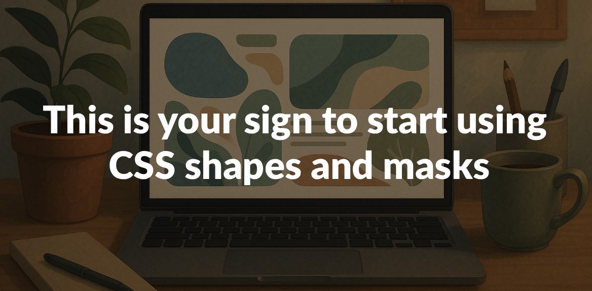
CSS shapes and masks are changing how we approach web design. They let you move beyond boring rectangular layouts and create dynamic visuals that stand out. With tools like clip-path and mask-image, you can design custom shapes, smooth transitions, and eye-catching effects - all with just CSS. Plus, they’re faster and more efficient than older methods like PNGs or SVGs.
Why use CSS shapes and masks?
- Better text flow: Shapes like circles, polygons, or custom paths let text wrap around elements in creative ways.
- Advanced visual effects: Masks allow for smooth fades, cut-outs, and layered designs.
- Performance: CSS reduces server requests compared to image-heavy solutions.
- Accessibility: Proper use ensures designs remain readable for all users.
Key techniques:
clip-path: Defines visible areas with geometric or custom shapes.mask-image: Uses gradients, images, or SVGs to control what’s shown or hidden.- Combining layers: Multiple masks can create complex, layered effects.
By mastering these tools, you can create layouts that are visually striking, user-friendly, and optimized for modern web standards. Ready to break free from rectangles? Let’s dive in.
Understanding CSS Shapes and Masks
CSS shapes and masks push web design beyond the standard rectangular layouts, offering creative ways to display content. Before diving into how they’re applied, it’s important to grasp how these two techniques work. While they operate differently, they complement each other beautifully to create designs that stand out.
What Are CSS Shapes?
CSS shapes let you control how text wraps around elements, moving beyond the typical rectangular flow. Instead, you can define custom boundaries for the text to follow. As Brian Treese puts it:
“When you use CSS Shapes, you are actually controlling how inline content flows around a defined shape.”
This is achieved using properties like shape-outside, clip-path, and mask. These tools allow you to create shapes using geometric forms (like circles, ellipses, and polygons), box values (such as border-box or content-box), or even images with alpha channels. For example, text can curve naturally around an image’s silhouette.
To fine-tune the effect with image-based shapes, the shape-image-threshold property lets you set how much transparency is needed. A value of 0.0 means fully transparent areas, while 1.0 requires full opacity to define the shape.
What Are CSS Masks?
CSS masks, on the other hand, work by selectively hiding or revealing parts of an element. They use mask images to filter what’s visible, relying on gradients, images, or SVGs as the source. The mask determines which parts of the element are displayed based on transparency.
With alpha masks, the visible areas of the element match the opaque parts of the mask, while transparent parts are hidden. Luminance masks, however, use brightness levels - the lighter areas reveal the element, and darker areas hide it.
Key properties for CSS masks include mask-image, mask-mode, mask-position, mask-size, mask-repeat, and more. These can all be combined using the shorthand mask property. Rachel Andrew explains the flexibility of this approach:
“CSS masking gives you the option of using an image as a mask layer. This means that you can use an image, an SVG, or a gradient as your mask, to create interesting effects without an image editor.”
With these techniques defined, let’s explore how they differ and when to use each.
Key Differences Between Masking and Clipping
Your choice between clipping and masking depends on the design effect you need. Here’s how they compare:
-
Clipping acts like a shape cutter - it defines a precise boundary that hides everything outside the outline. It’s great for simple geometric shapes but doesn’t support visual details like gradients or strokes. As explained:
“Clipping involves defining a closed vector path, shape, or polygon as a clipping path. Everything inside the clipping path region remains visible while everything outside is hidden, or ‘clipped out’.”
-
Masking is more like a filter. It reveals parts of an element based on transparency, color, or brightness, making it ideal for nuanced effects with smooth transitions. As Guus simplifies:
“I believe the simple difference between masks and clipPaths is this; one cuts out shapes, the other cuts out shades of grey.”
Masks can achieve everything clipping can, but they’re more versatile and resource-intensive.
| Technique | Best For | Limitations | Performance |
|---|---|---|---|
| Clipping | Clean geometric shapes, sharp cutouts | No gradients or strokes | Faster for basic shapes |
| Masking | Complex effects with smooth transitions | Higher processing demand | Slower but more flexible |
For sharp, clean boundaries, clipping is the go-to option. If you’re aiming for more intricate effects with gradual transparency, masking offers the creative flexibility you need, even if it comes with a slight performance trade-off.
The Benefits of Using CSS Shapes and Masks
CSS shapes and masks bring a fresh perspective to web design, offering creative possibilities that go beyond the limitations of standard rectangular layouts. Not only do they enhance the way users interact with your content, but they also provide technical advantages that make them a smart choice for modern web development.
Better Visual Appeal
CSS shapes and masks allow designers to achieve a level of precision and depth that basic styling tools can’t match. While properties like border-radius and box-shadow are useful, they only scratch the surface of what’s possible. Shapes and masks, on the other hand, let you create intricate geometric designs that truly grab attention.
Take MasterClass, for example. They use CSS masking with linear gradients to seamlessly blend images into their page backgrounds. This approach creates smooth transitions that naturally guide users’ eyes to key elements like call-to-action buttons or important text. It’s not just about aesthetics - it also ensures strong color contrast for better readability.
Another big plus? These techniques can replace complex SVG assets, which helps reduce page load times while delivering scalable, responsive effects that look great on any device. With pure CSS, you can achieve sleek designs without adding extra weight to your site.
CSS masking also shines when it comes to interactive elements. Designers can create hover effects where content appears or disappears dynamically, or even design shapes that transform based on user input. These features make for a more engaging and intuitive browsing experience.
Better User Experience
The impact of CSS shapes and masks on user experience is hard to ignore. Visual appeal plays a huge role in keeping users engaged, and unattractive layouts can drive people away. By using these techniques, you can create designs that not only look great but also improve usability.
For instance, LambdaTest introduced CSS masking in mid-2023 to hide content sections behind “Read More” buttons. This approach limited the amount of information visible at first glance, making it easier for users to navigate their site.
Similarly, The Atlantic uses CSS masking to fade out parts of its web pages for non-subscribers. This technique creates a clear visual distinction, drawing attention to premium content while maintaining an elegant and professional design.
CSS masking also enhances accessibility. By highlighting specific products or sections of an image during user interactions, designers can help users focus on what’s important without overwhelming them with too much visual clutter.
Flexibility and Performance Compared to Other Methods
Beyond aesthetics and usability, CSS shapes and masks excel in flexibility and performance, outperforming many traditional layout methods.
| Technique | Flexibility | Performance | Browser Support | Maintenance |
|---|---|---|---|---|
| CSS Shapes & Masks | High – geometric precision, custom effects | Fast – browser-native rendering | Modern browsers (95%+) | Low – pure CSS code |
| Image Slicing | Low – fixed designs only | Slow – multiple HTTP requests | Universal | High – multiple files to manage |
| SVG Assets | Medium – scalable but complex | Medium – additional file downloads | Good | Medium – separate files to maintain |
| JavaScript Libraries | High – but resource-intensive | Slow – runtime processing | Variable | High – dependency management |
Unlike image slicing, which requires multiple file downloads, CSS masking leverages browser-native rendering for faster performance and fewer server requests. This not only improves load times but also ensures effects remain scalable across devices without adding extra bandwidth costs.
Another standout feature is the geometric precision of CSS shapes and masks. They let you create circles, hexagons, and other non-rectangular shapes directly in CSS, eliminating the need for external tools like Photoshop to crop images. This streamlines the design process and reduces the reliance on graphic design software.
CSS shapes and masks are also a natural fit for responsive design. Unlike fixed image assets, they automatically adapt to varying screen sizes and resolutions, maintaining their visual integrity across devices. This adaptability simplifies maintenance by eliminating the need for multiple versions of the same asset.
To get the best results, make sure to optimize your images and SVGs to keep file sizes small. Use CSS shapes and masks thoughtfully to avoid performance issues, and always test your designs across different browsers to ensure they work as intended.
How to Implement CSS Shapes and Masks
Now that we’ve explored the design possibilities, let’s dive into how to use CSS shapes and masks to create visually striking layouts. While these techniques might seem a bit tricky at first glance, they’re actually quite approachable once you understand the basics. With just a few lines of code, you can achieve some stunning effects.
Using clip-path for Geometric and Custom Shapes
The clip-path property is a powerful tool that defines a clipping region for an element. Anything inside the region is visible, while everything outside is hidden.
Basic geometric shapes are straightforward to create. For example, here’s how to make a triangle:
clip-path: polygon(50% 0%, 100% 100%, 0% 100%);
Want a diamond shape? Try this:
clip-path: polygon(50% 0%, 100% 50%, 50% 100%, 0% 50%);
The polygon() function allows you to define shapes with any number of sides by specifying coordinate pairs.
Custom shapes take things a step further. Using the shape() function, you can create more intricate designs. For example, here’s how you might craft a flag shape:
.flag {
  clip-path: shape(from 0% 20%,
    curve to 100% 20% with 25% 0% / 75% 40%,
    vline to 80%,
    curve to 0% 80% with 75% 100% / 25% 60%,
    close);
}
This approach adapts to different container sizes, making it ideal for responsive designs. You can even enhance flexibility by using CSS variables. Instead of hardcoding values, define them as custom properties that adjust dynamically based on screen size or user interaction.
Now, let’s move on to creating smooth and layered effects with masks.
Creating Masks with mask-image
The mask-image property lets you use images, gradients, or SVG elements to control visibility. Unlike clip-path, which creates sharp edges, masks allow for smooth transitions and more complex effects.
Start with a mask image that includes transparent or semi-transparent areas. Fully transparent regions hide content, while semi-transparent areas let some of it show through.
For example, here’s how to create a fade effect using a gradient mask:
.mask1 {
  -webkit-mask-image: linear-gradient(to bottom, transparent 25%, black 75%);
  mask-image: linear-gradient(to bottom, transparent 25%, black 75%);
}
This code makes the top 25% of the image gradually fade away.
For more control, you can use PNG or SVG masks. For instance, Web.dev demonstrated masking with star-shaped images:
.one {
  -webkit-mask-image: url(https://assets.codepen.io/5928893/star-mask.png);
  mask-image: url(https://assets.codepen.io/5928893/star-mask.png);
}

.two {
  -webkit-mask-image: url("https://assets.codepen.io/5928893/star-mask-gradient.png");
  mask-image: url("https://assets.codepen.io/5928893/star-mask-gradient.png");
}
The first example uses a simple white star on a transparent background, while the second features a gradient for softer edges.
Key tips for masks:
- PNG masks should use the alpha channel for transparency.
- SVG masks rely on white for visible areas and black for hidden ones.
- Control behavior with properties like
mask-repeat: no-repeat;,mask-size: cover;, andmask-position: center;.
Now, let’s explore combining multiple masks for even more dynamic designs.
Combining Masks and Controlling Composition
To create intricate effects, you can layer multiple masks using the mask-composite property. This controls how different mask layers interact.
You can apply multiple masks by separating them with commas in the mask-image property. Then, use mask-composite to define how these layers combine.
| Composite Value | Effect |
|---|---|
add | Places the top mask over the ones below it |
subtract | Shows the top mask only where it doesn’t overlap lower layers |
intersect | Displays only the overlapping parts of all layers |
exclude | Shows non-overlapping areas of all layers |
For example, CSS-Tricks demonstrated combining two masks (circle.svg and plus.svg) with the exclude value. This made overlapping areas transparent while keeping non-overlapping areas visible. Similarly, MDN showcased combining a star mask with a striped mask for varied effects.
Important considerations:
- Ensure the number of
mask-compositevalues matches the number of mask layers. If they don’t, the values will repeat, which could lead to unexpected results. - Masks are processed as alpha masks before being combined, so all images are converted to transparency data.
Keep in mind that adding multiple layers increases processing demands. Test your designs on various devices, especially mobile ones, to ensure performance remains smooth. By mastering these techniques, you can craft engaging designs that leave a lasting impression on users.
Boosting Productivity with Hoverify
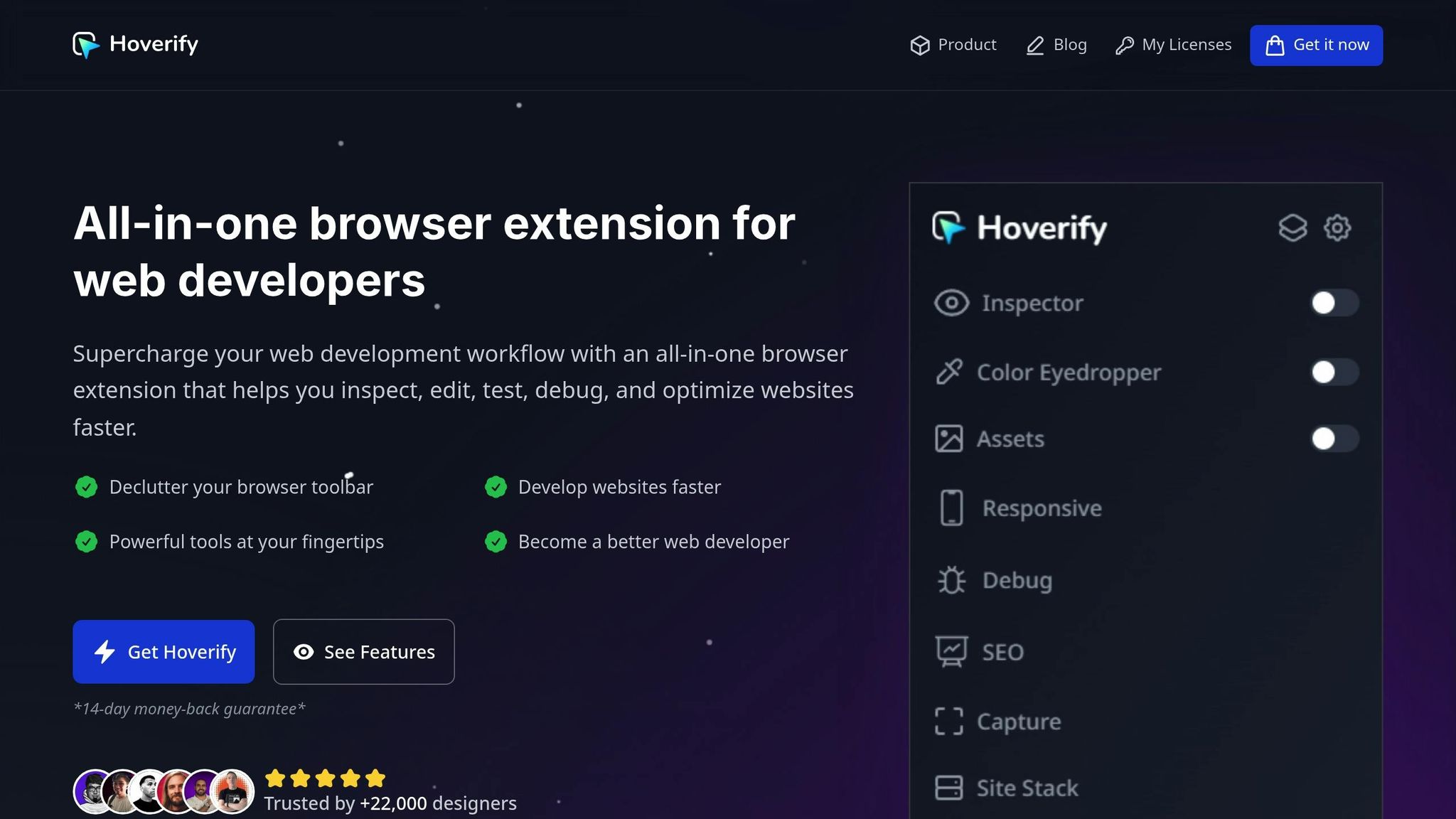
Once you’ve mastered CSS shapes and masks, the next challenge is deploying them efficiently. Adjusting these elements across various devices can be a tedious process. That’s where Hoverify steps in, streamlining your workflow by bundling essential development tools trusted by over 22,000 developers.
Hoverify brings everything you need for working with CSS shapes and masks into one place. Web developer Terri Tutich puts it best:
“As a website developer, this plugin has so many features…I love that everything is all in one place and consistent across different browsers and devices. Highly recommend.”
Let’s dive into the key features that make Hoverify a game-changer for managing CSS shapes and masks.
Real-Time Visual Editing
Hoverify offers a range of practical tools that make working with CSS much easier. Its Inspector tool is particularly handy for editing CSS shapes and masks. Instead of opening your browser’s developer tools every time you need to inspect an element, simply hover over it to instantly view its properties.
This feature is invaluable when fine-tuning clip-path values or adjusting mask properties. You can tweak these settings in real time while inspecting styles across various screen sizes and animations - no need to constantly switch between code and preview.
The visual editor allows you to style elements on the spot. For complex shapes, you can adjust curve coordinates and immediately see the results in your design. With syntax-highlighted code, it’s easier to spot and fix errors, reducing the risk of typos that could disrupt your carefully designed shapes.
Hoverify also lets you copy or export entire components, including their children, directly to CodePen. This makes it simple to share your work with team members or save it for future projects.
Responsive Viewer for Design Testing
Testing how CSS shapes and masks behave across different screen sizes can be a time-consuming task. Hoverify’s Responsive Viewer simplifies this by letting you preview websites on multiple devices simultaneously, complete with mirrored interactions.
This feature is especially useful if you’re using CSS variables to make your shapes responsive. You can watch how your designs - whether it’s a diamond or a triangle - adapt to various viewport sizes in real time, ensuring they look great on all devices.
The Responsive Viewer isn’t limited to standard device presets. You can add custom device profiles to suit your needs and even test on viewports larger than your screen. Plus, Hoverify allows you to change the user-agent, so you can see how different browsers handle your CSS shapes and masks.
Asset Extraction and Debugging
Managing assets like external images or SVGs for masks can be a hassle. Hoverify’s Assets tool makes this process effortless by extracting images, videos, SVGs, PDFs, Lottie animations, and even favicons from the page - including content hidden in iframes. With just one click, you can zip and save all the assets used in your project, eliminating the need for manual downloads.
Hoverify also shines when it comes to debugging. You can clear browsing data instantly to ensure you’re working with fresh results. The custom code injection feature allows you to inject HTML, CSS, and JavaScript in real time, making it easy to test new clip-path shapes or modify mask properties without touching your main codebase.
These debugging tools help you quickly identify and resolve browser-specific issues with CSS shapes and masks. By integrating these features seamlessly, Hoverify empowers you to refine and troubleshoot your designs more effectively than traditional methods ever could.
Troubleshooting and Best Practices
CSS shapes and masks can be tricky to work with, especially when it comes to browser compatibility and performance. Here’s how to handle common challenges and fine-tune your designs for better results.
Common Problems and How to Fix Them
One of the most frequent issues is browser compatibility. While modern browsers generally support CSS shapes and masks, older versions might not. To address this, use vendor prefixes like -webkit- to extend compatibility. Tools like Autoprefixer can automate this process, saving you the time and hassle of adding prefixes manually. Keep in mind that Firefox often handles the mask-composite property more effectively than other browsers, so testing your masked elements there first can be helpful. Be sure to test your designs across various desktop and mobile browsers to identify and resolve any platform-specific quirks early.
Another common issue arises with image formats. PNG files are ideal for CSS masks because they support transparency, which is key for smooth transitions and detailed shapes. JPEGs, on the other hand, lack transparency and can result in masks that look like solid blocks instead of intricate designs.
For those working with complex shapes, calculations can become overwhelming, especially when custom paths involve trigonometric formulas. One way to simplify this is by using CSS variables, which make your code cleaner and easier to maintain. Online shape generators are also a great resource for creating clip-path values without needing to manually handle the math. This not only reduces errors but also speeds up debugging. When working with gradients, remember that transparency often plays a more critical role than color.
With these technical challenges addressed, it’s important to focus on performance and accessibility to ensure your designs are user-friendly and efficient.
Optimizing Performance and Accessibility
Simplifying complex shapes can significantly improve rendering speed. For example, using the margin-box property within clip-path allows you to define shapes based on an element’s natural boundaries, reducing the need for custom coordinates and heavy calculations.
If your masks involve multiple layers or intricate paths, they can slow down page loading, especially on mobile devices. Test your designs on lower-end devices to ensure they perform well across a range of hardware.
Accessibility is equally important. Use semantic HTML elements to ensure your content is easy to interpret for screen readers. When CSS shapes change the appearance of an element, make sure they don’t interfere with keyboard navigation or screen reader functionality. For example, if you’re using masks that create partial transparency, check that text and background colors maintain sufficient contrast. Tools for contrast checking can help confirm your content meets accessibility guidelines.
Avoid using visibility: hidden or display: none unless you intend to hide content from screen readers entirely. If you’re using absolute positioning for visual effects, ensure the content remains accessible to assistive technologies. Similarly, for interactive elements triggered by mouse events like mouseover, provide keyboard-friendly alternatives using focus and blur events. This ensures that all users, regardless of their input method, can fully engage with your content.
Using US-Standard Units and Formats
Choosing consistent units is critical for creating precise, responsive designs with CSS shapes and masks.
Here’s a quick guide to unit selection:
- Pixels (
px): Best for exact measurements where precision matters. - Relative units (
rem,em): Ideal for designs that need to scale with text size or viewport changes. - Percentages (
%): Useful for fluid layouts where shapes should adapt to their container. - Viewport units (
vw,vh): Perfect for full-screen effects or shapes that scale with the browser window.
To make your code more maintainable, use clear, descriptive names for custom properties, such as --shape-width-px, which indicate both purpose and unit. Choose units that align with your design goals instead of defaulting to pixels for everything. The right unit can make your design more adaptable and visually appealing across devices and user preferences.
Conclusion: Start Experimenting with CSS Shapes and Masks
CSS shapes and masks bring a fresh dimension to modern web design, allowing for striking visual effects using just CSS. These techniques not only boost creativity but also maintain the performance and flexibility essential for today’s web projects.
Key Takeaways
The strength of CSS shapes and masks lies in their ability to create visually engaging designs without sacrificing speed. With 97.1% of all websites already leveraging CSS for visual enhancements, integrating these advanced techniques feels like a natural progression rather than a drastic shift.
By reducing server requests and offering endless creative options, CSS shapes and masks improve load times while unlocking new design possibilities. For instance, CSS masking enables intricate effects on images, interactive elements that respond to user actions, and unique typography styles where text can be filled with images or gradients.
What sets professional-grade designs apart is the mastery of these techniques. A July 2025 analysis by Blueprintblog highlights how Apple’s product pages use CSS clip-path and masking to achieve clean diagonal cuts, precise geometric shapes, and seamless transitions - eliminating the need for complex SVGs.
“The difference isn’t budget or design skills. It’s technical execution. Professional teams use CSS clip-path and masking to create impossible geometries and visual depth that traditional border-radius and box-shadow simply can’t achieve.”
When implemented thoughtfully, these techniques align with accessibility standards. They ensure content remains readable for screen readers and maintain proper color contrast ratios, which is critical for the approximately 15% of the global population with some form of disability.
Armed with these insights, you’re ready to bring a new level of creativity to your projects.
Your Next Steps
Start small by experimenting with basic shapes like hexagons, triangles, and circles using the clip-path property. Online generators can help you create more complex designs, such as starbursts and intricate polygons, before moving on to custom shapes and advanced masking.
Consider using tools like Hoverify for real-time visual editing. This can speed up your workflow by letting you test CSS shapes and masks directly within the browser. Hoverify’s responsive viewer ensures your designs look great across all screen sizes, and its asset extraction features simplify the implementation of intricate effects.
Build confidence by practicing with common shapes like hearts, ribbons, and tooltips. Incorporate CSS variables to make these designs more adaptable, and experiment with gradients and the mask property to explore circular and curved patterns.
Finally, test your designs on various browsers and devices to ensure consistent performance. Don’t forget to maintain keyboard navigation accessibility for a seamless user experience.
CSS shapes and masks are no longer experimental - they’re practical tools ready to enhance your designs. Whether you’re working on a personal project or a high-profile client website, these techniques offer the perfect mix of visual appeal and technical precision. Your next project is the ideal place to begin, transforming ordinary layouts into dynamic, engaging designs that captivate users and elevate your work.
FAQs
How do CSS shapes and masks make websites faster and more efficient compared to using images?
CSS shapes and masks can boost your website’s performance by cutting down the need for multiple image files. When you rely on traditional image-based designs, each image adds extra server requests, which can drag down load times. CSS shapes and masks, however, are rendered directly in the browser. This reduces server strain and speeds up the rendering process.
Beyond faster load times, this method offers flexibility and scalability for your designs - all without sacrificing performance.
How can I make CSS shapes and masks accessible in web design?
When working with CSS shapes and masks, it’s important to keep accessibility in mind. Always include meaningful alternative text for masked images so screen readers can effectively interpret the content. Opt for high-contrast colors in your masks to enhance visibility, particularly for users with visual impairments. Steer clear of overly complex shapes that could create challenges for assistive technologies. Use semantic HTML and ARIA attributes to clearly describe the visual effects and their intended purpose. Lastly, make sure to test your design with assistive tools to confirm it delivers an inclusive experience for all users.
Are CSS shapes and masks supported in modern browsers, and how can I ensure compatibility with older ones?
CSS shapes and masks are compatible with most modern browsers, including Chrome, Edge, Firefox, and Safari, as of 2025. These tools open up possibilities for creating layouts that are both dynamic and visually striking, enhancing the overall user experience.
For users on older browsers that might lack full support for these features, you can implement fallback options. For example, SVG-based masking or alternative styles can help maintain the design’s functionality and appeal. This approach ensures your content stays accessible and looks great across a variety of devices.
