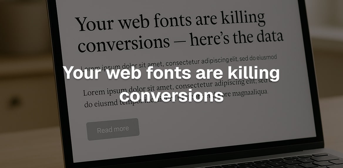
Your web fonts could be costing you customers. Slow load times, hard-to-read text, and inconsistent font rendering are driving users away before they convert. Here’s what you need to know:
- Slow page load times: Heavy font files and multiple font families increase load times, frustrating users and raising bounce rates.
- Readability issues: Fonts that are difficult to read or lack proper contrast make it harder for users to engage with your site.
- Inconsistent rendering: Fonts that display differently across devices or browsers create a poor user experience, reducing trust in your site.
Key fixes:
- Use fewer font families and styles (e.g., one for headings, one for body text).
- Switch to modern formats like WOFF2 to reduce file sizes by up to 30%.
- Optimize with subsetting, lazy loading, and
font-display: swapfor faster performance.
These changes improve page speed, readability, and user trust - helping you convert more visitors into customers.
The Data: How Fonts Hurt Conversions
The fonts you choose for your website can impact its performance in ways you might not expect, and these effects can directly hurt your conversions. Many website owners overlook how typography choices can influence user engagement, potentially driving away customers. Let’s break down three key areas where fonts can negatively affect your site.
Slow Page Load Times from Font Choices
Font files can be surprisingly large, especially when you use multiple font families or variations like different weights. This added bulk slows down your site’s load time. When browsers pause rendering to load these fonts - a phenomenon known as FOIT (flash of invisible text) - users might leave before they even see your content.
This issue is particularly problematic for mobile users on slower networks. Every extra second of delay can frustrate visitors, which is a big deal for businesses that depend on quick and seamless e-commerce experiences.
Readability Problems and User Frustration
Fonts don’t just affect speed - they also play a huge role in readability. Fonts that are too small, low in contrast, or overly decorative can make reading a chore. If users have to strain to understand your content, they’re less likely to stick around or engage with your site.
Color contrast issues add another layer of difficulty. Text that doesn’t meet accessibility standards can alienate users with vision impairments and cause reading fatigue for everyone else. This not only frustrates visitors but can also make them question your brand’s professionalism.
There’s also a psychological angle to consider. Hard-to-read text increases cognitive load, which makes decision-making harder for users. This concept, known as “processing fluency”, suggests that content that’s easy to read feels more trustworthy and valuable. On the flip side, poor typography can make your brand seem less credible.
Inconsistent Font Rendering Across Devices
Even if your site loads quickly and your fonts are readable, inconsistent font rendering can still hurt the user experience. Fonts often behave differently across browsers, operating systems, and devices, leading to layout shifts, uneven spacing, or visual glitches. These inconsistencies can make your site feel unpolished or unreliable.
Cross-browser testing shows that many websites experience noticeable differences in how fonts render on various platforms. The problem is even more pronounced on certain operating systems where font smoothing techniques differ. Mobile devices add another layer of complexity, as older models or outdated systems may not support modern font formats, leading to a fragmented experience.
Research has shown that layout shifts and broken typography are linked to lower conversion rates. When users see inconsistent or unstable typography - like missing fonts or unexpected layout changes - they may lose trust in your site. On the other hand, websites with stable and consistent font rendering tend to perform better in terms of conversions, reinforcing the importance of getting your typography right.
How to Optimize Web Fonts for Better Conversions
If you’re losing conversions due to slow loading times, optimizing your web fonts can make a noticeable difference. Here’s how to do it.
Limit Font Families and Variants
One of the simplest ways to speed up your site is to cut down on the number of fonts and variants you use. Every additional font family or style adds another file for browsers to download, which can slow things down. Many websites include far more font variants than they actually need.
Take a closer look at your fonts. Most sites only need two font families: one for headings and one for body text. Within each family, stick to just the weights you use most often - regular and bold are usually enough. Avoid loading extra styles like italics unless absolutely necessary. Keeping it simple reduces file sizes and improves performance.
Once you’ve streamlined your font selection, it’s time to upgrade to modern formats.
Use Modern Formats Like WOFF2
Switching to the WOFF2 format is a game-changer for font performance. Compared to older formats like TTF or OTF, WOFF2 uses Brotli compression to shrink file sizes by up to 30%. For example, Intel’s ClearSans font saw its size drop by 25% when converted to WOFF2. These smaller files download faster, reducing delays caused by invisible text.
With 97% of browsers now supporting WOFF2, you can confidently make it your default font format. To ensure browsers use the most optimized version, list WOFF2 first in your @font-face rules:
@font-face {
  font-family: 'YourFont';
  src: url('font.woff2') format('woff2'),
       url('font.woff') format('woff');
}
Fallback to WOFF for older browsers, but avoid using TTF or OTF directly on the web. These formats aren’t optimized for performance and may also lead to licensing headaches.
Here’s how the different formats stack up:
| Format | Compression | File Size | Performance | Browser Support |
|---|---|---|---|---|
| TTF/OTF | None | Largest | Slowest | Universal |
| WOFF | Standard | Medium | Good | 96%+ |
| WOFF2 | Brotli | 30% smaller | Fastest | 97% |
Once you’ve switched to WOFF2, you can further optimize your fonts with subsetting and lazy loading.
Use Font Subsetting and Lazy Loading
Font subsetting trims down font files by removing unnecessary characters. For example, if your site only uses English, you don’t need to include characters for languages like Chinese or Arabic. Many font services let you choose specific character sets, and focusing on Latin characters for English-only sites can shrink file sizes by 50–80%.
Another trick is lazy loading for non-essential fonts. Fonts used in less critical areas - like footers or modal windows - can load only when they’re needed. This prevents unnecessary delays during the initial page load.
The font-display CSS property can also improve perceived performance. Setting font-display to swap ensures text appears immediately with a fallback font, then switches to your custom font once it’s ready:
@font-face {
    font-family: 'YourFont';
    src: url('font.woff2') format('woff2');
    font-display: swap;
}
For fonts with multiple scripts, WOFF2 offers another advantage: browsers can load only the characters required, rather than downloading the entire font file upfront. This feature further reduces load times and enhances the user experience.
How Hoverify Makes Font Optimization Easy
Font optimization can feel like a chore, but Hoverify simplifies the process with tools that work in real time. Here’s how Hoverify makes font optimization a breeze.
Inspect Fonts Instantly
Hoverify’s Font Viewer gives you immediate access to font details for any text on your site. Just hover over the text, and you’ll see everything - font family, weight, style, and more. Want to experiment with changes? You can preview different font settings instantly, no coding required.
Preview Across Devices
With Hoverify’s Responsive Viewer, you can test how your fonts look on various devices. It simulates real-world conditions with accurate viewport sizes and user agents. Plus, any interaction with one preview updates all others simultaneously, making it easy to spot inconsistencies.
Conclusion: Boost Conversions with Smarter Font Choices
The fonts you use play a big role in driving conversions. Slow-loading fonts, hard-to-read styles, or inconsistent displays can frustrate users and hurt your revenue.
To improve performance, stick to fewer font families, switch to WOFF2 formats, and use techniques like font subsetting and lazy loading. These small adjustments can make pages load faster and improve readability - ultimately encouraging more conversions.
Tools like Hoverify can simplify the process. With features like real-time font inspection, cross-device previews, and direct CSS edits, you can fine-tune your fonts without juggling multiple tools. This efficiency not only saves time but also helps you achieve better results.
Start optimizing your fonts today to capture more leads, increase sales, and create a smoother user experience. Make your fonts work harder for you - implement these tips, track your progress, and watch your conversions grow.
FAQs
How can I tell if my website’s fonts are hurting user experience and conversions?
When it comes to your website, fonts play a bigger role than you might think. They can directly impact how users interact with your site and whether they stick around - or leave frustrated. Let’s break it down.
Readability is key. Fonts that are too small or difficult to read can annoy visitors, making them click away faster than you’d like. This not only increases bounce rates but also means fewer people are sticking around to engage with your content.
Loading speed matters too. If your web fonts take too long to load, it can slow down your site’s performance. This affects important metrics like Largest Contentful Paint (LCP) and First Contentful Paint (FCP). These metrics aren’t just technical jargon - they’re crucial for keeping users happy and even for ranking well on search engines.
And here’s the bottom line: If users find your fonts hard to read or your site slow to load, they’re less likely to engage, let alone convert. By choosing fonts that are easy on the eyes and ensuring they load quickly, you can create a smoother experience that keeps visitors around longer - and boosts conversions.
What are the benefits of using the WOFF2 font format, and how can I start using it on my website?
Using the WOFF2 font format comes with clear perks, like improved compression, smaller file sizes, and quicker page load speeds. In fact, WOFF2 can reduce file sizes by around 30% compared to the older WOFF format, which translates to better site performance and a smoother experience for users.
To start using WOFF2, you’ll need to tweak your @font-face rules to make it the priority. Modern browsers will automatically pick WOFF2 if it’s supported, while seamlessly falling back to WOFF for older browser compatibility. Here’s how it looks in practice:
@font-face {
    font-family: 'CoolFont';
    src: url('coolfont.woff2') format('woff2'),
         url('coolfont.woff') format('woff');
    font-display: swap;
}
This setup ensures your fonts load quickly and efficiently, no matter the browser or device, giving your site a performance boost and potentially improving conversions.
How can I optimize web fonts to improve site speed and readability?
To improve web fonts for better site speed and readability, consider these practical tips:
- Opt for modern font formats like WOFF2. They load quicker thanks to advanced compression.
- Stick to essential font styles and weights. Using only what you need keeps file sizes smaller and boosts performance.
- Preload important fonts with the
<link rel="preload">tag. This ensures they load early and render faster. - Apply
font-display: swapto display fallback text immediately, avoiding blank spaces while custom fonts load.
These steps not only enhance user experience but also contribute to faster loading times, which can positively impact engagement and conversions.