Want to create smooth CSS animations that work on all browsers? Here’s what you need to know:
- CSS animations work in nearly every browser people actually use, but quirks remain
- Key properties: animation-name, duration, timing-function, delay, iteration-count, direction
- Use @keyframes to define animation steps
- Stick to transform and opacity for best performance
- Browser prefixes still matter for older versions
Quick tips: • Test on multiple browsers and devices • Use GPU acceleration when possible
• Provide fallbacks for unsupported features • Keep animations simple and purposeful
This guide covers animation basics, browser-specific issues, performance optimization, and advanced techniques to help you create cross-browser animations that wow users everywhere.
CSS Animation Basics
CSS animations make web pages come alive. They let elements move, change, and transform smoothly. Let’s break down the key parts that make these animations work.
Main Animation Settings
CSS animations have a few important properties that control how they behave:
.element {
    animation-name: slide-in;
    animation-duration: 3s;
    animation-timing-function: ease-in-out;
    animation-delay: 0.5s;
    animation-iteration-count: infinite;
    animation-direction: alternate;
}
This code creates a “slide-in” animation that keeps going back and forth. It lasts 3 seconds, waits half a second before starting, and uses a smooth speed curve.
How to Write Keyframes
Keyframes are the heart of CSS animations. They define what happens at different points in your animation:
@keyframes slide-in {
    from {
        transform: translateX(100%);
    }
    to {
        transform: translateX(0);
    }
}
This keyframe moves an element from off-screen to its normal spot. For more complex animations, you can use percentages:
@keyframes color-change {
    0% { background-color: red; }
    50% { background-color: blue; }
    100% { background-color: green; }
}
Pro tip: Always include both 0% and 100% in your keyframes. It helps browsers understand your animation better.
Animation Timing and Events
The animation-timing-function property controls how fast or slow your animation moves. Some common options are:
- linear: Same speed from start to finish
- ease-in: Starts slow, then speeds up
- ease-out: Starts fast, then slows down
- ease-in-out: Slow start and end, faster in the middle
You can also use JavaScript to do something when an animation finishes:
element.addEventListener('animationend', function() {
    console.log('Animation finished!');
});
Speed and Loading Times
Animations can make your site look great, but they can also slow it down. Here’s how to keep things fast:
- Use the right properties
Stick to transform and opacity when you can. They’re the fastest to animate.
- Give browsers a heads up
Use will-change to tell browsers which elements might animate soon.
- Be careful with size and position
Changing width, height, or position can slow things down. Instead of this:
/* Avoid */
@keyframes expand {
    from { width: 100px; }
    to { width: 300px; }
}

/* Better */
@keyframes expand {
    from { transform: scaleX(1); }
    to { transform: scaleX(3); }
}
Making Animations Work in All Browsers
Creating CSS animations that work across all browsers can be tricky. But don’t worry - we’ve got you covered. Let’s break it down:
Browser Prefixes: Still a Thing in 2024
Yep, browser prefixes are still kicking around, especially for older browsers. Here’s the quick and dirty:
-webkit-: Chrome, Safari, newer Opera, iOS browsers-moz-: Firefox-ms-: Internet Explorer and Edge-o-: Old Opera versions
Just slap these in front of your CSS properties. Like this:
.animated-element {
    -webkit-animation: slide-in 1s ease-in-out;
    -moz-animation: slide-in 1s ease-in-out;
    -ms-animation: slide-in 1s ease-in-out;
    -o-animation: slide-in 1s ease-in-out;
    animation: slide-in 1s ease-in-out;
}
Pro tip: Always put the standard version last. It’s like letting the cool kids go first, but saving the best for last.
Who Supports What?
Here’s a quick cheat sheet:
| Feature | Chrome | Firefox | Safari | Edge | IE11 |
|---|---|---|---|---|---|
| Basic Animations | ✓ | ✓ | ✓ | ✓ | ✓ |
| Keyframe Animations | ✓ | ✓ | ✓ | ✓ | ✓ |
| Animation Events | ✓ | ✓ | ✓ | ✓ | Kinda |
| will-change | ✓ | ✓ | ✓ | ✓ | Nope |
Is My Browser Cool Enough?
Want to check if a browser can handle your fancy animations? Try this JavaScript:
function canIAnimate() {
    var div = document.createElement('div').style;
    return 'animation' in div || 'webkitAnimation' in div;
}

if (canIAnimate()) {
    console.log("Let's get animated!");
} else {
    console.log('No animation party here. Sad face.');
}
Plan B (and C)
Sometimes, browsers just won’t play nice. Here’s what you can do:
- Keep it simple: If fancy keyframes aren’t working, try basic transitions.
- JavaScript to the rescue: Libraries like GreenSock can save the day.
- Start basic, add flair: Begin with a static design, then sprinkle in animations for the cool browsers.
Testing with Hoverify
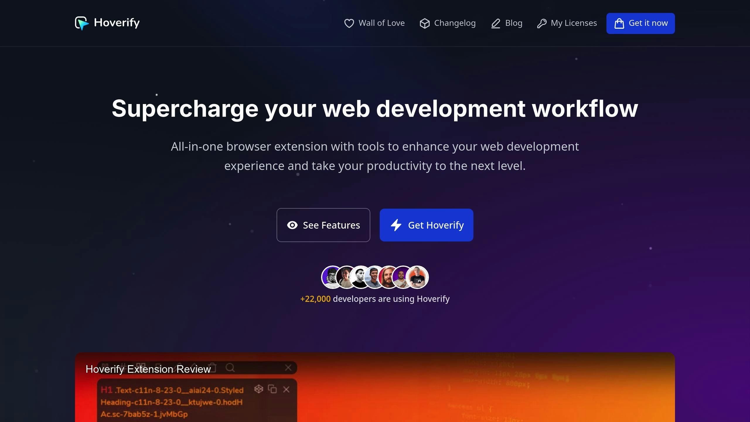
Hoverify is like a Swiss Army knife for web devs. Here’s how to use it:
- Get the Hoverify extension.
- Open your site and fire up Hoverify.
- Use Responsive Viewer to see how your animations look on different devices.
- Play with the Inspector to tweak your CSS animations in real-time.
Making Animations Run Faster
Want your animations to zip along? Here’s how to speed them up:
Which Properties to Animate
Some CSS properties are speed demons. Others? Not so much.
The fast ones: transform and opacity. The slow pokes: width, height, margin, and padding.
Why? It’s all about browser math. transform and opacity don’t mess with other elements, so the browser can handle them quickly.
Here’s a trick: Instead of width: 200px;, try transform: scaleX(2);. It’s way smoother.
Using the GPU
Your computer’s GPU is an animation powerhouse. Use it!
How? Stick to transform and opacity. These tap into GPU acceleration.
.smooth-move {
    transform: translateX(100px);
    transition: transform 0.3s ease-out;
}
This will slide across your screen like butter.
Using will-change
will-change is like a heads-up for your browser. It says, “Hey, this element’s about to move!”
Use it like this:
.about-to-animate {
    will-change: transform, opacity;
}
But don’t go crazy. Too much will-change can backfire. Use it wisely.
Smooth Animation Tips
Want silky 60fps animations? Try these:
- Keep it simple. Animate less stuff at once.
- Use
requestAnimationFramefor JavaScript animations. - Stick to CSS animations when you can.
- Test on phones and tablets too.
Testing Animation Speed
How do you know if your animations are smooth? Use your browser’s dev tools.
In Chrome:
- Hit F12
- Go to Performance
- Record while you trigger animations
- Look for:
- Frames per second (60 is the magic number)
- CPU usage spikes
- Long tasks blocking the main thread
Browser-Specific Problems and Fixes
Creating animations that work across all browsers can be a pain. Let’s look at some common issues and how to fix them.
Safari Issues
Safari can be a bit of a troublemaker with animations. One big problem? Animations jumping to the last frame during delays. Chrome and Firefox? No problem. Safari? Not so much.
Here’s the fix:
Add the -webkit- prefix to your animations:
@-webkit-keyframes grow {
    0% { -webkit-transform: scale(0); }
    30% { -webkit-transform: scale(1.1); }
    60% { -webkit-transform: scale(0.9); }
}

.badge * { -webkit-transform-origin: 50% 50%; }
.badge, .outer, .inner, .inline { -webkit-animation: grow 1s ease-out backwards; }
By the way, Safari on Windows is dead. If you’re still using it, time to upgrade!
Firefox Issues
Firefox plays nice with CSS animations, but older versions might need some extra love. Use the -moz- prefix for animations in older Firefox:
@-moz-keyframes slide-in {
    from { -moz-transform: translateX(-100%); }
    to { -moz-transform: translateX(0); }
}
Chrome Issues
Chrome handles animations pretty well, but it’s not perfect. The main issue? Performance on mobile devices. To keep things smooth on Chrome mobile:
Use transform and opacity for animations when you can. And try to avoid animating width, height, or position.
Old Browser Support
Internet Explorer (IE) is the stuff of developer nightmares. For IE support:
Use the -ms- prefix for animations, provide fallbacks for complex animations, and consider using simple transitions instead of keyframe animations for older browsers.
Mobile Browser Issues
Mobile browsers can struggle with fancy animations. Here’s how to keep things running smoothly:
Keep animations simple and light. Test on real devices, not just emulators. And use tools like Hoverify’s Responsive Viewer to see how your animations look on different screen sizes.
Advanced Animation Methods
Let’s explore some advanced CSS animation techniques to make your web pages stand out.
Chaining Animations
Chaining creates complex, multi-step animations. Here’s how:
@keyframes slideIn {
    from { transform: translateX(-100%); }
    to { transform: translateX(0); }
}

@keyframes fadeIn {
    from { opacity: 0; }
    to { opacity: 1; }
}

.element {
    animation: slideIn 1s ease-out, fadeIn 1s ease-in 1s;
}
This code slides an element in, then fades it to full opacity. The second animation starts after the first one ends.
Managing Animation States
For complex animations, you’ll need to control their start and stop points. Here’s how to do it with CSS classes and JavaScript:
const element = document.querySelector('.animated-element');

element.addEventListener('animationend', () => {
    element.classList.remove('animate');
    element.classList.add('finished');
});

element.classList.add('animate');
This code adds an ‘animate’ class to start the animation, then switches to a ‘finished’ class when it’s done. It’s great for creating interactive animations.
Transform vs Other Properties
Not all CSS properties are equal when it comes to smooth animations:
| Property | Performance | Use Case |
|---|---|---|
| transform | High | Moving, scaling, rotating elements |
| opacity | High | Fading elements in/out |
| width/height | Low | Avoid if possible, use scale instead |
| top/left | Low | Use translate instead |
Transform and opacity can be handled by the GPU, making them much faster than other properties.
GPU Speed Tips
Want faster animations? Here’s how to get your GPU working for you:
- Use
transform: translate3d(0,0,0)orwill-change: transformto tell the browser an element will animate. - Stick to animating
transformandopacityproperties when you can. - Don’t animate too many elements at once - it can slow down even powerful GPUs.
Fallback Options
Not all browsers support the same features. Here’s how to make sure your animations work everywhere:
- Use feature detection:
if ('animation' in document.body.style) {
    // Animations are supported
} else {
    // Use simpler effects
}
-
Design your site to work without animations first, then add motion.
-
Start with basic transitions, then add complex animations for modern browsers.
The goal is to create a smooth experience for all users, not just those with the latest tech.
Wrap-up
Let’s recap the key points about cross-browser CSS animations and peek into the future of web animation.
Main Points
Creating smooth CSS animations that work across browsers is both a technical and creative challenge. Here’s what you need to remember:
- Test Everywhere
Don’t assume your animations will work on all browsers and devices. Use tools like Hoverify’s Responsive Viewer to check.
- Focus on Performance
Want smooth animations? Stick to transform and opacity. These properties use the GPU, which means faster animations and better site performance.
- Think About Accessibility
Some users don’t like motion. Use the prefers-reduced-motion media query to respect their preferences. It’s a small change that makes a big difference.
- Keep It Simple
Fancy animations look cool, but they’re more likely to break across browsers. Aim for simple, purposeful animations instead. Remember:
“Less is more when it comes to CSS animations.”
- Stay in the Loop
Browsers are always changing. Keep an eye on caniuse.com to stay up-to-date with CSS animation features and browser support.
What’s Next
The future of CSS animations looks exciting. Here’s what’s coming:
- Scroll-Linked Animations
Soon, you’ll be able to create dynamic, scroll-based animations without JavaScript. The CSS Working Group is working on it.
- Better Performance Control
New APIs are in the works to give you more control over animation performance. This includes better GPU usage and more precise timing control.
- More 3D Power
CSS already does 3D transformations, but expect more advanced 3D animation capabilities soon. Think better WebGL integration and smoother complex 3D animations.
- Font Animations
As variable fonts become more common, we’ll see more creative font animations. Get ready for some cool typography tricks!
To prepare for these new features:
- Follow browser release notes and CSS specification drafts.
- Play around with new features in a safe environment.
- Use progressive enhancement to leverage new capabilities while supporting older browsers.
Two questions that come up a lot
Why isn’t my animation running at all?
First check that the name in your @keyframes rule matches the animation-name property exactly, since a typo there fails silently. If the names match, look in dev tools for another rule overriding the animation shorthand, and on older browsers try adding the -webkit- prefix.
Should I animate with CSS or JavaScript?
CSS is the better default for simple transitions because browsers can optimize it. Reach for JavaScript, or a library like GreenSock, when you need to pause, reverse, or drive an animation from user input.