
CSS properties are the building blocks of web design, enabling developers to transform basic HTML into visually engaging and functional websites. Here’s what you need to know:
- CSS Basics: Properties like
color,font-size,margin, andpaddingdefine how elements appear and interact. - Modern Layouts: Flexbox and Grid replaced older methods, making responsive design easier. Tools like container queries and subgrid (new in 2025) further improve layout flexibility.
- Typography and Colors: Use
font-family,line-height, and new color formats likeoklabandoklchfor better readability and visual consistency. - Debugging Tools: Extensions like Hoverify simplify real-time editing, responsive testing, and debugging, saving developers hours of work.
CSS evolves constantly, with new features like advanced pseudo-classes (:has(), :is()) and native nesting making it more powerful. Mastering these tools and staying updated is key to creating modern, responsive websites.
CSS Syntax and Structure
Grasping how CSS syntax works is key to understanding how browsers apply styles to web pages. Once you get the hang of it, CSS becomes much easier to work with.
CSS Rule Structure
A CSS rule consists of two main parts: the selector and the declaration block. The selector specifies the HTML element you want to style, while the declaration block defines the styles to apply.
Here’s the basic format:
selector {
  property: value;
  property: value;
}
The selector comes first and identifies the target element. This could be an HTML tag like h1, a class name like .button, or an ID like #header. The declaration block, enclosed in curly braces {}, follows the selector.
Inside the declaration block, you’ll find property-value pairs. Each pair includes a CSS property (such as color or font-size), a colon :, the desired value, and a semicolon ; to end the declaration.
Here’s a practical example:
.card {
  background-color: #ffffff;
  border: 1px solid #e0e0e0;
  border-radius: 8px;
  padding: 1.5rem;
  margin-bottom: 2rem;
  box-shadow: 0 2px 4px rgba(0, 0, 0, 0.1);
}
This rule styles elements with the class card. It sets a white background, a gray border, rounded corners, internal spacing, a bottom margin, and a subtle shadow.
Measurement units in CSS play a critical role. Developers often use:
- Pixels (px) for fixed dimensions (e.g.,
font-size: 16px). - Ems for scaling relative to an element’s font size (e.g.,
padding: 2em). - Rems for scaling based on the root font size (e.g.,
margin: 1.5rem).
CSS also offers various selector types for different use cases:
- Type selectors like
p {}style all<p>elements. - Class selectors like
.navigation {}target elements with specific class attributes. - ID selectors like
#main-content {}apply styles to unique elements with specific IDs.
Comments in CSS, written as /* comment text */, are invaluable for organizing your code, especially in large stylesheets:
/* Header navigation styles */
.navbar {
  display: flex;
  justify-content: space-between;
}

/* Main content area */
.content {
  max-width: 1200px;
  margin: 0 auto;
}
With the structure in place, the next step is to avoid common mistakes.
Common Syntax Errors to Avoid
Even seasoned developers slip up occasionally, but being aware of common errors can save you time and frustration. Here are the most frequent issues:
- Missing semicolons: Every property-value pair must end with a semicolon, even the last one in a block.
- Unmatched curly braces: Always ensure each
{has a corresponding}. - Misspelled properties: Errors like
colourinstead ofcolororfont-wieghtinstead offont-weightresult in ignored declarations. - Invalid units: Mistakes like
10pinstead of10pxor2einstead of2emrender the declaration invalid. - Incorrect selectors: Forgetting the dot for classes (
.buttoninstead ofbutton) or the hash for IDs (#headerinstead ofheader) can cause targeting issues.
Here’s an example with several errors:
/* Multiple errors in this code */
.button {
  background-color: blue
  font-size: 16p;
  padding: 10px 20px;
  border-radius: 5px
}

#header
  color: #333;
  font-size: 24px;
}
And here’s the corrected version:
/* Clean, error-free CSS */
.button {
  background-color: blue;
  font-size: 16px;
  padding: 10px 20px;
  border-radius: 5px;
}

#header {
  color: #333;
  font-size: 24px;
}
To minimize errors, consider these strategies:
- Use code editors with syntax highlighting to spot issues instantly.
- Test your changes incrementally instead of writing large chunks of CSS at once.
- Validate your CSS using browser developer tools or online validators.
Tools like Hoverify are especially helpful. They allow real-time inspection and editing, highlighting syntax errors like missing semicolons or unmatched braces before they create problems.
Case sensitivity is another consideration. While CSS property names and values are case-insensitive (COLOR: BLUE works the same as color: blue), HTML class and ID selectors are case-sensitive. For example, .Button and .button refer to different elements.
Finally, consistent formatting practices make your code easier to read and maintain. Stick to uniform indentation (2 or 4 spaces), group related styles together, and keep your stylesheets logically organized. This approach not only improves readability but also simplifies debugging and updates down the road.
Core CSS Properties Cheat Sheet
Here’s a rundown of essential CSS properties every developer should know. These are the building blocks of web styling, shaping how elements look and behave on your pages.
Layout and Positioning Properties
Layout properties handle how elements are arranged and positioned on your webpage. The display property, for instance, determines how an element behaves in relation to others.
The display property offers various values. For example:
display: blockmakes elements occupy the full width and stack vertically.display: inlineallows elements to flow side by side, like text.display: flexcreates flexible layouts that adjust to screen sizes.display: gridenables precise, two-dimensional layouts.
Flexbox is ideal for one-dimensional layouts. Here’s how to space items evenly in a navigation bar:
.navbar {
  display: flex;
  justify-content: space-between;
  align-items: center;
  padding: 1rem 2rem;
}
justify-contentcontrols horizontal alignment.align-itemsmanages vertical alignment.- Additional properties like
flex-directionadjust the main axis, whileflex-wrapallows items to wrap to new lines.
CSS Grid shines for two-dimensional layouts. For example, a two-column layout can be created like this:
.grid-container {
  display: grid;
  grid-template-columns: 1fr 2fr;
  gap: 1rem;
}
Here, 1fr 2fr means the first column takes one fraction of the available space, and the second takes two fractions, creating a 1:2 ratio.
The position property is essential for controlling element placement:
staticfollows the normal document flow.relativeoffsets an element from its normal position usingtop,right,bottom, orleft.absoluteremoves an element from the normal flow and positions it relative to its nearest positioned ancestor.
Box model properties manage spacing around and within elements:
marginadds outer spacing.paddingadds inner spacing.
For example:
.card {
  width: 300px;
  padding: 1.5rem;
  margin: 1rem auto;
  border: 1px solid #e0e0e0;
}
When elements overlap, the z-index property controls stacking order. Higher values appear on top, but it only applies to positioned elements.
Next up: styling text with key typography properties.
Typography and Text Properties
Typography properties dictate how text appears on your site. Start with the font-family property to set the typeface, always including backup options:
body {
  font-family: 'Helvetica Neue', Arial, sans-serif;
}
If the first font isn’t available, the browser will try the next one in the list.
Modern CSS often uses relative units for font sizes, like rem, which scales based on the root element’s font size:
h1 {
  font-size: 2.5rem;
}

h2 {
  font-size: 2rem;
}

p {
  font-size: 1rem;
}
The font-weight property adjusts text thickness. It accepts numeric values from 100 (thin) to 900 (black) or keywords like normal (400) and bold (700).
Line spacing improves readability. Use the line-height property to set the space between lines of text:
.readable-text {
  font-size: 1rem;
  line-height: 1.6;
  letter-spacing: 0.5px;
}
Other useful text properties include:
text-alignfor horizontal alignment (left,right,center,justify).text-transformfor capitalization (uppercase,lowercase,capitalize).text-decorationfor effects like underlines or strikethroughs. To remove default link underlines, usetext-decoration: none.
Now let’s explore how to enhance a website’s look with colors and backgrounds.
Color and Background Properties
Color and background properties define your site’s visual appeal. The color property sets text color and supports formats like:
.text-styles {
  color: #333333;           /* Hexadecimal */
  color: rgb(51, 51, 51);   /* RGB */
  color: hsl(0, 0%, 20%);   /* HSL */
}
- Hexadecimal values (e.g.,
#FF5733) are concise and precise. - RGB values (
rgb(255, 87, 51)) break colors into red, green, and blue components. - HSL values (
hsl(14, 100%, 60%)) offer hue, saturation, and lightness controls.
For background colors, use the background-color property with the same formats:
.hero-section {
  background-color: #f8f9fa;
  padding: 4rem 2rem;
}
Background images add depth and can be customized with properties like:
.banner {
  background-image: url('hero-bg.jpg');
  background-size: cover;
  background-position: center center;
  background-repeat: no-repeat;
}
background-size: coverensures the image fills the element while maintaining its aspect ratio.background-position: center centercenters the image horizontally and vertically.
CSS gradients let you create smooth color transitions without needing image files:
.gradient-button {
  background: linear-gradient(to right, #667eea, #764ba2);
  color: white;
  border: none;
  padding: 0.75rem 1.5rem;
  border-radius: 4px;
}
Gradients can flow in various directions, using keywords like to right or angles like 45deg.
For more complex designs, layer multiple backgrounds by separating them with commas:
.layered-bg {
  background:
    linear-gradient(rgba(0,0,0,0.3), rgba(0,0,0,0.3)),
    url('pattern.png'),
    #2c3e50;
}
This example creates a dark overlay on a pattern image, with a solid color fallback.
To fine-tune your designs, use tools like Hoverify. They let you experiment with colors and properties in real time, saving you from constantly switching between your code editor and browser.
New CSS Properties and Features in 2025
The world of CSS continues to evolve, and 2025 brings features that enhance responsive design, improve color handling, and introduce more expressive selectors.
Modern Layout Features
Container queries represent a game-changing approach to responsive design. Unlike traditional media queries that respond to the viewport size, container queries allow elements to adapt based on the dimensions of their parent container. This means components can adjust dynamically to fit their container’s space.
Here’s an example:
.card-container {
  container-type: inline-size;
}

@container (min-width: 400px) {
  .card {
    display: grid;
    grid-template-columns: 1fr 1fr;
    gap: 1rem;
  }
}
In this setup, when the .card-container hits 400px in width, the .card component automatically switches to a two-column layout. This flexibility ensures that the same component works seamlessly in a narrow sidebar or a wider content area.
Another breakthrough is subgrid, which simplifies aligning nested grids by allowing child grids to inherit the structure of their parent grid:
.parent-grid {
  display: grid;
  grid-template-columns: 1fr 2fr 1fr;
  gap: 1rem;
}

.child-grid {
  display: grid;
  grid-column: span 3;
  grid-template-columns: subgrid;
}
With subgrid, the child grid aligns perfectly with the parent’s three-column structure, eliminating the need for complex calculations. These layout tools make CSS more adaptable and efficient for modern design needs.
By late 2025, over 90% of U.S. web traffic comes from browsers that support these features, making them widely usable in production environments. Additionally, a survey from the 2025 State of CSS shows that 68% of U.S. developers are already incorporating container queries into their projects.
New Color Formats
CSS now includes oklab and oklch color formats, offering a more visually consistent way to represent colors compared to traditional RGB or HSL. These formats are especially useful for creating smooth gradients and ensuring accessible designs.
Oklab uses a lightness-based coordinate system, making it easier to maintain consistent brightness:
.modern-button {
  background-color: oklab(0.7 0.15 0.1);
  color: oklab(0.95 0 0);
}
Meanwhile, oklch uses cylindrical coordinates - lightness, chroma, and hue - for more intuitive color adjustments:
.accent-color {
  color: oklch(0.65 0.25 180);
}

.gradient-bg {
  background: linear-gradient(
    oklch(0.8 0.1 120),
    oklch(0.6 0.2 240)
  );
}
These tools make it easier for designers to create vibrant visuals while maintaining consistent contrast across devices.
New Pseudo-Classes and Selectors
The :has() pseudo-class, often called the “parent selector”, opens up new possibilities for styling elements based on their descendants:
/* Style articles containing images */
article:has(img) {
  border: 2px solid #e0e0e0;
  padding: 1.5rem;
}

/* Highlight form groups with errors */
.form-group:has(.error) {
  background-color: #fef2f2;
  border-left: 4px solid #dc2626;
}
Selectors like :is() and :where() simplify code by reducing repetitive selector lists:
:is(h1, h2, h3, h4) {
  font-family: 'Georgia', serif;
  margin-bottom: 1rem;
}

/* :where() is useful for base styles with zero specificity */
:where(button, input, select) {
  font-family: inherit;
  border-radius: 4px;
}
Additionally, native CSS nesting eliminates the need for preprocessors, making it easier to organize related styles:
.navigation {
  background: #333;
  padding: 1rem;

  ul {
    list-style: none;
    margin: 0;

    li {
      display: inline-block;
      margin-right: 1rem;

      a {
        color: white;
        text-decoration: none;

        &:hover {
          color: #ccc;
        }
      }
    }
  }
}
These updates simplify CSS, making it more expressive and easier to maintain. With container queries enabling modular design, new color formats improving visual consistency, and advanced selectors reducing complexity, CSS in 2025 is more powerful than ever. Tools like Hoverify further streamline workflows by offering real-time debugging for these modern features, helping developers create efficient and future-ready web projects.
CSS Editing and Debugging Tools
In 2025, working with CSS means navigating complex code, modern layouts, and new features like container queries. Traditional debugging methods can slow things down, making real-time experimentation a challenge.
Thankfully, modern CSS editing and debugging tools have stepped up to the plate. These tools integrate inspection, editing, and testing directly into the browser, streamlining workflows. In fact, a 2024 Stack Overflow survey found that over 68% of professional web developers rely on browser extensions or visual tools for CSS debugging as part of their daily routine.
Let’s take a closer look at how Hoverify tackles these challenges with its integrated features.
Hoverify Features
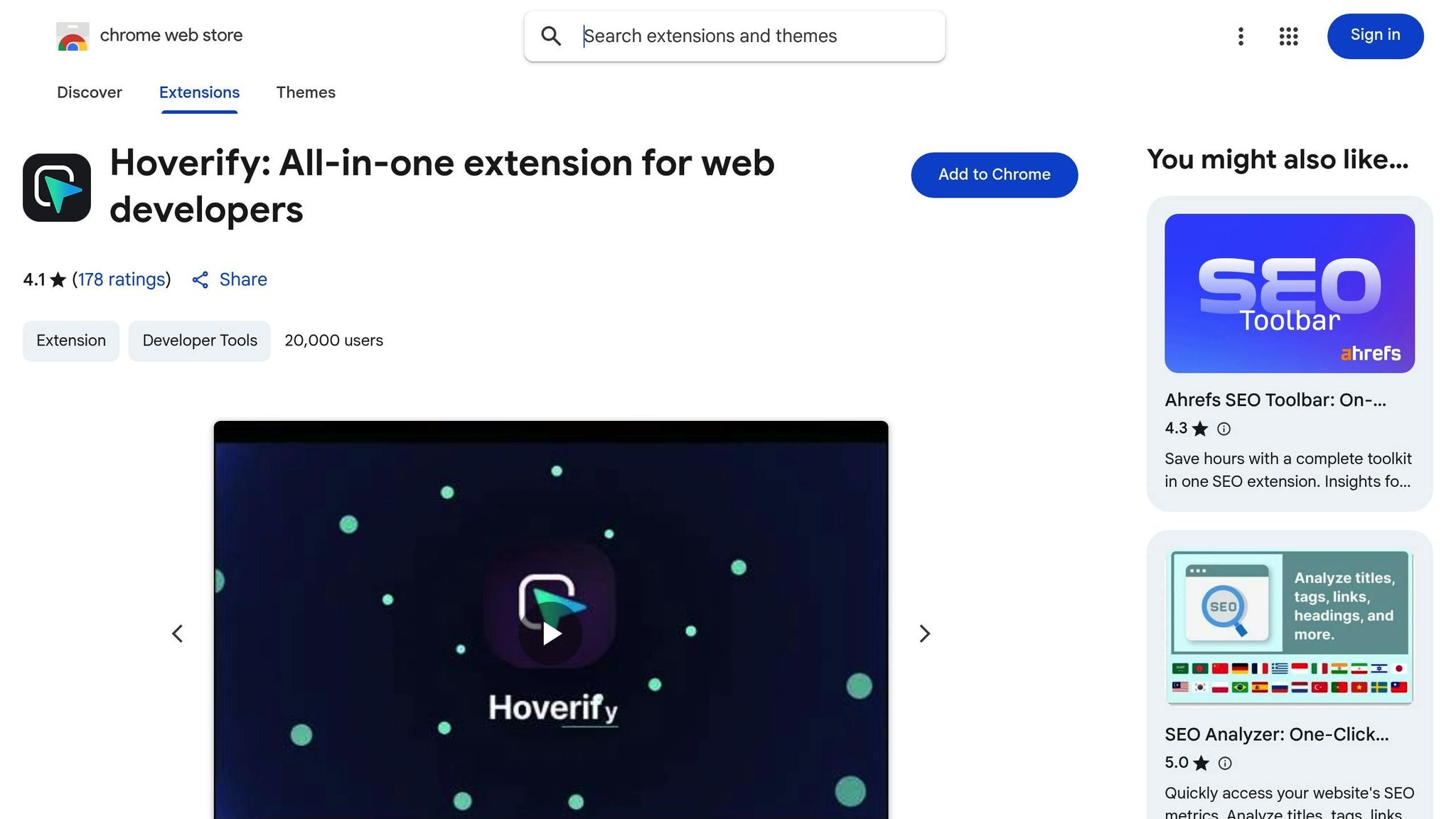
Hoverify combines multiple CSS tools into one convenient browser extension. Instead of juggling separate tools for inspection, responsive testing, and color picking, developers have everything they need in one place.
The Inspector feature offers real-time inspection by simply hovering over elements. This eliminates the need to dig into traditional developer tools for quick checks. You can target tricky pseudo-elements and classes, edit styles for different screen sizes, and tweak animations - all in real time. The visual editor makes it easy to adjust properties like margins, padding, colors, and fonts using sliders and color pickers, while showing the corresponding CSS code.
With real-time editing, changes appear instantly on the page. For example, if you adjust the justify-content property in a Flexbox container or tweak Grid gap values, you’ll see the results immediately, making experimentation seamless.
The Color Eyedropper is another standout feature. It lets you pick colors from anywhere on the page, including images and iframes, and provides values in formats like RGB, CMYK, HSL, and hex. This is a huge time-saver for matching brand colors and ensuring design consistency.
Hoverify’s Responsive Viewer lets you simulate multiple device views at once, making it easy to adjust CSS for mobile, tablet, and desktop layouts simultaneously. Any changes made on one device view are mirrored across others, which is especially handy for developers in the U.S., where websites must cater to a wide range of screen sizes.
Additional advanced features round out Hoverify’s toolkit, making it a comprehensive solution for modern web development.
How Hoverify Improves CSS Workflows
Hoverify’s features work together to simplify CSS workflows, cutting down debugging time and speeding up prototyping. Developers report saving 30-50% of their debugging time when using tools like Hoverify compared to manual methods. By reducing the need to switch between tools and providing instant visual feedback, the extension boosts overall efficiency.
For beginners, Hoverify bridges the gap between visual design and code. The visual editor helps users see how CSS properties influence layouts and styles without requiring in-depth knowledge of syntax. As one developer shared:
“I love that everything is all in one place and consistent across different browsers and devices.” - Terri Tutich, Website Developer
Experienced developers benefit from Hoverify’s rapid prototyping capabilities. When working with modern CSS features like container queries or oklch colors, you can test values instantly. The ability to inspect and edit animations in real time is another major plus, simplifying the process of fine-tuning transitions and keyframe animations.
The responsive testing feature is particularly valuable for U.S. developers, who must ensure websites perform well across a variety of devices and screen sizes. Instead of resizing browser windows or using separate tools, you can preview multiple device views side by side and make adjustments on the spot.
Hoverify also supports localization testing, allowing developers to check how CSS handles different content formats like U.S. date styles (MM/DD/YYYY), currency displays ($1,234.56), and both metric and imperial units. This ensures websites meet local user expectations and accessibility standards.
By combining these tools with modern CSS capabilities, Hoverify helps developers bring their designs to life efficiently. With over 22,000 developers and designers already on board, its all-in-one approach has proven to be a game-changer. As one user put it:
“Awesome Tool for Developers and Web Designers, Everything in one sorted place with this extension.” - Rahul Singh
CSS Properties Quick Reference Tables
Quick reference tables are a lifesaver when you need to locate CSS properties quickly. Instead of wading through lengthy documentation, these tables group properties by function, making it simpler to find exactly what you need. They’re a handy tool for streamlining your design process and making quick styling adjustments.
Tables for Layout, Text, and Effects
Here’s a compact summary of essential CSS properties to keep at your fingertips during development.
Layout Properties are the foundation of web design, controlling how elements are positioned and interact on the page.
| Property | Description | Typical Values | Example |
|---|---|---|---|
| display | Defines how an element is rendered | flex, grid, block, inline-block, none | display: flex; |
| position | Specifies positioning method | static, relative, absolute, fixed, sticky | position: relative; |
| flex | Shorthand for flex-grow, shrink, and basis | 1, 0 1 auto, none | flex: 1; |
| grid-template-columns | Sets column structure for grids | 1fr 2fr, repeat(3, 1fr), 200px auto | grid-template-columns: repeat(3, 1fr); |
| justify-content | Aligns items along the main axis | center, space-between, flex-start, flex-end | justify-content: space-between; |
| align-items | Aligns items along the cross axis | center, flex-start, flex-end, stretch | align-items: center; |
| gap | Sets spacing between items | 1rem, 20px, 10px 15px | gap: 1rem; |
Typography Properties ensure your text looks polished and remains easy to read across devices.
| Property | Description | Typical Values | Example |
|---|---|---|---|
| font-family | Specifies font stack | Arial, Helvetica, sans-serif | font-family: 'Arial', sans-serif; |
| font-size | Sets text size | 16px, 1.2rem, 100% | font-size: 1.125rem; |
| font-weight | Adjusts text thickness | normal, bold, 400, 700 | font-weight: 600; |
| line-height | Defines line spacing | 1.5, 24px, normal | line-height: 1.6; |
| text-align | Aligns text horizontally | left, center, right, justify | text-align: center; |
| letter-spacing | Adjusts character spacing | normal, 0.5px, 0.1em | letter-spacing: 0.05em; |
Visual Effects Properties add depth and interactivity, enhancing the overall look of your designs.
| Property | Description | Typical Values | Example |
|---|---|---|---|
| box-shadow | Adds shadows to elements | 0 2px 4px rgba(0,0,0,0.1) | box-shadow: 0 4px 8px rgba(0,0,0,0.15); |
| border-radius | Rounds corners | 4px, 50%, 8px 12px | border-radius: 8px; |
| background | Shorthand for background styles | #f0f0f0, url(‘image.jpg’), linear-gradient() | background: linear-gradient(45deg, #ff6b6b, #4ecdc4); |
| opacity | Sets transparency level | 0 to 1, 0.8, 0.5 | opacity: 0.9; |
| filter | Applies graphical effects | blur(5px), brightness(1.2), contrast(110%) | filter: drop-shadow(0 2px 4px rgba(0,0,0,0.2)); |
| transition | Animates property changes | all 0.3s ease, opacity 0.2s | transition: transform 0.3s ease-in-out; |
Spacing Properties are crucial for creating clean, accessible layouts. Proper spacing improves readability and user experience.
| Property | Description | Typical Values | Example |
|---|---|---|---|
| margin | Sets outer spacing | 10px, 1rem, auto, 0 20px | margin: 1rem 0; |
| padding | Sets inner spacing | 15px, 1em, 10px 20px | padding: 1.5rem; |
| width | Sets element width | 100px, 50%, auto, 100vw | width: clamp(300px, 50%, 800px); |
| height | Sets element height | 200px, 100vh, auto | height: 100vh; |
| max-width | Limits maximum width | 1200px, 100%, none | max-width: 1140px; |
For real-time testing and debugging, tools like Hoverify let you tweak these properties visually while instantly generating the corresponding CSS code.
Browser Compatibility Notes
While these properties are powerful, browser support varies. Here’s what you need to know:
- Universal Support: Core properties like
display: block,margin,padding,font-size, andbackground-colorwork reliably across all modern browsers. - Modern Layout Features: CSS Grid and Flexbox are well-supported in Chrome, Firefox, Safari, and Edge. However, newer features like
subgridare still experimental in Chrome and Edge. - Newer Color Functions: Tools like
color-mix()and color spaces likeoklch()are supported in most modern browsers but may fall back to standard colors in older versions. - Advanced Effects: Properties like
backdrop-filterare partially supported in Firefox but perform well in Chrome, Edge, and Safari. Thefilterproperty itself has broad support, though specific filters may vary. - Pseudo-Classes and Selectors: Features like
:has()and:is()are now widely supported, making complex CSS rules easier to implement.
When testing, Hoverify’s Responsive Viewer can simulate different browsers and devices, helping you identify any quirks or inconsistencies quickly.
“Found an incredibly useful web design / development tool called Hoverify. Allows you to inspect elements on any site, copy styles, show grids, check on different viewports, grab asset lists, hide elements, and a whole lot more.” - Madhu Menon
To ensure compatibility, start with well-supported properties and layer in newer features with fallbacks. This way, your designs remain functional while taking advantage of the latest CSS advancements where possible.
Conclusion and Next Steps
Mastering CSS properties is key to creating responsive, accessible websites that align with today’s web standards.
Key Takeaways
Becoming proficient in CSS not only enhances development efficiency but also elevates the quality of your projects. Over 85% of professional web developers rely on CSS daily, with layout and responsive design being among the most frequent challenges they tackle.
Modern web design has been transformed by advanced layout techniques, making it crucial to understand core properties like display, position, flex, and grid. These skills are essential for crafting effective and visually appealing designs.
The CSS Box Model is another cornerstone of layout control. Grasping how margin, padding, border, and content interact is vital for making informed layout decisions. Pairing this knowledge with CSS variables allows for scalable theming and more maintainable codebases.
Tools that offer real-time debugging and editing are game-changers for productivity. Take Hoverify, for instance - it combines debugging, inspection, and editing into one seamless tool, saving developers up to 6 hours of work each week. This kind of efficiency boost is invaluable in a fast-paced development environment.
To continue growing your CSS expertise, dive into curated learning resources and adopt a hands-on approach.
Further Learning Resources
CSS is constantly evolving, so staying up to date is critical. Here are some practical ways to deepen your knowledge:
- Cheat Sheets: Bookmark regularly updated CSS cheat sheets from trusted sources. These are excellent for quick syntax references and checking browser compatibility.
- Interactive Platforms: Experiment with new CSS features using platforms like CodePen. Try out advanced properties such as
color-mix(),oklch(), and pseudo-classes like:has()and:is()in a sandbox environment. - Browser Extensions and Tools: Tools like Hoverify, trusted by over 22,000 developers, are invaluable for bridging the gap between design and development. With features like integrated inspection, real-time editing, and responsive testing, these tools simplify workflows and enhance productivity.
Engaging with the developer community is another excellent way to grow. Follow reputable blogs, participate in forums, and regularly consult MDN Web Docs for updates on emerging standards and best practices.
For professional developers, investing in robust tools pays off. Hoverify, for example, offers a yearly subscription at $30 or a lifetime license for $89, providing advanced features that justify the cost.
The best way forward is to combine consistent practice on real projects with exploring new CSS features systematically. Use tools like Hoverify’s Debug functionality to experiment with custom CSS on live websites, refine your techniques, and build a solid foundation of practical knowledge. By integrating hands-on practice with reliable reference materials and modern tools, you’ll develop CSS expertise that grows alongside the language.
FAQs
What are container queries in CSS, and how are they different from media queries?
Container queries in CSS let you style elements based on the size of their container instead of the whole viewport, which is the focus of traditional media queries. This approach is a game-changer for creating components that respond directly to the dimensions of their parent container, making them more adaptable and modular.
The key difference is that while media queries target global properties like the viewport’s width or height, container queries zoom in on the specific size and context of individual elements. For instance, you can tweak the layout of a card component based on the dimensions of the container it sits in. This makes your designs more versatile and easier to reuse across various layouts.
How do new color formats like OKLab and OKLCH enhance a website’s design consistency?
New color formats like OKLab and OKLCH bring a fresh approach to representing colors, offering greater accuracy and a more natural alignment with how we perceive color. These formats make it easier to create smooth gradients and maintain consistent contrast, which can significantly enhance the visual harmony of a design.
For web developers, OKLab and OKLCH provide a reliable way to achieve consistent results across different devices. They also enable precise color tweaks that can improve accessibility, making them an excellent fit for modern design workflows that prioritize both functionality and visual appeal.
How can Hoverify improve your CSS editing and debugging process compared to traditional methods?
Hoverify simplifies CSS editing and debugging by bundling several tools into a single, easy-to-use browser extension. It lets you inspect, edit, test, and debug websites all in one place, cutting down on the hassle and saving both time and energy.
Thanks to features like live editing and instant previews, you can spot and resolve issues on the fly without juggling multiple tools. This streamlined approach helps make your web development process quicker and more efficient.
