Finding design inspiration doesn’t have to be a time sink. If you’re a developer juggling code, deadlines, and debugging, this guide offers practical ways to gather design ideas without disrupting your workflow. Here’s the gist:
- Use tools like Hoverify to inspect and pull design details directly from live websites in seconds.
- Leverage curated design collections like Awwwards, Webdesign-Inspiration, and UI Movement to quickly find examples for specific challenges (e.g., navigation, pricing pages).
- Organize your inspiration toolkit with bookmark folders, tab groups, and structured file systems for fast access.
- Focus on individual components instead of replicating entire designs, ensuring they align with your brand and tech stack.
- Prioritize accessibility by checking color contrast, interactive elements, and screen reader compatibility.
With the right tools and a simple system, you can turn everyday browsing into a source of ideas and create polished designs faster.
What Makes Design Inspiration Effortless
Working smarter doesn’t mean taking shortcuts - it’s about finding ways to achieve great results without unnecessary effort. When you’re managing multiple projects and tight deadlines, you need design inspiration that integrates smoothly into your workflow.
The secret lies in using modern tools and resources that cut out the tedious parts. Instead of spending hours scrolling through design trends or endless websites, you can use systems that deliver high-quality examples right when you need them. This way, you can focus your energy on what’s most important: creating outstanding designs.
Finding Inspiration While You Work
The easiest way to stay inspired is to make it part of your everyday routine. Every time you browse the web - whether you’re reading an article, checking documentation, or debugging - you’re coming across thoughtfully designed interfaces. The key is capturing those moments without breaking your flow.
Think about it: you probably visit dozens of websites daily as part of your regular work. Each one is packed with potential design ideas. With the right tools built into your browser, you can quickly analyze how elements are structured, what fonts are used, and how spacing contributes to the overall look - all without leaving the page you’re already on.
Tools like Hoverify make this process effortless. They let you capture design details as you work, building an inspiration library over time without the need for dedicated research sessions. Combine this with curated design resources, and you’ll always have a wealth of ideas at your fingertips.
Why Curated Design Collections Save Time
Starting from scratch can feel overwhelming and time-consuming. Curated design collections solve this by showing you what’s already working. These galleries feature websites and interfaces that have been carefully selected for their quality, saving you the hassle of sifting through subpar examples.
Award sites highlight projects recognized for their excellence, while pattern libraries offer ready-made solutions for common design challenges. Want to see how others have approached a pricing page? You’ll find dozens of examples in minutes. Need ideas for showcasing testimonials? There’s a gallery for that too.
The beauty of these collections is how organized and easy to search they are. This targeted approach means less time hunting for inspiration and more time applying it to your work. Plus, browsing these resources helps you stay naturally updated on current design trends without extra effort.
While curated galleries are great for discovering ideas, live websites provide the deeper insights needed to understand and replicate effective design techniques.
Using Websites You Can Inspect and Learn From
Some of the best inspiration comes from websites where you can explore how the designs were actually implemented. Screenshots are helpful, but they don’t show you the mechanics behind a design or why it works. This is where inspectable live sites become invaluable.
By diving into the real code behind a design, you gain insights that static images can’t provide. You can uncover exact font sizes, color values, spacing measurements, and CSS properties that bring the design to life. This hands-on exploration transforms inspiration into a learning experience.
Hoverify makes it easy to do this. Instead of opening developer tools and digging through complex HTML, you can hover over any element to instantly see its design specs. Curious about the font on a headline? Hover to find out. Want to know the padding on a button? It’s right there. This instant access to design details lets you analyze and learn from any website in seconds, turning everyday browsing into a source of inspiration and education.
Building Your Quick-Access Inspiration Toolkit
Having a well-organized toolkit can make finding inspiration a breeze. Setting up a simple system takes just a few minutes, but once it’s in place, it can save you hours of effort every week.
Think of this toolkit as your design safety net. When you’re knee-deep in a tricky layout problem on a busy afternoon, you don’t want to waste time rummaging through resources or figuring out how to extract design details. You need everything at your fingertips so you can quickly grab what you need and keep moving. This approach pairs perfectly with tools like Hoverify, which can extract design details on the fly. The next step? Bookmarking the best design resources to keep them within easy reach.
Bookmarking Top Design Inspiration Sites
Bookmarking a curated list of design sites can save you time and connect you with resources that make your creative process smoother.
Start with Awwwards, a site that showcases award-winning web designs from across the globe. It’s packed with live examples that highlight functional and aesthetic design solutions. You’ll find cutting-edge interactions, fresh layouts, and clever ways to handle challenges like navigation and content organization.
Another must-have is Webdesign-Inspiration, which categorizes websites by color, style, and type. Its tagging system makes it easy to pinpoint exactly what you need without wading through irrelevant examples.
For ideas focused on specific interface elements, UI Movement is a go-to resource. Whether you’re looking for inspiration for buttons, forms, modals, or animations, this site has you covered. It’s perfect when you need to refine one particular part of your design rather than an entire page.
Lastly, check out SiteInspire, a searchable database that organizes examples by platform, subject, and style. Its robust filtering options allow you to drill down into exactly what you need, whether it’s a specific design style or a particular type of project.
To make these resources easily accessible, create a browser bookmark folder called “Design Inspiration” and add these sites to it. With this folder visible in your bookmarks bar, you’ll always be just one click away from a treasure trove of ideas whenever you need them.
Organizing Resources for Fast Access
Having great resources is one thing, but being able to find them quickly when you need them is what makes a toolkit truly effective.
Start by using bookmark folders strategically. Create subfolders for specific design categories like “Navigation Examples”, “Pricing Pages”, “Forms & Inputs”, “Landing Pages”, and “Mobile Designs.” If you come across a site with an amazing pricing table, save it directly in the “Pricing Pages” folder. This way, you can easily retrieve it when working on a similar project.
Browser tab groups are another great way to manage your active inspiration sessions. While working on a project, create a tab group dedicated to that specific task and add all the relevant design sites and examples. Browsers like Chrome and Edge even let you color-code and name these groups, making it easy to juggle multiple projects at once.
For an extra layer of convenience, keep a simple text file with essential URLs. Save this “Quick Links” file on your desktop so you can copy and paste links without interrupting your workflow in a code editor or design tool.
Another tip: set your browser’s new tab page to prominently display your bookmarks bar. This ensures your carefully organized resources are always in sight, serving as a constant reminder of the tools at your disposal.
Finally, make it a habit to organize new finds as soon as you come across them. Whenever you add a new bookmark, take a moment to place it in the correct folder. This small step prevents your collection from becoming a chaotic mess of unsorted links. With everything neatly filed, your inspiration toolkit will always be ready to support you, even during tight deadlines or creative slumps.
Extracting Design Details from Live Websites
When you’re working on a design project, having a tool that lets you quickly extract details from live websites can save you a ton of time. Instead of manually measuring or guessing, you can streamline the process and get accurate information in seconds.
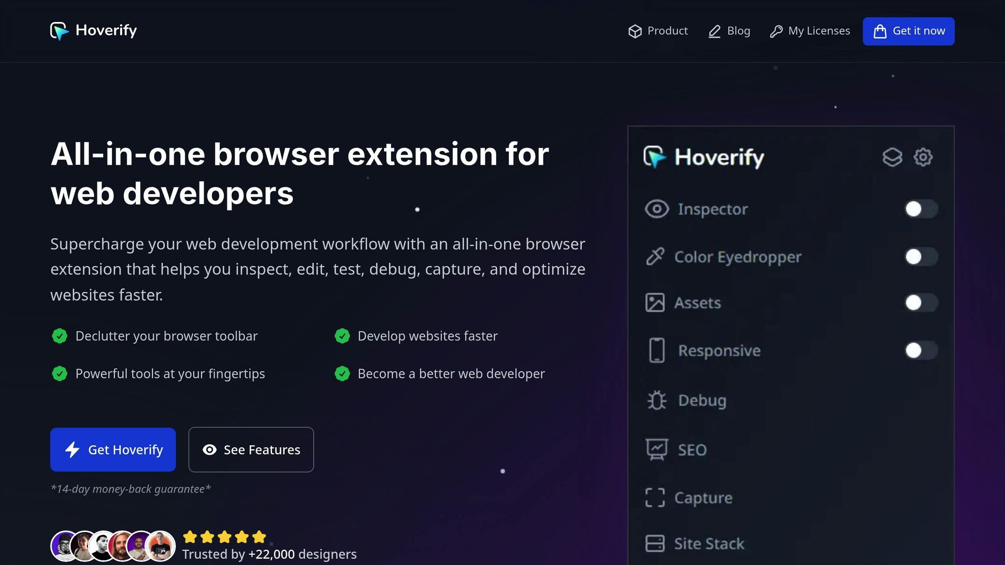
Hoverify makes this process incredibly simple. This browser extension, trusted by over 22,000 developers, allows you to inspect, capture, and extract design details directly from any live website. It stays out of your way until you need it, then provides instant access to the information you’re looking for.
Inspecting Elements by Hovering
Want to see how a design is built? Hoverify’s inspector makes it easy to analyze elements in real time. Just hover over any part of a webpage, and you’ll immediately see its styles, typography, spacing, and other properties.
When you activate the inspector, moving your cursor highlights each element automatically. An overlay pops up to show you dimensions, padding, margins, and borders. It even uses a CSS Box feature to visually map out these spacing relationships for quick understanding.
Clicking on an element reveals even more details, like font families, sizes, weights, line heights, colors, and background properties. It also captures pseudo-elements and classes (like :hover, :before, and :after), which are often responsible for those subtle, polished design touches.
Need to experiment? You can modify styles directly in real time - change colors, tweak padding, or swap fonts - and instantly see the results. You can even edit HTML content to test how different text lengths affect the layout. If you like a component, Hoverify lets you copy or export its full structure straight to CodePen.
Additional features, like the Font Viewer and Color Palette, make it even easier to break down a design. The Font Viewer identifies the exact fonts applied to elements, including fallback options, while the Color Palette extracts every color used on the page, giving you a complete scheme to reference. And if you’re searching for something specific, the Search function helps you locate elements by tag name, ID, class, or CSS selector.
Once you’ve inspected the styles, the next step is ensuring your design works across all devices.
Testing Layouts Across Multiple Devices
After gathering design details, it’s important to confirm that your layout looks great on every screen size. Hoverify’s Responsive Viewer lets you preview websites on multiple devices simultaneously, with synchronized interactions across all screens.
Using the Responsive Viewer, you can see device frames with preset or custom profiles. Any action you take - like clicking a button or scrolling - is mirrored across all devices, helping you catch layout issues that might only appear on certain screens.
You can even test designs on viewports larger than your own screen and change the user-agent to see how the site behaves in different browsers or operating systems. This gives you a complete picture of how your design adapts to various environments.
Taking Screenshots and Downloading Assets
Sometimes, you need to save examples or grab specific assets for later use. Hoverify’s Capture feature makes this a breeze with multiple screenshot options and a built-in asset extractor.
You can capture visible areas, full pages, or specific sections of a site. Screenshots can be saved in common formats, and you can annotate them if needed - perfect for sharing ideas or documenting designs for your team.
The Assets feature is equally powerful, allowing you to extract images, videos, SVGs, PDFs, Lottie animations, and even favicons. It can pull assets from iframes and hidden elements, too. Filter and sort assets by type, size, or format, then download them individually or as a zip file for bulk saving. With just one click, you can gather everything you need.
“Found an incredibly useful web design / development tool called Hoverify. Allows you to inspect elements on any site, copy styles, show grids, check on different viewports, grab asset lists, hide elements, and a whole lot more.” - Madhu Menon
Hoverify puts everything you need at your fingertips, making it easy to collect and organize design details for your personal library. Whether you’re inspecting styles, testing layouts, or saving assets, this tool simplifies the entire process.
Creating Your Personal Inspiration Collection
Design assets lose their value quickly if they’re a chaotic mess. By setting up a well-organized, searchable library, you’ll save time and frustration when you need inspiration or reference materials. Here’s how to keep everything in order.
Using Simple Folder Structures
Start with a straightforward and consistent folder hierarchy. Your top-level folders could include categories like Navigation, Forms, Cards, Hero Sections, Pricing Tables, and Footers. Stick to a consistent naming convention - like lowercase words separated by hyphens - to make everything easy to find.
Within these main folders, add subfolders for specific styles or use cases. For example, under Navigation, you might have subfolders like Mega Menus, Mobile Hamburger, Sticky Headers, and Dropdown Styles. If you’re tracking design trends, you can also create date-based folders, such as 2025 > December, to store examples of what’s trending. This setup not only helps you stay organized but also lets you trace how design styles evolve over time.
Once you’ve built this framework, categorizing new assets becomes second nature.
Saving Hoverify Outputs by Category
Hoverify generates a variety of assets - screenshots, images, videos, and JSON exports. To keep these resources useful, save them in dedicated folders that align with your broader system.
For example, a screenshot of a navigation bar you like can go into your Navigation folder, or better yet, into a specific subfolder like Mobile Hamburger. If you’re downloading icons or images from a site, store them in an Assets folder with subcategories like Icons, Illustrations, Photos, and Animations. This way, you’re never stuck digging through unrelated files when you need something specific.
For JSON exports from Hoverify’s Site Stack feature, create a Tech Stack folder. Use this to store information about the technologies, frameworks, and plugins behind designs you admire. This can be a goldmine when you’re working on your own projects and need to replicate a particular feature or effect.
If you’re working on a specific project, set up a dedicated folder - like Ecommerce Project - to gather all relevant inspiration in one spot. This could include product cards, checkout flows, and cart designs, making it easier to reference everything while coding.
Adding Tags for Quick Searches
Tags and descriptive filenames can take your organization to the next level, making it effortless to locate files. Most operating systems let you tag files. On macOS, right-click a file, select “Tags”, and add keywords like dark-mode, minimalist, or mobile-first. On Windows, you can add tags in the file properties. These tags make your files searchable across your system. For instance, typing animated in your search bar will instantly pull up all files tagged with that keyword, no matter where they’re stored.
If tagging feels like overkill, detailed filenames can work just as well. Instead of saving a file as something generic like screenshot-2025-12-08.png, rename it to something descriptive, like shopify-mobile-nav-hamburger-animation.png. This way, the file name itself tells you what’s inside and makes it easy to find using your computer’s search function.
For maximum efficiency, combine these methods. Use folder structures for broad categories, tags for themes that cut across categories (like reference or tutorial), and filenames for capturing specific details. This way, when you need to find a pricing table with a dark background and subtle animations, you’ll have it in seconds - no endless clicking through folders required.
Taking a few extra moments to organize files when you save them will save you hours later when you’re deep into a project and need quick access to inspiration or references.
Turning Inspiration into Your Own Designs
Once you’ve gathered a collection of design inspiration, the real challenge begins: turning those ideas into designs that suit your project. Collecting inspiration is just the starting point - what matters is transforming it into something that works for your unique needs.
Focusing on Individual Components
One common mistake is trying to replicate entire designs. Instead, focus on specific components that solve particular challenges. For example, if your navigation menu isn’t working, study how other sites structure theirs. If your call-to-action buttons feel uninspired, look at how others approach button styling, hover effects, and placement.
You can experiment directly by inspecting elements on a webpage. Hover over a component to reveal its CSS properties and tweak styles in real time. Play around with border radii, padding, colors, or typography until you create something that feels original and aligned with your vision.
To refine further, export components to tools like CodePen. This gives you a clean slate to adapt the design. Strip away the original branding, adjust dimensions to fit your layout, and tweak the styles to reflect your brand identity. This isn’t copying - it’s learning from structure and reimagining it for your needs.
By breaking designs into smaller pieces, you avoid mismatched “Frankenstein” designs. A sleek, minimalist hero section won’t pair well with heavily ornate cards. This focused approach ensures a more cohesive and polished final product that aligns with your technical skills and design goals.
Matching Ideas to Your Technology Stack
Not every design you admire will be practical for your project. A visually stunning animation might depend on a JavaScript library you don’t use, or a complex layout might require a CSS framework you’re unfamiliar with. Before diving in, make sure the design is achievable with your current tools.
This is where Hoverify’s Site Stack feature comes in handy. It identifies the technologies, frameworks, and libraries behind a site’s design. You’ll know if a site uses React, Vue, or plain JavaScript. You’ll find out if an animation is powered by GSAP, Framer Motion, or just CSS. You’ll even see if they rely on Tailwind CSS, Bootstrap, or custom styles.
For example, if you’re working in React and discover a component uses React Spring for animations, you can integrate it with minimal hassle. On the other hand, if a design relies on WordPress plugins you don’t have access to, you’ll know to either find an alternative or simplify your approach.
Site Stack can also inform your learning path. If you consistently notice the same tools or frameworks in designs you admire, it’s a good indication that those technologies are worth exploring. This way, you’re not randomly picking tools - you’re guided by proven examples of what works.
You can even save Site Stack data alongside your design assets. With the right tools in place, you can ensure every adapted component fits seamlessly into your brand’s visual and technical framework.
Keeping Designs On-Brand and Accessible
When drawing inspiration from other sites, remember that their colors, fonts, and spacing are tailored to their brand - not yours. Adapt these elements to align with your brand guidelines. Replace their color palette with yours, use your chosen typography, and adjust spacing to match your established patterns.
This isn’t just about aesthetics - it’s about building trust. A consistent interface helps users feel confident in your site. For instance, if your site features rounded corners and soft shadows, a sharp-edged component borrowed from a brutalist design will feel out of place. Every adapted element should harmonize with the rest of your site’s visual language.
Don’t overlook accessibility when adapting designs. Check color contrast to ensure readability for users with visual impairments. Make sure interactive elements are keyboard-friendly and that focus states are clearly visible. Use screen readers to verify that your structure makes sense even without visual cues.
Hoverify’s Inspector can help here, letting you examine and adjust accessibility attributes in real time. You can check ARIA labels, role attributes, and semantic HTML structure. If the original design overlooks accessibility, take the time to fix those gaps. Your users - and your future self - will appreciate the effort.
Inspiration should be a starting point, not a limitation. Use what you’ve collected to create designs tailored to your project’s goals, technical constraints, and audience needs. The aim isn’t to piece together a highlight reel of others’ work - it’s to craft something that speaks directly to your users while learning from the best examples out there.
Conclusion
Finding design inspiration doesn’t have to feel like a marathon of endless scrolling or juggling countless open tabs. The secret lies in creating a workflow that helps you gather ideas quickly, evaluate them effectively, and adapt them seamlessly to your projects.
Tools like Hoverify can make this process much smoother by integrating directly into your browser. It combines essential features - like inspecting CSS, extracting assets, testing responsive layouts, and checking tech stacks - all in one place. With these tools at your fingertips, you can export components to CodePen, capture screenshots, and analyze designs in minutes, giving you more time to focus on creating rather than managing logistics.
Your inspiration toolkit should work for you, not overwhelm you. Instead of saving every design that catches your eye, focus on curating a collection of ideas that solve actual challenges. This selective approach ensures your library is a practical resource, ready to accelerate your workflow when you need it.
Remember, inspiration is just the starting point. The designs you admire were created with specific audiences, brands, and technical requirements in mind. Your task is to break them down - look at the spacing, interactions, and visual hierarchy - and reimagine those elements in a way that fits your unique context. Adapt individual components to align with your tech stack, maintain your brand’s identity, and prioritize accessibility.
With the right tools and a clear, streamlined process, finding and using design inspiration doesn’t have to be a time drain. A smart workflow lets you create better designs, faster - exactly what every developer strives for.
FAQs
How can I make sure the design elements I use for inspiration work with my current technology stack?
To make sure the design elements you want to use align with your technology stack, start by examining the technical specifications or frameworks tied to the design. Pay attention to details like supported programming languages, libraries, or frameworks. Tools like Hoverify can be particularly useful, as they let you inspect design elements directly to confirm compatibility.
Another smart approach is testing smaller design components in a controlled setting before fully integrating them. This way, you can catch any issues early and tweak things as necessary. Having a solid understanding of what your stack can and can’t handle will save you time and help you make better choices.
How can I keep my brand consistent when using design inspiration from different sources?
To keep your brand identity consistent while drawing ideas from outside sources, start by establishing clear brand guidelines. These should cover essentials like your color palette, typography, tone of voice, and overall visual style. Having these rules in place makes it easier to incorporate external inspiration without veering off course.
When bringing in new ideas, focus on blending key elements - such as colors, fonts, and imagery - with your existing branding. Tools and browser extensions can help you identify and match colors or design features, ensuring everything aligns seamlessly. Paying attention to these smaller details helps create a unified look across all your designs.
Make it a habit to review your designs regularly. This ensures they not only stay true to your brand’s core values and message but also integrate fresh ideas in a way that feels natural and cohesive.
What’s the best way to organize and access my design inspiration for future projects?
To keep your design inspiration well-organized and easy to access, set up a system that fits your needs. Start with tools like bookmarking features, cloud storage services, or specialized design management platforms to save your favorite designs. Group your collection by themes, styles, or specific projects - this makes finding what you need much quicker.
For seamless access while working, try browser extensions or tools that integrate directly into your workflow. These allow you to save and retrieve inspiration without breaking your concentration. Make it a habit to review and refresh your collection regularly, so it remains relevant and helpful for your upcoming projects.
