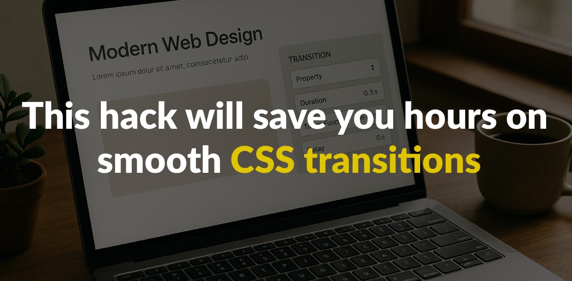
Smooth CSS transitions can elevate your website’s user experience, but manually coding them is time-consuming and tricky. Browser compatibility issues, complex syntax, and performance hiccups often make the process frustrating. That’s where Hoverify, a browser extension, simplifies everything. It lets you visually edit and test CSS transitions in real-time, eliminating the repetitive save-refresh cycle.
Key Takeaways:
- CSS transitions rely on four main properties:
transition-property,transition-duration,transition-timing-function, andtransition-delay. - Use performance-friendly properties like
transformandopacityfor smoother animations. - Hoverify enables real-time visual editing, responsive testing, and code export, saving hours of manual work.
- Features like live previews, timing function adjustments, and component exports make Hoverify a practical tool for developers.
Switching to Hoverify not only speeds up the workflow but also ensures polished, professional animations across devices. If you’re tired of wrestling with CSS, this tool could be the game-changer you need.
CSS Transition Basics
Smooth transitions are a cornerstone of modern web design, making interactions feel natural and engaging. At their core, CSS transitions create a gradual change between property values over a set period. Instead of abrupt shifts, transitions allow elements to adapt fluidly, whether triggered by user actions or JavaScript.
To achieve these effects, CSS transitions rely on four main properties. Understanding these is key to creating polished animations.
Main Transition Properties
CSS transitions are built on four essential properties that work together to define how animations behave:
transition-property: This specifies which CSS property (or properties) should animate. For example, you can targetbackground-color,opacity, or eventransform. Useallto animate every changeable property on the element.transition-duration: This determines how long the animation lasts, measured in seconds (s) or milliseconds (ms). A short duration like0.3sfeels quick and responsive, while a longer one like1.5screates a more dramatic effect.transition-timing-function: This controls the pacing of the animation - how it speeds up or slows down during its duration.transition-delay: This sets a pause before the animation begins, useful for creating staggered or sequential effects.
You can define these properties individually or combine them into a shorthand declaration, like this:
transition: background-color 0.3s ease-in-out 0.1s.
Common Use Cases
CSS transitions are perfect for improving user interactions and creating a more intuitive interface. Here are some popular ways they’re used:
- Hover effects: Transitions can make buttons change color, images scale up, or menu items highlight when hovered over.
- Visibility changes: Instead of elements appearing or disappearing instantly, transitions can fade them in or out, adding a touch of polish. This works well for dropdown menus, modals, or alerts.
- Form interactions: Subtle transitions can enhance forms - like input fields changing border colors when focused or error messages sliding into view.
- Navigation feedback: Smooth transitions on menu items, such as background or text color changes, make websites feel more responsive and user-friendly.
Using Timing Functions for Natural Motion
Timing functions are what make animations feel lifelike rather than robotic. They define how speed changes throughout the animation:
ease: The default option, which starts slow, speeds up in the middle, and slows down again - similar to real-world motion.linear: Maintains a constant speed throughout. While great for effects like progress bars, it can feel mechanical for most interactions.ease-in: Begins slowly and accelerates, drawing attention to the start of the motion. Ideal for elements entering the screen or growing in size.ease-out: Starts quickly and slows toward the end, emphasizing the final state. This works well for elements leaving the screen or shrinking.ease-in-out: Combines both approaches - starting slow, speeding up, then slowing down again. This is often the most natural choice for interface animations.
Even with the same duration, different timing functions can dramatically alter the feel of an animation. For example, ease-in-out compresses most of the motion into the middle, making it appear faster, while linear spreads it evenly, making it feel slower. For custom pacing, you can use cubic-bezier() to fine-tune acceleration curves, though built-in options often suffice.
The Time-Saving Method: Using Hoverify for CSS Transitions
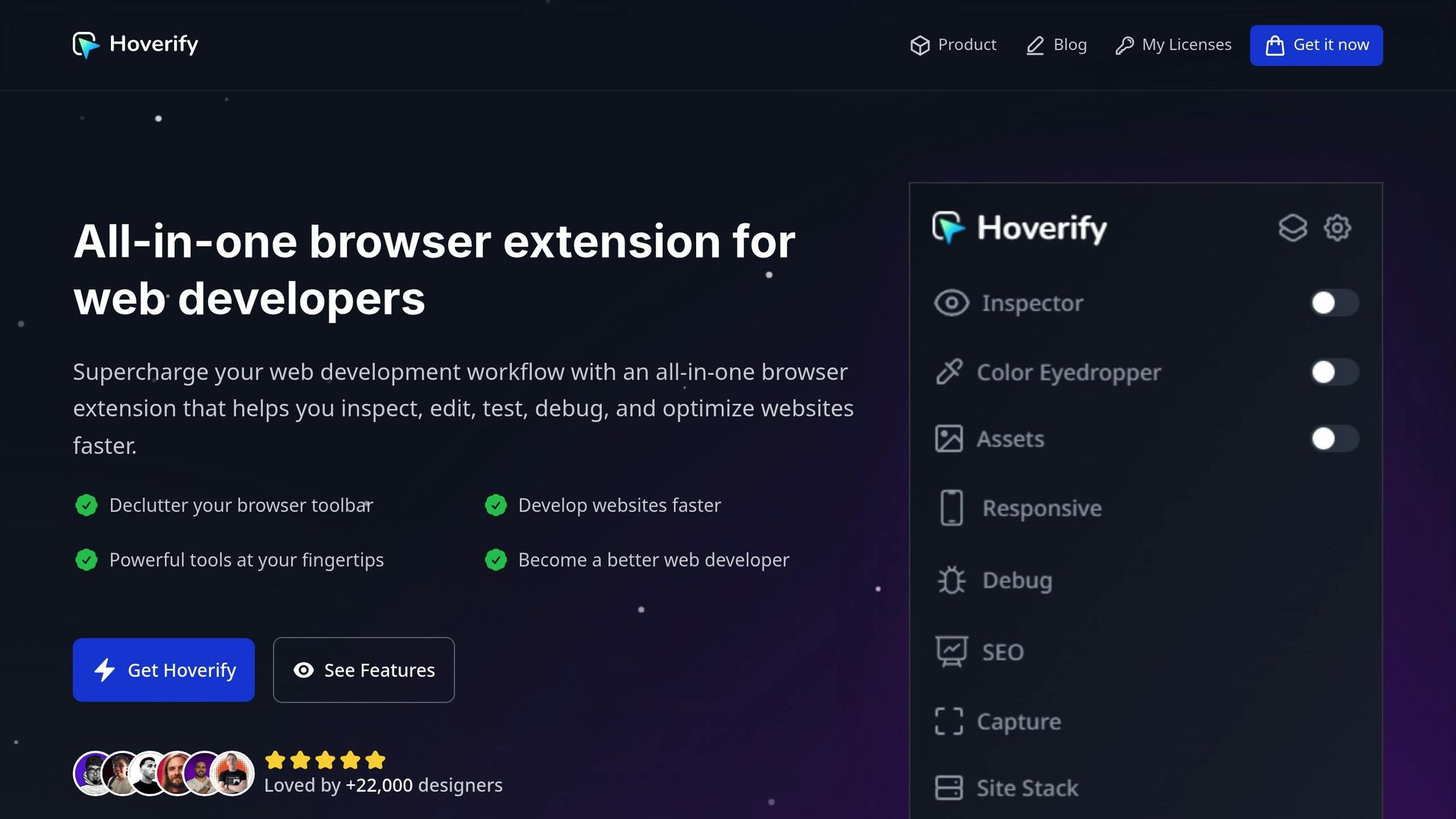
Mastering CSS transitions is crucial, but let’s face it - manually coding and testing them can eat up valuable time. That’s where Hoverify steps in. This browser extension simplifies your workflow by letting you edit CSS transitions visually, right in your browser. No more endless back-and-forth between your code editor and the browser. It’s a game-changer for tackling the challenges of creating smooth transitions.
Hoverify offers real-time visual feedback and an intuitive editing experience, so you can fine-tune animations without the guesswork. Instead of manually tweaking transition-duration or timing-functions and hoping for the best, you can instantly see the results as you make changes.
Real-Time Visual Editing
Hoverify’s Inspector feature is a standout. It allows you to inspect and edit any element instantly. When working on transitions, this means you can watch your updates in action without even opening developer tools or refreshing the page.
The built-in syntax-highlighted code editor ensures that your transition properties remain clean and readable. You can adjust transition-duration, test out different timing-functions, and tweak transition-delay values - all while seeing the effects live on your webpage.
What’s more, Hoverify lets you inspect and edit styles for all screen sizes and animations. This is a huge time-saver when testing transitions across various devices, as you can skip the hassle of resizing your browser or juggling multiple testing environments.
Managing Complex Transitions with Ease
Web interfaces often rely on multiple transitions working together - like hover effects on menus, modal fade-ins, or animations for form validation. Hoverify shines in these scenarios by enabling you to inspect and edit pseudo-elements and classes that are often tricky to handle with standard browser tools.
The extension also supports editing HTML, styles, media queries, and animations in one place. This unified approach keeps you organized, even when dealing with intricate transition sequences. You can preview how timing functions interact, test staggered animations, and ensure everything runs smoothly across different interaction states - all without switching between multiple tools.
Export and Reuse Components
One of Hoverify’s biggest time-saving features is the ability to export components with all their children to CodePen. Once you’ve perfected a transition effect, you can export the entire CSS and HTML structure for future use.
This feature turns repetitive tasks into quick wins. Instead of recreating hover effects or animation patterns from scratch, you can build a library of polished components. These reusable pieces ensure consistent timing and visual quality across projects while cutting down on development time.
The exported code includes everything - transition properties, timing functions, and structural elements - making it easy to integrate into new projects or share with your team. It’s a simple way to keep your workflow efficient without sacrificing quality.
Best Practices for Smooth and Fast Transitions
Building on the basics of transitions and Hoverify’s workflow, these tips can fine-tune your approach. Making smart choices ensures that your CSS transitions run smoothly and efficiently, while avoiding common mistakes that can lead to choppy animations.
Focus on Performance-Friendly Properties
When animating in CSS, some properties are far better for performance than others. Choosing the right ones can make all the difference.
Stick to transform and opacity. These properties are handled by the GPU, which means smoother animations since the browser doesn’t rely on the main processing thread. For tasks like moving, scaling, or rotating elements, always opt for the transform property instead of properties like left, top, width, or height.
Why? Animating properties like height, width, margin, or padding forces the browser to recalculate the layout of the entire page. This ripple effect can slow down your interface significantly, especially on pages with many elements.
If you absolutely must animate layout-related properties, test your animations across a range of devices. What works well on a high-end desktop might struggle on an older smartphone or a budget laptop.
Using the will-change Property
The will-change property is like giving your browser a heads-up about what’s coming. By telling the browser which properties are about to change, it can optimize rendering in advance, often by moving elements to their own rendering layers.
This approach is especially helpful for animations involving complex effects like blur() or brightness(). By isolating elements on separate layers, will-change reduces the strain on the main thread and boosts GPU efficiency, leading to smoother animations.
However, there’s a catch. As noted in the MDN Web Docs:
“will-change is intended to be used as a last resort, in order to try to deal with existing performance problems. It should not be used to anticipate performance problems.”
Use will-change sparingly and strategically. Apply it just before an animation starts, and remove it afterward to prevent unnecessary memory usage. Overusing this property can backfire, increasing memory consumption and GPU overhead instead of improving performance.
Testing Across Devices
Even well-designed transitions can behave differently depending on screen size and device capabilities. What looks smooth and polished on a desktop might feel sluggish on a mobile device or cramped on a smaller screen.
This is where Hoverify’s responsive testing tools shine. Instead of resizing your browser window or juggling multiple testing setups, Hoverify lets you inspect and tweak styles for various screen sizes directly within the extension.
Here’s a breakdown of key device categories to consider:
| Device Category | Width (px) | Example Use Cases |
|---|---|---|
| Mobile Small | 320–375 | Compact displays, older phones |
| Mobile Large | 376–428 | Most modern smartphones |
| Tablet | 768–1024 | iPads, Android tablets |
| Desktop | 1025–1440 | Laptops, standard desktop screens |
Testing transitions at these breakpoints ensures they feel natural and perform well across devices. Timing is crucial - what feels quick and responsive on a desktop might seem rushed on mobile, where users often expect slightly slower, more deliberate animations. Similarly, touch gestures on tablets may require different hover state considerations.
Hoverify’s tools make it easier to apply these practices consistently, helping you create transitions that not only look great but also perform seamlessly across a wide range of devices.
Manual CSS Editing vs. Hoverify’s Workflow
When it comes to creating seamless CSS transitions, the difference between manual editing and Hoverify’s workflow is like night and day. Manual CSS editing involves coding everything from scratch, running cross-browser tests, and constantly tweaking animations to ensure they work across devices. This process can easily eat up hours, especially when you’re dealing with intricate animations or compatibility challenges.
Hoverify simplifies this entire process by integrating real-time visual editing directly into your browser. Instead of juggling between your code editor, browser, and developer tools, you can make edits and instantly see the results right in your browser. Its hover-to-inspect feature lets you quickly identify elements, while the visual editor allows you to preview changes as you make them.
With manual workflows, you’re stuck in a repetitive cycle: coding, saving, refreshing, and reviewing. Hoverify eliminates this hassle by combining hover-to-inspect functionality with real-time adjustments, building on the benefits of live editing.
Hoverify also takes cross-device testing to the next level. Instead of manually resizing your browser or testing on multiple devices, its responsive viewer lets you simulate different device profiles simultaneously. This makes side-by-side comparisons a breeze.
Comparison Table: Manual Editing vs. Hoverify
| Aspect | Manual CSS Editing | Hoverify Workflow |
|---|---|---|
| Setup Time | Open editor, browser, and developer tools | Single browser extension |
| Element Selection | Inspect elements manually for CSS selectors | Hover-to-inspect functionality |
| Preview Changes | Save, refresh, and review in browser | Instant visual feedback |
| Cross-Device Testing | Test using multiple browser windows or devices | Simulate multiple devices at once |
| Timing Function Adjustment | Write cubic-bezier values by hand | Adjust timing functions with an interactive interface |
| Code Export | Copy and format manually from developer tools | Export directly to CodePen |
| Learning Curve | Requires knowledge of CSS syntax | Beginner-friendly visual interface |
| Debugging | Relies on console logs and trial-and-error | Visual cues to simplify troubleshooting |
One standout feature is Hoverify’s approach to timing functions. Writing cubic-bezier curves manually often means memorizing values or relying on external tools. Hoverify provides an intuitive interface with controls for adjusting these curves, letting you preview animations as you tweak them.
For developers working on client projects, Hoverify’s component export feature is a game-changer. Instead of pasting CSS snippets into an email or chat, you can export fully styled components with animations intact. This reduces the risk of miscommunication and ensures that animations will behave as expected when implemented.
On top of that, Hoverify’s syntax highlighting offers visual feedback that helps catch errors early. This saves you from spending unnecessary time on troubleshooting and makes the entire process smoother and more efficient.
Conclusion: Save Hours on CSS Transitions with Hoverify
Creating smooth CSS transitions doesn’t have to be a time-consuming chore. Hoverify transforms hours of manual coding into just minutes of real-time visual editing. With its robust features, this tool redefines the way developers and designers approach animations.
Web pages with animations can increase user retention by 20–30% and appeal to 70% of users. Hoverify’s real-time editing tools allow you to tap into these benefits without the frustration of traditional CSS workflows.
By combining code editing and live previews, Hoverify eliminates the endless save-and-refresh cycle. Its visual editor shows your changes instantly, freeing up time and energy for more creative tasks.
“Found an incredibly useful web design / development tool called Hoverify. Allows you to inspect elements on any site, copy styles, show grids, check on different viewports, grab asset lists, hide elements, and a whole lot more.”
- Madhu Menon
The responsive viewer is another game-changer, letting you test designs across multiple devices simultaneously. This means you can catch cross-device issues early, avoiding surprises during production.
For client projects, Hoverify’s ability to export components directly to CodePen simplifies collaboration. Animations are exported with all styles intact, ensuring seamless teamwork and consistent results.
With over 22,000 designers already relying on Hoverify to speed up their workflows, and a solid 4.1/5 rating on the Chrome Web Store, it’s clear that this tool is making an impact.
“Incredible app for web designers! Wow!! I’m really impressed, it combined a ton of other tools I was using. So happy I found this.”
- Ecom Queens
Whether you’re an experienced developer aiming to streamline your process or a beginner wanting professional-quality transitions without diving deep into CSS, Hoverify makes it possible. Its intuitive interface simplifies complex tasks, making advanced timing functions accessible while catching errors before they become problems.
Switching from manual CSS workflows to Hoverify isn’t just about saving time - it’s about producing better results with less stress. When you can focus on creativity instead of debugging, your animations shine, and your projects stand out.
Start using Hoverify today and see how it transforms your approach to CSS transitions.
FAQs
How does Hoverify make creating smooth CSS transitions faster and easier?
Hoverify changes how you approach CSS transitions by offering an easy-to-use interface paired with automation tools that cut down on the need for tedious manual coding. Instead of wrestling with intricate CSS properties and timing functions, this tool lets you craft and apply high-quality animations in no time.
By simplifying the process, Hoverify doesn’t just save you valuable hours - it also ensures your transitions are sleek and uniform, allowing you to streamline your workflow and concentrate on other important parts of your project.
How can I use Hoverify to create smooth and efficient CSS transitions across all devices?
To make CSS transitions smooth and efficient with Hoverify, rely on hardware-accelerated properties like transform and opacity. Avoid using properties such as top, left, or width, as they can slow down animations and lead to a less responsive experience. For the best results, aim for transition durations between 150ms and 400ms - this strikes a good balance between performance and visual appeal.
Don’t forget to test your transitions on real devices and multiple browsers. This ensures they perform consistently and helps you catch any compatibility issues. Taking this extra step ensures your animations look polished and work seamlessly across all platforms.
Can Hoverify improve the performance of complex CSS animations, especially when using resource-heavy properties like blur() or brightness()?
Hoverify is built to assist in improving the performance of intricate CSS animations. It offers tools to pinpoint and resolve performance issues, particularly those stemming from resource-intensive properties like blur() or brightness(). By enabling developers to inspect and debug animations effectively, Hoverify simplifies the process of refining these effects for smoother playback.
On top of that, Hoverify identifies opportunities to minimize reliance on CPU-heavy properties, allowing for more efficient animations without sacrificing visual appeal. This not only enhances the user experience but also streamlines the development process, saving time and effort.
