iPad screen size and viewport
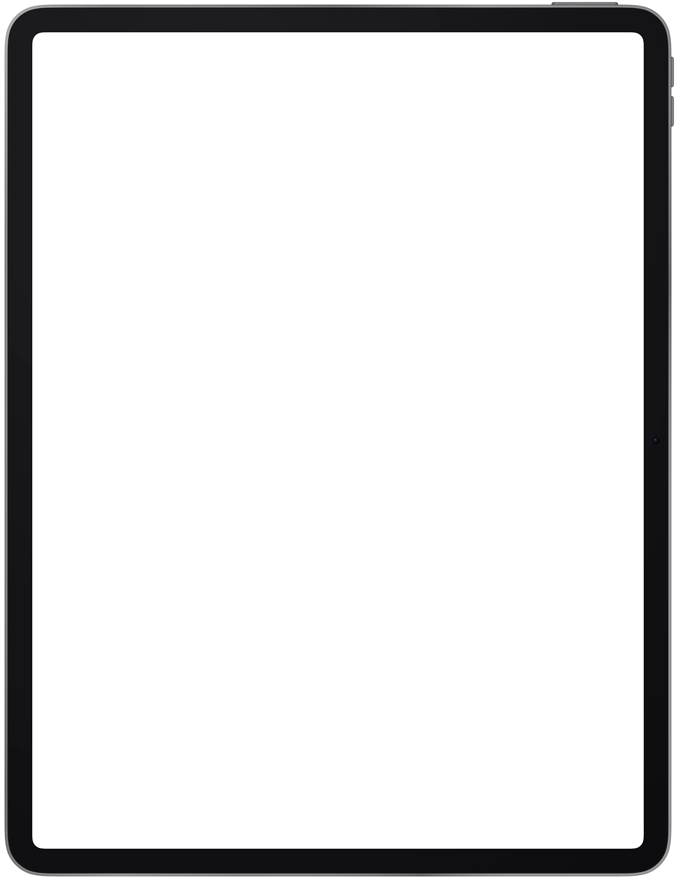
820 by 1180, which also matches the 11 inch iPad Air. The thickest bezels of the iPads at 64 px.
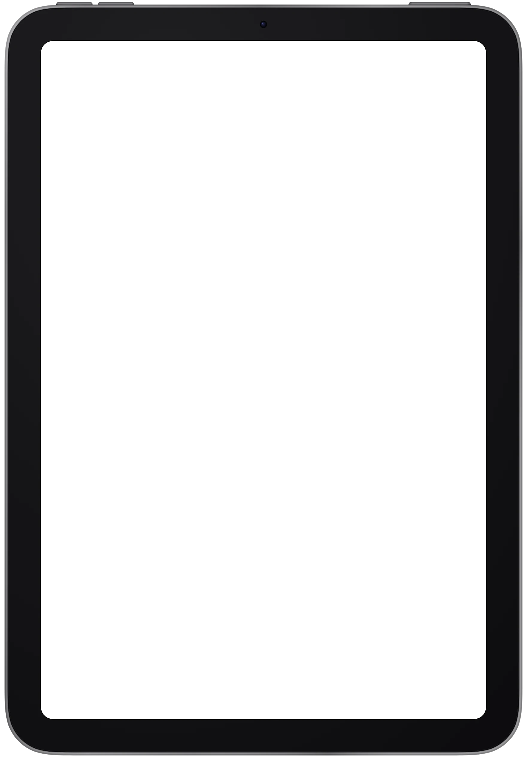
There is no cutout. The whole screen opening is yours. The viewport below is what Hoverify's responsive viewer renders the page at for this device, in CSS pixels. The frame image is that viewport plus the bezel, at 2 pixels per CSS pixel. Rows marked "in the frame image" are in those pixels, so they drop straight into Figma or Photoshop at the frame's full size.
- Viewport (CSS px)
- 820 × 1180
- Device pixel ratio
- 2
- Physical pixels at that ratio
- 1640 × 2360
- Operating system
- iPadOS
- Screen cutout
- None
- Status bar height
- 24 CSS px
- Navigation
- Gesture bar
- Screen corner radius
- 48 px in the frame image (24 CSS px)
- Frame image
- 1896 × 2616 px at 2× (948 × 1308 CSS px)
- Screen opening offset
- 128 px from the left, 128 px from the top in the frame image (64 and 64 CSS px)
- Finishes
- Silver, Blue, Pink, Yellow
iPad frame PNG and WebP download
The bare bezel with a transparent screen opening, one file per finish. The WebP is the file the Hoverify extension ships. The PNG is decoded from it in your browser when you click, and the pixels are identical. You can use both in personal and commercial work under the device frames license, and credit is optional.






Frequently Asked Questions
Have a question we haven't answered? Get in touch.
Test your live site on every device at once
The responsive viewer in Hoverify loads your page inside this frame at 820 × 1180, with Safari's bars drawn around it, next to every other device you have added. Scroll one and they all scroll. Capture a framed screenshot from the device header when it looks right.
- 3 browsers per license
- 14-day refund
- No auto-renewal
 Hoverify