Every device frame
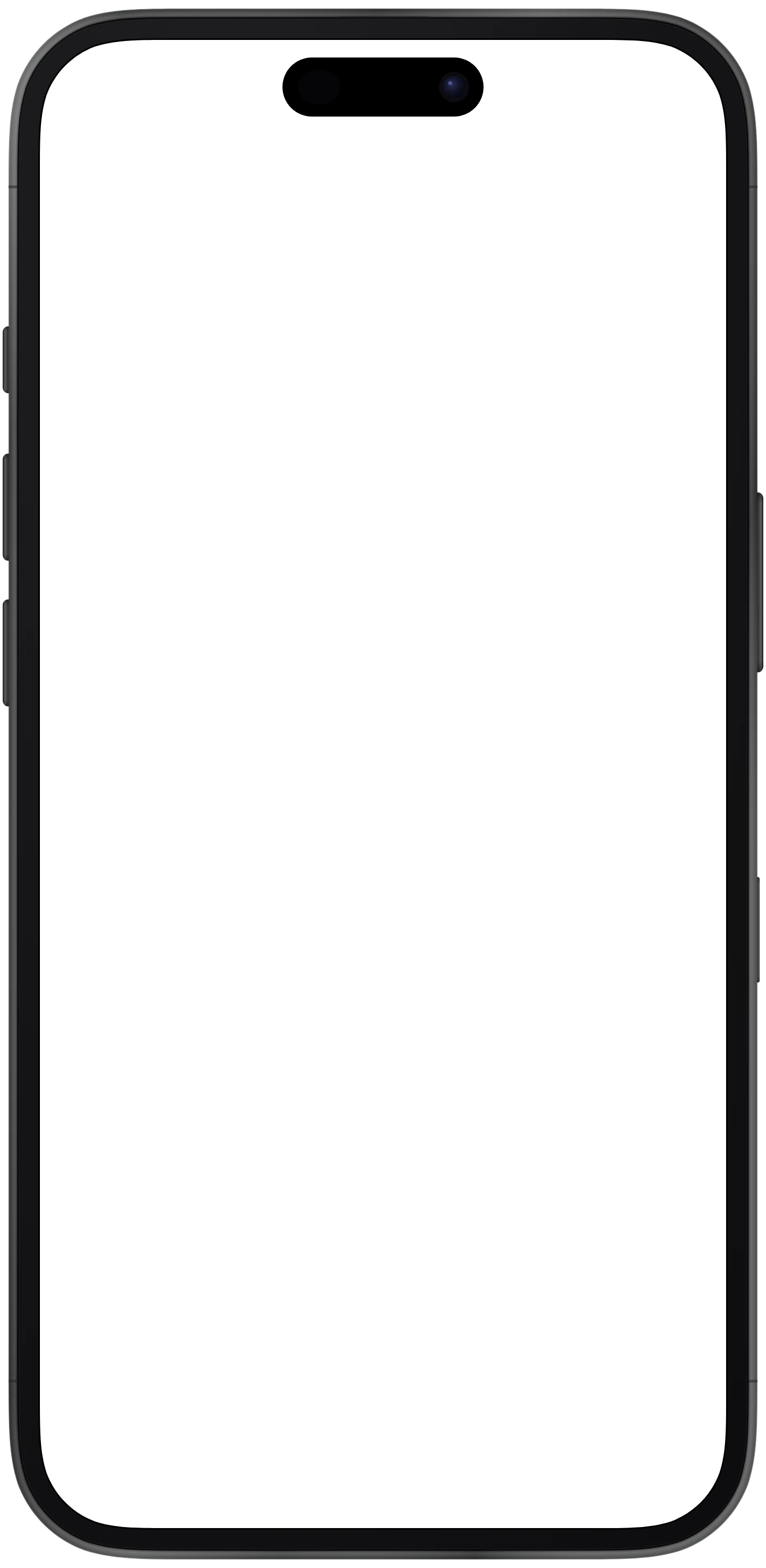
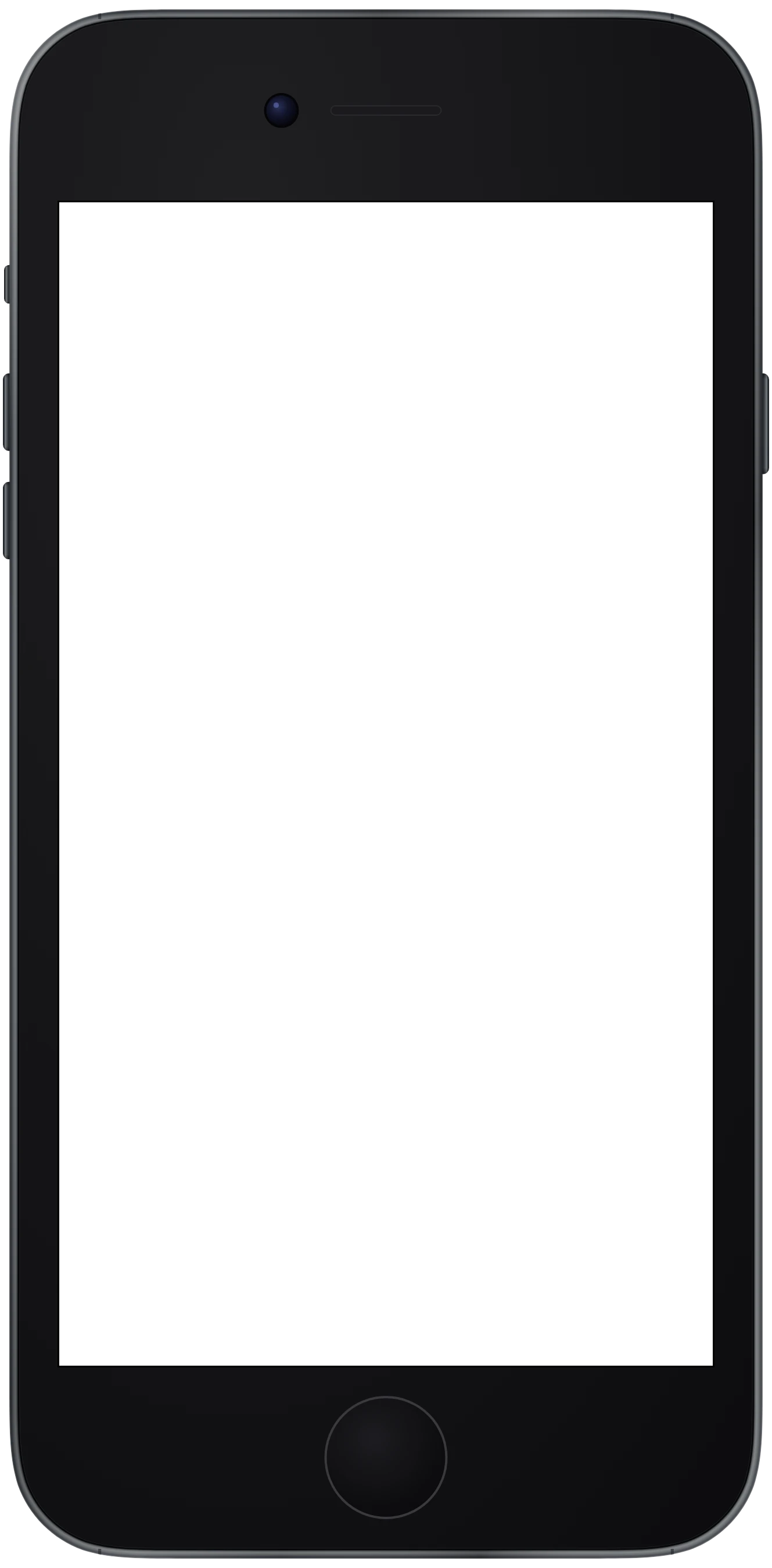
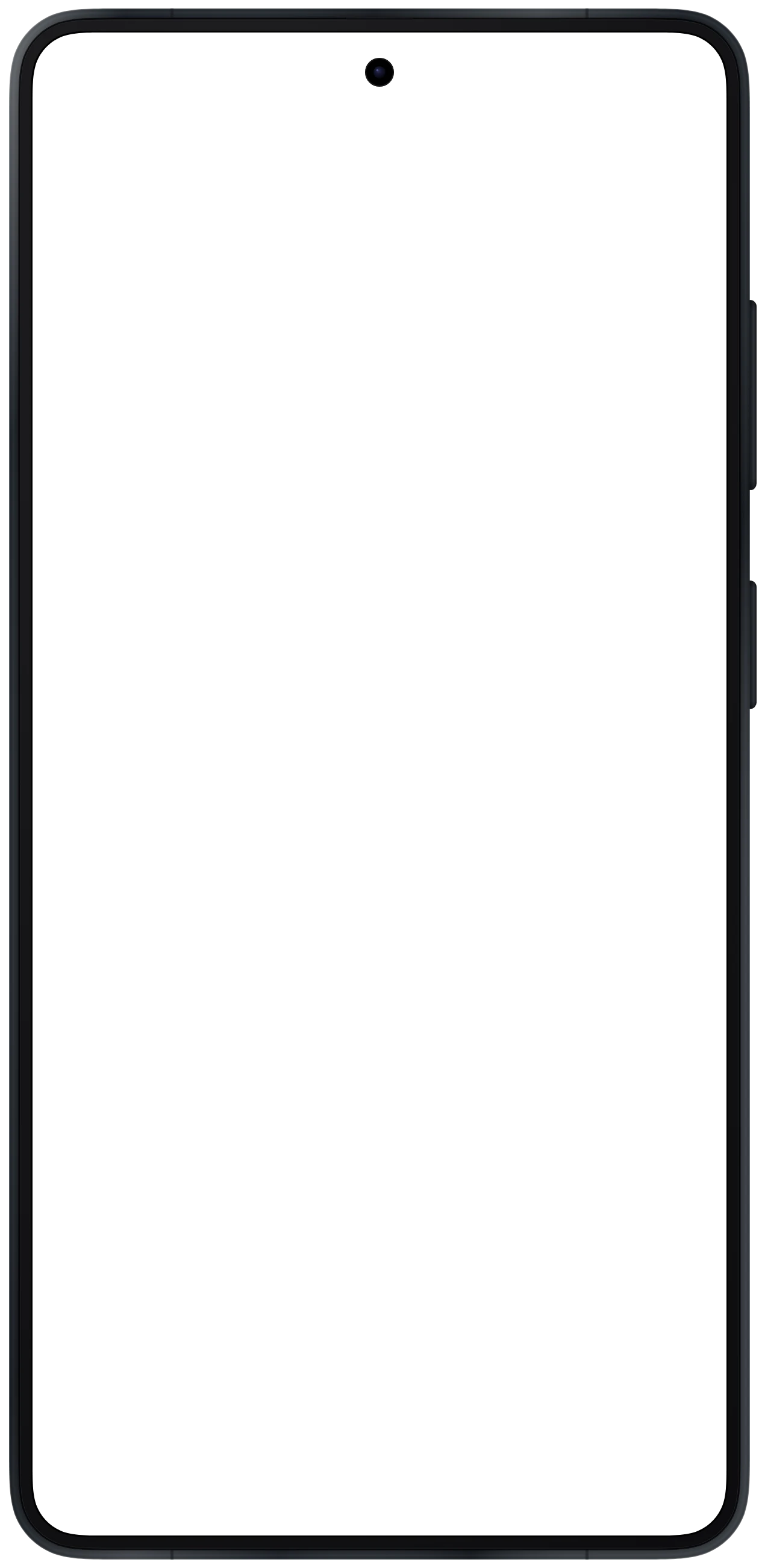
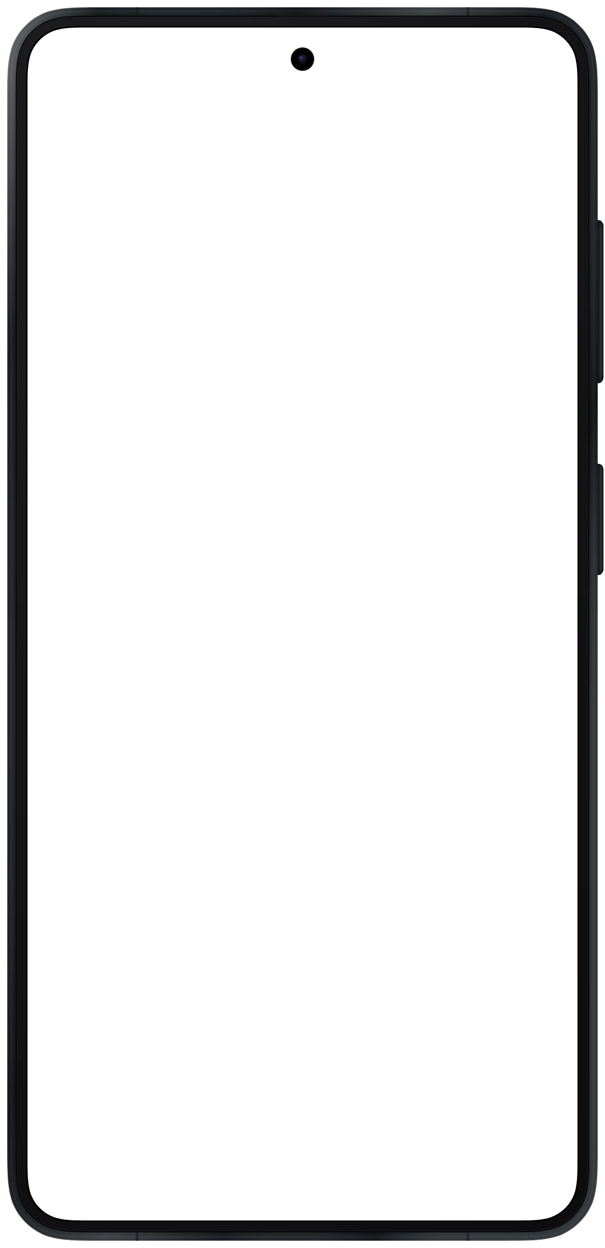
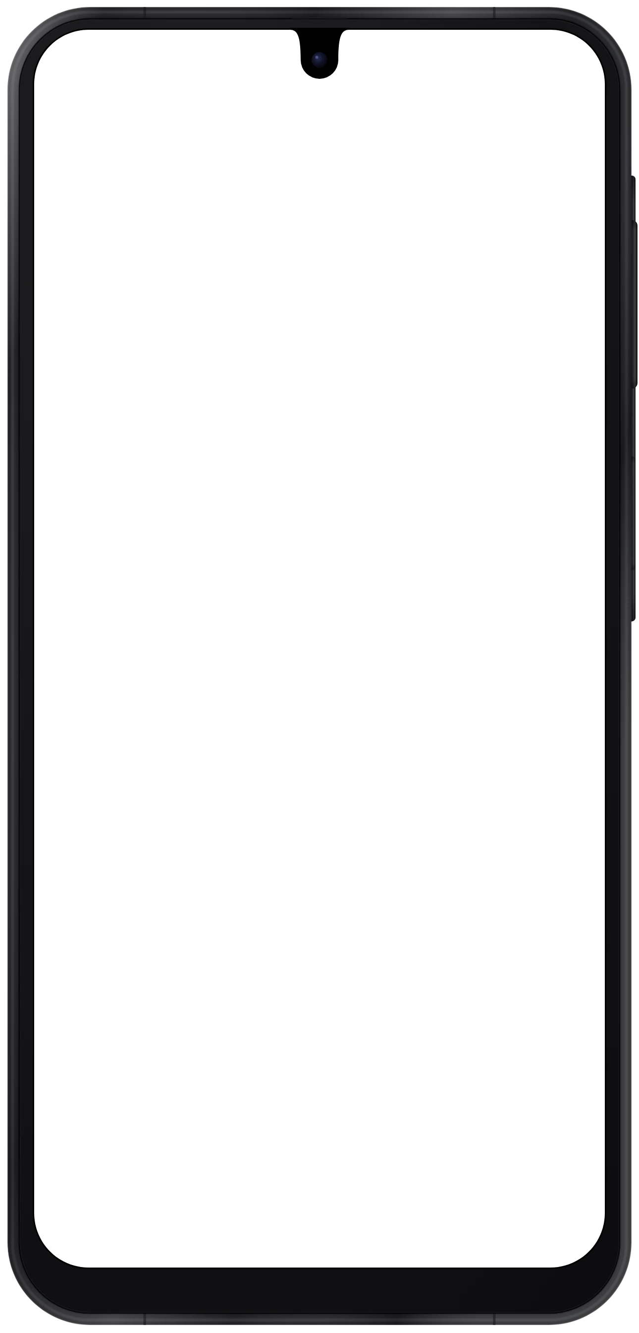
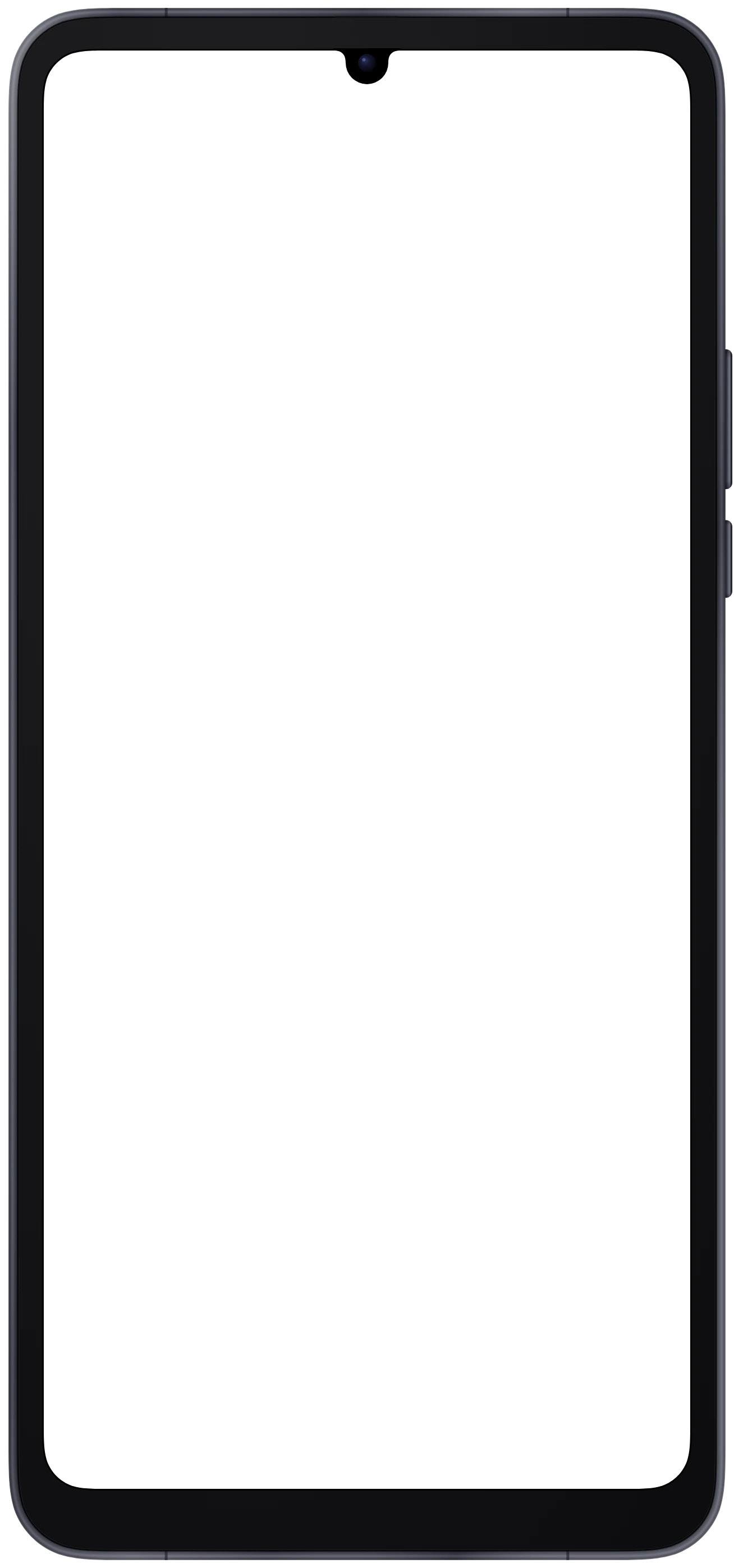
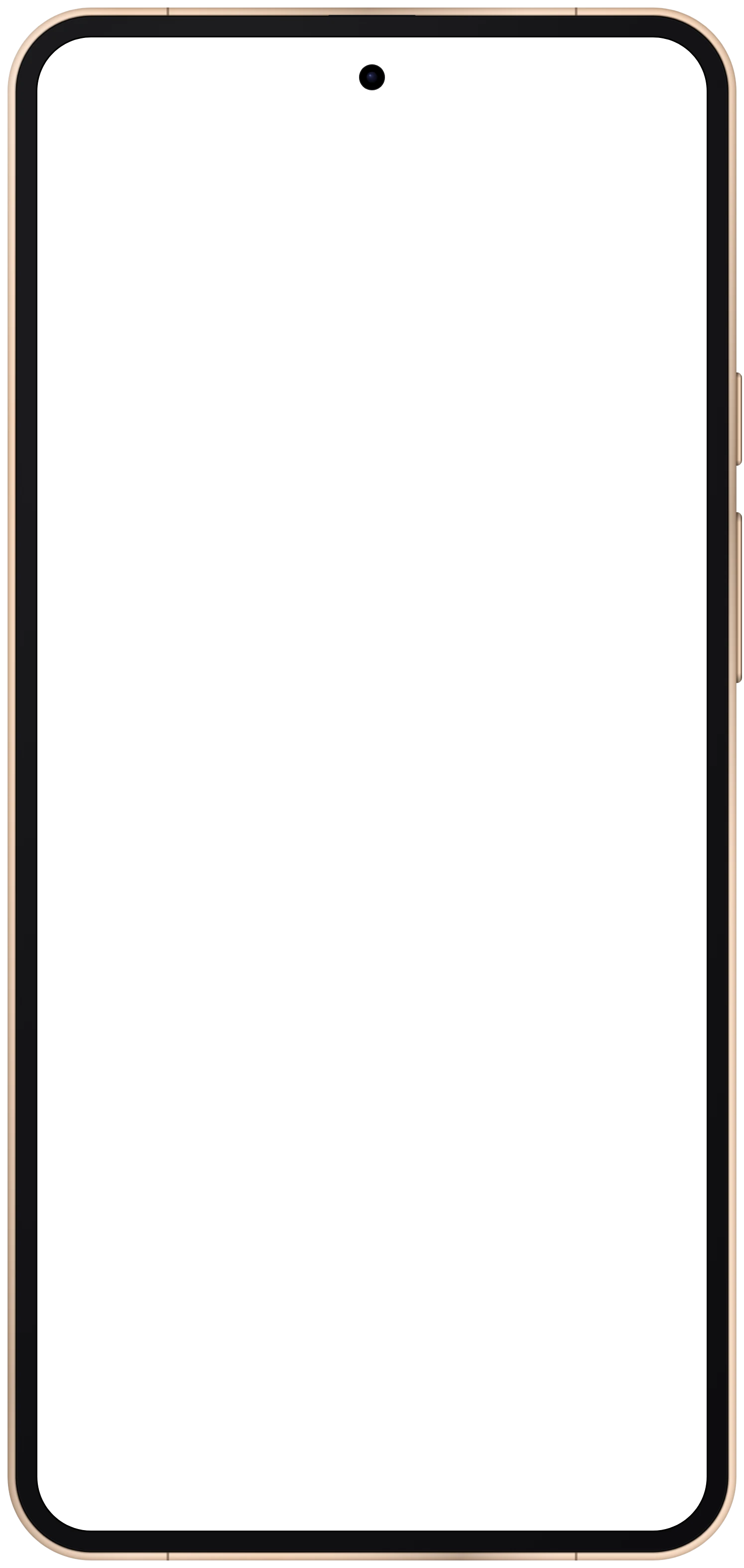
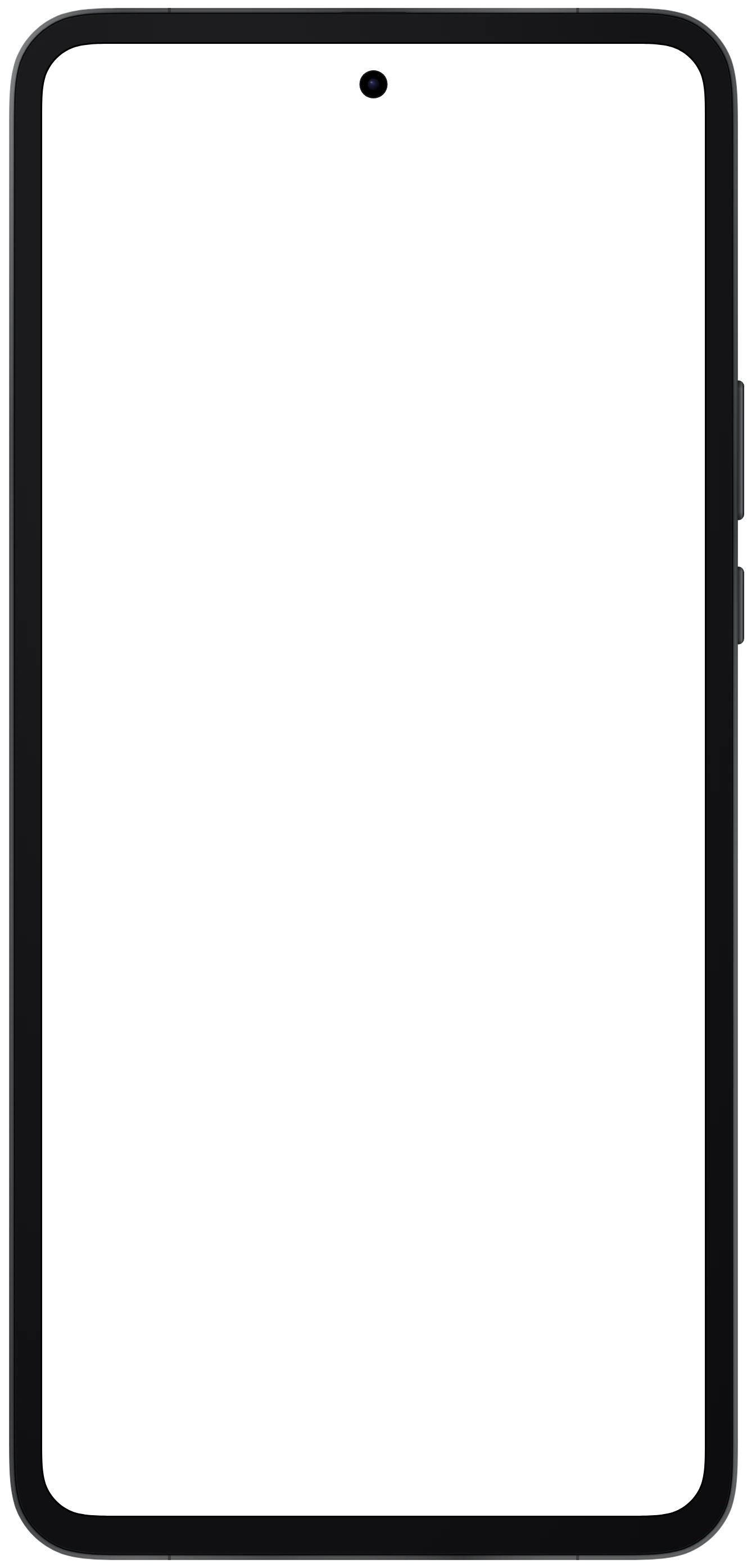
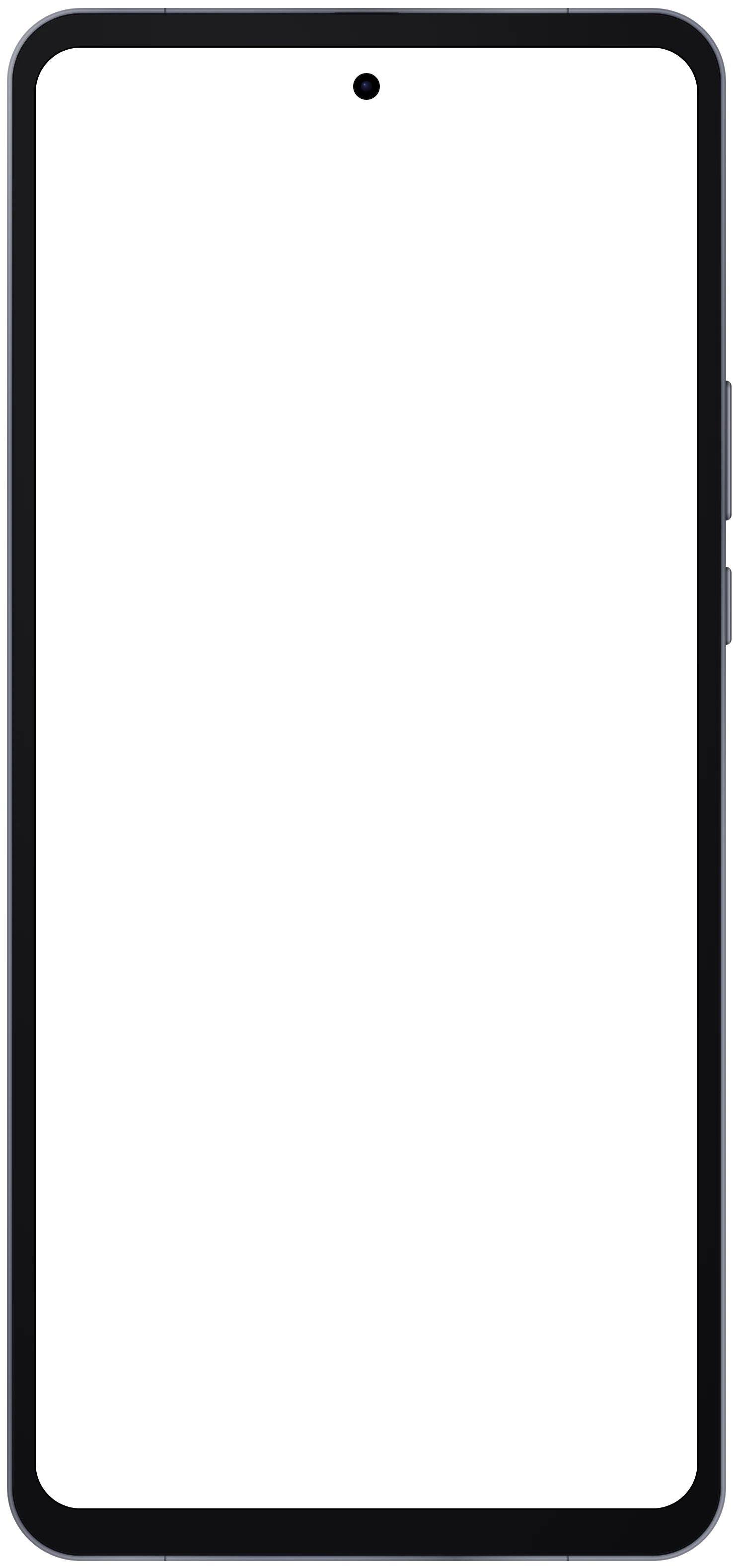
Each device has its own page with the viewport in CSS pixels, the status bar and cutout the extension draws, the corner radius and the frame files in every finish. The generator on that page opens with the device already selected.
Phones 18

Foldables 4

Tablets 6



About these device frames
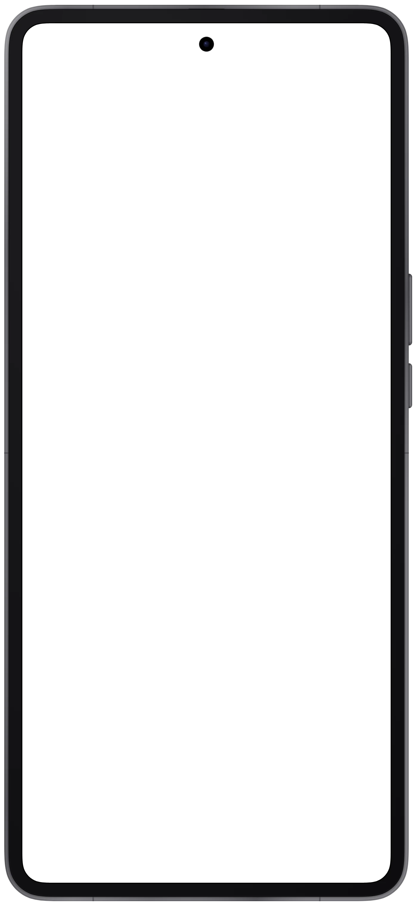
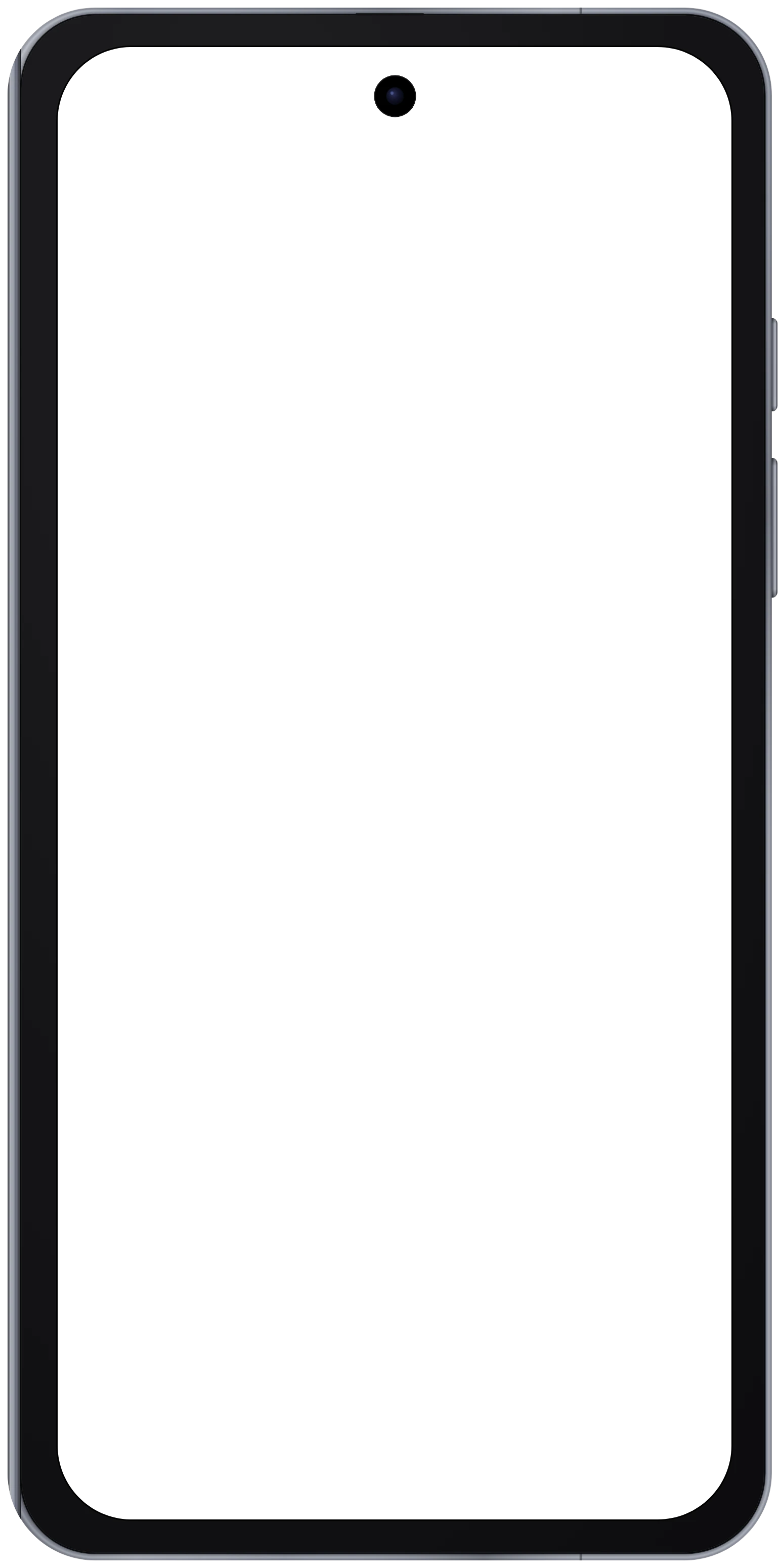
28 frames drawn to each device's real screen size and corner radius, current to the 2026 lineup. Take your screenshot at the viewport listed on the device page and it fills the screen with nothing cropped. Nothing you drop in leaves your browser.
Full resolution. Exports are 3 pixels per CSS pixel on phones and 2 on tablets. An iPhone 17 Pro mockup is 1332 × 2748, large enough for store listings and print.
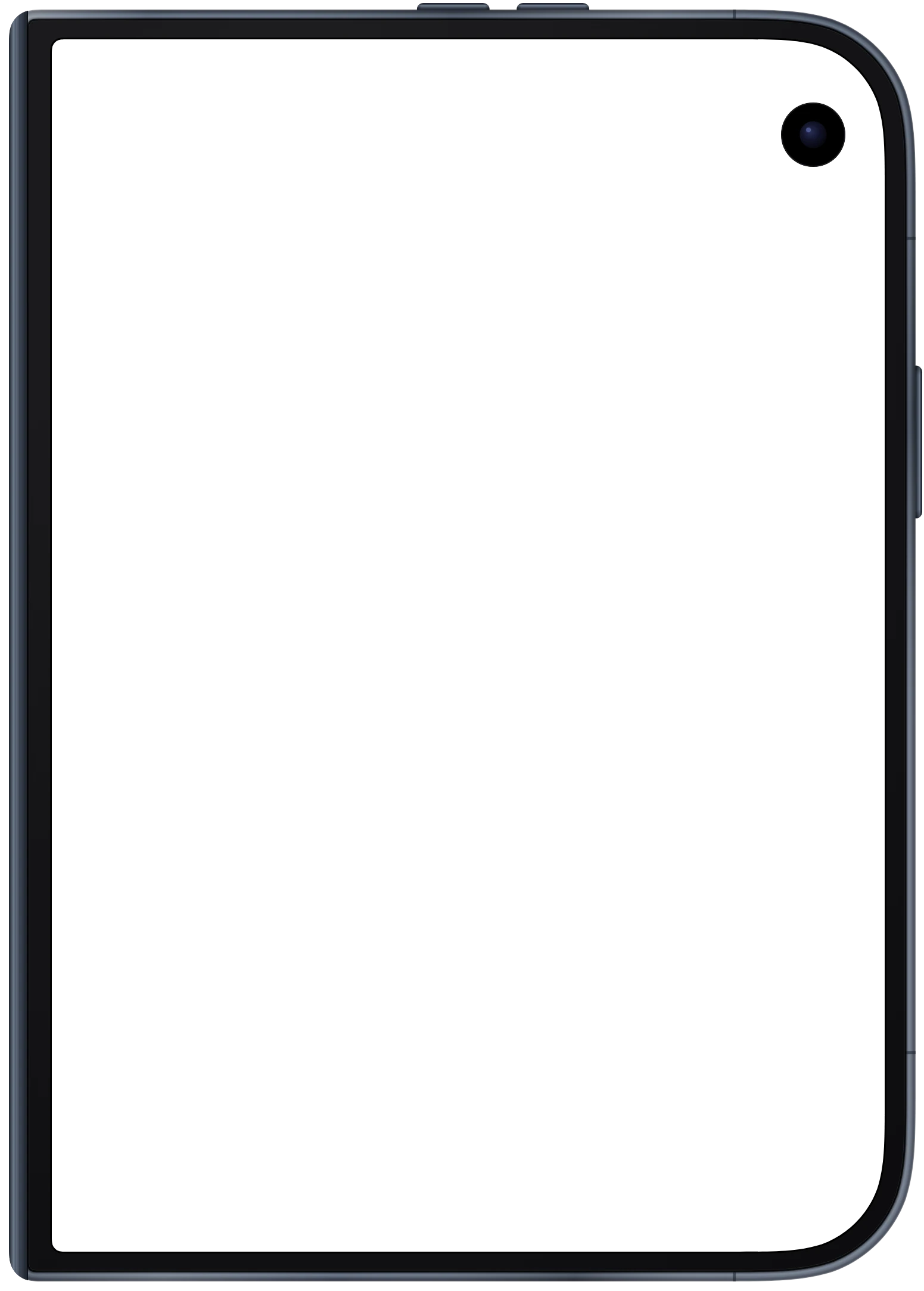
Foldables, closed and open. The iPhone Duo, Galaxy Z Fold7 and Pixel 10 Pro Fold each come as two frames, with the crease drawn where the real screen has one.
Free for commercial work. Use the mockups and the bare frames in listings, ads, decks and client projects without crediting Hoverify. The one rule is not to resell the frame files.
Frequently Asked Questions
Have a question we haven't answered? Get in touch.
See your live site in all of these frames at once
The responsive viewer in Hoverify opens your page in every device here, side by side, with scroll and clicks kept in sync. Fold the Galaxy Z Fold7 open, then capture a framed screenshot from any device without leaving the tab.
- 3 browsers per license
- 14-day refund
- No auto-renewal
 Hoverify